
ABSTRACT
Time, much like space, has always influenced the human experience due to its ubiquity. Yet, how we have communicated temporal information graphically throughout our history, is still inadequately studied. How does our image of time and temporal events evolve as the human world continuously transforms into a globally more and more synchronized community? Within this overview paper, we elaborate on these questions, we analyze visualizations of time and temporal data from a variety of sources connected to exploratory data analysis. We assign codes and cluster the visualizations based on their graphical properties. The result gives an overview of different visual structures apparent in graphic representations of time.
ABSTRAITE
Le temps, comme l'espace, a toujours influencé l'expérience humaine en raison de son ubiquité. Pourtant, la façon dont nous avons communiqué graphiquement l'information temporelle au travers de l'histoire est encore insuffisamment étudiée. Comment notre image du temps et des évènements temporels évolue-t-elle alors que le monde se transforme continument en une communauté globalement de plus en plus synchronisée ? Dans cet article, nous construisons sur ces questions, nous analysons des visualisations du temps et des données temporelles à partir de diverses sources liées à l'analyse exploratoire de données. Nous donnons des codes et nous regroupons des visualisations en fonction de leurs propriétés graphiques. Le résultat offre une vue d'ensemble sur différentes structures visuelles présentes dans les représentations graphiques du temps.
1. Introduction and related work
1.1. Why should we analyze visualizations of temporal data?
Our concept of time has, during only a few centuries, evolved from being defined by religious and worldly chronologies, which were used by generations of leaders to justify their power (cf. Rosenberg & Grafton, Citation2012), to the observation of rapid movements at minuscule atomic levels used to synchronize and enable modern technology, such as GNSS. However, given its physical ubiquity, time has always structured our lives across many different scales and we have organized our human and social activities into hours, days, weeks, months, seasons, years and lifetimes. Contrasting its ubiquity, time possesses, unlike space, no inherent visual component. When we ‘picture’ time, we can therefore not be led by any intrinsic appearance but have to rely on an abstract concept of time. But what constitutes our concept of time? Do we imagine time to be something linear, represented by an ever-increasing number or does time have a cyclic character determining our seasons? Do we see time as something branching into the past or future or does it provide us with a calendrical grid that we can fill with activities? These are questions that we want to address in this paper by taking stock of how we see time.
Drawing from linguistic relativity, also known as the Sapir–Whorf hypothesis, (cf. Kay & Kempton, Citation1984) and extending it to visual language, we can argue that how we visualize time and temporal data influences our cognitive concept of time, and vice-versa. Analyzing how we visualize time and temporal data can therefore contribute to a better understanding of the concepts of time prevalent in our culture.
Grasping these concepts is important because time is elemental to causal inference. For a cause to have an effect in our world, time needs to pass. In order to understand causal relations, we therefore need to reason temporally. If we on top of that aspire to have an effect on those causal relations, e.g. mitigating climate change by changing our behaviors, we need confidence in our choices and a sense of agency. Suspecting that an effective visual communication of causal theories, e.g. different predicted scenarios, is central to this sense of agency and sufficient confidence in our decisions, we suggest that starting by analyzing visualizations of time and temporal data, we will be able to discover patterns as well as possible blind spots in how we see time.
1.2. How are temporal components visualized and how can we interact with these visual representations?
The sections below describe three contexts of creating time visualizations – using time as a coordinate, unfolding time through a set of related spatial events and manipulating time with data interactions.
The prevalent approaches of showing the time component in data visualizations juxtapose dependent variables such as qualitative or quantitative properties of the objects with the independent time variable (Wills, Citation2012). The dominant visualization styles for temporal data utilize line graphs, bar charts, stacked area charts, steam graphs, density or heatmaps and polar area diagrams (DataViz Project, Citation2022). These style limitations stem from the nature of the dependent variable, be it univariate, bivariate, trivariate, and hypervariate (Cleveland, Citation1993). Univariate visualizations present one variable moving over time with the same or different quality or quantity. Similarly, multivariate visualizations visually stack the values of two or more variables over time. The novel temporal visualizations proposed so far, such as data vases, cycle plots, space-time cubes (Bach et al., Citation2016) and trajectory walls (Tominski et al., Citation2017), have not been widely utilized and established as temporal visualization genres.
The second context is to look at time visualizations as artifacts unfolding time through a set of related spatial events (G. Andrienko et al., Citation2013). On one hand, these events can feature existential changes, such as emergence and destruction (N. Andrienko et al., Citation2003), but also cause-and-effect, genesis, metamorphosis, convergence, divergence, and oscillation (Phillips, Citation2012). On the other hand, events can lead to changes of spatial properties (e.g. location, extent), or changes of thematic properties, e.g. qualitative or quantitative properties of the objects (Peuquet, Citation1994).
Finally, interactive time visualizations allow for manipulating time with data interactions (Aigner et al., Citation2011). In general, such interactions enable identification of proportions and patterns (e.g. temporal data concentrations, recursive data patterns or temporal data outliers), comparisons, and finding relationships and connections (Kirk, Citation2012). This can be achieved by operations of time coloring, cutting, flattening, or scaling (Bach et al., Citation2016).
In the early 2000s (N. Andrienko et al., Citation2003), research efforts centered around designing interactions from the perspective of time-oriented users tasks. The created interactive one-page visualization prototypes allowed for segmentation, overlay or arrangement of temporal visualization snippets. Typical segmentation functionalities involved dividing a linear chart into bins or splitting a calendar into square grids, the details of which can be enlarged and compared. Overlay functionalities enabled superimposition of single visualization snippets with animation and transparency controllers. Finally, arrangement functionalities allowed for comparing temporal distributions in a linear way or a radiating way from an origin in the middle. The single visualization snippets were placed side by side in a perspective view or arranged along a time axis at certain intervals.
The period between 2007–2015 was further inclined by researchers associated with the ICA Commission on Visualization and Virtual Environments towards the use of ‘interactive maps and cartographic techniques to support interactive visual analysis of complex, voluminous and heterogeneous information involving measurements made in space and time.’ G. Andrienko et al. (Citation2016). Therefore, authors like Rodrigues and Figueiras (Citation2020) revise the previous achievements and derive new sets of interactions for spatio-temporal data sets: filter, select, zoom, connect, reconfigure, encode and overview. Recently, CitationDodge & Noi argue for a ‘human-centered’ approach to knowledge discovery from movement data with visualization and mapping. ‘As movement data becomes more available and diverse in dimension and resolution, mapping becomes particularly important in the exploratory analysis of movement’ (Dodge & Noi, Citation2021).
1.3. GIS and visual analysis for time series data
In 2010, G. Andrienko et al. (Citation2010) furthermore suggested to ‘develop scalable visual analytics solutions to enable integrated processing and analysis of multiple diverse types of spatial, temporal and spatio-temporal data and information, including measured data, model outputs and action plans from diverse official and community-contributed sources.’ G. Andrienko et al. (Citation2010). Today, more than a decade after that appeal, we still lack sophisticated methods for analyzing temporal data, such as real-time data streams in geographic information systems (GIS). GIS are commonly used software tools in the analysis of geographic data. This includes dynamic data with a fast changing temporal component. In their book Exploratory Analysis of Spatial and Temporal Data (Citation2006), Natalia and Gennady Andrienko introduced a number of tools as well as principles which help connect different analytic tasks to relevant tools. They are organized into display manipulation, data manipulation, querying and computational tools (N. Andrienko & Andrienko, Citation2006). These tools are provided through stand-alone applications or visual analytics systems, as well as through custom programmed applications for a given collection of tasks, e.g. in computational notebooks or web-applications. There are a number of challenges when developing such a tool or tool-set to handle spatio-temporal data. Among them is how to deal with temporal ranges in which interval-based data are valid, in particular, how to convey them visually to the analyst (G. Andrienko et al., Citation2010). It seems that current of-the-shelf GIS and other software systems do not consider the temporal data visualization challenge in depth. The temporal dimension of geographic data is often neglected in the development of spatial data analysis methods. Tools implemented into GISs are usually very well suited for dealing with static data. Analysis models (e.g. for watersheds, vegetation maps etc.) are based on functionalities that do not account for highly dynamic phenomena. GIS tools and to some extent visual analytics tools are not sufficiently developed to support temporal reasoning. Therefore, an extension of current GIS tools needs to be considered. Attempts from ESRI or other commercial software providers are on the way or available. For example ESRIs ‘insight software extension to ArcGISPro’ includes a number of functionalities to visualize data in different plots and maps. Still, the options to visualize data that includes a time component are very limited. For example, there are, at this point, no options to alternate between linear or cyclic visualizations.
1.4. Related work on visual analysis of exploratory data analysis systems
All of these exploratory data analysis tools use visualization to communicate between the data and the user. It is therefore beneficial to take a close look at their basic visual building blocks. To do so, research communities widely utilize the Quantitative Content Analysis (QCA). QCA relies on systematical collection and categorization of visualizations based on the pre-defined category schema.
There have been several initiatives using QCA to generate a comprehensive, interactive overview of data visualization techniques that are particularly suitable for analysis and presentation of temporal data. The online repository of the Dataviz Project (DataViz Project, Citation2022) lists 31 visual techniques for time visualizations and provides 270 examples of their implementations, stemming mostly from modern data journalism practices.
Two further collections focus on the building blocks of spatio-temporal visualizations. First, the TimeViz Browser (Tominski & Aigner, Citation2011) is an online interface that allows to filter, explore, investigate and compare time-oriented visualization techniques. Its authors collected 115 examples published between 1913–2015 in scientific literature and grouped them according to three broad categories: data, time and visualization. The second initiative by Rodrigues (Citation2020) gathered 25 examples of interactive spatio-temporal visualizations published between 2005–2019 on the web by data journalists. Each of the examples was then scored across 11 categories such as data properties, temporal scales, interaction techniques and storytelling elements.
Recently, the manual collection of visualizations is being facilitated with object recognition algorithms. In their VISImageNavigator, Chen et al. (Citation2021) replaced manual image collection with automatic image extraction supported by convolutional neural networks (CNN). This approach resulted in extracting more than 30.000 figures and tables published in each track of the IEEE Visualization conference series (Vis, SciVis, InfoVis, VAST) between 1990–2020. Temporal visualizations are a subset of this vast collection – the keyword-based filtering of the dataset returned 1730 temporal visualizations, among them bar charts, scatter plots, line charts, node-link networks and grids.
2. The process of analyzing temporal data visualizations
The different angles (conceptual, research-driven, and tool-driven) on the topic of visual representations of time each pose their own open questions as discussed above. To get to the core of the question of how we see time, we complement the theoretical aspect with a practical analysis of visual outputs of a selection of sources. We analyze a collection of 302 visualization samples by combining manual Quantitative Content Analysis with object recognition algorithms ().
Figure 1. The process of analyzing the state-of-the-art in temporal data visualizations.
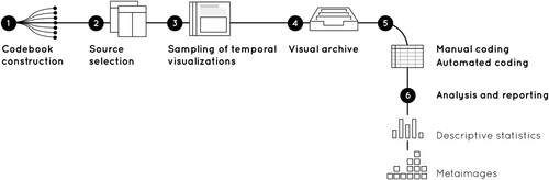
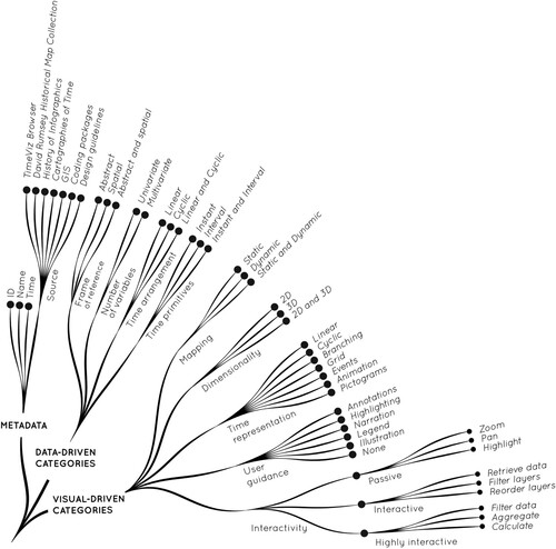
2.1. Codebook construction
The process starts from designing a codebook – a list of mutually exclusive and exhaustive design implementations, also referred to as codes. presents the structure of the codebook as a set of codes for three broad design categories: metadata, data-driven categories and visual-driven categories. To ensure that codes are analytically meaningful and grounded in the previous research, we re-use the code definitions proposed by Tominski et al. (Citation2017). We add several new codes emphasizing the visual components of the temporal visualizations. These new codes include, time representation (visual metaphor), user guidance and interaction design.
Figure 2. The structure of the codebook for temporal data visualizations consists of 48 single codes grouped into three broad design categories: metadata, data-driven categories and visual-driven categories.
2.2. Sampling procedure
The goal of the sampling is to create a relatively small, but well curated image set featuring time visualizations present in the scientific discourse. To this end, multiple sources are combined to capture a wide temporal range, i.e. include historical material from cartographic textbooks as well as their counterparts in state-of-the art cartography and visual analytics. Thererefore, seven sources of temporal visualizations are selected for detailed investigation: the previously mentioned TimeViz Browser (Tominski & Aigner, Citation2023), the David Rumsey Historical Map Collection, the book History of Information Graphics (Rendgen, 2019), the book Cartographies of Time (Rosenberg & Grafon, 2012), examples from the coding package matplotlibFootnote1, GIS softwares and digital design guidelines. The selected sources feature a variety of temporal visualizations:
The online David Rumsey Historical Map Collection is a searchable database of more than 150.000 maps and map-like visualizations. A subset of this collection focuses on gathering spatio-temporal visualizations.
In Cartographies of Time: A History of the Timeline (Citation2012), the historians CitationRosenberg & Grafton set out to critically analyze graphic representations of time along with ‘the formal and historical problems posed by [these representations]’ (Rosenberg & Grafton, Citation2012). With a strong focus on time and temporal data, the book gives a comprehensive overview over many centuries of graphics, relating them to each other and their specific context.
In her book History of Information Graphics (Citation2019), CitationRendgen portrays the rich history of infographics, focusing not on ‘presenting a succession of singular masterpieces [but on the fact] that the practice of information visualization was always a natural part of intellectual culture’ (Rendgen, Citation2019).
Matplotlib is a widely used Python-based library for creating static, animated, and interactive visualizations
The common Geographic Information Systems: QGIS, ArcGIS Pro, Kepler.GL, and Mapbox.
Digital design guidelines such as Google Material Design provide adaptable systems of visual components to be used in interface design. Time and date pickers defined there are widely used and penetrate modern life.
The search for representative visualizations is different for each source. The David Rumsey Historical Map Collection, Matplolib and Google Material Design feature temporal visualizations as static images on their websites. Therefore, it is possible to investigate the source code of these websites and use two Google Chrome extensions (Image Link Grabber and Tab Save) to save the visualizations directly in the *.jpg image format. If visualizations are interactive or generated on-the-fly, as in the case of GIS software, one of their interaction states is captured in a screenshot. The book-based examples are captured on photographs.
2.3. Manual and automated coding, analysis and reporting
The two coders are researchers in information visualization. Manual coding starts with a careful and detailed pass on the visualization image. Then the presence of certain codes is marked in the spreadsheet. To ensure the consistency of the multiple-author coding, the first 20% of the visualizations are coded together. Any potential ambiguities are marked and then resolved in the follow-up clarification meeting. The whole dataset is coded two times within a 2 months interval.
After manual coding the resulting spreadsheet and image archive are loaded into a set of interconnected Jupyter notebooks (Crockett, Citation2021). Due to their capacity to integrate multiple programing languages, notebooks facilitate visual data exploration and generate high quality vector figures for each exploration step.
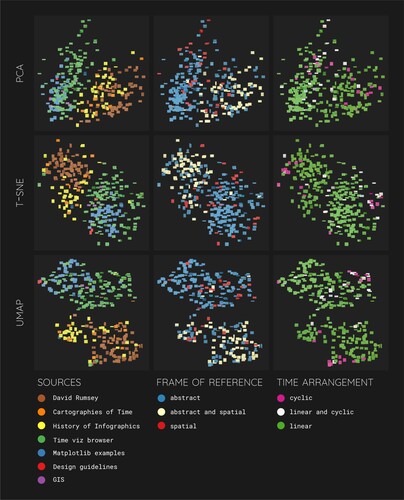
In the next step, the manually assigned codes are extended with automatically computed similarity scores. This is done using IVPY's high-dimensional neural net vector, which is the output of the penultimate layer of ResNet50 (He et al., Citation2015). We then apply a k-means clustering algorithm to the image-vectors which we test with multiple numbers of clusters. Eventually, we find that with sixteen clusters, we end up with a good mix of bigger clusters and some outliers. We proceed to analyze and organize the clusters. To compare this manual organization of clusters to machine-generated compact overviews, we apply three different algorithms (PCA, t-SNE and umap) to the high-dimensional image-vectors created by the neural network. We end up with three two-dimensional classifications of each individual visualization. Machine learning techniques themselves cannot capture the semantics of visual representations. Therefore we overlay the individual samples with different colors depending on their semantic classification captured in the codebook. This way, we can analyze in how far their semantic and their visual characteristics align.
Eventually, the design space of visualizations is explored by creating descriptive statistics and metaimages – digital collages that provide a preview of all images in the image collection (Manovich, Citation2020). The size of the images is kept small to allow for their location in the dataset to act as an entry point for generating research hypotheses. Where applicable, metaimages are annotated with key findings on visual characteristics of the samples.
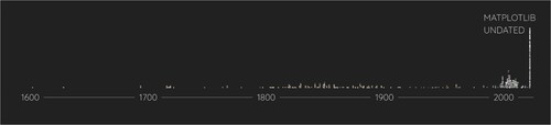
Figure 3. A histogram of all coded and analyzed visualizations. Visualizations sourced from matplotlib coding examples are not dated and were therefore assigned 2020 as their year, resulting in the peak on the right end of the plot. Most of the historical examples gather in the nineteenth century, while most modern examples are from the past 25 years. The graphic features 302 samples as indicated in section 3.1. Metadata of this paper.
3. Results
3.1. Metadata
The final collection includes 302 samples from three types of temporal visualization:
116 samples from the online repository of temporal visualization techniques TimeViz Browser (Tominski & Aigner, Citation2023)
131 samples from historical depictions recognized as cartographic heritage
79 samples stemming from the David Rumsey Map Collection (https://www.davidrumsey.com/)
40 samples from the book History of Information Graphics by CitationRendgen
12 samples from the book Cartographies of Time by CitationRosenberg & Grafton
55 samples from interactive tools and libraries implemented for wide practical re-use
48 samples from the matplotlib example gallery (https://matplotlib.org/stable/gallery/index)
5 samples from GIS software
2 samples from digital design blocks
presents a histogram of all coded and analyzed visualizations. Visualizations sourced from Matplotlib library are not dated and are therefore assigned 2020 as their year, resulting in the peak on the right end of the plot. Most of the historical examples gather in the nineteenth century, while most modern examples are from the past 25 years.
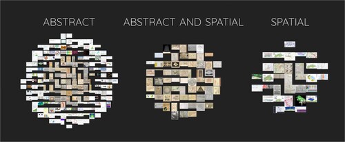
Figure 4. Histograms of the analyzed visualizations, grouped by their assigned frame of reference. Older examples are in the middle of each group and newer examples further out. Two thirds of the examples show purely abstract data, a fifth shows both abstract and spatial data and a tenth is portraying purely spatial data. The graphic features 302 samples as indicated in section 3.1. Metadata of this paper.
3.2. Descriptive statistics
Frame of reference (cf. ): 67% of the samples provided only the abstract reference, while 11% only the spatial one. Combination of both references was present in 22% of cases (66 graphics).
Variable representation: in most cases (61%) temporal variable was combined with other variable(s). The univariate depictions were less of use (39%).
Time arrangement: the dominant type was the linear placement (258 visualizations – 85%), the least popular was the cyclic one (19 visualizations). Both types of arrangement (linear + cyclical) were present in 25 cases. Cyclic depictions were in sparse use until 2010s, with the following 10 years marked by further decline of this pattern. Its re-emergence was brought through the release of Google Material Design patterns for representing time in digital designs.
Time primitives: 61% of the visualizations used instant primitives, 13% time intervals, and 26% provided both temporal markers.
Mapping: 91% temporal depictions were static, with only 8% being dynamic. Both views were offered in 1% of cases (4 samples).
Dimensionality: two-dimensional depictions made up most of the sample (87%), followed by much rarer three-dimensional visualizations (9%). Both views co-occurred 12 times (4%).
Visual representation: when looking at the visual metaphor of time flow, the most popular depiction is the static straight line (107 samples) or branching line (23 samples). 37 samples visualized time as a grid. In 19 samples time was shown as a circle, rarely the timeline was replaced by animated transitions (9 cases) or sets of of pictograms (5 cases). The visual guidance through time is provided by longer textual narrations on ‘how to’ navigate the timeline (41 cases), or shorter textual annotations (38 cases) or graphical-textual legends (18 cases).
Level of interactivity: For 87 cases we were not able to assign any interactivity label. Where assessment was feasible, most of the representations were passive (178 cases), with 31 interactive and 6 highly interactive samples.
Instant time primitive was equally useful for both univariate (90 samples) and multivariate visualizations (94 samples). Yet, multivariate visualizations more often mixed both intervals and instant time points (63 samples vs. 15 samples).
3.3. Visual description and analysis of clustered visualizations
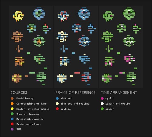
The resulting sixteen clusters of visualizations show a general division between historical examples and modern ones, which becomes apparent, when plotting the clusters with a color overlay that encodes the image source, see the left part of . This is presumably a result of the fact that the neural net similarity algorithm, in combination with the clustering algorithm, is sensitive to paper color and the older examples tend to have acquired a more yellow background color. We have thus organized the sixteen clusters according to their prevalent age group – clusters with older graphics on the left and clusters with more recent graphics on the right, see . On the vertical axis, we organized the clusters according to their visual characteristics: we observed that the clusters can be arranged along a spectrum ranging from precise plots and stricter structures, such as line plots, grids and tables, across rounder shapes (circles and spirals) to more organic shapes and illustrations, such as trees, rivers and branches. Most of these different visual types can be found in both, clusters featuring mostly historical samples as well as within in those featuring predominantly modern examples. When coloring the samples according to their assigned type of time arrangement (cyclic, linear or both, see right part of ), we observe that most samples with a cyclic time arrangement can be found in the clusters featuring circles and spirals.
Figure 5. Sixteen clusters obtained by applying k-means clustering to 2048-dimensional image-vectors resulting from a neural net similarity measure. Organized from strict structures (top) to organic shapes (bottom) and from dominantly historical examples (left) to dominantly modern ones (right). The graphic features 302 samples as indicated in section 3.1. Metadata of this paper.
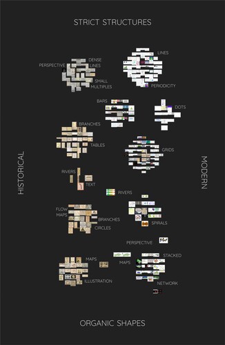
Figure 6. The same sixteen clusters as in but overlaid in three different color schemes, encoding the image source (left), the assigned frame of reference (middle), and the time arrangement (right). The graphic features 302 samples as indicated in section 3.1. Metadata of this paper. Colour schemes based on ColorBrewer2 (Brewer, Citation2022).
, and show the annotated outcomes of the visual dimensionality reduction, with color overlays in . Again, a tendency to big overall clusters of historical and modern examples can be seen. However, there is quite some overlap between different image sources, specifically for the PCA result (see top-left part of ). Zooming in on sub-clusters and the individual visualizations, we can detect similar accumulations of structures as in the manually organized k-means clusters. In (the annotated result of the PCA algorithm), examples featuring 3D-plots, perspective views and stacked plots all show up towards the top of the plot, which also exposes the famous ‘Temple of Time’ (Willard, Citation1846) on the top right. In (the annotated result of the t-SNE algorithm), the diagonal from the top-left to the bottom-right seems to be representing the historical span of examples. Towards the bottom of the top-left quad- rant, there seems to be an accumulation of visualizations that were photographed from a book and one of the three instances of the ‘Temple of Time’ visualization is located quite far from the other two. This indicates that less relevant, features are being taken up by this algorithm. Nevertheless, many sub-clusters can be determined. In (the annotated result of the UMAP algorithm), historical examples gather towards the bottom-right while modern ones tend to locate towards the top. Again, an accumulation of photographed open book pages can be observed at the top of the big historical cluster, separating one instance of the ‘Temple of Time’-example from the other two located further to the bottom-right. In general, however, rather clear sub-clusters can be made out.
Figure 7. The annotated result of the principal component analysis (PCA) of the high-dimensional neural net similarity image-vectors. Historical examples gather towards the right of the plot while modern ones are located towards the left. Examples featuring 3D-plots, perspective views and stacked plots all show up towards the top of the plot, which also exposes the famous ‘Temple of Time’ (Willard, Citation1846) on the top right. The graphic features 302 samples as indicated in section 3.1. Metadata of this paper.
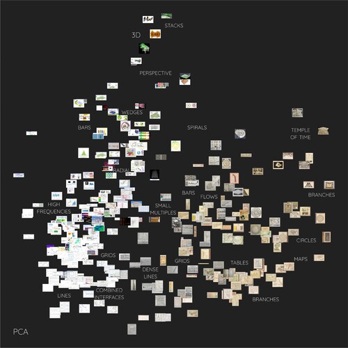
Figure 8. The annotated result of the t-distributed Stochastic Neighbor Embedding algorithm (t-SNE) of the high-dimensional neural net similarity image-vectors. The diagonal from the top-right to the bottom-left seems to be representing the historical span of examples. Towards the bottom of the top-right quadrant, there seems to be an accumulation of visualizations that were photographed from a book and one of the three instances of the ‘Temple of Time’ visualization is located quite far from the other two (the top of the historic cluster as opposed to the bottom of the cluster). This indicates that less relevant, features are being taken up by this algorithm. Nevertheless, many sub-clusters can be determined. The graphic features 302 samples as indicated in section 3.1. Metadata of this paper.
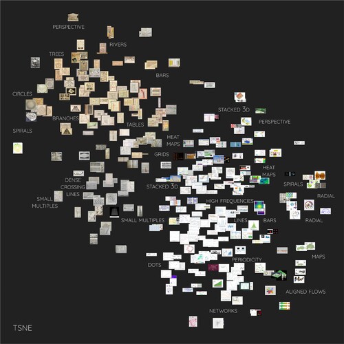
Figure 9. The annotated result of the Uniform Manifold Approximation and Projection algorithm (UMAP) of the high-dimensional neural net similarity image-vectors. Here, historical examples gather towards the bottom-right while modern ones tend to locate towards the top. Again, an accumulation of photographed open book pages can be observed at the top of the big historical cluster, separating one instance of the ‘Temple of Time’-example from the other two located further to the bottom-right. In general, however, rather clear sub-clusters can be made out. The graphic features 302 samples as indicated in section 3.1. Metadata of this paper.
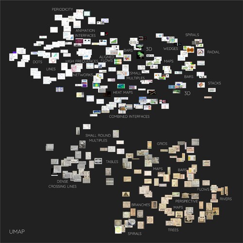
Figure 10. The result of three different dimensionality reduction algorithms applied to the high-dimensional neural net similarity image-vectors: Principal component analysis (PCA, top), t-distributed Stochastic Neighbor Embedding algorithm (t-SNE, middle), and Uniform Manifold Approximation and Projection algorithm (UMAP, bottom). After the automatic analysis, the images were overlaid in three different color schemes, encoding the image source (left), the assigned frame of reference (middle), and the time arrangement (right). The graphic features 302 samples as indicated in section 3.1. Metadata of this paper. Colour schemes based on ColorBrewer2 (Brewer, Citation2022).
4. Discussion and conclusion
What can we learn about temporal visualizations by this approach? On one hand, in line with the quantitative findings by Rodrigues (Citation2020), we observed an underrepresentation of the cyclic time arrangement (6% of our collection). On the other hand, we observed that time arrangement should not be considered as either cyclic or linear. In our collection we found that the combined cyclic and linear views are used slightly more often than exclusively cyclic depictions (8%). User experiences of the existing temporal visualizations are underreported. There were only 6 highly interactive samples in our collection that enabled data filtering, aggregation and calculations. We did not discover any new types of functionalities, such as collaboration or gamification (Rodrigues, Citation2020). With 80% of our samples serving presentation purpose and 83% being static, there is a further need to extend design solutions for visualizing highly dynamic data streams.
The visual analysis of our samples resulted in a concise and direct overview of the analyzed data. There are many different types of visual structures present in both historical as well as modern examples. The different structures tend to cluster together, both when applying a k-means algorithm as well as when using a neural network analysis combined with various dimensionality reduction algorithms. This co-occurrence of clusters within both historical as well as modern samples might point to a very limited evolution when it comes to visualizing temporal data. What can be seen, however, is the underlying evolution in how we capture and manipulate temporal data. Historical examples within our collection tend to show much coarser time steps and intervals and often feature illustrative aspects. More modern samples in our collection often feature a much more detailed temporal axis and higher overall precision. A turning point concerning this evolution can be seen in early train time tables. Contrary to previous visualizations, these feature very densely drawn straight lines at specific angles which represent the trains' locations and speeds at different points in time.
In our cross-analysis of manual coding with automated image analysis, some correspondence between the two can be seen. This is especially true for the visualization of cyclic vs linear time arrangements. Data with a cyclic time arrangement appears to be more likely to feature circles or spirals on a visual level. However, what remains to dominate the image analysis is the background color and potentially the general visualization style. This is of course connected to the specifics of the present collection. We aimed to select a combination of sources that capture a wide temporal range, i.e. included historical material, but also feature the state-of-the art within cartography and visual analytics. This lead to a rather broad and diverse collection which helps obtaining a good overview and connecting modern visualization styles to their historical counterparts. Naturally however, the diversity within the image collection to some extent hinders (automated) analysis from accessing a deeper structural level of visualization which might show even greater correspondence to the semantic (manually coded) content of the visualization. To make this possible, one way to go in future work would be to carry out substantial pre-processing on the images, including manipulations concerning color, contrast and brightness. Another path will be to focus on a specific source or type of source with a greater continuity across time, e.g. journalistic visualizations. While the overall overview would be reduced, we would expect clearer clustering within this group of images which could help to determine the level of intentionality with which different temporal data types are visualized. In a further step, comparing different subsets, e.g. culturally different sources, historical and modern sources or scientific and journalistic examples, will help determine whether there are different distributions across different clusters. Finally, extending the sample size, e.g. by consulting the VISImageNavigator (Chen et al., Citation2021) and collections of journalistic visualizations, will give a more comprehensive overview of used and distributed visualizations.
Disclosure statement
No potential conflict of interest was reported by the author(s).
Additional information
Notes on contributors
Verena Klasen
Verena Klasen is a Research Assistant in Applied Geoinformatics at the University of Augsburg, Germany. Her research interests include Visual Analytics and the interplay between temporal visualization and cognition.
Edyta P. Bogucka
Edyta P. Bogucka is a Postdoctoral Researcher in Cartography and Visual Analytics at the Technical University of Munich, Germany. Her research interests include Map-based Storytelling, Data Visualization and Cultural Analytics.
Liqiu Meng
Prof. Dr. Liqiu Meng is a Professor for Cartography and Visual Analytics at the Technical University of Munich, Germany. Her current research interests include HD mapping, routing algorithms, ethics in mapping, and visual analysis of knowledge graphs.
Jukka M. Krisp
Prof. Dr. Jukka M. Krisp is a Professor of Applied Geoinformatics at the University of Augsburg, Germany. His current research interests include in particular Geovisualization, Geographic Information & Location Based Services (LBS).
Notes
1 Examples—Matplotlib 3.6.2 documentation. https://matplotlib.org/stable/gallery/index.html.
References
- Aigner, W., Miksch, S., Schumann, H., & Tominski, C. (2011). Interaction support. In Visualization of time-oriented data (pp. 105–126). Springer London. https://doi.org/10.1007/978-0-85729-079-3_5
- Andrienko, G., Andrienko, N., Bak, P., Keim, D., & Wrobel, S. (2013). Visual analytics focusing on spatial events. In Visual analytics of movement (pp. 209–251). Springer Berlin Heidelberg. https://doi.org/10.1007/978-3-642-37583-5_6
- Andrienko, G., Andrienko, N., Demsar, U., Dransch, D., Dykes, J., Fabrikant, S. I., Jern, M., Kraak, M.-J., Schumann, H., & Tominski, C. (2010). Space, time and visual analytics. International Journal of Geographical Information Science, 24(10), 1577–1600. https://doi.org/10.1080/13658816.2010.508043
- Andrienko, G., Andrienko, N., Dykes, J., Kraak, M. J., Robinson, A. C., & Schumann, H. (2016). Geovisual analytics: Interactivity, dynamics, and scale. Cartography and Geographic Information Science, 43(1), 1–2. https://doi.org/10.1080/15230406.2016.1095006
- Andrienko, N., & Andrienko, G. (2006). Exploratory analysis of spatial and temporal data: A systematic approach. Springer.
- Andrienko, N., Andrienko, G., & Gatalsky, P. (2003). Exploratory spatio-temporal visualization: An analytical review. Journal of Visual Languages & Computing, 14(6), 503–541. Visual data mining. https://doi.org/10.1016/S1045-926X(03)00046-6
- Bach, B., Dragicevic, P., Archambault, D., Hurter, C., & Carpendale, S. (2016, April). A descriptive framework for temporal data visualizations based on generalized space-time cubes. Computer Graphics Forum, 36(6), 36–61. https://doi.org/10.1111/cgf.12804
- Brewer, Cynthia A., 2022. Retrieved October 21, 2022, from https://colorbrewer2.org
- Chen, J., Ling, M., Li, R., Isenberg, P., Isenberg, T., Sedlmair, M., Moller, T., Laramee, R. S., Shen, H.-W., Wunsche, K., & Wang, Q. (2021, September). VIS30K: A collection of figures and tables from IEEE visualization conference publications. IEEE Transactions on Visualization and Computer Graphics, 27(9), 3826–3833. https://doi.org/10.1109/TVCG.2021.3054916
- Cleveland, W. S. (1993). Visualizing data. Hobart Press.
- Crockett, D. (2021, March). IVPY: Iconographic visualization inside computational notebooks. International Journal for Digital Art History, 4(4), 360–379. https://doi.org/10.11588/dah.2019.4.66401
- DataViz Project (2022). Trend over time. Retrieved August 11, 2022, from https://datavizproject.com/function/trend-over-time/
- David Rumsey Map Collection. David Rumsey Map Center. Stanford Libraries. Retrieved August 12, 2022, https://www.davidrumsey.com
- Dodge, S., & Noi, E. (2021). Mapping trajectories and flows: Facilitating a human-centered approach to movement data analytics. Cartography and Geographic Information Science, 48(4), 353–375. https://doi.org/10.1080/15230406.2021.1913763
- He, K., Zhang, X., Ren, S., & Sun, J. (2015, December). Deep residual learning for image recognition. arXiv:1512.03385 [cs]. Retrieved August 11, 2022, fromhttps://doi.org/10.48550/arXiv.1512.03385
- Kay, P., & Kempton, W. (1984). What is the Sapir-Whorf hypothesis? American Anthropologist, 86(1), 65–79. https://doi.org/10.1525/aa.1984.86.1.02a00050
- Kirk, A. (2012). Data visualization: A successful design process. Packt publishing LTD.
- Manovich, L. (2020). Cultural analytics. The MIT Press. https://doi.org/10.7551/mitpress/11214.001.0001
- Peuquet, D. J. (1994). It's about time: A conceptual framework for the representation of temporal dynamics in geographic information systems. Annals of the Association of American Geographers, 84(3), 441–461. https://doi.org/10.1111/j.1467-8306.1994.tb01869.x
- Phillips, J. (2012). Storytelling in earth sciences: The eight basic plots. Earth-Science Reviews, 115(3), 153–162. https://doi.org/10.1016/j.earscirev.2012.09.005
- Rendgen, S. (2019). History of information graphics. Taschen.
- Rodrigues, S. (2020). Unexplored and familiar: Experiencing interactive spatio-temporal visualization. In 2020 15th Iberian conference on information systems and technologies (CISTI) (pp. 1–6). Institute of Electrical and Electronics Engineers. https://doi.org/10.23919/CISTI49556.2020.9140811
- Rodrigues, S., & Figueiras, A. (2020). There and then: Interacting with spatio-temporal visualization. In 2020 24th International conference information visualisation (IV) (pp. 146–152). Institute of Electrical and Electronics Engineers. https://doi.org/10.1109/IV51561.2020.00033
- Rosenberg, D., & Grafton, A. (2012). Cartographies of time: A history of the timeline. Abrams & Chronicle Books.
- Tominski, C., & Aigner, W. (2023). The TimeViz Browser – A Visual Survey of Visualization Techniques for Time-Oriented Data, Version 2.0. https://browser.timeviz.net
- Tominski, C., Aigner, W., Miksch, S., & Schumann, H. (2017, January). Images of time. In A. Black, P. Luna, O. Lund, & S. Walker (Eds.), Information design: Research and practice (pp. 23–42). Routledge.
- Willard, E. (1846). The temple of time. A.S. Barnes & Co. Place.
- Wills, G. (2012). Time as a coordinate. In Visualizing time: Designing graphical representations for statistical data (pp. 105–121). Springer New York. https://doi.org/10.1007/978-0-387-77907-2_5