
 ?Mathematical formulae have been encoded as MathML and are displayed in this HTML version using MathJax in order to improve their display. Uncheck the box to turn MathJax off. This feature requires Javascript. Click on a formula to zoom.
ABSTRACT
This paper compiles guidelines for minimum dimensions of cartographic symbology from the literature on map design for printed and digital maps. Such minimum dimensions are relevant not only for the design of cartographic symbology, but also as fundamental parameters affecting the visual hierarchy of the overall map and the cartographic generalization of its elements. However, this review shows that only few studies have actually verified minimum dimensions in controlled empirical experiments, and most authors seem to have based their recommendations on anecdotal evidence or theoretical considerations only. Conclusions for a future research agenda in cartography, ranging from ethical questions to calls for empirical research on minimum dimensions, are drawn from the presented findings.
ABSTRAITE
Cet article compile les recommandations des tailles minimales des symboles cartographiques à partir de la littérature sur la conception de cartes imprimées et digitales. Ces dimensions minimales sont pertinentes non seulement pour la conception des symbolisations cartographiques mais aussi comme paramètres fondamentaux qui impactent la hiérarchie visuelle de la carte dans son ensemble et la généralisation cartographique de ces éléments. Pourtant, cette analyse montre qu'il n'y a que peu d'études qui ont vérifié les dimensions minimales par des études empiriques contrôlées et que la plupart des auteurs ont l'air d'avoir basé leurs recommandations uniquement sur des preuves anecdotiques ou sur des considérations théoriques. Des conclusions pour un future agenda de recherche en cartographie sont tirés de ces résultats, allant des questions éthiques à l'appel pour des recherches empiriques sur les dimensions minimales.
Introduction and Motivation
Cartography differs from other types of information visualization in that it is concerned with an information space of potentially infinite density – the real world. Before the widespread adoption of digital maps, the content of a map had to be fixed far in advance of its actual use, and packing as much information as possible into the available space was a major consideration for providing a more versatile cartographic product. In the age of digital maps, some of the pressure to clutter maps with many layers of information has been relieved by the availability of interactive means for selecting, filtering and reexpressing information dynamically (Roth, Citation2012). However, increased map use on mobile devices, more detailed and higher-resolution data, complex application scenarios, and the availability of high-resolution display technology call for a re-evaluation of map design advice that mandates digital maps to use coarser and simpler symbology, and a reconsideration of more densely layered information in digital cartographic applications. The increased need to tell complex stories, contextualize information, and reach audiences with short attention spans in the age of ‘viral cartography’ (Robinson, Citation2019) should spark renewed interest in map use scenarios located in the ‘presentation’ region of MacEachren’s map use cube (MacEachren, Citation1994), characterized by low interaction and known (but nevertheless potentially complex) information. Increasing the information density of cartographic products may be one possibility to get more contextual information across to an audience that does not necessarily reliably interact with a map to explore all its details and nuances. Also, in recent years sophisticated techniques for algorithmic map design, such as texture synthesis (Christophe et al., Citation2016) or rock depiction (Geisthövel & Hurni, Citation2018), have been developed that take inspiration from the techniques applied in printed and handcrafted maps. Novel applications in multimodal or bicycle transport have users require more detailed information about their environment than conventional monomodal navigation systems (Wessel & Widener, Citation2015). More detailed geometric and attribute data about urban environments become available and need to be communicated to the user (Carlino, Citation2021; Hormann, Citation2021; Seidel, Citation2021). With the availability of new data and rendering techniques to produce maps of arbitrary complexity, and hardware displays of sufficient resolution to accurately reproduce highly detailed designs, we once again face the question: how densely can we pack information on a map?
This paper attempts to compile theoretical knowledge and practical recommendations related to the question of minimum dimensions of cartographic symbology from the body of cartographic literature. Sections 2, 3 and 5 will discuss theoretical foundations related to the topic – definitions and rationale, perceptual foundations, and contemporary display technology. Section 4 compiles recommendations found in the cartographic literature for the design of maps printed on paper. Some authors have hypothesized that the recommendations for paper-based maps would apply directly to the design of maps for presentation on digital media, once display resolutions have surpassed a resolution of 300 pixels per inch (Neudeck, Citation2001), which could make these guidelines relevant today, even for purely digital cartographic output. Section 6 compiles recommendations that have been given for the design of cartographic symbology for computer screens. Section 7 attempts to draw conclusions from the reviewed contributions and proposes initial items for a research agenda that could help to clarify the remaining open questions.
Relevance and definition of minimum dimensions
A guideline for a minimum dimension is hardly ever to be read as a direct recommendation to actually use symbology reduced to such limit for the representation of important information on a map. So why are such recommendations even relevant? Four aspects of map design can be identified that are related to the question of the smallest possible details of the overall symbology:
The smallest details and finest lines will establish the lowest levels of a map’s visual hierarchy. Dent demands ‘two levels of organizational order’ as the minimum for a simple thematic map, demanding that ‘objects should become less intense and their edges more fuzzy’ on lower levels (Dent, Citation1972, p. 84). The number of levels can be expanded to five in a typical thematic map, with the thematic symbols at the highest level and the map frame, supplemental information and grid lines at the lowest (Dent et al., Citation2008; Muehlenhaus, Citation2014). The line widths and symbol sizes used at the lowest levels (approaching the minimum sizes) will influence the symbology dimensions at higher levels of importance, even if for those levels the cartographer will want to employ symbology sizes well above the theoretical minimum.
The minimum size of what can be rendered by the medium and read by the map user is a fundamental parameter for map generalization and other algorithmic symbolization techniques. If the resolution of the medium would be infinite, and the map reader could reliably discern infinitely small graphical details, generalization would not be necessary. Töpfer therefore bases his theoretical considerations of map generalization on the very practical aspects of map medium and reader, stating that ‘the limits of scaled-down depiction are not only depending on map scale and size of an object’s footprint, but also on the means of visualization dedicated to the task’Footnote1 (Töpfer, Citation1974, p. 20, emphasis mine). Digital cartographic generalization has been mainly conceptualized as an algorithmic problem, with graphical clarity listed as but one of its main objectives (McMaster & Shea, Citation1992). Minimum dimensions are one way of formalizing minimum requirements for graphical clarity, upon which digital generalization algorithms can be based on.
Symbols of minimal size and/or intensity can indeed be directly used on a map, but only to depict non-essential information of low importance. In the introduction it has already been argued that today there is an abundance of map use scenarios requiring more layers of information, such as multimodal urban transport or mountaineering. When additional layers are added to a map for contextual or auxiliary information, map designers may refer to minimum dimensions as a starting point for designing those parts with the best chance of not conflicting with more important layers of the already established visual hierarchy.
The possibilities provided by current technologies of querying the user’s context and users influencing the map presentation through interaction will allow a map design to be adapted to the individual user’s special needs, e.g. by using larger symbology or a different representation for users with low visual acuity or visual impairments. Therefore, even if only a certain percentage of all users can be expected to be able to reliably read map symbology at a particular size, the remaining user group is not excluded from accessing the information, but may be able to express their preferences and needs in order to adapt the map display.
So far, the term ‘minimum dimensions’ has been used without a clear definition. The cartographic literature unfortunately does not readily provide such a definition, and some questions remain open or allow differing positions. Clearly, the possibilities of the map medium and the capabilities of the map user must be taken into account. While the properties of the map medium can be characterized by technical specifications, humans vary greatly in their perceptual and cognitive abilities, in their experience, motivation and training, and maps are used in many contexts, from the expert’s well-lit office to the battlefield at night. In the face of such variations of map users, context and tasks, is it justified to propose a single set of ‘minimum dimensions’?
A point can be made in favor of providing clear guidance on cartographic symbology, even if the fully correct answer would require analysis of target demographics, intended map use scenario, and overall map design for each cartographic project. If guidelines for viewing maps under good conditions, by ‘normal’ map users and simple tasks are provided, and such guidelines can be accompanied by models on how symbology needs to be adjusted if context, user or task deviates from these criteria, using the designation of ‘minimum’ can be justified even for a constant value (as it may be adjusted upwards, but not further downwards in any reasonable map usage scenario). This idea of a dynamic model for minimum dimensions for variations of map use context will be picked up again in the conclusions.
Spatial resolution and visual acuity
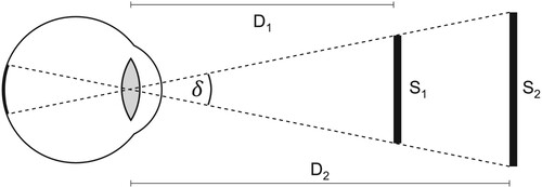
The perceived size of an object depends on its real-world size and its distance from the viewer (see ). This apparent size of an object is measured in angular units (degrees and fractions of a degree) and can be calculated using the equation
in which S is the size of the object and D is the distance from the focal point to the object. Because of this relationship between real-world size and distance (a larger object farther away may have the same apparent size than a smaller object closer to the viewer), in optics and psychophysics dimensions are often specified in angular units instead of real-world units, removing the need to specify a size/distance pair for a given stimulus size. Conversely, when specifying real-world dimensions (as is usually expected for cartographic symbol sizes), an expected viewing distance must be specified or assumed in order to establish the apparent size of the object.
Figure 1. The apparent size of objects, expressed as angle δ, defines the size of their retinal image and depends on their real-world size (S₁, S₂) and distance from the observer (D₁, D₂).
Traditionally, a viewing distance of 60 cm has been assumed for screens of desktop computers, and a distance of 30 cm for mobile phone screens and printed maps (Malić, Citation1998). Consequently, guidelines for printed maps can be applied unchanged for mobile maps (because of the equal assumed viewing distance), but would need to be doubled in size for presentation on a desktop monitor in order to result in identical apparent size.
In ophthalmology and psychophysics, the apparent size of a visual detail at the limit of what can be recognized by a human observer is referred to as the minimum angle of resolution (MAR) and usually specified in minutes of arc. Visual acuity is specified as the base-10 logarithm of the MAR of a subject, logMAR – with logMAR 0 corresponding to a MAR of 1 minute of arc. lists various real-world sizes at certain distances and their MAR and logMAR values.
Table 1. Various real-world sizes at 30 and 60 cm viewing distances, and their corresponding angular sizes, logMAR and ppi values. Numbers set in bold indicate anchoring values of special relevance, as explained in the comments column and referred to from various parts of the paper.
When the concept of a minimum angle of resolution was introduced by Robert Hooke in 1679, an estimate of one minute of arc was used for the limit of human capability to detect the separation of two points (Wu, Citation2019). This value has since then been commonly used as an easy-to-remember threshold, with consensus in the medical literature that acuity of young healthy subjects is usually significantly better than that (ibid.). The density of photoreceptors in the center of vision of the human eye, its optical properties, and sampling theoretical considerations all point to a limit of approximately ½ minute of arc as a simple model for the eye’s maximum optical resolution capability (Ware, Citation2020; Westheimer, Citation2009). Population studies agree that normal visual acuity of healthy subjects can be expected to remain higher than 0 logMAR from the age of 16 to over 65 (Frisén & Frisén, Citation1981; International Council of Ophthalmology, Citation1984; Ohlsson & Villarreal, Citation2005; Radner & Benesch, Citation2019).
However, eyes are not a neutral and uniform sampling device, as well-known examples of optical illusions illustrate (Bach, Citation2014). Perhaps more relevant, a class of stimuli exists for which the human visual system exceeds its theoretical limitations, known as hyperacuity phenomena. The most well-known and practically relevant example is Vernier acuity, in which a human observer can judge whether two line segments are collinear with an apparent threshold of about 10 seconds of arc, surpassing the theoretical limit that would be mandated by a simple sampling model based on the density of photoreceptors in the retina (Westheimer, Citation1981). Despite the insights into the workings of human perception achieved by medical and psychophysical studies, a comprehensive model of visual perception that could be operationalized to ‘calculate’ for a given complex, real-world stimulus (such as a cartographic symbol on a map) the probability, across the overall population, for correctly extracting information from it, remains presently elusive (Snowden et al., Citation2012).
Minimum Dimensions for printed maps
The specification of minimum dimensions for printed maps has long been a staple of cartography textbooks and reference material. Arthur Robinson’s ‘Elements of Cartography’ demands that the graphical elements of a map be ‘easy to read and understand’ as the ‘first rule’ of cartographic design, and specifies an apparent size of one minute of arc as a practical rule for an absolute minimum (Robinson et al., Citation1995, p. 324f). The text is clear that such minimum ‘assumes perfect vision and perfect conditions of viewing’ and recommends using a minimum size ‘somewhat higher’ at an apparent size of two minutes for point symbols (corresponding to ≈0.2 mm at a distance of 30 cm) for ‘average vision and average viewing conditions’. Lines can be used at a smaller width ‘since the length seems to enhance visibility’. Terry Slocum’s textbook on thematic cartography does not specify minimum dimensions for graphic symbology, but mentions that for text on maps, the intended audience, reproduction method and map viewing conditions must be taken into account (Slocum et al., Citation2009, p. 230). It is mentioned in passing that text ‘as small as 3.2 points […] is commonly used on congested street maps’. Judging from the literature available to an international audience, the American cartographic community does not seem to have broadly discussed more finely differentiated guidelines for minimum dimensions of cartographic symbology.
Such more differentiated specifications for minimum dimensions can be found in the European cartographic literature. It has already been mentioned above that Töpfer (Citation1974) based his theory of generalization in minimum dimensions, for which he mentions 0.2 mm for line separation as sufficient (p. 21) and 0.25 mm² for the area of a lake as ‘already problematic’ (p. 20), and mentions that there can be no absolute minimum dimensions, but only such corresponding to the intended viewing conditions and means of reproduction. Imhof’s textbook on thematic cartography recommends to use symbology as small as possible to not overload the map graphics and allow good localization, but also as large as possible to allow for good legibility of variations in form and color – with the cartographer needing to find a compromise on a case by case basis (Imhof, Citation1972, p. 67). A range of sizes is given as a recommendation for the minimum dimensions of point symbols, starting at 0.1 mm for points as part of a pattern (e.g. sand) to 1.5 mm for simple graphical icons (see for details).
Table 2. Minimum dimensions for cartographic point symbols, as specified by various authors. Only values for optimal contrast are listed. Values established in empirical studies are set in bold, values converted from other units for this paper are set in italics.
In their book on topographic maps, Arnberger and Kretschmer (Citation1975) specify a line width of 0.1 mm as the smallest that can be reliably reproduced in print, and a limit of 0.05 mm for the width of isolated lines to be legible. In accordance with such limits of what can be graphically represented on the cartographic medium and what can be reliably perceived and differentiated by human observers, they present a table of symbology sizes at various scales, including a cutoff line for sizes which are considered too small (p. 46f, see for details). Arnberger and Kretschmer also introduce the differentiation between discriminability and countability of symbols, a differentiation by intended map use task in addition to the consideration of viewing conditions. For icons and lines to be countable, they need to be of larger size and be separated by a minimum distance, which is specified as 0.25 mm for contour lines (p. 48).
Table 3. Minimum dimensions for cartographic line symbols, as specified by various authors. Only values for optimal contrast are listed.
Hake, Grünreich and Meng present a comprehensive, systematic table of minimum dimensions in their textbook on cartography (Hake et al., Citation2002, p. 110). In addition to values for optimal contrast, also a set of values for reduced contrast (for colored symbols or black symbols on colored ground) is specified. For point symbols, a minimum diameter of 0.25 mm is given for the maximum contrast scenario, with a diameter of 0.45 mm required for reduced contrast, and for lines, a width of 0.05 mm is demanded (0.08 mm at reduced contrast) (see for all values).
Spiess gives detailed examples for the minimum dimensions of geometrical symbols and generalized building footprints in the figures of his publication on generalization of built-up areas (Spiess, Citation1990).
Figure 2. Graphical representation of current symbology guidelines for printed maps, extracted from Hake et al. (Citation2002) and Schweizerische Gesellschaft für Kartographie (Citation2002).
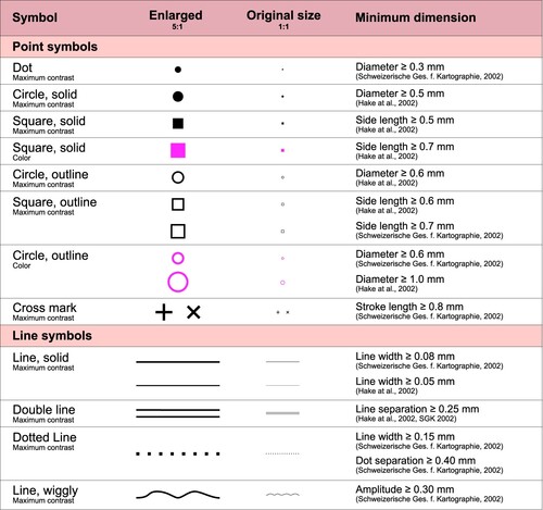
The most differentiated specification for minimum dimensions for printed maps known to this author was released by the Swiss Cartographic Society in their materials on map graphics and generalization for topographic maps (Schweizerische Gesellschaft für Kartografie, Citation2002). Based on theoretical assumption of a resolution of the human visual system of 0.2 mm at a distance of 30 cm, the authors derive detailed dimensions and graphical examples for various geometrical forms and cartographic symbols at maximum contrast. While earlier versions of the map design guidelines specified smaller dimensions for some symbols, while at the same time advising that symbology should not be used at the limit of human perception to allow for rapid map reading under non-optimal circumstances (Schweizerische Gesellschaft für Kartografie, Citation1980), the newer version increased the minima slightly and recommends further adaption, not specified in detail, only for colored symbols, grey paper or high information density on the map. For text labels, the 1980 version of the guide recommended a minimum letter height of 1.2 mm, while the newer edition does not specify any numerical size. The recommended minimum dimensions for cartographic symbology on printed maps extracted from the literature mentioned so far can be found in .
Figure 3. Applying minimum dimensions in the generalization of building footprints (Spiess, Citation1990).
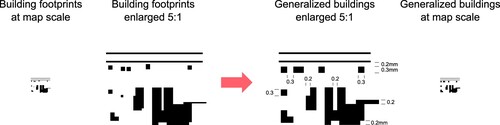
Table 4. Minimum dimensions for areas on maps, as specified by various authors. Only values for optimal contrast are listed.
Table 5. Minimum dimensions for text labels on maps, as specified by various authors.
Empirical verification of minimum dimensions for printed maps
Although minimum dimensions have been specified in many cartography textbooks, it remains somewhat unclear on which basis the various authors derived such guidelines. None of the books listed in the previous section refers to any empirical study or describes any kind of experimental validation of the stated dimensions. In some cases, a typical viewing distance of 30 cm is specified for printed maps (Chlupac, Citation1982; Schweizerische Gesellschaft für Kartografie, Citation1980, Citation2002). The absence of any other hints on experimental validation of the specified dimensions suggests the conclusion that the guidelines may have been derived from subjective impressions by the authors themselves or informal tests in a small group of professionals.
It is important, however, to note that the minimum dimensions for printed maps were not solely based on the perceptual abilities of human map readers, but also on the affordances and constraints of the medium. During the printing process, ink is transferred to the paper where it is absorbed and, to a certain extent, distributed over a short distance by capillary motion. Thus, when two areas of high ink saturation are separated only by a narrow gap, there is a risk of the ink flowing across the gap and merging the areas into one, or for lines crossing at an acute angle to form a blot of ink at the intersection. Such media-dependent effects have been discussed by some authors as motivation for minimum values for gap widths and line separation (Hake et al., Citation2002, pp. 110–111; Schweizerische Gesellschaft für Kartografie, Citation1980, p. 15, 30), and it can be assumed that some of the minimum dimensions were based not only on the authors’ subjective perceptual judgement, but also on printing tests to establish the limits of the medium. However, procedures for conducting such tests are not described in any of the literature reviewed for this paper.
Only a single attempt to verify the limits of cartographic symbology for printed maps in a systematic empirical study could be found during this review in the unpublished PhD dissertation by Chlupac (Citation1982). In his lab experiments, Chlupac presented solid black geometric shapes (circle, square, triangle pointing upwards/downwards, rectangle in vertical/horizontal orientation, pentagon) of various sizes to participants at a ‘typical reading distance’ of 30 cm and asked them to specify the type of shape and their confidence of their answer. The results show that squares were correctly identified with a probability of >95% with a side length above 0.48 mm, circles with a diameter above 0.83 mm, triangles with a side length of 0.50 mm and rectangles with a short sideFootnote2 of at least 0.21 mm. When demanding 98% accuracy, these dimensions increase to 0.58 mm for the square and remain identical for triangle and rectangle, while the circle was not distinguished from the pentagon at such level of reliability even at the largest size of 0.92 mm. Chlupac admits that the chosen shapes do not differ from each other by an equal amount (e.g. circle and pentagon are most frequently confused), and thus the results are skewed and would turn out different when testing a different set of shapes. The subjective confidence of participants largely corresponded with their accomplished success rates at a given size.
Foundations for screen-based symbology: display technology
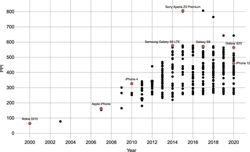
In the past 20 years, multiple revolutions have taken place in how information is presented to users of computer systems. Flat screen panels have largely replaced bulky CRT monitors in a timespan of only a few years (Kalmykova et al., Citation2015). The smartphone as we know it today has been popularized with the release of the iPhone in 2007, and pixel densities of mobile phone screens have since then dramatically increased from 163 pixels per inch (ppi) of the original iPhone to over 800ppi of the Sony Xperia Z5 Premium, released in 2015. More recently, high and ultra-high resolutions have become available for desktop and laptop monitors as well, and technological development continues for novel viewing devices such as e-ink readers and virtual- and augmented-reality headsets.
Today, OLED screens can be manufactured with practically arbitrary pixel density, and densities of over 5000 ppi have been demonstrated to be technologically feasible (Katsui et al., Citation2019). New manufacturing technologies also allow for novel subpixel geometries instead of a strictly rectangular arrangement of red, green and blue subpixels, potentially adding multiple green or white subpixels per physical pixel to increase perceived resolution (Credelle & Brown Elliott, Citation2005). Pixel density and arrangement for phone and desktop application scenarios is therefore not limited by technological factors any more, but by economic factors of manufacturing and marketing. Indeed, pixel densities of smartphones seem to have peaked around the 800 ppi mark in 2015–2017, and have since then retracted to an upper limit of around 580 ppi for top-of-the-line smartphone screens. A resolution of about 250 ppi marks the lower end of resolutions of commercially available smartphones consistently since the year 2015 (see ).
Figure 4. Development of pixel densities of mobile phone screens over the last 20 years. Pixel density of commercially available devices has peaked at about 800 pixels per inch (PPI). Sources: pixensity.com, wikipedia.org.
Desktop monitors have also seen an increase in maximum pixel densities in the past years. However, high resolutions are not yet as commonly deployed in desktop scenarios, and resolutions around 90–100 ppi are still common, making the landscape of pixel densities more heterogeneous for desktop viewing scenarios.
In the past era of relatively homogenous pixel densities, the pixel has been used as a convenient unit of measurement for specifying the dimensions of user interface elements, and has been assumed to have a consistent size of about 0.3 mm for desktop monitors (Brunner, Citation2000). With the real-world size of pixels now diverging by an order of magnitude between conventional desktop screens and the highest resolution smartphones, such an approach anchored with the physical pixel has stopped being feasible. Indeed, with the introduction of the iPhone 4 with its ‘retina’ display as the first step towards ultra-high resolutions, Apple introduced a concept that was since then adopted by the rest of the industry: a pixel specified in software would cease to correspond to a physical pixel on the display. Instead, it is taken as a measurement corresponding roughly to the apparent size of a pixel on a conventional desktop monitor at 96 ppi, with an internal software multiplier applied by the operating system for converting dimensions specified in such ‘device-independent pixels’ to physical pixels. Android devices have today adopted non-integer pixel multiplier values, and let users configure this factor to match their preference for the scaling of screen elements via system settings (Android Open Source Project, Citation2021). The Windows operating system also allows users to change the screen scaling setting, which determines the mapping from logical pixels to physical pixels on the screen.
The process of mapping the size of on-screen graphical elements, often expressed in ‘logical pixels’, to the physical pixels of the display hardware has thus become somewhat fluid. This uncertainty is aggravated on the web, where content designers face a heterogeneous landscape of screen sizes, pixel densities and viewing scenarios. To account for these variations, the World Wide Web Consortium has taken an approach based on apparent size (see section 3), specifying the unit of one CSS pixel (px) to have an apparent size identical to 1/96 inch at a distance of 28 inch (∼71 cm), or about 1.26 minute of arc (World Wide Web Consortium, Citation2019). Designers specifying dimensions in CSS pixels can therefore be relatively sure that content remains readable at different viewing distances and physical pixel densities. However, it needs to be noted that at a nominal size of ≈0.22 mm at 60 cm viewing distance, the CSS pixel is significantly smaller than the 0.3 mm previously assumed for desktop screens of normal resolution.
Minimum Dimensions for screen-based maps
With the availability of powerful graphics capabilities and – for the time – higher screen resolutions, interest rose around the turn of the millennium to establish guidelines similar to those applying to printed maps for screen-based cartography. For CRT monitors, screen resolution could be configured individually, but was generally assumed to be in a range of 80–100 ppi for most common configurations (Malić, Citation1998, p. 63), and the desktop computer and CRT screen was the dominant viewing situation to expect, with typical viewing distances of 50–90 cm (ibid., p. 50). Antialiasing as a technique for smooth rendering of graphical elementsFootnote3 was generally known and recommended by the turn of the millennium, but could not be expected to be available in all software environments (Jenny et al., Citation2008; Neudeck, Citation2001). Therefore, a single pixel was generally assumed to be the minimum granularity of any graphics that could be represented on a screen, and the dimensions of any graphical content were commonly specified in integer multiples of full, discrete pixels.
Consequently, scientific investigations undertaken at the time concluded that cartographic symbology had to be coarse in comparison to the fine details that could be reproduced on printed maps. Malić (Citation1998) bases her results on theoretical considerations and individual empirical assessment of various symbology sizes, and presents detailed tables of minimum dimensions for various screen resolutions and sizes. At the highest resolution tested – 1280 × 1024 pixels on a 20-inch screen – and rendering without antialiasing (which was not commonly available at the time), she derives a minimum dimension of 0.3 mm for line width and separation – a little bit over 1 pixel in size, to reliably avoid aliasing artefacts.
Other authors have followed with similar approaches, with different resolutions and screen sizes considered, but essentially treating a single pixel as the atomic unit that defines the spatial sampling resolution. Brunner decries the ‘grave limitations’ that the limited resolution sets the cartographer, leading to ‘significant distortions of image and graphical deformations’ (Brunner, Citation2001, p. 233) and laments that while typographers discuss the issue of optimizing graphical elements for screen presentation, such discussion is not taking place in cartography (ibid., p. 236). Fundamental minimum dimensions were specified and contrasted with dimensions for printed maps, which are up to ten times smaller (Brunner, Citation2000, p. 58). Neudeck developed detailed guidelines for symbology for screen-based maps based on pixel sizes, considered the possibility of antialiasing to improve appearance, and hypothesized that once digital displays reach a pixel density of 300 dpi, there should be no difference to the conventional guidelines established for printed maps (Neudeck, Citation2001, p. 62). Hake et al. (Citation2002) also acknowledges that ‘nearly all image editing programs support antialiasing’ and specify minimum sizes for point, line and area symbols. See for an overview of the dimensions proposed by these authors.
Table 6. Minimum dimensions for point symbols on screen, as specified by various authors. Values established in empirical studies are set in bold, values converted from other units for this paper are set in italics.
Table 7. Minimum dimensions for line symbols on screen, as specified by various authors. Values established in empirical studies are set in bold, values converted from other units for this paper are set in italics.
Table 8. Minimum dimensions for areas depicted on screen, as specified by various authors.
Table 9. Minimum dimensions for text labels on screen, as specified by various authors. Values established in empirical studies are set in bold, values converted from other units for this paper are set in italics.
After a brief period around the turn of the millennium, interest in minimum dimensions of cartographic symbology seems to have largely waned. Without the means to overcome the severe limitations of computer screens, which were by then well documented and understood, cartographers focused on other aspects of digital cartography in which the new medium offered advantages and new possibilities, such as interaction and animation (Lobben & Patton, Citation2003; Peterson, Citation1995; Roth, Citation2013), the integration of multimedia content (Cartwright et al., Citation2007) and novel interface technologies such as autostereoscopic displays (Dickmann, Citation2010) or augmented reality (Schmalstieg & Reitmayr, Citation2007).
The advent of the smartphone posed further challenges to cartographers due to its small display area, which required significant adaption and simplification of map graphics (Reichenbacher, Citation2005; Roth, Citation2019). The worldwide distribution of maps to devices of unknown size and resolution, in a variety of usage and cultural contexts has, if anything, aggravated the uncertainty about the fidelity of cartographic symbology that can be reliably read by the map user. Consequently, Jenny et al. in their article on ‘map design for the internet’ recommend to take a conservative approach, with 1.5 pixels minimum distance of separation for lines and areas, a minimum diameter of 6 pixels for geometric point symbols, and a minimum font size of 12 points (Jenny et al., Citation2008). This is, however, the first time that the idea of fractional pixels as a valid dimension appears in the cartographic literature, as was facilitated at the time by antialiasing, which was ubiquitously available by then.
The introduction of pixel multipliers, starting for mainstream devices with the iPhone 4, has further complicated matters, prompting Muehlenhaus to decry the ‘big mess’ that cartographers now faced: a heterogeneous landscape of display sizes, viewing distances and pixel densities, without reliable ways to query the exact display configuration of a particular user (Muehlenhaus, Citation2014). The pixel ceased to be a reliable atomic building block of screen graphics, and evolved into a unit of length for which the mapping onto actual hardware pixels was determined by an unknown and potentially non-integer multiplying factor. But the increased screen resolution could not be made full use of, because many devices with low pixel densities were still around, posing the known restrictions on the fidelity of graphical output.
As sketched out in the previous section, things have stabilized somewhat since the early days of the ‘big mess’, and high-resolution devices are now consistently available in mobile settings. Although the physical pixel is not a reliable unit of measurement any more, the consistent implementation of pixel multipliers in many devices and operating systems makes ‘logical’ or ‘CSS pixels’ a reliable, simple choice, which also allows users with special needs or preferences to configure larger on-screen graphics if demanded by their specific circumstances.
Empirical verification of guidelines for high-resolution screens
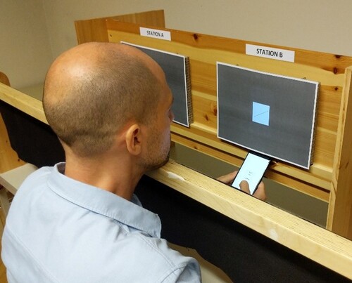
The current landscape of display pixel densities calls for a reevaluation of cartographic guidelines for screen-based cartography. Some authors have started working toward this project. In a browser-based study, Mańk (Citation2019) has shown that the legibility of point symbols (for discriminating circle, square and triangle) starts to drop off significantly only below 0.6 mm on a high-resolution (217 ppi) desktop screen – a size corresponding to approximately two conventional pixels. Different types of dashed lines could be reliably discriminated on phones with pixel densities of 202–801 ppi at widths of 0.5 mm. However, the study has some limitations as it did not control for the visual acuity of participants and did not use identical stimuli on all devices.
Ledermann recently conducted a more rigorous controlled experiment on a range of mobile phones covering the spectrum of commercially available devices, and derived initial revised guidelines for mobile cartography (Ledermann, Citation2021, Citation2022). Cartographic symbols were tested in isolation – lateral and longitudinally structured lines, point symbols, outlines and text labels – and all stimulus dimensions were specified in millimeters instead of pixel values, which can be read as corresponding to the decreased relevance of physical pixels as a fundamental reference unit for screen-based cartography. A change from low (228 ppi) to medium (342 ppi) pixel density significantly improved legibility of 4 out of 5 cartographic stimulus types, and going from medium to high (522 ppi) pixel density improved performance for 3 out of the 5 stimuli. Even for the lowest pixel density tested (at a 228 ppi, lower than what is commercially available today), the minimum sizes for reliable discrimination at a 30 cm viewing distance approach the traditional guidelines for printed maps. The guidelines derived from these empirical results are available in ().
Figure 5. Empirical verification of the legibility of cartographic symbology on various digital displays in a lab-based setting (Ledermann, Citation2022).
Conclusions and outlook: towards a renaissance of highly detailed cartography
Recent research has shown that developments in display technology let recommendations for minimum dimensions for screen-based presentation approach the values established for printed maps in many cases. This does certainly not justify a call for a general reduction of size of all map symbology, but may open up the possibility of introducing additional layers in the visual hierarchy of digital maps, which may carry additional contextual information. It could be envisioned that applications in multimodal urban transport, bicycle maps or mountaineering would benefit from such increased fidelity of the cartographic medium. The ‘big mess’ perceived by Muehlenhaus is being cleaned up a bit, with mobile devices even on the low end of technical specifications generally having resolutions that support the display of fine details, and concepts like the CSS pixel relieving authors of the need to consider various physical pixel densities and viewing distances, providing them with a measurement unit for graphical elements, correlating with the concept of apparent size, that can be reliably used across devices and usage contexts.
In the presented review of the cartographic literature and the compilation of guidelines found therein, it has become apparent that authors diverge, sometimes considerably, in the types of symbology and dimensions specified. Since few studies cared to verify their guidelines experimentally, it is unclear under which circumstances and for which cartographic content specifically these guidelines apply. Even guidelines that differentiate between multiple scenarios, e.g. between high and low contrast, leave the question open of how exactly these scenarios are defined. A set of standardized specifications for different viewing conditions (from the ideal to the detrimental) and map tasks (from the simple to the difficult) would help future research to more precisely contextualize their findings and open up the possibility for replication by others. In the end, however, cartography is a creative discipline, so any guidelines should also allow for creativity instead of limiting map designers to standardized elements. The geometric icons used in the past for determining point symbol legibility – most often square, circle and triangle – appear of reduced relevance today, with vast icon libraries available to map designers to choose their map icons from.
It can be argued that the issue of minimum dimensions is rooted in ethical questions. Dent et al. (Citation2008) lists ‘always show all relevant data whenever possible’ among their key ethical principle for cartographers. Introducing additional levels of information on a map by making use of smaller symbology may be a tool to accomplish this. However, any depiction that approaches the limits of human perceptual abilities will also exclude a certain part of the demographic, contradicting principles of inclusion and accessibility, which are also fundamental ethical values. Is it acceptable to use such symbology only for ‘non-essential’ information (for whoever decides that), or offer alternative representations on demand? Does the individual also have obligations, for example to equip themselves with the best available viewing correction, in order to access secondary information? These questions probably have to be answered on a case-by-case basis by the map designer, but should ideally be informed by reliable guidelines and insight provided by academic cartography.
A research agenda for cartographic symbology dimensions
This paper compiled guidelines for minimum dimensions found in the accessible literature, which may hopefully be useful information for map designers to consider. For some aspects of this overall topic, gaps in our knowledge or contradictory information also became apparent. Going forward, there is potential to close these gaps and work towards comprehensive and clear guidelines which would hopefully be of practical use. Without claiming completeness, some issues have been identified as initial items on a research agenda that could contribute to resolving the remaining open questions:
A comprehensive and commonly agreed upon definition of what is referred to as a ‘minimum dimension’ was not found in the literature. In order to develop a shared understanding and comparable results, a shared definition of what is meant by ‘minimum dimension’ would be required. Such definition would have to take into account aspects of the map medium and the map users, but also the symbology tested and means to detect the size at which a symbol becomes ‘too small’. It is, for example, presently not clear which rate of correct identification, by which users, most authors expect for a map symbol at the minimum size. A shared understanding and well-defined benchmarks would help to clarify expectations and make empirical studies comparable across user segments and media types.
For empirical verification of the legibility of symbols, there are currently no standardized methods and settings established. Psychophysical methods are well established to test users’ performance of correctly identifying graphical stimuli, but are often optimized for detecting perceptual thresholds at recognition rates as low as 75% (Bruce et al., Citation2003; Cunningham & Wallraven, Citation2011) – far below of what would be considered acceptable for cartographic applications. Standardized methods tailored to cartographic requirements would also help academics and practitioners to run empirical user studies for specific media types, user groups or map use scenarios and derive results comparable to those of other researchers.
A standardization of symbol geometry used for testing map-reading performance would also aid comparability and applicability of empirical results. However, the simple geometric figures used by some authors for establishing minimum dimensions for point symbols seem to be of less relevance today, where map designers can make use of symbol libraries with hundreds of map icons. Identifying test sets of icons, or creating specific shapes that plausibly represent the most ‘similar’ icons found in such real-world map icon collections would increase the applicability of any derived guidelines for real-world map creation projects.
Due to the vast range of geometries that can today be devised and effortlessly put to use for representing point and line features on a digital map, it may be that static guidelines recommending a particular minimum size for a type of symbol are altogether outdated; a dynamic model, which for a given set of symbol geometries, color, contrast ratio and information density, the properties of the map medium, and the capabilities of the intended user could be used to compute appropriate dimensions needed for reliable differentiation, would be better suited for today’s cartographic design practices.
Besides conventional symbology for two-dimensional point, line and area features mainly covered by existing guidelines, current technology allows for new types of visual variables, such as transparency, blur or stylization (Roth, Citation2017), as well as animated map symbols and three-dimensional cartographic depictions. Research into the applicability of established guidelines for those visualization techniques, and the establishment of revised guidelines where necessary, would be desirable.
Media types of relevance for cartographic applications today go beyond printed paper, desktop screens and mobile phones. Smartwatches, e-ink displays and head-mounted displays for virtual and augmented reality are some examples for which both empirical research and the development of models for how symbology dimensions affect the legibility of graphical elements for various user groups and map use tasks would be of benefit to map designers targeting those devices. Few proposals of map design guidelines exist for such novel display devices, which may be owed to the ongoing rapid technological development in this area. Once technology stabilizes and it becomes clear what fidelity of reproduction can be expected of such novel display devices, guidelines for cartographic designs targeting these devices should be proposed and verified by the cartographic community.
Promoting smaller map symbology may potentially result in map designs that exclude users that do not have the required visual capabilities to reliably read the information. How such potential exclusion should be weighed against the expanded possibilities of map designers to produce more accurate or detailed maps, and the responsibilities of map designers to mitigate such potential exclusion (by providing interactive means to enlarge the symbology or asking for a user’s preferences) is a discussion that should be put forward in the context of current debates of ethical issues in cartography (Field, Citation2022).
In conclusion, the author hopes that the compilation of guidelines attempted with this paper will let practitioners of cartography consider a wider range of options for map symbology design, and that the proposed items for a future research agenda may contribute to developments that put map designers, map medium and map users at the center of attention and further expand the possibilities for creative and reliable map designs.
Acknowledgements
The author thanks the anonymous reviewers for additional suggestions contributing towards the proposed research agenda. Open access publication was supported by TU Wien Bibliothek through its Open Access Funding Programme.
Disclosure statement
No potential conflict of interest was reported by the author(s).
Additional information
Notes on contributors
Florian Ledermann
Florian Ledermann is a researcher and lecturer at the Research Unit Cartography, Department of Geodesy and Geoinformation at TU Wien. He received his Dipl.-Ing. (MSc.) Degree in 2004 and his Dr.techn. (PhD) Degree in 2022 from TU Wien, and has previous research experience in the fields of augmented reality, information visualization and interactive online cartography. Florian’s current research interest lies in exploring the potential of modern digital display hardware for cartographic applications.
Notes
1 Own translation; German original: “daß die Grenzen der maßstäblichen Darstellung nicht nur vom Kartenmaßstab und der Größe des Objektgrundrisses, sondern auch von den vorgesehenen Darstellungsmitteln abhängig sind.”
2 Chlupac specifies only the area of the presented stimuli and does not give the aspect ratio of the rectangular shape – an aspect ratio of 2:1 has been assumed based on a figure of the stimuli.
3 See Ware, Citation2020, p. 63f for a discussion of advantages and disadvantages of antialiasing in the context of information visualization that would also be applicable to cartographic applications.
4 Malić produced elaborate tables of minimum dimensions for different screen resolutions and sizes. Here, the values for the highest resolution listed (1280 × 1024) at a screen size of 20 inch (diagonal) are extracted.
5 Absolute values published by Ledermann (Citation2022) have been converted to CSS pixel values assuming a pixel size of 0.11 mm at 30 cm viewing distance, in line with the CSS specification (World Wide Web Consortium, Citation2019). Note that the nominal size of a CSS pixel (≈0.22 mm) is significantly smaller than conventional pixel size (≈0.3 mm) assumed by earlier authors.
6 Conversion from point to metric sizes is taken from the authors, since this is not consistent between authors.
References
- Android Open Source Project. (2021). Support different pixel densities. Android Developers Documentation. https://developer.android.com/training/multiscreen/screendensities.
- Arnberger, E., & Kretschmer, I. (1975). Wesen und Aufgaben der Kartographie – Topographische Karten (1st ed., Vol. 1). Franz Deuticke.
- Bach, M. (2014). Visual illusions on the Internet: 15 years of change in technology and user behaviour. Perception, 43(9), 873–880. https://doi.org/10.1068/p7708
- Bruce, V., Green, P. R., & Georgeson, M. A. (2003). Visual perception: Physiology, psychology, and ecology (4th ed.). Routledge.
- Brunner, K. (2000). Neue Gestaltungs- und Modellierungsaufgaben für den Kartographen – Ein Plädoyer für eine attraktive Kartengraphik zur Bildschirmvisualisierung. In F. Kelnhofer, & M. Lechthaler (Eds.), Interaktive Karten (Atlanten) und Multimedia-Applikationen (pp. 53–62). Institut für Kartographie und Reproduktionstechnik, TU Wien. https://repositum.tuwien.at/handle/20.500.12708/368.
- Brunner, K. (2001). Kartengraphik am Bildschirm—Einschränkungen und Probleme. KN - Journal of Cartography and Geographic Information, 51(5), 233–239. https://doi.org/10.1007/BF03544835
- Carlino, D. (2021, September). Deep dive into devilish details: Intersection geometry. A/B Street. https://a-b-street.github.io/docs/tech/map/geometry/index.html.
- Cartwright, W., Peterson, M. P., & Gartner, G.2007). Multimedia cartography (2nd ed.). Springer.
- Chlupac, J. (1982). Die Erkennbarkeits- und Unterschiedsschwelle verschiedener geometrischer Signaturenformen [PhD Thesis]. Universität Wien.
- Christophe, S., Duménieu, B., Turbet, J., Hoarau, C., Mellado, N., Ory, J., Loi, H., Masse, A., Arbelot, B., Vergne, R., Brédif, M., Hurtut, T., Thollot, J., Vanderhaeghe, D. (2016). Map style formalization: rendering techniques extension for cartography. Expressive 2016 The Joint Symposium on Computational Aesthetics and Sketch-Based Interfaces and Modeling and Non-Photorealistic Animation and Rendering (pp. 59–68) The Eurographics Association, May 2016, Lisboa, Portugal. https://doi.org/10.2312/exp.20161064
- Credelle, T. L., & Brown Elliott, C. H. (2005). High-pixel-density PenTile matrix RGBW displays for mobile applications. In Proceedings of the 5th International Meeting on Information Display (IMID 2005 Digest) (pp. 867–872), July 20--23 2005.
- Cunningham, D. W., & Wallraven, C. (2011). Experimental design: From user studies to psychophysics (1st edition). CRC Press.
- Dent, B. D. (1972). Visual organization and thematic map communication. Annals of the Association of American Geographers, 62(1), 79–93. https://doi.org/10.1111/j.1467-8306.1972.tb00845.x
- Dent, B. D., Torguson, J., & Hodler, T. (2008). Cartography: Thematic map design (6th edition). McGraw-Hill Education.
- Dickmann, F. (2010). The potential of the lenticular foil technique for thematic cartography. The Cartographic Journal, 47(3), 250–256. https://doi.org/10.1179/000870410X12786821061459
- Field, K. (2022, January 11). Ethics in mapping. ArcGIS Blog. https://www.esri.com/arcgis-blog/products/arcgis-pro/mapping/ethics-in-mapping/.
- Frisén, L., & Frisén, M. (1981). How good is normal visual acuity? Albrecht von Graefes Archiv Für Klinische Und Experimentelle Ophthalmologie, 215(3), 149–157. https://doi.org/10.1007/BF00413146
- Geisthövel, R., & Hurni, L. (2018). Automated Swiss-style relief shading and rock hachuring. The Cartographic Journal, 55(4), 341–361. https://doi.org/10.1080/00087041.2018.1551955
- Hake, G., Grünreich, D., & Meng, L. (2002). Kartographie: Visualisierung raum-zeitlicher Informationen (8th ed.). de Gruyter.
- Hormann, C. (2021, May 12). Navigating the Maze – Part 2. Imagico.De. http://blog.imagico.de/navigating-the-maze-part-2/.
- Imhof, E. (1972). Thematische kartographie. Walter de Gruyter.
- International Council of Ophthalmology. (1984). Visual acuity measurement standard. International Council of Ophthalmology. http://www.icoph.org/dynamic/attachments/resources/icovisualacuity1984.pdf.
- Jenny, B., Jenny, H., & Räber, S. (2008). Map design for the Internet. In M. P. Peterson (Ed.), International perspectives on maps and the internet (pp. 31–48). Springer.
- Kalmykova, Y., Patrício, J., Rosado, L., & Berg, P. E. (2015). Out with the old, out with the new – The effect of transitions in TVs and monitors technology on consumption and WEEE generation in Sweden 1996–2014. Waste Management, 46, 511–522. https://doi.org/10.1016/j.wasman.2015.08.034
- Katsui, S., Kobayashi, H., Nakagawa, T., Tamatsukuri, Y., Shishido, H., Uesaka, S., Yamaoka, R., Nagata, T., Aoyama, T., Nei, K., Okazaki, Y., Ikeda, T., & Yamazaki, S. (2019). A 5291-ppi organic light-emitting diode display using field-effect transistors including a c-axis aligned crystalline oxide semiconductor. Journal of the Society for Information Display, 27(8), 497–506. https://doi.org/10.1002/jsid.822
- Ledermann, F. (2021). Investigating the effect of display pixel density on the minimal legible size of cartographic symbols. Abstracts of the International Cartographic Association, 3, 174. https://doi.org/10.5194/ica-abs-3-174-2021
- Ledermann, F. (2022). The effect of display pixel density on minimum legible size of fundamental cartographic symbols. The Cartographic Journal, 58(4), 314–328. https://doi.org/10.1080/00087041.2022.2055938
- Lobben, A. K., & Patton, D. K. (2003). Design guidelines for digital atlases. Cartographic Perspectives, 44(44), 51–62. https://doi.org/10.14714/CP44.515
- MacEachren, A. M. (1994). Visualization in modern cartography: Setting the agenda. In A. M. MacEachren, & D. R. F. Taylor (Eds.), Visualization in modern cartography (Vol. 2, pp. 1–12). Elsevier Science.
- Malić, B. (1998). Physiologische und technische Aspekte kartographischer Bildschirmvisualisierung [PhD thesis]. Rheinische Friedrich-Wilhelms-Universität.
- Mańk, A. K. (2019). Cartographic symbolization for high-resolution displays [Master’s thesis, TU Wien]. https://doi.org/10.12708/2696.
- McMaster, R. B., & Shea, K. S. (1992). Generalization in digital cartography. Association of American Geographers.
- Muehlenhaus, I. (2014). Web cartography. CRC Press.
- Neudeck, S. (2001). Zur Gestaltung topografischer Karten für die Bildschirmvisualisierung [PhD Thesis]. Universität der Bundeswehr.
- Ohlsson, J., & Villarreal, G. (2005). Normal visual acuity in 17–18 year olds. Acta Ophthalmologica Scandinavica, 83(4), 487–491. https://doi.org/10.1111/j.1600-0420.2005.00516.x
- Peterson, M. P. (1995). Interactive and animated cartography. Prentice Hall.
- Radner, W., & Benesch, T. (2019). Age-related course of visual acuity obtained with ETDRS 2000 charts in persons with healthy eyes. Graefe’s Archive for Clinical and Experimental Ophthalmology, 257(6), 1295–1301. https://doi.org/10.1007/s00417-019-04320-3
- Reichenbacher, T. (2005). Adaptive Kartengestaltung für mobile Nutzer. KN - Journal of Cartography and Geographic Information, 55(4), 175–180. https://doi.org/10.1007/BF03544013
- Robinson, A. C. (2019). Elements of viral cartography. Cartography and Geographic Information Science, 46(4), 293–310. https://doi.org/10.1080/15230406.2018.1484304
- Robinson, A. H., Morrison, J. L., Muehrcke, P. C., Kimerling, A. J., & Guptill, S. C. (1995). Elements of cartography (6th ed.). Wiley.
- Roth, R. E. (2012). Cartographic interaction primitives: Framework and synthesis. The Cartographic Journal, 49(4), 376–395. https://doi.org/10.1179/1743277412Y.0000000019
- Roth, R. E. (2013). Interactive maps: What we know and what we need to know. Journal of Spatial Information Science, 2013(6), 59–115. https://doi.org/10.5311/JOSIS.2013.6.105
- Roth, R. E. (2017). Visual variables. In D. Richardson, N. Castree, M. F. Goodchild, A. Kobayashi, W. Liu, & R. A. Marston (Eds.), International encyclopedia of geography: People, the earth, environment and technology (pp. 1–11). John Wiley & Sons. https://doi.org/10.1002/9781118786352.wbieg0761
- Roth, R. E. (2019). What is mobile first cartographic design? Presentation given at the ICA Workshop on Mobile Map User Experience Design. July 11--12. Beijing, China. https://use.icaci.org/wp-content/uploads/2018/11/Roth.pdf.
- Schmalstieg, D., & Reitmayr, G. (2007). Augmented reality as a medium for cartography. In W. Cartwright, M. P. Peterson, & G. Gartner (Eds.), Multimedia cartography (pp. 267–281). Springer.
- Schweizerische Gesellschaft für Kartografie. (1980). Kartographische Generalisierung: Topographische Karten (2nd ed.). Schweizerische Gesellschaft für Kartografie.
- Schweizerische Gesellschaft für Kartografie. (2002). Topografische Karten: Kartengrafik und Generalisierung. Schweizerische Gesellschaft für Kartografie.
- Seidel, A. (2021). Parkraumanalyse für den Berliner Ortsteil Neukölln (p. 17). https://strassenraumkarte.osm-berlin.org/parkraumkarte/methodenbericht-2021-03.pdf.
- Slocum, T. A., McMaster, R. B., Kessler, F. C., & Howard, H. H. (2009). Thematic cartography and geovisualization (3rd Edition). Prentice hall.
- Snowden, R., Thompson, P., & Troscianko, T. (2012). Basic vision: An introduction to visual perception (Revised edition). Oxford University Press.
- Spiess, E. (1990). Siedlungsgeneralisierung. In Schweizerische Gesellschaft für Kartographie (Ed.), Kartographisches Generalisieren (pp. 49–55). Schweizerische Gesellschaft für Kartografie.
- Töpfer, F. (1974). Kartographische Generalisierung. Haack.
- Ware, C. (2020). Information visualization—perception for design (4th ed.). Morgan Kaufmann.
- Wessel, N., & Widener, M. (2015). Rethinking the urban bike map for the 21st century. Cartographic Perspectives, 81, 6–22. https://doi.org/10.14714/CP81.1243
- Westheimer, G. (1981). Visual hyperacuity. In H. Autrum, E. R. Perl, R. F. Schmidt, & D. Ottoson (Eds.), Progress in sensory physiology (pp. 1–30). Springer.
- Westheimer, G. (2009). Visual acuity: Information theory, retinal image structure and resolution thresholds. Progress in Retinal and Eye Research, 28(3), 178–186. https://doi.org/10.1016/j.preteyeres.2009.04.001
- World Wide Web Consortium. (2019). CSS Values and Units Module Level 3 [W3C Candidate Recommendation]. https://www.w3.org/TR/css-values-3/.
- Wu, A. (2019). Clinical refraction. In M. Yanoff, & J. S. Duker (Eds.), Ophthalmology (5th ed, pp. 38–47). Elsevier.