 ?Mathematical formulae have been encoded as MathML and are displayed in this HTML version using MathJax in order to improve their display. Uncheck the box to turn MathJax off. This feature requires Javascript. Click on a formula to zoom.
Abstract
In the classroom, we traditionally visualize inferential concepts using static graphics or interactive apps. For example, there is a long history of using apps to visualize sampling distributions. The lineup protocol for visual inference is a recent development in statistical graphics that has created an opportunity to build student understanding. Lineups are created by embedding plots of observed data into a field of null (noise) plots. This arrangement facilitates comparison and helps build student intuition about the difference between signal and noise. Lineups can be used to visualize randomization/permutation tests, diagnose models, and even conduct valid inference when distributional assumptions break down. This article provides an overview of how the lineup protocol for visual inference can be used to build understanding of key statistical topics throughout the statistics curriculum. Supplementary materials for this article are available online.
1 Introduction
Recent years have seen a great deal of innovation in how we teach statistics as we strive to overcome what Cobb (Citation2007) termed “the tyranny of the computable.” Most notably, simulation-based pedagogies for the first course have been proposed and tested (Cobb Citation2007; Tintle, VanderStoep and Holmes Citation2011; Tintle, Topliff and VanderStoep Citation2012; Maurer and Lock Citation2016; Tintle et al. Citation2014; Hildreth, Robison-Cox and Schmidt Citation2018). These simulation-based pedagogies have also been used in mathematical statistics (Chihara and Hesterberg Citation2011; Cobb Citation2011) and Tintle et al. (Citation2015) argued that they should be used throughout the entire curriculum.
In addition to changes in how we introduce inference, there have also been changes to the computational toolkit we use throughout the statistics curriculum. At the introductory level, numerous toolkits are commonplace depending on the objectives and audience of the course. Web apps are commonly used when students may not have access to their own computers, or simply to lower the technical barriers to entry. Examples include StatKey (Lock et al. Citation2017), the Introduction to Statistical Investigations applets (Tintle et al. Citation2015), and the Shiny apps from Agresti, Franklin and Klingenberg (Citation2017). These apps allow students to explore course concepts without getting into the computational weeds. For courses exploring both the concepts and implementation in a realistic data-analytic workflow, R (R Core Team Citation2019) is a common open-source choice and multiple R packages have been developed to lower the barriers to entry for students, notably mosaic (Pruim, Kaplan and Horton Citation2017), ggformula (Kaplan and Pruim Citation2019), and infer (Bray et al. Citation2019).
The above developments enabled the statistics education community to address key recommendations made in the GAISE report (GAISE College Report ASA Revision Committee Citation2016). The simulation-based curriculum has focused attention on teaching statistical thinking and fostering conceptual understanding before delving into the mathematical details. An improved computational toolkit has enabled students to use technology to explore concepts, such as sampling and permutation distributions, and to analyze data.
While the use of the simulation-based curriculum has helped students focus on the underlying ideas of statistical inference, little has changed about the way we help students visualize inference. Specifically, we still have students grapple with null/reference distributions in hypothesis testing and sampling distributions for estimation while they are trying to hone their intuition. These distributions are very abstract ideas and while the web apps we use to demonstrate their construction can help make sense of a single “dot” on the distribution, students commonly lose the forest for the trees. Wild et al. (Citation2017) proposed the use of scaffolded animations to help students hone their intuition about sampling/randomization variation and to discover the utility of the bootstrap and permutation distributions. While the animations discussed by Wild et al. (Citation2017) to visualize randomization variation appear to be quite useful in communicating this complex idea to students, a “formal” distribution is not necessary to introduce the core ideas behind hypothesis testing. As an alternative, we propose the use of the lineup protocol (Buja et al. Citation2009) to visually introduce the logic behind hypothesis tests and to help students differentiate signal from noise as they meet new plots.
Lineups are created by generating a number of decoy plots and randomly situating the data plot into this grid of plots. Using this lineup of plots, students can be asked to apply “Sesame Street logic” (i.e., “which one of these is not like the others”), which can then be linked to fundamental statistical ideas.
In this article, we discuss how to use the lineup protocol from visual inference to help students differentiate between different forms of signal and noise and to better understand the meaning of statistical significance, or “statistically discernible differences,” following the suggestion of Witmer (Citation2019). In Section 2, we present an overview of the lineup protocol. We provide examples of how the lineup protocol can be used in the first course in Section 3, and we provide additional examples of its use throughout the curriculum in Section 4. In Section 5, we discuss implementation issues and informal student reactions. We conclude with a brief summary in Section 6.
2 Visual Inference
Most introductory statistics books teach that classical hypothesis tests can be broken down into the following steps:
Formulate competing claims, the null and alternative hypotheses.
Calculate a test statistic from the observed data.
Compare the test statistic to the reference (null) distribution.
Quantify the strength of evidence against the null by calculating a p-value.
State a conclusion in the context of the problem.
This is still true for the first course after adapting it based on the new GAISE guidelines, regardless of whether a simulation-based approach is used (Lock et al. Citation2017; Tintle et al. Citation2015; De Veaux, Velleman and Bock Citation2018). In visual inference, the lineup protocol provides a direct analog for each step of a hypothesis test (Buja et al. Citation2009).
Competing claims: As in a traditional hypothesis test, a visual test begins by clearly stating the competing claims about the model/population parameters.
Test statistic: A plot displaying the raw data or fitted model (called the observed plot) serves as the test statistic. This plot must be chosen to highlight features of the data/model that are relevant to the hypotheses. For example, a scatterplot is a natural choice to examine whether or not two quantitative variables are correlated.
Reference (null) distribution: Null plots are generated consistently with the null hypothesis and the set of all null plots constitutes the reference (or null) distribution. To facilitate comparison of the observed plot to the null plots, the observed plot is randomly situated in the field of null plots, just as a suspect is randomly situated among decoys in a police lineup. This arrangement of plots is called a lineup.
Technical note: When introducing the lineup to our students, we tell them that the null plots were generated in a manner such that the null hypothesis is true, glossing over additional details/conditions to focus student attention on the main point of the hypotheses. For example, using permutation resampling to investigate a difference in means requires not only that the means of the two distributions are equal, but that the two groups have the same distribution, so the spread and shapes of the distributions must also be the same. When you discuss the details behind the permutation test you can return to the lineups to clarify this point, but students do not need that level of detail when initially building their intuition.
Assessing evidence: If the null hypothesis is true, then we expect the observed plot to be indiscernible from the null plots. The more discernible the observed plot is from the lineup, the more evidence this provides against the null hypothesis. If one wishes to calculate a visual p-value, then lineups need to be presented to a number of independent observers for evaluation. While this is possible, it is not a productive discussion in introductory courses that don’t explore probability theory.
Stating a conclusion: A visual test, just like a traditional hypothesis test, ends by interpreting the evidence and stating a conclusion.
2.1 Example: Comparing Groups
As a first example of visual inference via the lineup protocol, consider the creative writing experiment discussed by Ramsey and Schafer (Citation2013). The experiment was designed to explore whether motivation type (intrinsic or extrinsic) impacted creativity scores. To evaluate this, creative writers were randomly assigned to a questionnaire where they ranked reasons they write: one questionnaire listed intrinsic motivations and the other listed extrinsic motivations. After completing the assigned questionnaire, all subjects wrote a Haiku about laughter, which was graded for creativity by a panel of poets. Ramsey and Schafer (Citation2013) discuss how to conduct a permutation test for the difference in mean creativity scores between the two treatment groups. Below, we illustrate the steps of a visual test.
A visual test begins identically to a traditional hypothesis test by clearly stating the competing claims about the model/population parameters. In a first course, this could be written as:
vs.
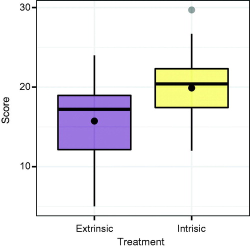
In a visual test, plots take the role of test statistics (Buja et al. Citation2009). In this situation, we must choose a plot that can highlight the difference in average creativity scores between the intrinsic and extrinsic treatment groups. displays boxplots of creative writing scores by treatment group where a dot is used to represent the sample mean for each group, though other graphics could be used. There is an apparent difference in the distribution of the scores—the average score for the intrinsic group appears to be larger—but could it be due to chance alone?
Fig. 1 Boxplots of the original creative writing scores by treatment group. The dot represents the mean of each group.
To understand whether the observed (data) plot provides evidence of a statistically discernible difference, we must understand the behavior of our test statistic under the null hypothesis. To do this, we generate null plots consistent with the null hypothesis and the set of all null plots constitutes the reference distribution. To facilitate comparison of the data plot to the null plots, the data plot is randomly situated in the field of null plots. This arrangement of plots is called a lineup. shows one possible lineup for the creative writing experiment. The nineteen null plots were generated via permutation resampling, and the data plot was randomly assigned to Panel #10.
Fig. 2 A lineup consisting of 19 null plots generated via permutation resampling and the original data plot for the creative writing study. The data plot was randomly placed in Panel #10. Can you discern the difference?
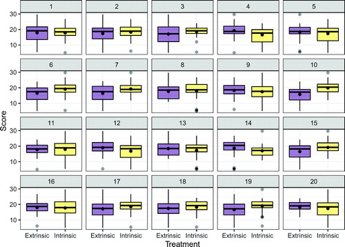
If the null hypothesis is true, then we expect the data plot to be indiscernible from the null plots. Thus, if one is able to identify the data plot in Panel #10 of , then this provides evidence against the null hypothesis. We will not discuss the process of calculating a visual
Depending on your selection, you would either write a conclusion communicating that you found evidence of a discernible difference (or made a lucky guess), or did not find evidence of a discernible difference. Either way, this conclusion should be framed in context.
Note: With only one observer this binary result (identifying the data or not) can appear to reinforce the type of bright-line thinking that the statistics community is trying to avoid (Wasserstein and Lazar Citation2016). While this is a risk, it is mitigated by class discussion, as you will see below.
3 Using Visual Inference in Introductory Statistics
In this section, we discuss how to use the lineup protocol in the introductory setting to introduce students to the logic of hypothesis testing and to help students interpret new statistical graphics. The goal is to provide examples of how this can be done, not to provide an exhaustive list of possibilities.
3.1 Introducing (simulation-based) Inference
The strong parallels between visual inference and classical hypothesis testing make it a natural way to introduce the idea of statistically discernible differences (i.e., statistical significance) without getting bogged down in the minutiae/controversy of p-values, or the technical issues of describing a simulation procedure before students understand why that is important. All students understand the question “which one of these plots is not like the others,” and this common understanding generates fruitful discussion about the underlying inferential thought process without the need for a slew of definitions. Below is an outline of a class activity discussing the creative writing experiment to introduce the inferential thought process.
3.1.1 Outline of Activity
This activity is designed to be completed in groups of three or four students. We have found that this group size allows all students to contribute to the discussion, and is also conducive to assigned roles, such as facilitator, spokesperson, recorder, and encourager/questioner (see Garfield Citation1993; Roseth, Garfield and Ben-Zvi Citation2008).
Competing claims
To begin, we have students discuss what competing claims are being investigated. We encourage them to write these in words before linking them with the mathematical notation they saw in the reading prior to class. The most common answer is: “there is no difference in the average creative writing scores for the two groups vs. there is a difference in the average creative writing scores for the two groups.” During the debrief, we make sure to link this to the appropriate notation.
EDA review
Next, we have students discuss what plot types would be most useful to investigate this claim. It’s important to ask students why they selected a specific plot type, as this reinforces links to key ideas from exploratory data analysis.
Lineup evaluation
Most students recognize that side-by-side boxplots, faceted histograms, or overlayed density plots are reasonable choices to display the relevant aspects of the distribution of creative writing scores for each group. We then provide a lineup of side-by-side boxplots to evaluate (we do place a dot at the sample mean for each group), such as the lineup shown in . At this point, we do not give the details behind the creation of null plots, we simply tell students that one plot is the observed data, while the other 19 agree with the null hypothesis. We ask students to choose which plot is the most different from the others and explain why they chose that plot. Once each student has had time to make this assessment (usually about 1 or 2 min), we ask the groups to discuss and defend their choices.
Lineup discussion
After all of the groups have evaluated the lineup and discussed their reasoning, we regroup for a class discussion. During this discussion, we reveal which panel contains the observed data (Panel #10 of ), and display these data on a slide so that we can point to particular features of the plot as necessary. After revealing the observed data, we have students return to their groups to discuss whether they chose the real data and whether their choices support either of the competing claims. Once the class regroups and thoughts are shared, we make sure that the class realizes that an identification of the observed data provides evidence against the null hypothesis (though we always hope students will be the ones saying this).
3.2 Interpreting Unfamiliar Plots
You can also utilize the lineup protocol to introduce new and unfamiliar plot types. For example, we have found many introductory students struggle to interpret residual plots. In this situation, the lineup protocol helps students tune their understanding of what constitutes an “interesting” pattern (i.e., signal).
3.2.1 Residual Plots
Interpreting residual plots is fraught with common errors and we have found that, regardless of our valiant attempts to explain what “random noise” or “random deviations from a model” might look like, there is no substitute for first-hand experience. In this section, we outline a class activity/discussion designed to help train students to interpret residual plots. This activity takes place after a brief introduction to residual plots is given in class (or video if in a flipped or hybrid classroom). Again, we suggest that students complete such an activity in small groups.
Model fitting
To begin, we have students fit a simple linear regression model, interpret the coefficients, write down what a residual is (in both words and using notation), and calculate a residual for a specific observation.
Introduce residual plots
Next, we define (or review) what a residual plot is and ask students what conditions for regression could be checked using this type of plot. At this point, we do not have students render a residual plot so that they can be asked “which of these residual plots is not like the others” when evaluating a lineup. Alternative versions of this activity could have students create the residual plot first and then use a lineup to evaluate it.
Lineup evaluation
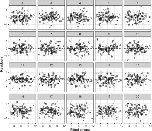
Once students have considered how to use a residual plot, we have them generate via a Shiny app (or present them with) a lineup of residual plots, such as the lineup shown in . Here, the null plots have been generated using the parametric bootstrap, but the residual or nonparametric bootstraps are other viable choices. We avoid the details of how the null plots were generated, but this depends on the goals for your class. Once the lineup has been generated, we ask students to identify which plot is most different from the others, describe what feature(s) led them to their choice and to choose two other plots (i.e., plots they think are decoys) and describe any patterns they see. We ask students to answer these questions individually before discussing them in their groups. Typically, about 3 to 5 min of “think time” are given prior to group discussion.
Fig. 3 A lineup of residual plots. The null plots are generated via a parametric bootstrap from the fitted model. The observed data are shown in Panel #9. Can you discern the difference?
Debrief
Once all of the groups have evaluated their lineups and discussed their reasoning, it is important to regroup for a class discussion. This allows you to reveal the observed residual plot and revisit key points about residual plots and their interpretation. During this process, we often have students return to their groups to discuss the implications of their choice after they learn which panel was the observed residual plot, after which we discuss the implications as a class.
Teaching tips
In , the observed residual plot in Panel #9 is systematically different from the null plots. While this is one example we use in class, we also recommend a parallel example where there is no discrepancy between the data and the model.
Depending on your course goals, follow-up discussions about the design of residual plots could be injected to the end of this activity. For example, you could provide students with a second version of the lineup where LOESS smoothers have been added to each panel and ask students what features of the residual plot the smoother highlights.
An alternative activity first has students use the Rorschach protocol (Buja et al. Citation2009) to look through a series of null plots, describing what they see, and then has them look at a single residual plot.
3.2.2 Other Plot Types
Similar activities can be designed to introduce other statistical graphics. Specifically, we have also found that lineups help students learn to read normal quantile-quantile and mosaic plots (or stacked bar charts).
4 Using Visual Inference in Other Courses
The utility of visual inference is not limited to introductory courses. Whenever a new model is encountered, intuition about diagnostic plots must be rebuilt, and the lineup protocol helps students build this intuition. As an example, consider diagnostics for binary logistic regression models, a common topic in a second course.
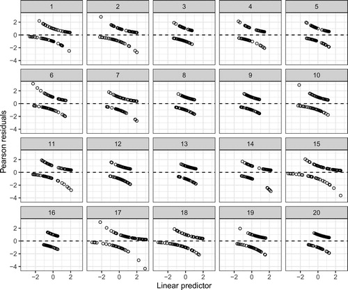
Interpreting residual plots from binary logistic regression is difficult, as plots of the residuals against the fitted values or predictors often look similar for adequate and inadequate models. The lineup protocol provides a framework for this discussion. For example, you can simulate data from a model where a quadratic effect is needed, but fit the data to a model with only a linear effect and extract the Pearson residuals. Then, you can simulate the null plots from the model with only the linear effect and extract the Pearson residuals. shows a lineup created in this way, and the observed residual plot (Panel #8) does not appear to stand out from the field of null plots. Having a discussion surrounding this lineup in class will help pinpoint the difficulty of using “conventional” residual plots for model diagnosis.
Fig. 4 A lineup for a deficient logistic regression model. The data plot is simulated from a model with a quadratic effect, while the null plots are simulated from a model with only a linear effect. The observed residuals are shown in Panel #8 and are indiscernible from the field of null plots, showing the problematic nature of residual plots for logistic regression.
After establishing the pitfalls of “conventional” residual plots for binary logistic regression, you can introduce alternative strategies (i.e., new diagnostic plots) and again use the lineup protocol to calibrate student intuition. In this section, we discuss two such examples.
4.1 Binned Residual Plots
Gelman and Hill (Citation2007) recommended using binned residual plots to explore possible violations of linearity for binary logistic regression. A binned residual plot is created by calculating the average residual value in bins that partition the -axis. shows a binned residual plot from a binary logistic regression model. The average deviance residual is plotted on the
-axis for each of 31 bins on the
-axis. The number of bins is set to
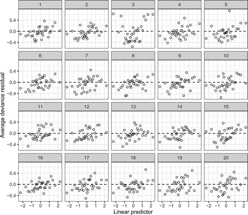
, but can be adjusted as with a histogram. Gelman and Hill (Citation2007) claim that these plots should behave much like the familiar standardized residual plots from regression. If this claim is true, then is indicative of nonlinearity. However, rather than simply citing Gelman and Hill (Citation2007) to students, a lineup empowers them to investigate the behavior of this new plot type. A lineup for these residuals is given in . As suspected, the data plot (Panel #3) stands out from the field of null plots, with a quadratic pattern that is absent from the null plots, indicating a deficiency with the model. This investigation via a lineup can be framed as a whole class discussion or as a group activity, similar to the activities already outlined.
Fig. 5 A binned residual plot from a binary logistic regression model. The average deviance residual is plotted on the -axis for each of 31 bins on the
-axis.
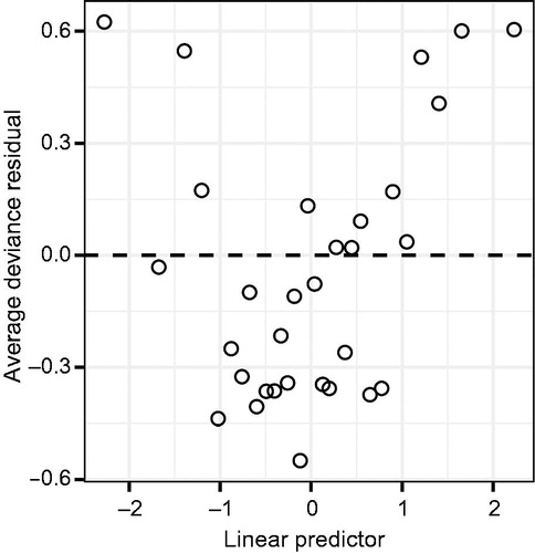
Fig. 6 A lineup of binned residual plots from a binary logistic regression model. The observed residuals are shown in Panel #3 and clearly stand out from the field of null plots, indicating a problem with linearity.
4.2 Empirical Logit Plots
A more-common alternative to the binned residual plot is the empirical logit plot (see Cannon et al. Citation2018; Ramsey and Schafer Citation2013). An empirical logit plot can be constructed for each explanatory variable by calculating the adjusted proportion of “successes” within each “group” asand plotting
against the average value of a quantitative explanatory variable, or the level of a categorical explanatory variable. For quantitative variables, it is common to form groups by forming bins of roughly equal size.
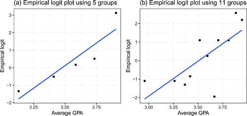
While an empirical logit plot is quite straightforward to create, it can be hard to interpret for smaller datasets where few groups are formed. For example, Cannon et al. (Citation2018) used empirical logit plots to explore a binary logistic regression model for medical school admission decisions based on an applicant’s average grade point average and render empirical logit plots based on both 5 and 11 bins. shows recreations of these plots. Experimenting with the number of bins reveals the difficulty students may encounter determining whether linearity is reasonable: the plot can change substantially based on the number of bins chosen. In our experience, students often see some indication of nonlinearity in the plot with five bins (), whereas they think the plot with 11 bins () is reasonably linear.
Fig. 7 Two empirical logit plots rendered for the same dataset with n = 55 observations. Panel (a) is rendered using 5 groups while Panel (b) is rendered using 11 groups. The appearance of the plots changes substantially, often leading to confusion in intrepretation.
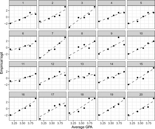
To help students interpret whether observed patterns on empirical logit plots are problematic, we again appeal to the lineup protocol to force a comparison between the observed plot and what is expected under the model. displays a lineup of the empirical logit plot created using five groups. The observed plot (Panel #2) is difficult to pick out from the field of null plots, providing no evidence against linearity.
Fig. 8 A lineup of empirical logit plots from a simple binary logistic regression model. The observed plot is shown in Panel #2 and does not stand out from the field of null plots, indicating no problem with linearity.
We have only focused on using the lineup protocol to help diagnose logistic regression models, but the approach is generally applicable. If you have a plot highlighting some feature(s) of the fitted model, then after simulating data from a “correct” model (i.e., one without model deficiencies), you can create a lineup to interrogate the model. For example, Loy, Hofmann and Cook (Citation2017) discuss how visual inference can be used to diagnose multilevel models.
5 Implementation and Student Reception
5.1 How to Create Lineups
All of the lineups presented in this article were rendered in R (R Core Team Citation2019). A tutorial outlining this process using the ggplot2 (Wickham Citation2016) and nullabor (Wickham, Chowdhury and Cook Citation2014) R packages is provided in the supplementary materials. These tools allow you to customize lineups for class use, but we do not recommend having introductory students grapple with this code. For introductory students, we recommend providing handouts or slides with pre-rendered lineups during class activities. Alternatively, we have created a suite of Shiny apps (Chang et al. Citation2019) where students can upload datasets and render lineups. The current suite includes apps to generate lineups to explore associations between groups, normal Q-Q plots, and residual plots for simple linear regression models. Links to the Shiny apps can be found at https://aloy.github.io/classroom-vizinf/.
5.2 Scaffolding Class Activities
The lineup activities briefly outlined in Sections 3 and 4 follow the same framework, which we briefly expand on below. We have also included the full-length activities along with instructor guides for the activities outlined in Section 3 in the supplementary material.
Introduce the main idea
Before starting the activity, we introduce students to the main idea via assigned reading or a mini lecture. For example, to use a lineup to introduce mosaic plots, students should first understand what a mosaic plot is. The first time we utilize a lineup in class, we also provide a brief introduction of what a lineup is, as discussed in Section 2. We typically use in-class mini lectures to introduce the main idea, but recording these mini lectures for preclass viewing is an attractive option.
Setup questions
The lineup activities contain a few questions for students to discuss as a group before seeing a lineup. For example, the activity in Section 3 introducing the logic of testing has students discuss the hypotheses, identify the response and explanatory variables, and discuss what type of plot they would choose to explore the data prior to examining a lineup. These questions help make connections to previous topics and also allow the group to work together before discussing lineups. This seems to “break the ice” and has led to more engaged discussions.
Lineup evaluation and discussion
Once a group has completed the setup, students individually evaluate a lineup. We ask students to choose which plot is the most different from the others and explain why they chose that plot. Once each student has had time to make this assessment (usually about 1 or 2 min) we ask the students to discuss and defend their choices with their group. More time can be given if you want students to write down their justification before discussing their choice. We generally give between 5 and 10 min for this discussion, using cues from the class and our perception of the lineup difficulty to determine whether to extend time past the initial 5 min. To guide the group discussion, it can be helpful to ask specific questions, such as
“Which one of these plots is not like the others?”
“What feature of the plot led you to this choice?”
“What does your choice indicate about your initial claim?” (if introducing hypothesis testing)
“What does your choice indicate about the data?” (if conducting EDA)
“What does your choice indicate about the model conditions?” (if interpreting diagnostic plots)
In our experience, having each group report back to the class leads to far more productive conversations. In addition, assigning roles eliminates the need to discuss who will report back to the class.
Reveal and discussion
Next, have each group share their selection and justification. This could be done by calling on each group, or by tracking the choices of each group through post-it notes on the board or a quick survey. If you choose the latter option, then calling on a couple groups to justify their selections after tallying the choices helps focus discussion. It is useful to have the lineup projected during this discussion so that you can highlight specific features mentioned. Once the groups have shared their selections, have students return to their small groups to discuss the implications of their selections.
Debriefing
The final step of the activity is a class-wide discussion. Each group (or a randomly chosen subset) can report back on the implications of their choice. What these choices imply is the key idea behind the activity, so it’s important to spend time on this step. We tend to give a mini lecture at the end recapping the main points of both the activity and discussion to help students reflect on the process. This part of the activity generally lasts about 10 min, but is variable depending on the talking points brought from the groups.
While we have found in-class activities exploring new plot types and the inferential thought process to be useful, these could also be assigned as homework problems or preclass exercises. Regardless of the mode, scaffolding the activity to guide students and foster discussion/reflection is key. In the above examples, we illustrated the approach that has worked well for our students, but each instructor should adjust this to their own class, teaching style, and student population. In addition, our discussion has not been exhaustive, so we encourage instructors to identify additional places in their curriculum where the lineup protocol can help their students build intuition.
5.3 Addressing Subjectivity
Unless you only use lineups in situations where there are obvious differences between groups or clear associations, you will encounter situations where some students struggle to identify the data plot. While this can be frustrating, we believe this is a productive struggle. We have found the following strategies to be helpful in dealing with this uncertainty:
A first point of frustration is that each student has their own ability to perceive patterns/differences. Consequently, some students will need more time to evaluate lineups and some students will be unable to perceive smaller differences. A quick comment acknowledging the inherent differences in perceptual ability between people can diffuse some of this frustration. This acknowledgment can be followed by encouraging students to discuss the reasons plots were chosen and to come to consensus as a group. The discussions surrounding lineups help students see that they are not alone in their frustration, and discussing their thought processes with their peers helps them remain engaged rather than staring blankly at a plot.
During the debriefing session, have each group share their chosen plot and use differences of opinion as discussion opportunities. For example, one group may have focused on outliers while another focused on central tendency. That’s an interesting difference that can lead to discussions of which plot to choose if you want to focus attention on specific features of a distribution. This discussion will also highlight that uncertainty still exists even if one person or group is able to discern the data plot.
When introducing the logic of testing, it is also valuable to design a lineup where everyone will struggle. This will help students visualize the situation where there is no association and can lead to fruitful discussions if a group chooses the data plot by chance alone. These lineups can later be talking points surrounding statistical errors.
A side benefit of students struggling with the uncertainty, and sometimes difficulty, of identifying the data plot is that they are primed for discussions that discourage bright-line thinking. If you have already discussed the differences in individual perceptive ability, then it is natural to challenge the idea of some “universal cutoff” for strength of evidence.
5.4 Student Reception
We have not formally tested the utility of lineups in the classroom, but we can offer informal observations on how students responded to the class activities. These observations are taken from two courses: an introductory course and a second course in statistics. The introductory course is taught out of Statistics: Unlocking the Power of Data (Lock et al. Citation2017) and focuses on developing the statistical thought process. The second course is a “regression course” taught out of The Statistical Sleuth (Ramsey and Schafer Citation2013) and focuses on developing the modeling thought process guided by research questions; thus, students fit and refine regression models (linear, logistic, and Poisson) throughout the course. Both courses generally enroll between 30 and 35 undergraduate students from many different majors.
In the introductory course, we use lineups to help students read new plots and to introduce key ideas behind statistical hypothesis tests. Prior to using lineups, we would introduce the logic of testing by trying to “informally” describe the permutation testing framework without getting into all of the technical details/necessary conditions, sometimes using tactile simulation such as shuffling cards. After switching to the lineup protocol to introduce the logic of testing, we find that students better grasp the ultimate goal: deciding whether the observed data are discernibly different from what we would expect. Students quickly realize that choosing the data plot in a lineup is either evidence of a discernible difference or chance. The experience of being uncertain which panel is the data plot seems to help reinforce that chance is always a possible explanation, priming them for discussions of statistical errors and discouraging them from believing every discernible difference is important. We have also found that relating dots on the permutation distribution to null plots in the lineup helps some students grasp what a permutation distribution is. We still use apps to explore individual dots, so it is not a substitute for this strategy, but rather another tool to help students grasp what that distribution represents.
During the first lineup activity, we initially met resistance or skepticism from the class. Simply asking students “which of these is not like the others” seemed to be the culprit, so we now provide a brief explanation of what a lineup is and why we are using them in class. Taking 2 or 3 min to do this seems to win over many skeptics and helps make discussion more productive.
We find ourselves and our students referring back to lineups as we discuss new topics. For example, our students talk about null plots in the lineups when they think about dots in the permutation distribution. As instructors, we refer back to the lineup when we discuss comparing a test statistic to the tails of the reference distribution: a plot that is obviously different might be “far out in the tails” since it exhibits strikingly different behavior.
In the second course, we use lineups to help students review how to interpret residual plots, and then revisit them when we start diagnosing residual plots for logistic regression models. Prior to using lineups, we would quickly review a series of example residual plots to help guide interpretation (e.g., random scatter, nonlinear, “funnel”/heteroscedastic) after which students would complete an in-class analysis where they would construct and interpret a residual plot. We have observed the following benefits of using a lineup activity over this approach:
Students are actively engaged during the review, as their discussion of the lineups guides the review in their small groups.
Students who do not recall as much (e.g., a senior who hasn’t had an introductory course since high school) are more willing to ask questions of their peers than to ask during a lecture.
The null plots are generated from models without any violations to the conditions, so students keep seeing examples of what we previously called “random scatter,” which never fully resonated with the entire class.
Overall, the lineup protocol seems to resonate with a large group of students. One recurring struggle is that students tend to see the lineup protocol as exclusively a teaching tool, rather than also seeing it as a rigorous statistical tool. We are still determining the best way to address this misconception, but see the use of lineups to diagnose complicated models or as ways to explore spatial association (as a teaser to an advanced topic) as good steps.
6 Conclusion
The lineup protocol provides a framework to help students learn to interpret new statistical graphics and build their intuition about what constitutes an interesting feature/pattern. This is achieved by randomly embedding the observed data plot into a field of decoy (null) plots. Lineups provide a natural way to introduce new statistical graphics throughout the statistics curriculum. At the introductory level, lineups can help students learn to detect association in side-by-side boxplots and mosaic plots, and detect problematic patterns in residual plots for regression models. In more advanced courses, lineups can be used to frame conversations about why conventional residual plots are problematic for certain models and can improve a student’s diagnostic ability as they investigate new models.
The shift to permutation tests in introductory courses has lowered the initial technical barriers to hypothesis testing; however, it still requires an explanation of why we need to resample and how we resample. Exploring lineups that you provide and making the analogy to the police lineup, or alternatively the Sesame Street question: “which one of these is not like the others,” introduces students to the logic behind testing without the need for these technical discussions. This allows the initial focus to be on the core concepts of hypothesis testing rather than requiring simultaneous focus on the core concepts and the technical details. We have found that a wide range of students understand why an inferential process is needed and what the findings imply at a more intuitive level after grappling with questions such as “Which one of these plots is not like the others?”, “How do you know?”, and “What does this mean about your initial claim?” In addition, permutation tests logically follow the lineup protocol, providing students with the details behind the generation of the null/decoy plots and ways to formalize the strength of evidence against an initial claim.
Finally, the lineup protocol equips students with a rigorous tool for visual investigation that is applicable outside of the classroom. This not only prepares students to explore unfamiliar models or graphics in their own statistical analyses, but can facilitate “teaser” conversations about advanced models for majors. For example, if you introduce your students to the lineup protocol in a modeling course, then you can show a lineup of choropleth maps and discuss spatial statistics as a potential area of future study.
Supplemental Material
Download Zip (646.5 KB)Acknowledgments
I thank the editorial board of the StatTLC blog for their thoughts on an early version of this manuscript, and Laura Le for reviewing the class activities. In addition, I thank the editor, associate editor, and anonymous reviewers for their helpful suggestions which improved this paper.
Supplementary Materials
Full versions of the activities discussed in Section 3 along with instructor guides. Further activities will be hosted at https://aloy.github.io/classroom-vizinf/ in the future.
A tutorial on using nullabor and ggplot2 to create lineups for common topics in introductory statistics can be found at https://aloy.github.io/classroom-vizinf/tutorial.html.
A suite of Shiny apps that creates lineups for common topics in introductory statistics can be found at https://aloy.github.io/classroom-vizinf/
References
- Agresti, A., Franklin, C. A., and Klingenberg, B. (2017), Statistics: The Art and Science of Learning from Data (4th ed.), Boston, MA: Prentice-Hall.
- Bray, A., Ismay, C., Chasnovski, E., Baumer, B. and Cetinkaya-Rundel, M. (2019), infer: Tidy Statistical Inference. R package version 0.5.1. Available at https://CRAN.R-project.org/package=infer
- Buja, A., Cook, D., Hofmann, H., Lawrence, M., Lee, E. K., Swayne, D. F. and Wickham, H. (2009), “Statistical Inference for Exploratory Data Analysis and Model Diagnostics,” Philosophical Transactions of the Royal Society, Series A, 367, 4361–4383. DOI: 10.1098/rsta.2009.0120.
- Cannon, A., Cobb, G. W., Hartlaub, B. A., Legler, J. M., Lock, R. H., Moore, T. L., Rossman, A. J. and Witmer, J. A. (2018), STAT2: Modeling with Regression and ANOVA (2nd ed.), Macmillan.
- Chang, W., Cheng, J., Allaire, J., Xie, Y. and McPherson, J. (2019), Shiny: Web Application Framework for R. R package version 1.4.0. Available at https://CRAN.R-project.org/package=shiny
- Chihara, L., and Hesterberg, T. (2011), Mathematical Statistics with Resampling and R, Wiley.
- Cobb, G. W. (2007), “The Introductory Statistics Course: A Ptolemaic Curriculum?,” Technology Innovations in Statistics Education, 1.
- Cobb, G. W. (2011), “Teaching Statistics: Some Important Tensions,” Chilean Journal of Statistics, 2, 31–62.
- De Veaux, R., Velleman, P., and Bock, D. (2018), Intro Stats (5th ed.), Boston, MA: Pearson.
- GAISE College Report ASA Revision Committee (2016), “Guidelines for Assessment and Instruction in Statistics Education College Report 2016’. Available at http://www.amstat.org/education/gaise
- Garfield, J. (1993), “Teaching Statistics Using Small-Group Cooperative Learning,” Journal of Statistics Education: An International Journal on the Teaching and Learning of Statistics, 1. Available at DOI: 10.1080/10691898.1993.11910455.
- Gelman, A., and Hill, J. (2007), Data Analysis Using Regression and Multilevel/Hierarchical Models, New York: Cambridge University Press.
- Hildreth, L. A., Robison-Cox, J., and Schmidt, J. (2018), “Comparing Student Success and Understanding in Introductory Statistics Under Consensus and Simulation-Based Curricula,” Statistics Education Research Journal, 17, 103–120.
- Kaplan, D., and Pruim, R. (2019), ggformula: Formula Interface to the Grammar of Graphics. R package version 0.9.1. Available at https://CRAN.R-project.org/package=ggformula
- Lock, R., Frazer Lock, P., Lock Morgan, K., Lock, E., and Lock, D. (2017), Statistics: Unlocking the Power of Data (2nd ed.), Hoboken, NJ: John Wiley & Sons.
- Loy, A., Hofmann, H., and Cook, D. (2017), “Model Choice and Diagnostics for Linear Mixed-Effects Models Using Statistics on Street Corners,” Journal of Computational and Graphical Statistics, 26, 478–492. Available at DOI: 10.1080/10618600.2017.1330207.
- Maurer, K. and Lock, D. (2016), “Comparison of Learning Outcomes for Simulation-Based and Traditional Inference Curricula in a Designed Educational Experiment,” Technology Innovations in Statistics Education, 9(1), 1–21.
- Pruim, R., Kaplan, D. T. and Horton, N. J. (2017), “The Mosaic Package: Helping Students to ‘Think With Data’ Using R,’’ R Journal, 9, 77–102. Available at https://journal.r-project.org/archive/2017/RJ-2017-024/RJ-2017-024.pdf
- R Core Team. (2019), R: A Language and Environment for Statistical Computing, Vienna, Austria: R Foundation for Statistical Computing. Available at https://www.R-project.org/
- Ramsey, F., and Schafer, D. (2013), The Statistical Sleuth: A Course in Methods of Data Analysis (3rd ed.), Boston, MA: Cengage Learning.
- Roseth, C. J., Garfield, J. B., and Ben-Zvi, D. (2008), “Collaboration in Learning and Teaching Statistics,” Journal of Statistics Education: An International Journal on the Teaching and Learning of Statistics, 16. Available at DOI: 10.1080/10691898.2008.11889557.
- Tintle, N., Chance, B., Cobb, G., Rossman, A., Roy, S., Swanson, T., and VanderStoep, J. (2015), Introduction to Statistical Investigations, Wiley.
- Tintle, N., Chance, B., Cobb, G., Roy, S., Swanson, T. and VanderStoep, J. (2015), ‘Combating Anti-Statistical Thinking Using Simulation-Based Methods Throughout the Undergraduate Curriculum,” The American Statistician, 69, 362–370. DOI: 10.1080/00031305.2015.1081619.
- Tintle, N. L., Topliff, K., and VanderStoep, J. (2012), “Retention of Statistical Concepts in a Preliminary Randomization-based Introductory Statistics Curriculum,” Statistics Education Research Journal, 11, 21–40.
- Tintle, N., Rogers, A., Chance, B., Cobb, G., Rossman, A., Roy, S., Swanson, T. and VanderStoep, J. (2014), “Quantitative Evidence for the Use of Simulation and Randomization in the Introductory Statistics Course,” in Sustainability in Statistics Education. Proceedings of the Ninth International Conference on Teaching Statistics (ICOTS9, July, 2014), eds. K. Makar, B. de Sousa and R. Gould, Flagstaff, AZ.
- Tintle, N., VanderStoep, J., and Holmes, V. L. (2011), “Development and Assessment of a Preliminary Randomization-based Introductory Statistics Curriculum,” Journal of Statistics Education, 19. DOI: 10.1080/10691898.2011.11889599.
- Wasserstein, R. L. and Lazar, N. A. (2016), “The ASA Statement on p-values: Context, Process, and Purpose,” The American Statistician, 70, 129–133. Available at DOI: 10.1080/00031305.2016.1154108.
- Wickham, H. (2016), ggplot2: Elegant Graphics for Data Analysis, New York: Springer-Verlag. Available at https://ggplot2.tidyverse.org
- Wickham, H., Chowdhury, N. R. and Cook, D. (2014), nullabor: Tools for Graphical Inference. R package version 0.3.1. Available at http://CRAN.R-project.org/package=nullabor
- Wild, C. J., Pfannkuch, M., Regan, M., and Parsonage, R. (2017), “Accessible Conceptions of Statistical Inference: Pulling Ourselves Up by the Bootstraps,” International Statistical Review, 85, 84–107. Available at https://onlinelibrary.wiley.com/doi/full/10.1111/insr.12117 DOI: 10.1111/insr.12117.
- Witmer, J. (2019), “Editorial,” Journal of Statistics Education, 27, 136–137. Available at DOI: 10.1080/10691898.2019.1702415.