Abstract
The Chicago Hardship Index is a proposed starting point for introducing students to structural urban inequities. ASA’s mission statement to use statistics to enhance human welfare serves as a motivation for social justice projects. This article contains an application of ASA’s ethical guidelines to such projects, background information about the history and landscape of Chicago community areas, and practical ideas for how to combine hardship index data with learning statistical and data science tools. Supplementary materials for this article are available online.
1 Introduction
In February 2021, to become better informed about how expert statistical practitioners approach social justice research, I joined Day 1 of the “Human Rights and Data Science Conference” (SMU Citation2021) held remotely at Southern Methodist University. I was fascinated by the high quality applied statistical work being conducted globally by invited speakers such as Megan Price (Human Rights Data Analysis Group), Caitlin Augustin (DataKind), Shannon Loomis (Community Lattice), and Davina Durgana (Statistics Without Borders). The panelists expressed interest in further academic collaboration. A question that arose from educators is: Where can one access data on important social justice issues suitable for classroom use? Indeed, finding data that can effectively address social problems (Experian Citation2021) and help train students (Lesser 2017) are major challenges with a potentially wide gap between the two. This article seeks to help bridge the gap to support statistics educators wishing to introduce students to data revealing urban structural inequities.
An important motivation for statistics educators to consider social justice data is the American Statistical Association (ASA) missional statement to use statistics to enhance human welfare (Lesser Citation2007). Motivated educators must recognize, however, that urban problems such as structural economic hardship and high homicide rates are complex, and cannot be solved by data analysis alone. Indeed, the participation and practical wisdom of a community and its leaders are essential. There are realities that are only understood by those who have faced and suffered structural injustice.
For those working with social justice data, Schramm et al. (Citation2018) recommended an application of the ASA’s Ethical Guidelines for Statistical Practice (American Statistical Association Citation2018): (i) make results accessible to community leaders without statistical training; (ii) aim for enduring project value as a result of relevance and validity; (iii) be responsible about data that may overlook vulnerable populations; (iv) care about outliers as important cases; and (v) explain methods for traceability and transparency.
I worked on the hardship index data for Chicago’s 77 community areas and other urban social justice projects during an extended Fall 2019 residential sabbatical in the Woodlawn community area of Chicago. Interfacing with a workforce development organization, a violence reduction organization, as well as urban studies staff and students, I can attest that Schramm et al.’s five recommendations are both practical and beneficial for such collaboration. These guidelines also serve as a good way to assess outcomes of statistical social justice project work ().
Table 1 Schramm et al.’s (Citation2018) guidelines can serve as a rubric for assessment of a social justice data table or visualization.
The layout of this article is as follows. Section 2 encapsulates the essential historical context underlying hardship index data. Once informed with a basic understanding of the long history of systemic injustice, students are ready to analyze the 2013–2017 Chicago Hardship Index, which indicates that wide disparities persist in Chicago’s 77 community areas. Section 3 shows how these hardship index data are useful for learning statistical and data science tools in a general education, entry level statistics, or applied math capstone class. Section 4 summarizes a recommended general approach to social justice projects as well as specific open problems for further investigation of the urban hardship index. Project evaluation using Schramm et al.’s 5 guidelines () is illustrated in the latter two sections.
2 Understanding the Chicago Urban Context
The director of the Woodlawn violence reduction organization connected me to the Chicago Economic Hardship Index data for the 5-year period 2013–2017 as furnished by the Great Cities Institute (Citation2019) of the University of Illinois at Chicago. The hardship index (Nathan and Adams Citation1976) is a score scaled between 1 and 100, with a higher index indicating greater hardship. This index is computed for each of the 77 Chicago community areas using an average of normalized values for 6 raw indicators: unemployment, lack of secondary education, per capita income, percentage below poverty level, overcrowded housing, and age dependency (). Based on the American Community Survey, these 6 indicators and the composite hardship index draw attention to the economic disparity between affluent community areas and many communities on the South and West sides of Chicago (Sarabia and Cordova Citation2016).
Table 2 Hardship Index data for 7 of the 77 Chicago community areas.
Although the violence reduction director did not specify a research question, I understood that my task was to look for a relationship between the 2013 and 2017 hardship index scores and the 2017 homicide counts in disadvantaged communities such as Woodlawn and its neighbor Englewood on the South Side, or Austin on the West Side. From the outset, I had impressed upon me the imperative to connect community hardship index data analysis with the daily reality faced by the people living in these communities. A young adult who grew up in Woodlawn and served on my research team offered a poignant perspective on economic hardship and gun violence. Raised by a single mother working two jobs to support 4 kids, his view on economic hardship was “do whatever it takes.” He also had this advice for younger students in his community: “Look left and right to the person sitting next to you. I was sitting in those same seats. Many years ago I sat next to tons of people that I would never thought would disappear out of my life. To see so many people I was close to die because of gang violence and homicides is unbelievable. Most of my childhood friends died before they reached the age of 18. It is outrageous.”
The Woodlawn urban studies staff also emphasized the importance of the history that has led to the current disparities in economic hardship. While at the University of Chicago in the Hyde Park community next to Woodlawn, distinguished Harvard professor William Julius Wilson wrote his landmark book The Truly Disadvantaged (Wilson Citation1987). Wilson describes the systemic, large-scale factors that created an underclass in inner-city neighborhoods, thereby preventing members of this socioeconomic group from improving their economic conditions. The concentration of poverty in these predominantly Black communities was caused by economic shifts that reduced job availability, as well as an out-migration of working and middle-class residents. Given this history and the continued lack of public-sector job creation, Wilson argues that advantaged groups of all races and class backgrounds must engage in comprehensive policies that can improve the life outcomes of these communities.
Books such as The Truly Disadvantaged (Wilson Citation1987), Great American City (Sampson Citation2012), The Warmth of Other Suns (Wilkerson Citation2010), and Gang Leader for a Day (Venkatesh Citation2008) are helpful resources to understand the historical context and landscape of Chicago neighborhoods. encapsulates the history of structural injustices, which is essential knowledge for working with the recent Chicago hardship index data.
Table 3 Basic knowledge of the history of injustices in urban centers like Chicago should accompany data analysis of current hardship.
3 Practical Ideas for Classroom Use
This section illustrates how I used hardship index data in 3 different types of courses, and includes additional ideas for classroom activities.
3.1 General Education: History Presentations
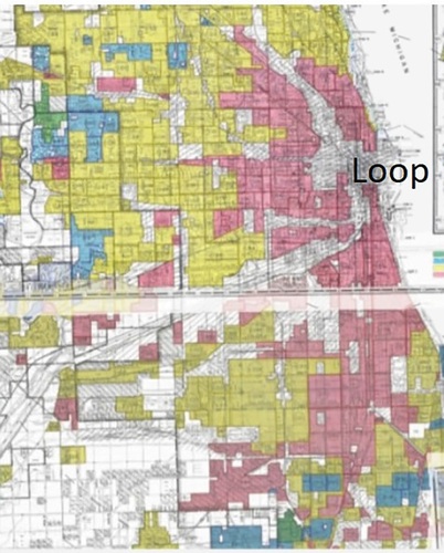
As I explained in Section 2, when looking at recent data of hardship in the 77 Chicago community areas, it is important to understand key points in the history of injustices () which led to the current conditions, and why we should all be concerned. Students in a general education class can be assigned a 15- to 20-min group oral presentation on one of the 77 Chicago community areas, discussing its history of injustices. Showing a video such as the the TEDX talk on redlining in Chicago by Walls (Citation2016) and a discussion on the map in can help students get started. Communities where Great Migration Black American Families settled were designated “red” on the map. Such families were denied housing loans. Blockbusting, slum land-lording, white flight, disinvestment, and restrictive covenants ensued. It is interesting to note that the property extending north of the Loop along Lake Michigan eventually became the affluent Near North Side community area known as the “Gold Coast” as a result of gentrification (McClelland Citation2018).
Fig. 1 Public domain redlining map from the late 1930s. Green=“Best,” Blue=“Still Desirable,” Yellow=“Definitely Declining,” Red=“Hazardous” (Nelson Citationn.d.).
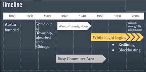
My Fall 2020 General Education Capstone class focused on two communities: Woodlawn (South Side) and Austin (West Side). Between roughly 1916 and 1970, two Great Migrations brought millions of Black Americans from the Jim Crow South to northern cities such as Chicago. The students discussed the historical injustices in during their PowerPoint presentations. At least one data analysis slide was required. Ideas my students came up with include
a pie chart showing the change in % White vs. % Black in a community before and after the Great Migration;
a bar chart showing when houses in a community area were built (since 2000, 1970–1999, 1940–1969, and before 1940); and
a timeline showing the history of structural injustices in a community area ().
Fig. 2 A data visualization can effectively communicate the history of injustices in a Chicago community area such as Austin.
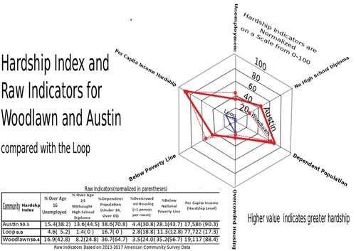
Having acquired background knowledge of this history of injustices, students can be introduced to the recent hardship index data using a visualization such as . One can discuss with students whether this radar chart satisfies Schramm et al.’s (Citation2018) ethical guidelines (i)–(v) using the rubric in . Students can argue its accessibility and gauge whether it is transparent by trying to reproduce it using Excel; they can check its significance by investigating the relevance and accuracy of the American Community Survey (U.S. Census Bureau Citation2008); and they can discuss the pros and cons of creating a visualization from only a small subset of a dataset in assessing the equitable and impartial criteria.
Fig. 3 2013-2017 hardship index data visualization for 3 of 77 Chicago community areas (Data source: Great Cities Institute (Citation2019)).
The Capstone students afterwards wrote the following composite response:
I think it’s very important for us to consider the history and background of these neighborhoods because it puts everything into context. There’s a real danger if you only put up statistics that show currently what’s happening. You wouldn’t be able to explain why the crime or unemployment is so bad. By not looking at the full picture and not giving the full story you risk propagating the perspective that the people in these neighborhoods are just lazy or don’t have the cognitive ability to work. This is clearly wrong when you look at the historical narrative of injustices that have happened. This full picture is essential whenever you display this data so you’re not propagating racist feelings. It’s hard to make a solution to anything without looking at the deep rooted social structures. Looking at statistics on the surface level, you might think you’re addressing problems with some sort of solution. You first need to take a deeper look at the history of different injustices and why things are the way they are before making a solution off of just statistics.
3.2 Intro to STATS: R-Lab
An R-lab suitable for an Intro to Stats class (listed in the appendix and downloadable from the supplemental materials) guides students to consider the history of injustices of a community area, create a data visualization of hardship index data, and think critically about whether the hardship index measures the reality experienced by the truly disadvantaged. Those students in my applied math capstone familiar with R also used this lab as a starting point to create other visualizations of the hardship index data.
The final R-lab question (Exercise 10) discusses limitations on what a single hardship index can measure by considering gentrification in Woodlawn. In July 2016, Woodlawn was selected as the site of a history-in-the-making project, the Obama Presidential Center. Plans are monumental, but have heightened the potential for real estate speculation and gentrification. A community benefits agreement coalition has been pushing for action that would help protect residents from being displaced (Black Citation2019) and has warned against “watered-down housing protections” (Ramos Citation2020). Good discussion questions include: Without social justice activism, might improved economic hardship indicators in communities like Woodlawn be merely a gentrification effect, overlooking the continued or possibly worsened conditions of the most disadvantaged in the community (Guthmann Citation2020)? How might we determine whether or not this is the case?
Feedback from students included appreciation that this R-lab was included in the course. One student commented that our residential urban studies program in Woodlawn could in fact be considered a form of gentrification. The lab successfully raised awareness of urban social injustices.
3.3 Applied Math Capstone: K-Means Clustering Data Visualization
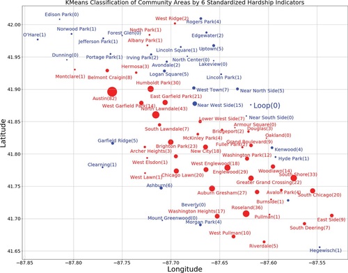
With an understanding of the history of injustices, and the R-lab as an example of a basic data analysis, advanced students can engage in various types of exploratory data analysis using more sophisticated methods such as machine learning. As I illustrated earlier for the general education visualization shown in , an important learning objective when using more advanced statistical methods is to train students to evaluate the results (data visualization or summary table) using the guidelines based on Schramm et al. (Citation2018). For example, my applied math capstone class considered a k-means bi-clustering based only on the 6 standardized hardship indicators without any geographic data. The cluster groups (blue or red) were then displayed as a latitude/longitude map (). This visualization includes the names of the community areas and their 2017 homicide counts via text and marker size. Homicide data are easily obtainable from the Chicago Data Portal, part of the open data movement (Thornton Citation2013).
Fig. 4 Geographic plot of Chicago’s 77 community areas with marker color (blue or red) indicating k-means bi-clustering based only on the 6 standardized economic hardship indicators. Affluent community areas such as the Loop (central business district), Near North Side (which includes the “Gold Coast”), and Hyde Park (site of the University of Chicago) appear in blue. Lower-income communities with a history of injustices, including Woodlawn, Englewood, and Austin, appear in red. Marker sizes are proportional to homicide counts, with actual numbers in parentheses following named community areas.
We can evaluate this machine-learning map visualization using Schramm et al.’s guidelines ():
Accessible—This visualization is accessible to those with a basic knowledge of Chicago community areas (Section 2), as well as familiarity with k-means clustering. Having lived in Woodlawn and spent considerable time at both a homeless mission in Englewood (adjacent to the west) and shopping district in Hyde Park (adjacent to the north), I found this to be an interesting example since the k-means bi-clustering without any geographic information separates the two disadvantaged community areas from the adjacent affluent community. Being based on machine learning, however, this graph might not be broadly accessible. Discussion Question: How can we explain the clustering in this visualization to a community leader who is not familiar with machine learning?
Significant—The 2013-2017 Hardship Index data (UIC Great Institute 2019) is the most up-to-date. Hardship index data are only available for two 5-year periods (2010–2014 and 2013–2017), and only reported for community areas. Homicide data from the Chicago Data Portal, on the other hand, are available for any time period (days, months, and years) and various geographic units such as community areas, police districts, and police beats. This map is significant in light of Chicago’s history of injustices (), particularly redlining. The predominance of red in the South and West sides resembles that of Chicago redlining maps (). Lower-income communities with a history of injustices, including Woodlawn, Englewood (Woodlawn’s neighbor to the west), and Austin, appear in red. The visualization should be updated with the next release of the Hardship Index. Discussion Questions: How much confidence can we place in the raw indicator data used to compute the hardship index? Since homicide data is available for each community and year between 2013 and 2017, what number should be used to represent the homicide count in each community area? (i.e. how should we handle the variation in homicide counts from year to year?)
Equitable—The choice of community area to represent both economic hardship and homicide counts has pros and cons. Discussion Question: What geographic unit might best reveal the economic hardship and level of gun violence faced by the most vulnerable?
Impartial—The k-means bi-clustering is based on all 6 hardship indicators and classifies all 77 Chicago areas. However, since the explicit hardship index values are not included, one does not recognize from this graph that Riverdale (furthest south of the red group) has an extremely high hardship index and the Near North Side “Gold Coast” (in blue) an extremely low hardship index. Homicide counts for all communities, on the other hand, are indicated explicitly. Discussion Question: What are the pros and cons of using a graph such as rather than ?
Transparent–Both the data and the Python Jupyter Notebook used to create are available as Supplemental Materials. Discussion Questions: How can the k-means clustering algorithm be explained to someone without a statistics background? Is our work fully reproducible?
Another classroom activity is to make this visualization more accessible and transparent to a broader audience (see ). The simplified graph can be assessed and further revised using the rubric in . may be considered more impartial than in the sense that the former indicates very low homicide count (e.g., Loop) and very low hardship index (eg. Near North Side) community areas as well as very high homicide count (e.g., Austin) and very high hardship index (eg. Riverdale) community areas. On the other hand, could be made even more significant if the dot size corresponds to homicide rate rather than homicide count. The Near North Side, with a population of roughly 90,000, had the lowest Hardship Index value of 8.6. Riverdale, with a population of only 7000, had the highest hardship index of 84.2, and the same homicide count (5) as the Near North Side. This means that the homicide rate (number of homicides per 100,000 people) in Riverdale was in fact over 10 times higher than the Near North Side. Using an equal size homicide marker for Near North Side and Riverdale in makes the latter community appear to be less relevant in considering the need for gun violence reduction.
Fig. 5 This visualization is more accessible and transparent than . Marker size and labeled values indicate the 2017 homicide count. Homicide-free communities are indicated in blue. The 2013-2017 hardship index is listed next to the name of each community area.
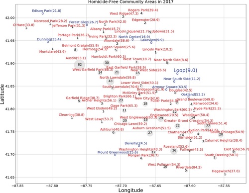
In assessing graphs with students, biases and general misconceptions may emerge. Data visualizations gain significance if they help overcome erroneous viewpoints by a careful examination of the data. For example, one might presume that an urban community with greater economic hardship must also be more violent. Note that in , Oakland was among the homicide free community areas, though its hardship index (53.2) was essentially the same as Austin (53.1), the community with the highest homicide count (82). Oakland would be a good choice of community area for a history presentation (Section 3.1).
4 Discussion
In keeping with the ASA missional statement “to enhance human welfare,” an urban social justice project that heightens awareness of both the historical context and current hardship disparities may serve as the first step toward the goal to improve life outcomes for truly disadvantaged communities. ASA ethical guidelines apply to working with community organizations as well as students. An introductory project that follows Lesser (Citation2007), GAISE College Report ASA Revision Committee (Citation2016) and Schramm et al. (Citation2018) will align with best practices in working with social justice data. This article offers a variety of examples following Schramm et al.’s guidelines to evaluate a social justice project data table or visualization ():
(i) accessible and (v) transparent in assessing, comparing, and/or revising ;
(ii) significant by considering how relevant and accurate are the raw indicator estimates used in and how a graph such as is connected to Chicago’s history of structural injustices (including the redlining map in );
(iii) equitable by a final question on the R-lab whether gentrification hides the plight of the most vulnerable in the community; and
(iv) impartial, by observing that includes data for both very low homicide count (e.g., Loop) and very low hardship index (e.g., Near North Side) community areas as well as very high homicide count (e.g., Austin) and very high hardship index (e.g., Riverdale) community areas.
The complexity of the problem of economic hardship and violent crime, and the barriers to real understanding that must be overcome by outsiders to the community may seem insurmountable. We need humility, courage, and perseverance to engage students effectively with social justice data. We should not attempt to do so alone, which is why events such as the Human Rights and Data Science Conference (SMU Citation2021) and collaborating with community organizations on the ground are so important.
Clearly we have only scratched the surface of what might be done with hardship index data. Health scientists Wilkinson and Pickett (Citation2007) linked greater inequality with a variety of worsened social outcomes, such as mental illness, educational performance, teenage birth rates, percentage of population imprisoned, social mobility, and homicides. Our study only related hardship index data to homicide counts. It would be valuable to study the other social outcomes as well.
Another suggested area for further investigation is a form of relative deprivation that occurs when a raw indicator such as percent unemployed shows reduced hardship from one time period to the next, but the standardized values show increased hardship. This can occur since changes in the standardized value of a raw indicator take the changes of all 77 communities into consideration.
An important caveat arises when studying relative deprivation. The U.S. Census Bureau (Citation2008) expressly advised against comparing American Community Survey (ACS) data for overlapping time periods. Point estimates for the 6 hardship indicator values are constructed by combining data across a five-year period, and are neither averages of individual years nor necessarily representative of the end or middle year. Another challenge is census tracts that overlap more than one community area. Granting a major assumption that the Great Cities Institute’s indicator estimates are representative of each community for a given five year period, the next release of Chicago Hardship Index Data will not overlap the 2010–2014 data (Great Cities Institute Citation2017). Although the problem of overlapping time intervals in analyzing relative deprivation would be avoided, the hardship index does not measure factors such as homicides or gentrification. An open-ended research question would be to compare the hardship index with other measures of hardship/relative deprivation such as the Index of Multiple Deprivation in the United Kingdom (Social Value Portal Citation2017), or to propose a revised index.
My dive into urban data analytics began with a residential sabbatical in Woodlawn. shows the graph I returned to the Woodlawn community violence reduction director. At that time, I did not know one should not make comparisons for overlapping 5-year periods based on ACS Data (U.S. Census Bureau Citation2008). I also was not familiar with Schramm et al.’s (Citation2018) guidelines, so had not formulated in my mind the evaluation rubric in . As far as I can recall, the graph was accessible and transparent to the director. He did not question its significance or comment on the extremes represented in the graph but instead showed interest in asking more granular questions about specific neighborhoods within these communities that had undergone economic changes.
Fig. 6 Homicide count vs. Hardship index.
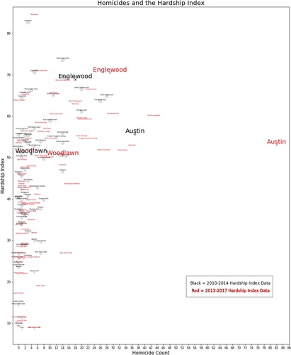
At that time, what struck me most about is Austin’s huge spike in homicides in 2017. I lamented how a just society could fail to respond after so many homicides (82) occurred in one community during a single year.
This leads me to a final important point emphasized by the urban studies staff on my data team. While focusing on systemic social injustices such as the relationship between economic hardship and homicides on the South and West sides of Chicago, we might unconsciously be contributing to negative stereotypes that social problems are the most salient features of these communities. We must not overlook the overwhelming beauty, resilience, creativity, faith, and genius of the truly disadvantaged. In the words of Pulitzer Prize winning author Isabel Wilkerson (2021):
Think about those cotton fields, and those rice plantations, and those tobacco fields, and those sugar plantations. On those sugar plantations, and on those tobacco fields, and on those rice plantations, and on those cotton fields, were opera singers, jazz musicians, playwrights, novelists, surgeons, attorneys, accountants, professors, journalists. And how do we know that? We know that because that is what they and their children and now their grandchildren and even great-grandchildren have often chosen to become once they had the chance to choose for themselves what they would do with their God-given talents.
4.1 Project Team
The following W.C. Amdat (Wheaton College Applied Math Data Analysis Team) members worked on this project: Dr. Paul Isihara (lead professor); Hope Wood (urban studies program staff); Dr. Peter Jantsch (assisting professor); Christian Cameron, Nathan Varberg, Demetrius Crawford, Sean Ferguson, Lucy Henneker, Andy Holmberg, Gracie Johnson, Olivia Pearsall, Andy Peterson, Christopher Plimpton, and Kiki Rogers (students).
Supplemental Material
Download PDF (205.1 KB)Acknowledgments
Many thanks to the JSDSE editorial staff for their helpful insights, patience, and guidance. Support from the Wheaton College Sabbatical and Summer Research Programs, and Alumni Association is gratefully acknowledged. Joel Hamernick, Executive Director of Sunshine Gospel Ministries, initiated the hardship data analysis. Dr. Darcie Delzell offered help and encouragement during an initial project assessment.
Supplemental Materials
The following videos provide background into the Chicago urban history and landscape.
(4:57) Joblessness and Poor Neighborhoods: William Julius Wilson (Stanford Center on Poverty and Inequality Citation2016);
(1:24:16) Great American City: Chicago & the Enduring Neighborhood Effect (USC Sol Price Center for Social Innovation Citation2014);
(17:45) Isabel Wilkerson: How Did the Great Migration Change the Course of Human History? (TED Radio Hour Citation2021);
(54:00) Sudhir Venkatesh Becomes ‘Gang Leader for a Day’ (Kulman Citation2008).
The Github https://github.com/wcapdat/ChicagoHardshipIndex has data files and R/Python Notebooks used in our analysis.
References
- American Statistical Association (2018), “Ethical Guidelines for Statistical Practice.” Available at https://www.amstat.org/asa/files/pdfs/EthicalGuidelines.pdf
- Black, C. (2019), “Obama Center Community Benefits Agreement Gains Traction as Jackson Park Site Controversy Continues.” Available at https://www.chicagoreporter.com/obama-center-community-benefits-agreement-gains-traction-as-jackson-park-site-controversy-continues/
- Experian (2021), “Using Statistics to Advance Social Justice & Human Rights w/Dr. Megan Price” [podcast]. Available at https://www.experian.com/blogs/news/datatalk/stats-for-social-justice/
- GAISE College Report ASA Revision Committee (2016), “Guidelines for Assessment and Instruction in Statistics Education College Report 2016.” Available at http://www.amstat.org/education/gaise.
- Great Cities Institute (2017), “Fact Sheet # 2: Chicago Community Area Economic Hardship Index.” Available at https://greatcities.uic.edu/wp-content/uploads/2016/07/GCI-Hardship-Index-Fact-SheetV2.pdf
- Great Cities Institute (2019), “Fact Sheet # 2: Chicago Community Area Economic Hardship Index.” Available at https://greatcities.uic.edu/wp-content/uploads/2016/07/GCI-Hardship-Index-Fact-SheetV2.pdf
- Guthmann, A. (2020), “Advocates Push for Protections Amid Fears of Obama Center Displacement.” Available at https://news.wttw.com/2020/02/06/advocates-push-protections-amid-fears-obama-center-displacement
- Kulman, L. (2008), “Sudhir Venkatesh Becomes ‘Gang Leader for a Day.” Available at https://www.npr.org/2008/02/05/18593528/sudhir-venkatesh-becomes-gang-leader-for-a-day
- Lesser, L. (2007), “Critical Values and Transforming Data: Teaching Statistics with Social Justice,” Journal of Statistics Education, 15, 1, DOI: https://doi.org/10.1080/10691898.2007.11889454.
- McClelland, E. (2018). “How Lincoln Park Gentrified.” Available at https://www.chicagomag.com/city-life/october-2018/how-lincoln-park-gentrified/
- Nathan, R., and Adams, C. (1976), “Intercity Hardship Index,” Political Science Quarterly, 91, 47–62. DOI: https://doi.org/10.2307/2149158.
- Nelson, R., Winling, L., Marciano, R., Connolly, N. et al. (n.d.), “Mapping Inequality,” in American Panorama, ed. Robert K. Nelson and Edward L. Ayers. Available at https://dsl.richmond.edu/panorama/redlining/#loc=10/41.944/-88.165&city=chicago-il
- Ramos, M. (2020), “Residents Worried About Displacement by Obama Center Call on Lightfoot for More Affordable Housing.” Available at https://chicago.suntimes.com/2020/6/11/21288135/affordable-housing-obama-center-cba-coalition-vacant-lots
- Sampson, R. (2012), Great American City: Chicago and the Enduring Neighborhood Effect, Chicago, IL: University of Chicago Press.
- Sarabia, T., and Cordova, T. (2016), “A Nation Engaged: New Study Finds Disparity in Economic Hardship in Chicago.” Available at: https://www.wbez.org/stories/a-nation-engaged-new-study-finds-disparity-in-economic-hardship-in-chicago/0edb2728-04da-41da-b1c0-14fc83f94367
- Schramm, H., Koehlmoos T., and Nestler, S. (2018), “Statistics in Pursuit of Social Justice.” Available at https://csbaonline.org/about/news/statistics-in-pursuit-of-social-justice
- SMU (2021), Data Science and Human Rights Conference Day [Video]. Available at https://smu.hosted.panopto.com/Panopto/Pages/Viewer.aspx?id=5cfd68ba-4fe4-456a-a0b3-ace9014bec93
- Social Value Portal (2017), “Indices of Multiple Deprivation in the UK.” Available at https://socialvalueportal.com/indices-of-multiple-deprivation-in-the-uk/#::̃text=Measuring%20multiple%20deprivation%20%20%20%20Domain%20of,%20%2014%25%20%205%20more%20rows%20
- Stanford Center on Poverty and Inequality (2016), Joblessness and Poor Neighborhoods: William Julius Wilson [Video]. Available at https://inequality.stanford.edu/publications/media/details/joblessness-and-poor-neighborhoods-william-julius-wilson
- TED Radio Hour (2021), Isabel Wilkerson: How Did the Great Migration Change the Course of Human History? [Video]. Available at https://www.npr.org/2021/04/30/992040563/isabel-wilkerson-how-did-the-great-migration-change-the-course-of-human-history
- Thornton, S. (2013), “Open Data in Chicago: A Comprehensive History.” Available at https://datasmart.ash.harvard.edu/news/article/open-data-in-chicago-a-comprehensive-history-311#::̃text=Open%20data%E2%80%99s%20fast%20rise%20is%20already%20transforming%20how,executive%20order%20mandating%20routine%20releases%20of%20government%20data.
- US Census Bureau (2008), “A Compass for Understanding and Using American Community Survey Data: What General Data Users Need to Know.” Available at: https://www.census.gov/content/dam/Census/library/publications/2008/acs/ACSGeneralHandbook.pdf
- USC Sol Price Center for Social Innovation. (2014), Great American City: Chicago & the Enduring Neighborhod Effect [Video]. Available at: https://www.youtube.com/watch?v=gEXSOUqwztA
- Venkatesh, S. (2008), Gang Leader for a Day: A Rogue Sociologist Takes to the Streets, New York: Penguin Press.
- Walls, A. (2016), Rethinking Affordable Housing [Video]. TedX. Available at https://youtu.be/fZvKY9tb9Kw
- Wilkerson, I. (2010), The Warmth of Other Suns. New York: Random House.
- Wilkinson, R., and Pickett, K. (2007), “The Problems of Relative Deprivation: Why Some Societies do Better than Others,” Social Science & Medicine, 65, 1965–1978. DOI: https://doi.org/10.1016/j.socscimed.2007.05.041.
- Wilson, W. (1987), The Truly Disadvantaged The Inner City, the Underclass, and Public Policy, Chicago, IL: University of Chicago Press.
Appendix:
R-Lab
The following R-lab was used in an Intro to Stats class for non-statistics/non-mathematics majors in the Fall of 2020. The only prerequisite for the course is a knowledge of pre-calculus. This R-lab was given in the first half of the course after students had been introduced to basic R syntax for reading, filtering, and plotting data by means of the tidyverse suite of packages.