 ?Mathematical formulae have been encoded as MathML and are displayed in this HTML version using MathJax in order to improve their display. Uncheck the box to turn MathJax off. This feature requires Javascript. Click on a formula to zoom.
Abstract
In this article, we discuss our attempt to teach applied statistics techniques typically taught in advanced courses, such as clustering and principal component analysis, to a non-mathematical educated audience. Considering the negative attitude and inclination toward mathematical disciplines of our students we introduce them to our topics using four different games. The four games are all user-centric, score-based arcade experiences intended to be played under the supervision of an instructor. They are developed using the Shiny web-based application framework for R. In every activity students have to follow the instructions and to interact with plots to minimize a score with a statistical meaning. No other knowledge than elementary geometry and Euclidean distance is required to complete the tasks. Results from a student questionnaire give us some confidence that the experience has benefited students, not only in terms of their ability to understand and use the explained methods but also regarding their confidence and overall satisfaction with the course. This fact suggests that these or similar activities could greatly improve the diffusion of statistical thinking at different levels of education.
1 Introduction
To deal with a wider number of problems in the age of big data, it is necessary to rethink the curriculum of the next generation of statisticians and to learn how to collaborate with researchers with expertise in other fields. New skills crossing the traditional boundaries are needed and that is nothing new. In the age of big data this request is particularly evident when applying statistics to problems quite computationally onerous, but, in the past, statisticians have always had to deal, for instance, with visualization or design issues. Thus, it is not shocking that important names such as John W. Tukey worried about how to visually display data in the decades to come (1990). In conclusion, if statisticians have to expand their set of skills in database management, distributed and parallel systems, and communication, experts and researchers in these aforementioned disciplines have to do the same with statistics too. This is the case of communication design students. Using visual tools such as dashboards or infographics, they might have to explain to a broader audience also complex analysis strongly founded on statistics. Thus, it is fundamental for them to know and understand the basis of the statistical methods whose results they are going to rethink visually. For this reason, in our university, master students in communication design interested in Data Visualization are required to attend a 30-hr class in statistics, precisely applied statistics. Due to their curricula, the majority of our students completely lack any kind of statistical or mathematical background. Most of them have, for instance, a bachelor in communication design, some others in fashion design, architecture or even in paintings, all disciplines where maths and abstract reasoning are not the main requested skills.
For these reasons, teaching some advanced statistical topics, such as clustering and inferential statistics, can be a real challenge for us as teachers. As largely emphasized by Garfield (Citation1995), ideas of probability and statistics are very difficult for students from other disciplines, especially when they display a lack of interest. Also, deficiencies in basic statistical knowledge and “maths-phobia,” a negative attitude toward mathematical disciplines, can negatively affect the teaching (and learning) procedure (Gal and Ginsburg Citation1994). Motivated by this challenging situation, we decided to structure the class by mixing formal and theoretical concepts with tangible interactive activities. This was useful not only to get the attention of the less interested students but also to highlight some intuitions behind the topics, pushing away the initial fear one can have when dealing for the first time with this discipline. In brief, the instructors engaged the class by presenting four of the main topics of the course, the concept of mean and variance, clustering (i.e., k-means algorithm), dimensionality reduction (i.e., principal component analysis (PCA)), and prediction (i.e., linear regression), using four different interactive games. Every game was developed using Shiny (Chang et al. Citation2015), a web-based application framework for R (Team et al. 2013) which makes very easy the conversion from R scripts to visual, interactive, and user-friendly apps. The idea to use digital interactive tools to help the students’ comprehension is not new. Over the last 20 years, thanks to the great impact of digitalization on culture and the rapid growth in the development of online applet; many examples of enhancement of statistics education and teaching through computer technologies were created.
To the best of our knowledge, there are two types of didactical interactive games related to statistics: one, where the student is asked to collect data that will be analyzed together in class (sometimes software such as Minitab, R, Stata, or Excel are needed for descriptive statistics and analysis); the other one, where users play a game, analyze the game data, develop improved strategies, and test their strategies in another round of the game. For instance, stat2Labs (Kuiper Citation2016) proposes both the types of games but the focus is on the collection of data. Instead, Data Games (Finzer, Konold, and Erickson Citation2014) is an anthology of the second type of game and the attention is on improving the game strategy by thoroughly understand the data and the techniques characterizing the gameplay.
Besides videogames, researchers, and teachers worked hard to make statistics more accessible through interactive visualizations. Seeing theory (Kunin et al. Citation2017) by Daniel Kunin explains topics from basic probabilities to regression analysis with brief text descriptions and appealing interactive plots. While or after reading the descriptions, the student is asked to interact with parameters, data, and plots (moving data points or choosing data within a collection of datasets) to see how the visualization changes. Similar experiences are proposed by many authors on Geogebra (Hohenwarter Citation2001), an interactive application intended for learning and teaching mathematics and science from primary school to university level. However, except for some statistics quizzes, the Geogebra apps are usually exploration tools where the user interacts with the data points composing plot and sees what happens. Another example is the Probability Distributome Project (Dinov, Pearl, and Siegrist Citation2011), an open-source, open content-development project for exploring, discovering, navigating, learning, and computational utilization of diverse probability distributions. While presenting three games and many other activities, the main idea of this project is to play with distribution parameters. Even if allowing conspicuous interactions, these activities cannot be considered videogames because of their lack of goals and challenges. A detailed review on similar platforms and applications is outside the scope of this article. For more details, CAUSEweb (Pearl Citation2021) provides a list with many more games and activities that have already been used in classroom. Please take into account that many digital activities are no longer working due to the use of outdated programming standards.
In this article, we present four videogames that mix gameplay with interactive visualization tools to create a new experience. Precisely, according to the gamification spirit which applies game-design elements and principles in non-game contexts (Deterding et al. Citation2011), every game proposed in this article is user-centric and score-based. It is user-centric because it can work with students’ data collected during the class, making the experience more personal. It is instead score-based because the player has to minimize a statistical performance score. The introduction of a score allows comparison within students, starting a real competition to get the best performance. Also, considering the large diffusion of touch screens, smartphones, and tablets, we decided to base the interaction with the game environment (e.g., move points on a scatterplot) on clicking/touching instead of using sliders or formulas (Leman and House Citation2012). This decision could lead to a sometimes vague control system but we think that this is the most natural way to interact with plots.
The activities are, thus, simple and catchy, they require little preparation and they can be proposed, with little modifications, to students at all different levels and backgrounds as proved by our experience. This is possible thanks to the fact that elementary geometry and Euclidean distance are the two only topics required to fully understand the activities. The four videogames were created for introducing communication design students to different problems and topics of multivariate applied statistics. Due to the positive response of the class, they were shared with other colleagues and used in other courses of different levels and background. Environmental engineering students, school students, but also business students had the opportunity to learn statistics with them. In these occasions, it was evident how the games could be helpful not only as a qualitative introduction to the selected topics (advanced course) but also as a way to bring students closer to the world of data analysis and to highlight the importance of statistical methodologies and algorithms (school students).
The article is organized as follows. Section 2 is dedicated to describing the results of the students’ questionnaire and the four games. Details about class activities and alternative materials are given. In Section 3, we explain how to prepare the games. Section 4 is for discussion, some general conclusion, and possible future directions.
2 The Game
Our class touched four different topics introduced sequentially, one after the other. Therefore, we proposed four different games, to be played under the supervision of an instructor, developed using Shiny: the first was about the mean as the best 0-dimensional representation of data; the second one tried to introduce the idea behind clustering and, in detail, the k-means algorithm; the third one was about dimensionality reduction and, precisely, PCA; while the last one gave the general idea of prediction algorithms, with a special focus on linear regression. We decided to name all four games after famous videogames that remind, in their title or gameplay dynamics, the aims and topics of our experiences. summarizes some general information regarding the four games: topic, type of interaction, aim and score.
Table 1 General information about the four games.
All the games (except for the 3D version of the first one) present the same structure. On the top panel, one can find the aim of the game, the device to upload the data (only datasets with exactly two variables are allowed) and, according to the applications, some buttons to visualize the score or to reset the current session. The experience takes place in the scatterplot in the central main panel where the user has to interact with a plot by identifying new points or lines. All the interactions generate an immediate visual and score response.
For this structural similarity and because of the centrality of the concept of Euclidean distance, the four games compose a single experience aiming at minimizing a score, defined in a statistically different way depending on the game. Following the classical coin-op arcade spirit, all the scores reached by the players were recorded and then shown in a ranked list. This makes the experience a little bit more challenging for the users. The students’ best score is then compared with the score one can get by using statistics (a particular model or algorithm on which the game is based). Also, to make the students curious about the details and discoveries one can get through statistics, the instructor supervising the activity can make them play with data collected in class (see Section 3). However, it is also possible to use an already available dataset. This possibility is suggested for more advanced or introductory courses to data analysis.
To evaluate our activity and collect our students’ opinions, we asked them to fill out a questionnaire () available on the online platform of the course. The questionnaire was distributed to our (online) class of communication designers composed of 63 students each. A total of 49 individuals filled it out. The questionnaire was confidential and, due to privacy issues, we are not allowed to share or publish the data. The results ( and ) highlight that the communication design students who played the games were less afraid of statistics than before and were much more likely to use these methods in their final year project of data visualization. The majority of our students agreed with the statement “I have always had a negative attitude and low interest toward statistics and mathematics in general” (Q1 average answer 4.02, standard deviation 0.80) but many of them admit being less afraid of statistics than before (Q7 average answer 3.65, standard deviation 1.07). Also, the four activities facilitated the first interaction with the proposed topics without getting embroiled in the technicalities: students principally agreed with the statement “The games helped me understanding the corresponding statistical methods” (Q2 average answer 3.71, standard deviation 1.08). It is also interesting to notice that the players did not have any problem passing from an application to another thanks to their similar design, gameplay, goals, and controls. This reflects the fact that the totality of our students agreed with the statement “The games’ control system was easy and properly explained” (Q5 average answer 4.51, standard deviation 0.50). Still, according to the results of the questionnaire, the use of data collected in class increased the student’s interest (Q3 average answer 4.18, standard deviation 0.78), while the competitive nature is an aspect we have to improve (Q4 average answer 2.93, standard deviation 1.51).
Fig. 1 Boxplots showing the distribution of the communication design students’ answers.
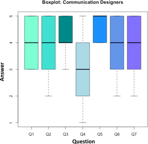
Table 2 The questions composing the questionnaire given to our communication design students in order to express their opinion regarding the statistical games.
We also proposed the four games to a class of 58 in environmental engineering. In this case, we collected 44 responses. Results highlighted a more positive attitude and a higher interest toward maths and statistics (Q1 average answer 2.04, standard deviation 0.88) and a more competitive nature (Q4 average answer 3.31, standard deviation 1.09). Also environmental engineering students appreciated the games’ control system (Q5 average answer 4.47, standard deviation 0.5) and found the activities useful to understand the corresponding statistical methods (Q2 average answer 3.68, standard deviation 1.25) and stimulate thinking (Q6 average answer 3.63, standard deviation 1.05).
2.1 Game 1: Point Blank—The Mean Game
2.1.1 Structure and Goal
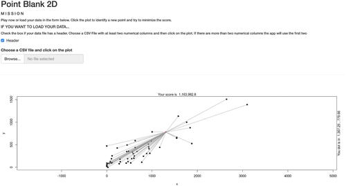
The first and simplest game is named “Point Blank.” It was used to explain the concept of mean and variance, using the general definition given by Maurice Fréchet. Given a set of points in a metric space, the Fréchet mean is the “best” 0-dimensional representation, meaning a single representative point or a central tendency for the cloud of points.
This mean can be easily visually interpreted in 2D or 3D space as the point m that is global “less far” from all the points in terms of Euclidean distance, and thus “more central.” Instead, the sum of the squared distances of all the points to the Fréchet mean is the Fréchet variance. These two informal definitions are the main elements of the experience.
There are two versions of the game. The first one, the easier one, is a two-dimensional version of the game. The second one presents the same experience in a 3D space. While the 2D version allows the users to upload their data, the 3D version is based on a default dataset composed by three variables. Also, being the only three-dimensional experience, it differs from the other games for its structure and control. In all the bi-dimensional games, dots (or lines) are identified by clicking on the scatterplot. This is not possible in a 3D setting where we had to introduce a control panel composed by sliders to choose the dot.
shows the 2D Point Blank game. As one can see, the movable dot (the Fréchet Mean) is connected to all the others with segments whose lengths represent the distance between the dot and the data points. Every time the user modifies the position of the movable point, the plot is completely updated in all its elements. The score displayed is the Fréchet variance and it is used for both the versions of the game.
Fig. 2 Point Blank 2D: the 2D version of Point Blank.
2.1.2 Class Activities
When we presented the game to communication design students, they were aware of the geometrical interpretation of the score but they had no clue about its statistical nature. Indeed, the definition of the mean given by Fréchet was not yet introduced to the class. For this reason, the students just had to play with the position of the movable dot to find the lowest score. Given the explorative nature of the activity, we suggest giving the class some time to play with it. At the end of the experience, after an initial conversation about the strategies used by the students, the instructors explained the statistical meaning of the game and the optimal way to solve it by calculating the algebraic mean of the columns of the data matrix: a procedure that is easily computable. After that, students were invited to play again knowing how to get the best score.
We proposed to the class to think about what would happen in terms of mean and variance if, for instance, the data points cloud is moved or expanded. The class reacted quite well to our provocative questions, showing to have understood the explanation of mean and variance as, respectively, a centrality and dispersion measure. Precisely, if the data cloud moves, the mean will move with it; if it expands, the variance, which is a measure of the dispersion of all the points, will increase. However, it is important to remark that the interpretation of variance as a dispersion measure is not completely correct. Using the standard deviation as a dispersion measure should be preferable. However, keeping the variance in the first game is helpful to understand the within-cluster variance introduced in the second game.
In conclusion, Point Blank can be presented to any class regardless of its level.
2.1.3 Alternative Materials
There are lots of similar statistics education materials freely available online and the majority of them are quizzes or interactive visualizations.
Usually, quizzes ask the student to compute the mean of univariate dataset (numbers). The data are usually automatically generated (e.g., https://www.mathgames.com/skill/6.91), but sometimes they are created after completing a simple game (e.g., https://www.abcya.com/games/mean_median_mode_range). In interactive visualizations, the user changes the dataset or the position of a defined point and sees how the mean changes (e.g., https://www.geogebra.org/m/wJmAFqjh). Typically, these activities also deal with the concepts of median, range, and mode. Only a minority of them take into account the concept of standard deviation or variance (e.g., https://www.geogebra.org/m/BxqJ4Vag). None of them, to the best of our knowledge, deals with nonunivariate data or allows one to load one’s own dataset.
Therefore, our activity differs from the others for gamifying interactive visualizations, dealing with bivariate data (and multivariate data in Point Blank 3D), and allowing the user to load their own data. In addition, Point Blank excels in geometrically representing the bond between mean and variance.
2.2 Game 2: Point Blank Revolution—The k-means Game
2.2.1 Structure and Goal
The second game can be considered an enhanced version of the previous game. Therefore, it is named after the improved version of Point Blank, “Point Blank Revolution.” This experience was used to introduce the unsupervised learning problem of clustering, a statistical data analysis technique aiming at finding clusters, that is, groups where data points are typically less distant to each other than points belonging to different clusters. There is no general explicit solution to perform clustering, so an algorithm is needed. We based our game on the k-means algorithm (see Johnson and Wichern Citation2015), a method that aims to partition n observations into k clusters, assigning each item to the cluster having the nearest centroid (mean). The method, thus, uses the concepts of distance, mean, and variance to define, respectively, cluster membership and cluster centroids. Then, it is natural to introduce this game after the first one. shows the interface of the game played by communication design students.
Fig. 3 Point Blank Revolution: the k-means Game.
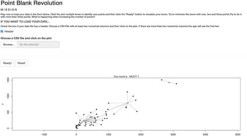
Let us remark that in the previous game the user had to identify one single point, the “optimal” 0-dimensional representation of data. Instead, this time the user has to find the “best” set of 0-dimensional representations, precisely one point (i.e., one mean, one centroid) for each of the k clusters. Therefore, every single click in the plot corresponds to a different cluster centroid whose position is summarized in the table below the plot. Each data point is connected to the closest user-defined cluster centroid with a segment whose length represents the distance between the two points.
The score used is the sum of k individual values, one for every cluster. Each value is the singular cluster variance. Therefore, the final score is the sum of k within variance, which is known as the “total within-cluster variance” in the clustering literature. To minimize the score, thus, one has to find the positions of the centroids that minimize the total within-cluster variance.
2.2.2 Class Activities
Being used as an introduction of clustering analysis, this game was presented before approaching the corresponding topic in more advanced applied statistics courses. The students were asked to play with the number of centroids trying to minimize the score. They were also invited to study how the score changes by adding more centroids. In this occasion, they started asking which was the optimal number of clusters, leading to a brief introduction of some methods to determine the k (e.g., silhouette method, elbow method, and gap statistics). Also, some students immediately understood that this game with one single centroid (k = 1) was the same as the previous one. Then, they used this idea to figure out what they were doing.
At the end of the experience, we explained the statistical meaning of the game. We also highlighted that, differently from the first game where we had one single theoretical solution, the solution is algorithmic and it is based on the definition of clusters used by the algorithm. Therefore, it is important to remark that different methods and strategies could lead to different solutions, according to the definition of clusters used. Instead, human eyes can impose flexible definitions of clusters. Also, with the k-means algorithm, the resulting clusters (and their centroids) depend on the chosen starting centroids. However, once that they are fixed, the solution is computed in a deterministic way. Therefore, it is suggested to repeat the method multiple times (changing the starting centroids) to get robust clusters.
Let us notice that the majority of the introductory-level classes do not include clustering in their programs, so the instructors should decide between skipping the activity or presenting it right after the first game. In the second case, Point Blank Revolution was introduced as the “Hard Mode” of the first activity because of the selection of multiple centroids (which leads to the identification of groups). In this way, students can understand the existence of the problem of grouping data and how hard it is. Because of the absence of clustering from the program, a possible solution using a clustering algorithm was not proposed but just hinted.
2.2.3 Alternative Materials
The number of applications and games about clustering is negligible. For instance, we were able to identify just one application on the GeoGebra platform. This activity (https://www.geogebra.org/m/bzzpBPTH), whose interface is in German, tries to represent step by step how the k-means algorithm works. In this way, the student can easily understand the iterative nature of the method and how it converges. So, it focuses on explaining one particular algorithm when the number of groups is already fixed to 2. As one can notice, the interaction is very limited and the aim of the app is completely different from ours. Besides, Point Blank Revolution focuses on manually grouping the data by defining one or more cluster centroids. This mission highlights the problem in the selection of the number of clusters. In addition, the geometric nature of the game helps the visualization of the within-cluster variance.
2.3 Game 3: Dimensions for Descent—The PCA Game
2.3.1 Structure and Goal
The third game was about dimensionality reduction and it is named “Dimensions for Descent”, after the unofficial add-on for the 1995 videogame “Descent.” Dimensionality reduction is the process of synthesizing the variables of a data matrix introducing a reduced number of new variables obtained by aggregation of the original ones. This procedure preserves the original distances between units by mapping the data points to a space of fewer dimensions. The main linear technique for dimensionality reduction is the one that we introduced in this game: the PCA (see Johnson and Wichern Citation2015). All the principal components are linear combinations of the original variables. The first principal component is the one having the largest possible variance. The others, instead, also have the highest possible variance but under the constraint of being orthogonal to the previous ones. Therefore, all the components create a new coordinate system (obtained by rotating the original system) and define the best approximating sub-space to synthesize data. They perform, thus, a “dimensional descent.”
shows the interface of the game played by communication design students. The user can draw a line by clicking two distinct points on the scatterplot. A third click will delete the previous line and start a new one. The mathematical formulation of the line is expressed below the plot. In the scatterplot, all the data points are projected on the user’s line generating new dots (projections). Data points and their projections are connected by segments whose lengths represent the projecting distances. Every time the user draws a new line, the plot is completely updated in all its elements.
Fig. 4 Dimensions for Descent: the PCA game.
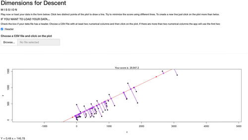
The score is computed as the sum of all the squared distances between the data points and their projections (i.e., the sum of all the squared lengths of the segments). Therefore, the goal of the game is to find the line minimizing the score.
2.3.2 Class Activities
This game was developed to introduce the students to the geometrical meaning and representation of the first principal component. Precisely, it displays the idea of projecting data to a new space, in this case, a line. The activity followed the same routine as the previous games: the students played the game, discussed the results and the strategies, and then submitted the score. At the end of the experience, the instructors revealed the statistical meaning of the score. Precisely, minimizing the score corresponds to minimize the mean squared approximation errors, that is, the Fréchet variance of the orthogonal residuals. Moreover, the Pythagorean Theorem can be used to further show that the score can be interpreted with the Fréchet variance of the original data, making a connection with the first game. Another important similarity with the mean and variance game is in the fact that both the activities have an analytic solution, presented to the class right after the experience. After the theoretical explanation, we asked our students to think to the same problem in a 3D environment, giving some intuitions and stressing out the obvious difficulty of dealing with three-dimensional visualizations and more than one principal component.
However, let us remark that dimensionality reduction is typically not taught in introductory-level classes. Therefore, if this is the case, given the conceptual difficulty of this topic, we suggest skipping the game. Also, being similar to the regression game, it could be confusing
2.3.3 Alternative Materials
Being a topic typically taught in advanced courses, we succeeded in finding only two alternative educational applications freely available online, both on GeoGebra and both in Portuguese. These two activities (https://www.geogebra.org/search/pca and https://www.geogebra.org/m/deSjYSEq) are interactive visualizations and they perform PCA to a given bivariate dataset which can be modified by dragging its data points around. Differently from our proposal, they compute and show the first two principal components, the projections, the corresponding eigenvalues, eigenvectors, and covariance matrix. So, here, the focus is on showing the results of PCA and not on the concept of mapping the data points to a space of fewer dimensions. Therefore, we suggest playing these two alternative games after the one we propose.
2.4 Game 4: Deadly Premonition—The Linear Regression Game
2.4.1 Structure and Goal
“Deadly Premonition,” named after the homonymous 2010 videogame, is our last game and it was created to introduce regression analysis. Regression analysis is the statistical methodology widely used to perform prediction of one (or more) response variable values from a collection of predictor variable values. Many are the techniques developed for carrying out regression analysis and, in our case, we decided to focus this experience on linear regression, which is the most intuitive and most taught one. In the case of simple linear regression, that is, when there is only one single response variable y and one single predictor variable x, the dependence between the two variables can be expressed by a linear model () that is represented by a line.
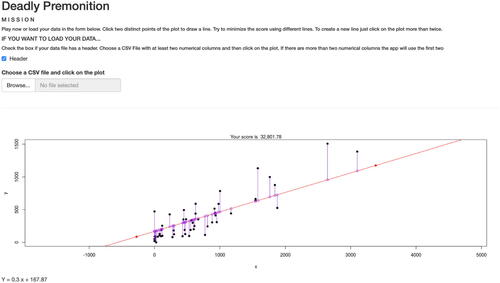
We presented to the communication design students a two dimensional game based on two social network variables collected in class. Similarly to “Dimensions for Descent” (2.3), the user can draw a line by clicking two distinct points on the scatterplot (). A third click will delete the previous line and start a new one. The mathematical formulation of the line is, as in the previous game, expressed below the plot. As one can see in the plot, all the data points are connected to the user-defined line by vertical segments. The sum of the squared lengths of those segments is the score to minimize. It is the sum of the squared residuals one has to minimize to find the best fitting line in the ordinary least-squared (OLS) approach.
Fig. 5 Deadly Premonition: the linear regression game.
2.4.2 Class Activities
As usual, this game was used as an introduction to linear regression. As in the previous game, the students were asked to minimize the score and submit their best scores. During the discussion, some students, playing this game right after “Dimensions for Descent”, noticed that the two games are almost identical. The main difference lies in the segments connecting data points to the line: they are vertical in this game, while in the PCA game they follow the distance from the point to the line. At the end of the experience, the instructors revealed the statistical meaning of the score. Therefore, we explained the OLS approach which describes the unexplained variance and the prediction error one is making with the regression. At this point, we suggest introducing the coefficient of determination R2 and other tools used to estimate the goodness of fit.
In conclusion, from our experience, this game can easily fit into the program of any class of statistics, in particular introductory ones and, thanks to its ease of use and its low number of rules, it can bring students closer to the world of regression analysis and prediction.
2.4.3 Alternative Materials
Linear regression is one of the most used statistical methodologies. For this reason, the Internet is full of alternative interactive applications. We can divide them into two groups: applications where the user interacts with the data and applications where the user interacts with the regression line.
For instance, the app available at https://www.geogebra.org/m/rJj6yr6C#material/GpzbtecN belongs to the first group. In this app, the user can generate data points and automatically find out the best fitting line for all of them or for a set of them. Instead, in another app (https://www.geogebra.org/m/PdMRxPAy), the user can drag around four different data points to see how the regression line, in particular the slope of it, changes.
The apps where the center of the interaction is the regression line belong to the second group. These applications are the most similar to our proposal. https://www.geogebra.org/m/xC6zq7Zv and https://www.geogebra.org/m/JsFmFEg6 are two examples. In these activities, the user has to find the best fitting line trying to minimize the sum of squared residuals. The plot shows residuals, squared residuals, or both. Two control points define the regression line. Usually, there is no possibility to load your data. The dataset is fixed or can be randomly generated multiple times. The solution, that is, the best fitting regression line, is already available. For all these reasons the two apps aforementioned could be used in class as valid alternatives even without supervision. The only drawbacks are the impossibility to load the user data. An even more complete alternative is the Rossman/Chance applet available at http://www.rossmanchance.com/applets/Reg/index.html. The app works only on browsers with Java support, a fact that could limit the usability, but it offers many features such as the R-squared, the correlation coefficient, and the ANOVA table. For this reason, it is the most complete interactive experience. However, the large number of features, the Web 1.0 design (Viswanathan, Mathur, and Pradeep Citation2019) and the quite complex control system could frighten a younger or inexperienced audience. Therefore, we suggest using the Rossman/Chance applet for more advanced courses.
Similar to the activities about linear regression, there are a lot of applications about correlation. We want to mention two of them that perfectly turn statistics in interesting gameplay: the “Guessing Correlation” game (http://www.rossmanchance.com/applets/GuessCorrelation.html) and the “Guess the Correlation” game (http://guessthecorrelation.com). The goal of both the activities is the same: to guess the correlation. However, while the “Guessing Correlation” game looks like an educational application, the “Guess the Correlation” game, thanks to its pixel art, scores, multiplayer mode, and an online ranked list, looks like a captivating videogame.
3 Technicalities and Preparation
The four games can be played using a default dataset or after loading your data. Only datasets in the comma-separated-values format and composed by at least two numerical variables/columns are allowed: if the number of numerical variables/columns is less than two the games will not work, while if it is more than two only the first two numerical variables/columns will be used. Students can load their data using the form in each game. If the instructor wants to provide a dataset instead of requiring students to load it, some changes in the source code are needed. Now the default dataset is the one collected the first time we proposed our activity in class.
3.1 Data Collection
During our experience, we let our students play with data generated and then loaded by them. As a consequence, it was necessary to collect those data. Data collection took place during the first hours of the class using one of the many digital survey services available online. Briefly, instructors provided students with a link to an anonymous survey. The survey was created to be long enough to be completed in a maximum of 3 min and we asked to fill it out during class. In our case, it counted three different questions about the use of social networks. shows the questions that we used and that might be used to repeat this activity.
Table 3 List of questions composing the survey used to collect the data.
We suggest to choose the questions in the view of DEI (Diversity, Equity, and Inclusion) according to the ones that are going to play the games. If the class is small, then the instructors could also let the students build their own survey. In the case of communication design students, they had already attended classes about social media communication and they were really into social networks. Also, it is suggested to ask questions with numerical answers, due to the numerical nature of the games. However, we want to remark that the instructors could skip the data collection procedure and let the students play with a preexisting dataset or the default one.
After the collection, data were shown to the class. It was useful to point out the many issues (such as missing values, misspelt words, or impossible values) they presented. It was the proper occasion to explain the necessity of data cleaning and preprocessing, two fundamental steps often neglected by newcomers. It was also the moment to introduce the data matrix, the basic element of our games. Students were then informed about the difference between rows and columns, in particular between observations (i.e., sample units) and features (i.e., random variables).
3.1.1 Ranked List
All four games present a ranked list where the students’ best scores are recorded. The list allows comparisons within the players and makes the experience a little bit more challenging. This feature can be added in the applications in many ways. In our case, we decided to connect the games with a digital survey where the students can insert their score. To do so, the instructor needs to modify the source code of the Shiny apps before presenting the activities to the students. An easier alternative (for the instructors, not for the student) is to collect the scores by giving the survey to the class without embedding it in the app. When the class is particular small it would be fun to compare the students’ scores live. At the end of the collection, a ranked list is generated and displayed in class before revealing the result.
3.1.2 Useful Concepts Before Playing
Once that everything is set, games are ready to be played by the students. Before doing that, however, we think it could be useful to spend some extra time to define some concepts behind the experience such as the Euclidean distance, an easy and natural distance. Every game is based on it because all the scores are just the sum of squared Euclidean distances. Then, it would sound natural to go through this concept in a bit more detail. To tame the general maths-phobia of the class, we had to associate the explanation of theoretical definitions and important theorems, like the Pythagorean one, with everyday life examples. Luckily, Euclidean distance is a natural concept and students can understand it without using formulas. Also, it is important to notice that, even if suggested, the theoretical review can be skipped if the knowledge of the class is sufficient. For instance, when presenting the games to more expert students (like environmental engineering ones) the review was skipped: students already knew the Euclidean distance. We also skipped it when the aim of the games was to highlight the importance of statistical methodology and make an introduction to data science.
4 Conclusion
In the age of data science, statistical skills are becoming mandatory for everyone who has to work with data such as, for instance, communication designers and data visualization experts. It is therefore important to rethink their curriculum adding statistics. We have described a set of four simple and attractive games useful to introduce our students, afraid of mathematical disciplines, to some applied statistics topics typically taught in advanced courses. All four experiences are meant to be played under the supervision of an instructor and they require very basic theoretical background (i.e., the notion of distance). They mix gameplay with interactive visualization and they are user-centric because they allow the users to load their own datasets. In the spirit of the old coin-op arcade games, the players have to minimize a score and they can decide to share their scores with the rest of the class. This idea makes the experience a real challenge where the student reaching the best (lowest) score within the class wins. In this way, even students with poor mathematical backgrounds may find this activity an interesting and fun way to study statistical tools and methods.
To make these four Shiny applications user-friendly, we put a considerable amount of time and effort into designing them. Now, thanks to their ease of use, they are suitable for a wide range of students and they can be proposed in courses of different level and background. Indeed, they could be helpful not only as a qualitative introduction to the selected topics (in the case of advanced courses) but also as a way to bring students closer to the world of data analysis and to highlight the importance of statistical methodologies and algorithms (in the case of school students).
The results from a student questionnaire give us confidence that the experience has benefited students. However, there is still room for improvement especially if we want to enlarge the user base, reaching also kids. To do so, we should focus more on storytelling and we should propose more endearing designs and captivating graphics. Even if courses for kids are more and more popular, especially in disciplines like computer science or computer programming, there are not many initiatives to introduce children to statistics in a fun way. A mixed team of statisticians, game designers, and computer programmers can fill this gap, creating new statistical videogames that could help to forge the next generation of young statisticians and data scientists. A generation is ready since their childhood to solve problems by thinking in a statistical and distance-based way, a skill that is fundamental for dealing with new kind of data as the ones proposed by the object-oriented data analysis (OODA) approach.
Acknowledgments
The authors gratefully acknowledge Paolo Ciuccarelli (DensityDesign Research Lab—Politecnico di Milano) and his Final Synthesis Design Studio class for making this first didactic experience possible.
Supplementary Material
R code: The R code of the four 2D games is available here: https://github.com/JacopoDior/htgaws The Mean Game 2D: The 2D version of the mean game is available at the following url: https://htgaws.shinyapps.io/pointblank2D/ The Mean Game 3D: The 3D version of the mean game is available at the following url: https://htgaws.shinyapps.io/game1bis/ The k-means Game: The k-means game is available at the following url: https://htgaws.shinyapps.io/pointblankrevolution/ The PCA Game: The PCA game is available at the following url: https://htgaws.shinyapps.io/descent/ The Linear Regression Game: The Linear Regression game is available at the following url: https://htgaws.shinyapps.io/premonition/ Data: The default dataset can be downloaded at the following url: https://drive.google.com/file/d/1W4jz64UnF2KktxaR8NVVPuiXAkJHoPXQ/view?usp=sharing Be careful! The survey buttons might not be working due to the expiration of the survey link.
References
- Chang, W., Cheng, J., Allaire, J. J., Xie, Y., and McPherson, J. (2015), “Shiny: Web Application Framework For R,” R package version 0.11, 1(4), 106.
- Deterding, S., Sicart, M., Nacke, L., O’Hara, K., and Dixon, D. (2011), “Gamification. Using Game-Design Elements in Non-Gaming Contexts,” in CHI’11 Extended Abstracts on Human Factors in Computing Systems, Vancouver, BC, Canada, pp. 2425–2428. DOI: https://doi.org/10.1145/1979742.1979575.
- Dinov, I., Pearl, D., and Siegrist, K. (2011), Distributome. Available at http://www.socr.ucla.edu/distributome/about.html
- Finzer, W., Konold, C., and Erickson, T. (2014), Data Games. Available at http://ccssgames.com
- Gal, I., and Ginsburg, L. (1994), “The Role of Beliefs and Attitudes in Learning Statistics: Towards an Assessment Framework,” Journal of Statistics Education, 2. DOI: https://doi.org/10.1080/10691898.1994.11910471.
- Garfield, J. (1995), “How Students Learn Statistics,” Revue Internationale de Statistique [International Statistical Review], 63, 25–34. DOI: https://doi.org/10.2307/1403775.
- Hohenwarter, M. (2001), GeoGebra. Available at https://www.geogebra.org.
- Johnson, R. A., and Wichern, D. (2015), “Applied Multivariate Statistical Analysis,” Statistics, 6215, 10.
- Kuiper, S. (2016), stat2Labs. Available at https://stat2labs.sites.grinnell.edu
- Kunin, D., Guo, J., Dae Devlin, T., and Xiang, D. (2017), Seeing Theory. Available at https://seeing-theory.brown.edu.
- Leman, S. C., and House, L. (2012), “Improving mr. miyagi’s Coaching Style: Teaching Data Analytics With Interactive Data Visualizations,” Chance, 25, 4–12. DOI: https://doi.org/10.1080/09332480.2012.685362.
- Pearl, D. (2021), CAUSEweb: Consortium for the Advancement of Undergraduate Statistics Education. Available at https://www.causeweb.org/cause/search/node/games.
- R: A Language and Environment for Statistical Computing (2013), R: A Language and Environment for Statistical Computing.
- Tukey, J. W. (1990), “Data-Based Graphics: Visual Display in the Decades to Come,” Statistical Science, 5, 327–339. DOI: https://doi.org/10.1214/ss/1177012101.
- Viswanathan, G., Mathur, P. D., and Pradeep, Y. (2019), From Web 1.0 to Web 2.0 and beyond: Reviewing Usability Heuristic Criteria Taking Music Sites as Case Studies.