
 ?Mathematical formulae have been encoded as MathML and are displayed in this HTML version using MathJax in order to improve their display. Uncheck the box to turn MathJax off. This feature requires Javascript. Click on a formula to zoom.
Abstract
As COVID-19 is an emerging pandemic, analysing its evolution is necessary to understand it in order to find appropriate answers. In this paper, we aim to observe and analyse it at the Chadian-Senegalese level. Thus, we collect public data in order to present via curves, histograms and tables the main characteristics of this pandemic. In this way, we implement a python program to construct these. We focus only on extracting long-term data without predictive models. We observed that there are mainly two waves (outbreak) per year with stable or even decreasing infection and death rates. We also identified moments of growth and relaxation of the disease. These results can be used to identify times when treatment or prevention should be intensified.
1. Introduction
The COVID-19 pandemic that swept through Africa in early 2020 left no country untouched. Being a new disease, each state has had to adopt a response strategy. The common point of these strategies is the daily communication of data via ministries in charge of health. Despite they are not organized in a standard way, we note among other things, the number of samples tested, positive cases, cured, deaths, vaccinated, imported, etc. The number of infected people, the rates of infection, recovery, etc. can be deduced from this. These data require appropriate analysis and observations over a period of years in order to understand the main characteristics of this pandemic: the number of waves per year, the peak and lull times, the basic reproduction rate etc.
One can quote the site of the ministries, in particular that of Senegal [Citation1] which has even undertaken the illustration of the spatial data. There are also interactive sites providing information on the global situation [Citation2–4]. In addition to well-illustrated baseline data, there is a lack of thorough analysis of the underlying data.
In contrast, Mathematical models have required little attention due to lack of knowledge around the disease. However, after more than two years of pandemic, several studies suggesting mathematical models appeared. Most of them are variants of the SEIR model [Citation5–10]. It is worth noting that these SEIR-type models are comparable to research conducted by A. Jajarmi and al. on outbreaks such as dengue fever or cholera [Citation11,Citation12]. Some of these approach uses fractional models [Citation13,Citation14], in this perspective, M. Aychluch and al. shows that the good way to limit virus transmission is by increasing test of population [Citation15]. Other authors, such as Zenebe and al. have used the optimal control approach to address this topic, they pointed out that in comparison to the absence of control cases, the suggested controls have a considerable impact on disease burden [Citation16,Citation17].
In short, these approaches have in common the forecasting of reported and active cases, some also estimate the basic reproduction rate . Although the quality of their mathematical results is well presented, there is little investigation into the validation of these models with real data.
To address the issues raised above, we propose to observe and analyse the cases of Chad and Senegal for at least two years [Citation18].
First, we designed a Python program containing the modules ‘matplotlib.pyplot’, ‘numpy’, ‘datetime’. The aim of this algorithm is to collect, store, and display graphs of variables and parameters of the pandemic [Citation19–21].
Our main contribution is the creation of graphics that depict basic and underlying data. As a result, the following conclusions have been reached: The Covid-19 pandemic is a seasonal disease with two waves per year, with peak periods in Senegal around February and August; the infection rate ranges between 4% and 8%, with a death rate of 2% to 3%.
2. Methods & materials
We collected data from health authorities' daily public reports and stored it in a database in ‘.csv’ format (the first and last lines of which are shown in Table ). After that, we analysed them to capture outbreak features. In Senegal, these cases derive from samples of people tested (see Table ): Infected, contact (who comes into contact with an infected), untraceable, imported, active (in medical treatment), recovered, severe, and deceased. The number of vaccinated is added one year later. For Chadian side, we have the same data as in Senegal except cases such as severe, untraceable or vaccinated are omitted. In addition, beginning in mid-October 2021, Chadian authorities will no longer report data on a daily basis. They switched to monthly and then weekly reporting. From there, we have chosen to present the monthly evolution of the situation by compiling weekly data.
Table 1. Representation of brute data from Senegalese case.
Table 2. Description of daily variables with colour coding used on figures.
Using these primary sources of data, we calculated the number of active cases per day, as well as the infection and cure rates. Table gives notations and formulas for these variables. In general, for representing some data (sample, infected, etc.), we denoted
it's cumulative value and for scaling purposes, we may normalize
in two manner : we called the first maximum normalization the value
; this gives time series varying between 0 and 1. The second named centered normalization, the value
where
,
denote mean and standard deviation of
for
.
Table 3. Description of variables shown on Figure .
Having these brute facts, we built a Python framework to analyse them. It contains graphical and mathematical methods like interpolation and distribution. Then, to smooth curves representing primary data, we made interpolation via the fast Fourier transform (the ‘fft’ method of the ‘numpy’ module). Thus, for given, we note
its Fourier transform but before taking its inverse, we calculated the power spectral density (PSD) according to the formula:
(1)
(1)
where
is the modulus and
is the average of modules taken as a reference module. The transform
was then filtered by keeping only indices whose PSD was greater than an amplitude δ threshold.
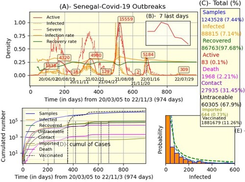
Figure 1. Senegal's global situation (A) The daily evolution of maximum normalized data: active, infected, etc. (C) Total number with proportions. (D) Cumulated number in Y-logarithmic base 10 scale. (E) Histogram of infected cases and power-law fitting (dashed-green).
In addition, to observe the dynamics of the pandemic by season, we grouped averages of data specific to each month. We also calculated the duration of each outbreak as well as their lengths, which are the areas of the equivalent curves (see Table ).
Table 4. The features of the Senegalese and Chadian outbreaks; lag time is the amount of time between waves.
3. Results & discussion
Figure displays the global scenario in Senegal. In part (A), we represented the instantaneous evolution of active cases' number (red), infected (dashed-orange), severe (dashed-red), infection, and recovery rate (orange and dashed-green) (see Table ). The x-axis represents time in days, with the initial time representing the beginning of the pandemic and the final time
representing the present day. The y-axis represents the number of people; it varies between 0 and 1 because of maximum normalization, but the preponderant numbers are explicitly marked (for example, 4324 is the first peak reached on 2020/08/19, which lasted 5 months and 2 weeks). Note that the evolution of active cases for the last 7 days is illustrated in part(B). After that,we pictured totals at time
with their respective percentages (part(C)); the proportion of infected cases is taken compared to samples, that of other cases compared to infected and that of samples and vaccinatedFootnote1 are compared to the population (estimated at 16,70 million people). We employed a logarithmic scale of base 10 and observed a logistic progression of samples (blue), infected (orange), recovered (green), untraceable (black), etc. The x−y axes are equally important as in part (A). The last part (E) represents the histogram of infected cases (orange). We used the function ‘hist’ of the Python library ‘maplotlib’ with 45 bins and the option ‘density=true '. As a result, we were able to calculate the probability density (dashed-blue curve). The dashed-green is the curve of power law
where
.
In parallel, the global situation in Chad is illustrated in Figure ; as in the Senegalese case, part (H) represents the instantaneous evolution of the number of active, infected, and infection-recovery rate. The x-axis represents time in days where the initial time corresponds to start of pandemic (14 days after the beginning of pandemic in Senegal) and the final time
. The population of Chad is estimated at 15.95 million people, the rest of the details are similar to those in Senegal's case except that data about severe, contact, untraceable, imported, and vaccinated cases are missing. We can see the totals and their proportions in part (K), the cumulative density in part (I), and the infected histogram in part (J), where the dashed-green is the power law curve
where
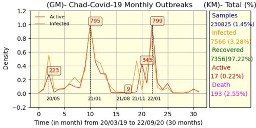
and k = −1.86. Since the Chadian authorities stopped reporting daily data in mid-October 2021, we decided to present the data on a monthly basis. Thus, Figure is the monthly equivalent of Figure .
Figure 2. Chadian global situation. Description as shown in Figure .
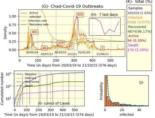
Figure 3. Tchad-Covid-19 monthly outbreak. Description as shown in Figure .
Although reading the data in Figures – shows us a global view of the pandemic, the curves representing them are not smooth. Therefore, the result of interpolation via the fast Fourier transform is shown in part (L) of Figure , where solid curves represent filtered densities and dotted curves are the original data; the values are the amplitude thresholds for active, susceptible, infected, and removed. Part (M) demonstrated the PSD of susceptible and infected individuals as a function of frequency; this is the foundation for calculating threshold amplitudes. Thus, we filtered the data to easily observe, for each outbreak, the evolution of removed versus infected, which shows the cyclical nature of the pandemic (part (N)). While the Fourier transformation can be used to smooth curves and refine analyses, it requires regular sampling, as is the case in Senegal, unlike Chad. This is why we could not do it for the latter.
Figure 4. Fourier analysis of the Senegalese case.
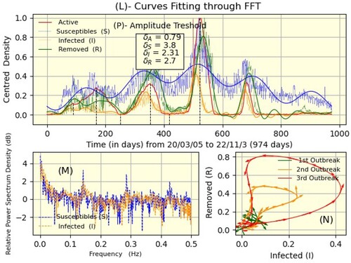
Figure 5. Chad-Senegal monthly mean case.
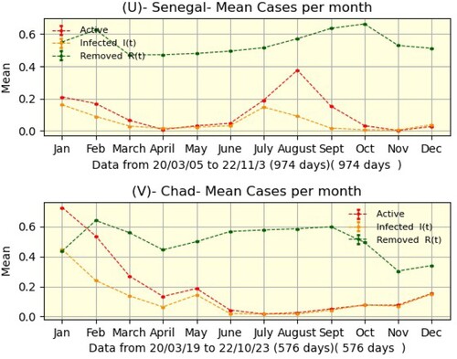
Nevertheless, by noting the natural regularity of active curves in the two countries, we found some characteristics of outbreaks: duration, size, peaks, and minima (Table ). Thus, Senegal has four waves that last an average of six months, whereas Chad has three waves that last an average of five months. The area of the active curve is the size of a wave, and its percentage is calculated from the overall area. Finally, we grouped by month the averages of active, infected, and removed cases. This allowed us to observe that in Senegal, July and December are the months when the epidemic is growing, whereas April and October are relaxation months. However, due to a lack of data from the Chadian side, we are unable to reach such a judgment.
The above-mentioned results show that the more data there are, the more precise the observation of the characteristics of the pandemic will be.
From this perspective, the contrast between the Chadian and the Senegalese cases lies in the sampling rate. To date, 7% of the Senegalese population has been tested, compared to less than 1% in Chad. Despite this, there is an apparent similarity between the cumulative data following a logistic distribution and the probability of daily infections following a power law. We also note the regression or even extinction of the pandemic since the beginning of 2022.This might be the outcome of barrier measures, a vaccination program, collective natural immunity, or other factors (Figures and ).
4. Conclusion
In essence, we present data on the COVID-19 pandemic in Senegal and Chad from its beginning to the present day (about 2 years). The major indication is the number of active persons (patients at time t); the evolution curve of this indicator demonstrates that there are two nearly equal-sized waves (outbreaks) every year. For Senegal, the average of peaks and minima is 7514 and 43, respectively, while in Chad, we have 457 and 19. In both countries, disease characteristics are similar; for example, infection and recovery rates are nearly constant, and the distribution of infected people is identical (approximating the power law). When we compare the amount of persons examined (1% in Chad against 7% in Senegal), we see a paucity of data on the Chadian side, which explains the difference in the regularity of the curves, the best of which are on the Senegalese side.
Because we only covered the issue through data collecting and graphical analysis, extra work may be done by modelling these processes. Existing models can be validated as well.
Disclosure statement
No potential conflict of interest was reported by the author(s).
Notes
1 Vaccination started at the beginning of March 2021; it's one year after the first case.
References
- Senegal Ministry of Health; [cited 2022 Mar 23]. Available from: https://www.sante.gouv.sn/actualites
- COVID-19 Dashboard by the CSSE at Johns Hopkins University (JHU); Available from: https://www.arcgis.com/apps/dashboards/bda7594740fd40299423467b48e9ecf6
- REUTERS COVID-19 TRACKER; Available from: https://graphics.reuters.com/world-coronavirus-tracker-and-maps
- Dong E, Du H, Gardner L. An interactive web-based dashboard to track COVID-19 in real time. Lancet Infect Dis. 2020;20(5):533–534.
- Akgül A, Ahmed N, Raza A, et al. New applications related to Covid-19. Results Phys. 2021;20: Article ID: 103663. Available from: https://www.sciencedirect.com/science/article/pii/S221137972032088X
- Okuonghae D, Omame A. Analysis of a mathematical model for COVID-19 population dynamics in Lagos, Nigeria. Chaos Solitons Fractals. 2020;139:Article ID: 110032. Available from: https://www.sciencedirect.com/science/article/pii/S0960077920304306
- Kuhl E. Data-driven modeling of COVID-19 – lessons learned. Extreme Mech Lett. 2020;40:100921. Available from: urlhttps://www.sciencedirect.com/science/article/pii/S2352431620301784
- Hurford A, Rahman P, Loredo-Osti JC. Modelling the impact of travel restrictions on COVID-19 cases in Newfoundland and Labrador. R Soc Open Sci. 2021;8(6):Article ID: 202266.
- Adiga A, Dubhashi D, Lewis B, et al. Mathematical models for Covid-19 pandemic: a comparative analysis. J Indian Inst Sci. 2020;100(4):793–807.
- Zeb A, Alzahrani E, Erturk VS, et al. Mathematical model for coronavirus disease 2019 (COVID-19) containing isolation class. BioMed research international. 2020; 2020.
- Jajarmi A, Arshad S, Baleanu D. A new fractional modelling and control strategy for the outbreak of dengue fever. Physica A Stat Mech Appl. 2019;535: Article ID: 122524. Available from: https://www.sciencedirect.com/science/article/pii/S0378437119314451
- Tian JP, Wang J. Global stability for cholera epidemic models. Math Biosci. 2011;232(1):31–41.
- Mohammadi H, Rezapour S, Jajarmi A. On the fractional SIRD mathematical model and control for the transmission of COVID-19: the first and the second waves of the disease in Iran and Japan. ISA Trans. 2022;124:103–114. Available from: https://www.sciencedirect.com/science/article/pii/S0019057821002093
- Baleanu D, Hassan Abadi M, Jajarmi A, et al. A new comparative study on the general fractional model of COVID-19 with isolation and quarantine effects. Alex Eng J. 2022;61(6):4779–4791. Available from: https://www.sciencedirect.com/science/article/pii/S111001682100702X
- Aychluh M, Purohit SD, Agarwal P, et al. Atangana–Baleanu derivative-based fractional model of COVID-19 dynamics in Ethiopia. Appl Math Sci Eng. 2022;30(1):635–660. doi:10.1080/27690911.2022.2121823
- Kifle ZS, Obsu LL. Optimal control analysis of a COVID-19 model. Appl Math Sci Eng. 2023;31(1): Article ID: 2173188. doi:10.1080/27690911.2023.2173188
- Zamir M, Abdeljawad T, Nadeem F, et al. An optimal control analysis of a COVID-19 model. Alex Eng J. 2021;60(3):2875–2884.
- Covid19 data used in this article. doi:10.17605/OSF.IO/CVNDT
- Matplotlib documentation; [cited 2022 Mar 23]. Available from: https://matplotlib.org/
- Numpy documentation; [cited 2022 Mar 23]. Available from: https://numpy.org/doc/
- Python documentation. Available from: https://docs.python.org/3/