
Abstract
Despite a plethora of behavioral research exploring the phenomenon of color categorical perception (CP) known as “better discrimination between pair of colors stimuli from different categories and pair of colors stimuli from the same category even when the stimulus differences between the pairs of stimuli are equal”, most of the evidence for the CP of color was derived from Roman or top-to-down script readers and very rarely from right-to-left script readers in primary category. To date, no studies of color CP have been conducted on right-to-left script readers in secondary category boundary to support this theory. Three experiments have been conducted: Experiments 1 and 2 established the Arabic blue–purple secondary category boundary, and Experiment 3 tested the CP of color in the blue–purple category boundary. Sixty participants (30 men and 30 women) took part in this study. All spoke Arabic as their first language, and all were undergraduate or postgraduate students at King Saud University. Their ages ranged from 18–35 years with a mean age of 21.9 years (SD =5.2). The result indicated that for Experiments 1 and 2, it appeared that the Arabic blue–purple category boundary was approximately 10PB and it is in the same location as for English. For Experiment 3, reaction times in the between-categories condition were significantly faster than those in the within-category condition; this suggested that CP of color was shown in the Arabic’s blue–purple secondary category boundary.
Introduction
Although all humans with normal trichromatic color vision have the same general physiological basis of color vision,Citation1 there is noticeable diversity among languages in the way they categorize the continuum of visible colors. Some languages are reported to use as few as two terms to describe all colorsCitation2; others use many more.Citation3,Citation4 Although a considerable amount of material has been written on this subject, relatively little has been written on color categorization in Arabic.
The logic of the experiments presented in this study, on color CP, requires that the differences between chosen pairs of colors are equal according to some metric. The metrics most commonly used in the literature are derived from either the Munsell systemCitation5 or Commission Internationale de l’Eclairage (International Commission on Illumination) (CIE)Citation6 systems (Supplementary materials). Both aim to represent colors in “perceptually uniform” color space. That is, distances within each spatial coordinate system are intended to represent “perceptual distance”: the perceived dissimilarity between colors. The greater the spatial separation between two colors is, the greater the perceived dissimilarity between the two colors should be.
The universal color category hypothesis that all languages draw their basic color terms from a universal inventory of just eleven color categories was examined in a series of experiments on Arabic language speakers.Citation7–Citation9 It was found that Arabic speakers have eleven basic color categories, like English, that correspond to Berlin and Kay’sCitation10 universal categories. More importantly, as Arabic proved to have eleven basic categories, a further study of color CP in Arabic speakers has been investigated in the blue–purple primary category boundary to shed light on the role of language in CP.Citation11
Current study examines a color category effect (categorical perception [CP] of color) whereby the category of colors appears to affect color discrimination. Previous research has found color category effect in the Arabic blue–purple primary category boundary.Citation11 Here, the author investigates this color category effect, by considering whether it will be shown in a secondary color region such as blue–purple region. This was the prime reason for the current study.
Historical and conceptual framework
The origin and nature of color and our perception of color have intrigued philosophers and scientists, from at least the time of Aristotle (~350 BC). Although the ontology of color continues to be debated by philosophers,Citation12 there is a consensus among scientists that color perception derives from an interaction between the physical properties of light (wavelength and intensity) and the way our visual system responds to the physical stimulus. Although this statement might seem tautological, it has an important implication, recognized by two great physicists, that color is, in part, a matter of psychology. “For the Rays to speak properly are not coloured. In them there is nothing else but a certain Power and Disposition to stir up a Sensation of this or that Colour.”Citation13 And, similarly, “Now if the sensation which we call colour has any laws, it must be something in our own nature which determines the form of these laws.”Citation14 This recognition of the roles of the visual system led directly to posing the general questions mentioned above. What might be the role of the visual system in influencing color language? If there were such influences, were they the same for everybody – Universalism – or might individual visual systems differ leading to differences in color language – Relativism? Moreover, if visual systems differed, did the differences arise from experience – Nurture – or were they inherited – Nature?
Color language
GladstoneCitation15 was probably the first to draw attention to how languages differed in the ways they named colors. He noted that the way Homer described colors differed markedly from the way Victorian English described color. Moreover, he attributed this difference to differences in color perception: “that the organ of colour and its impressions were but partially developed among the Greeks of the heroic age” (pp 457–499). Meanwhile, GeigerCitation16 extended Gladstone’s survey of ancient literature and concurred with Gladstone that the ancients used fewer color terms than found in English, which he too attributed to differences in color vision. He suggested that color term systems “evolved” systematically acquiring new terms reflecting the parallel evolution of color vision.
RiversCitation17 seemed to have found the first empirical evidence linking differences in color language to differences in color vision. On finding that the languages of the Torres Straits had fewer color terms than English, and that they did not distinguish blue from purple, he attributed these differences to differences in color vision.
Of course, it should be noted straight away that in all three cases above, what had been observed was an association between (presumed) color vision and color language; even granted the validity of the observation, the attribution of “perception-causing language” does not necessarily follow. Language could change color perception, consistent with the yet-to-be formalized Linguistic Relativity Hypothesis (LRH).Citation18
Even as early as 1877, Magnus,Citation19 using recently collected data, confirmed that languages differed in the way Geiger had noted but failed to find the corresponding differences in color vision. In the early days of the development of scientific psychology, Woodworth,Citation20 while criticizing Rivers, offered an explanation of Magnus’s data: differences between languages reflected differences in cultural needs – the Utilitarian Hypothesis. This hypothesis came to dominate American Linguistics and Anthropology for the next 60 years. For example, Ray’s views were typical: “Each culture has taken the spectral continuum and divided it into units on a quite arbitrary basis.”Citation21
Many of the issues summarized above are still debated today. Berlin and KayCitation10 offered an updated version of the Geiger/Magnus evolutionary hypothesis, and subsequently argued that the evolutionary path was constrained by universal visual physiology.Citation22 Although a considerable amount of data supports their position, both the data and the interpretation are disputed.Citation23,Citation24
Color language and color perception
As mentioned above, as early as the late 19th century, Gladstone, Geiger, and subsequently, Rivers all assumed that differences in color language reflected differences in color perception. This was consistent with the commonsense view that language was determined by thought, where thought in its widest sense included perception. Language was taken to be the “servant” of thinking being “merely” a way of expressing thoughts. This view was turned on its head most prominently by WhorfCitation18 who argued that rather than being a passive way of expressing thoughts, language determined (heavily constrained) thought: “We dissect nature along lines laid down by our language.”
This LRH was first introduced to experimental psychologists by Brown and Lenneberg.Citation25 They investigated the relationship between recognition memory for colors and the “codability” or ease of naming of the colors. They found that the easier it was to describe a color to someone else so that they could recognize the color among distractors, the easier it was to remember (recognize) the color among distractors. They argued that this showed language influencing memory, an aspect of thought. This implies that if people differed in their color language, so should their memory for particular colors.
Heider, in a series of classic studies,Citation2,Citation26 tested this implication by comparing the Dani of Iranjia whose language had only two color terms, with English-speaking Americans. In one task, he compared recognition memory for good examples (foci) of English chromatic terms, with memory for less prominent examples. As for English speakers, names for foci were more salient than names for less good examples; following Brown and Lenneberg, memory for focals should be better than for nonfocals. And, indeed, this was the result. If this pattern results from language influencing memory, then it should not be found for the Dani, who had no distinctive names for the colors. However, the Dani showed the same pattern as the English speakers. RoschCitation27 attributed the results to the greater perceptual salience of the focals than of the nonfocals, and she attributed this to the way the visual system processed color, and she assumed that this was in common to all people.
Curiously, for a study just comparing two languages, and just investigating one domain (color), Rosch’s results were taken as showing that color perception was universal, and that language did not influence perception. Despite this small empirical base, the Zeitgeist shifted from the presumption of Relativity to the presumption of Universalism, and there was very little further empirical work until interest in the issue was rekindled by, among others, Davies and CorbettCitation28 and Roberson et al.Citation24 This new wave of interest was centered on the phenomenon of CP – better discrimination between colors from different categories than colors from the same category.Citation29 As colors from different categories also have different names, the question arose of whether CP was due to the use of language in some way, and if it were, this would be evidence for the LRH.
Physiology of color vision
Color vision is usually defined as the ability to discriminate stimuli of equal brightness that differ in their spectral composition. In humans, this ability is associated with our experience of color, although there appears to be no necessary connection between the two. The causal chain leading to perceptual experience starts with the nature of light, continues with the interaction between surfaces in the world and light, then the formation of the retinal image, followed by recovery of information about the relative spectral distribution of light at each point on the retina. A great deal is now known about this casual chain involving physics, molecular biology, genetics, and neurology leading Mollon to claim that color perception is the first case of understanding the pathway from physics through to conscious experienceCitation30 (see Ref Citation30 for reviews). The aim here, however, is to provide the basis for understanding Kay and McDaniel’s appeal to perceptual physiology to explain the origin and nature of CP of color. In this case, what is needed is an explanation of the “cardinal directions of color space”,Citation33 and this is given below.
Sunlight, and most artificial substitutes, is composed of a mixture of different wavelengths including those in the range of approximately 400–700 nm, in approximately equal amounts. We experience such spectral mixtures as white or gray (achromatic). However, surfaces in the world change this equal-energy composition. The chemical structure of the surface material selectively absorbs some wavelengths and reflects the remainder. For instance, a surface appears red if it reflects long wavelengths more strongly than shorter wavelengths. The structure of light incident on an eye in the world “preserves” its history of reflections. The optics of the eye preserves the spatial history of its trajectory: light reflected from adjacent points on a surface falls on adjacent points on the retina of the eye, hence forming an “image” of the world. Thus, the boundary between two objects (an edge) also forms a boundary in the image. If the spectral composition of the light reflected from either side of the edge differs, then if the visual system could detect differences in wavelength, it would have the potential to detect the edge. Thus, sensitivity to wavelength has the potential to allow recovery of the layout of objects in the world.
The visual system has evolved to exploit the properties of visual stimulation described above. The key first stage is that the retina contains four different kinds of light-sensitive receptors, the rods and three kinds of cones. Each kind of receptor, although sensitive to a broad range of wavelengths, responds more strongly to some wavelengths than others. Moreover, the distribution of spectral sensitivities varies across types of receptors, due to differences in the “photopiment” – the light-sensitive chemical – they contain. As the rods are only operative at low illumination levels, in normal daylight, the primary information for vision is carried by the relative signal strengths of the three kinds of cone. The cones are usually designated as long (L), medium (M), and short (S) reflecting their relative peak sensitivities (560 nm, 530 nm, and 420 nm).Citation31,Citation32
The trichromatic stage at the receptor level is transformed into three opponent channels in the ganglion cells of the retina. Different combinations of the L and M cones are involved in each channel, but the S cone is primarily involved in just one channel. The luminance channel signals in proportion to the sum of the L and M cones (L+M). The other two channels carry potential information about relative wavelength. One encodes the difference between L and M signal strengths (L–M), while the other signals the difference between the sum of L and M, and the S cone signal strength ([L–M]–S). As well as the functional separation of these channels, they are also anatomically separate, being carried by distinct kinds of ganglion cells, and the three pathways (magno, parvo, and konio) following different pathways from retina to lateral geniculate nucleous (LGN), to V1.
When opponent process neurons were first discovered in monkey LGN,Citation34 it was thought that they were the neurological substrate of Hering’s conjectured opponent primaries.Citation35 Hering suggested that there were four “unique hues”, red, purple, yellow, and blue, and that all other colors appeared to be mixtures of these primary experiences. Orange, for instance, was a blend of red and yellow, and purple was a blend of red and blue. Moreover, while we could experience blends such as these, there were other “impossible blends”. These were red–purple and blue–yellow, and Hering thought that his four primaries were organized into these mutually antagonistic pairs. De Valois and Jacobs originally thought that the peak activity of their newly discovered opponent process neurons was red or purple and blue or yellow, but it later became clear that their primary axes were more like magenta–chartreuse and orange–turquoise.Citation34 Nevertheless, the activity of these opponent process neurons has been taken to signal the cardinal directions of color space, and to underlie color perception.
Color-order systems
The logic of the experiments presented in this study, on color CP, requires that the differences between chosen pairs of colors are equal according to some metric. The metrics most commonly used in the literature are derived from either the Munsell system or the CIE systems (Supplementary materials). Both aim to represent colors in “perceptually uniform” color space. That is, distances within each spatial coordinate system are intended to represent “perceptual distance”: the perceived dissimilarity between colors. The greater the spatial separation between two colors is, the greater the perceived dissimilarity between the two colors should be.
Although both systems attempt to represent perceptual distance, they were derived by quite different methods. The Munsell system was empirically derived, and in its current form, is based on 40 observers making similarity/difference judgments between many color pairs; the total number of judgments runs into the tens of millions.Citation5 In contrast, the CIE system is modeled on the relative spectral sensitivities of the three types of cone (L, M, and S; “Aim of the study”) in the “standard CIE observer”. The CIE coordinate system is thus three dimensional, based on three “primaries”, but for reasons of convenience, the cone primaries have been transformed into the CIE primaries X, Y, and Z. One advantage of using these primaries is that all perceivable colors can be represented in a simple chromaticity diagram whose axes are x and y, where x=X/(X+Y+Z) and y=(Y/(X+Y+Z). As x and y are proportional values, by implication, there is a third coordinate, z (z=Z/(X+Y+Z), which is not explicitly represented in the diagram. For present purposes, the key point is that a further transformation from x and y to u′ and v′ results in a diagram where to a first approximation, distance in the diagram represents perceptual distance. Moreover, a further transformation to L*u*v* yields a color “space” where Euclidean distance (∆E) provides a quantitative measure of perceptual distance.
Both Munsell and Commission Internationale de l’Eclairage (CIELUV) try to provide a measure of perceptual distance on at least an interval scale, and if they have succeeded, the two distance measures should correspond. The two measures agree to a good first approximation, but the correspondence is not perfect.
The current study
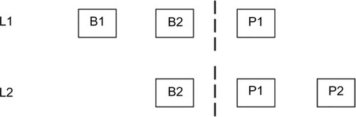
The color spectrum is a physical continuum, but it is perceived discontinuously, as discrete categories or segments of hues.Citation37 This is part of an effect called CP. CP is found when a continuum is divided into categories, and when these categories appear to affect discrimination. In operational terms, CP can be defined by faster and/or more accurate discrimination of pair of stimuli that cross a category boundary (across category), than two stimuli from the same category (within category), even when the stimulus differences between the pairs of stimuli are equal. This definition of CP will be used throughout, and is illustrated in the classic form shown in .
Figure 1 Diagram representing categorical perception.
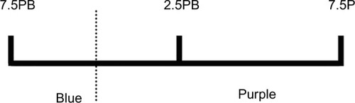
shows three stimuli designated as 7.5PB, 2.5PB, and 7.5PB. One stimulus (7.5PB) belongs to the linguistic category blue, and two (2.5P, 7.5P) belong to the linguistic category purple, with the category boundary between 7.5PB and 2.5P. The separation between the stimuli is equal. Discrimination of the cross-category stimulus pair (7.5PB, 2.5P) is faster and/or more accurate than discrimination of the within-category stimuli (2.5P, 7.5P).
CP has been reported on a wide range of color perception tasks. For example, recognition memory and X-AB tasks,Citation24,Citation38–Citation41 same–different tasks,Citation29,Citation42 similarity judgments,Citation39,Citation43 and target detection and visual search tasks.Citation44–Citation46 In the 2-X-AB task, a target stimulus (eg, blue1) is presented followed by two test stimuli; one of the test stimuli is identical to the target, and the other one (the foil) is different. The foil can be either from same category as the target (eg, blue2) or from a different category (eg, green1). The task is to decide as fast as possible which of the test stimuli is identical to the target. The results showed that target identification was faster and/or more accurate for different category than same-category foils. In the search task, a target stimulus is presented among other stimuli (distractors); the distractors can either be from the same category as the target (eg, blue1 among blue2s) or from a different category to the target (blue1 among purple1s). The task is to detect the location of the target as fast as possible. Detection of a target that is from a different category to the distractors is faster and/or more accurate than detection of a target from the same category as the distractors.
Although CP has been reported in a wide range of studies, it is not clear what the origin and nature of this effect are. The degree to which language and perception contribute to the category effect has been extensively debated. To investigate the contribution of language to CP, recent studies have considered how the effect is lateralized.Citation47–Citation49 And, they reasoned that, as the left hemisphere (LH) is dominant for most language functions, if color CP is related to language, it should be stronger in the LH. To test this, Gilbert et alCitation47 used a visual search task where targets were lateralized to the left or right visual field (RVF). Stimuli were shown in a display of 12 colored squares in a clock shape; eleven of the squares (the distractors) were identical in color, and one (the target) was different. The relationship between the distractors and the target stimulus was manipulated, so targets and distractors were either from the same color category or from a different color category. While looking at a central fixation cross, participants had to decide whether the target was to the left or to the right of fixation. They found that response times (RTs) were faster when target and distractors were different categorically than when target and distractors were just perceptually different. However, this category effect was found larger when the target was presented to the RVF. They argued that this pattern of lateralization was consistent with CP being due to the implicit use of language.
The LH bias in color CP has been related to the linguistic nature of the LH, and converging evidence to support this hypothesis has been reported on a wide range of color perception tasks and methods, for example, functional magnetic resonance imaging,Citation50 the event-related potential technique,Citation51 and grid search task.Citation52 It is also possible that other factors contribute the LH bias in category effect in adults as the influence of reading habits to perception has been shown in several studies.Citation53–Citation58
Although it is not entirely clear how to predict the effect of habitual reading direction on CP of color, the author decided that it was worth exploring to test the generality of categorical effects of color across cultures and reading directions. Han and NorthoffCitation59 describe several instances of cultural differences being associated with differing neural organizations, and argue that in general, it is a good practice to test the generality of findings across a range of cultures. Their exhortation is consonant with the motivation behind this study, which is to test that patterns of CP of color are generalizing across cultures and reading directions.
Aim of the study
Despite a plethora of behavioral research exploring the origin and nature of color CP, most of the evidence for the CP of color was derived from Roman script readers in primary and secondary boundaries and as, to date, no studies of color CP have been conducted on Arabic in secondary boundary (blue–purple) to support of this theory. The main aim of this study is to investigate whether the color CP can be shown in participants whose reading direction is from right to left as in Arabic in (blue–purple) secondary color category boundary.
A preliminary study by Al-rasheedCitation11 established the location of the azrock “blue”–akhdar “green” boundary in Arabic. As the boundary was at more or less the same location as in English (7.5BG), then CP of color was tested in a visual search task, and a target detection task for the azrock “blue”–akhdar “green” boundary. However, there have been no studies that have established the Arabic blue–purple secondary category boundary. The other goal of this study is to identify the Arabic blue–purple category boundary. The purposes of this research and the procedures that were undertaken were explained to the participants. All participants’ questions were fully answered. All participants understood the explanations and gave informed consent. This study was ethically approved by the review board.
Experiment 1: lightness and saturation for the blue–purple category boundary
Introduction
The overall aim of this study was to establish the Arabic blue–purple category boundary. Experiment 1 determined the saturation and lightness levels in which stimuli were named purple and blue with high agreement. Experiment 2 then estimated where the boundary was using hues at the value (V)/chroma (C) combination found in Experiment 1.
Method
Participants
Twenty participants, ten male and ten female, took part in the value and chroma task. They spoke Arabic as their first language, and all were students at King Saud University. Based on self-reports, all were right-handed and had normal color vision, as indicated by the City University Test.Citation60 Their ages ranged from 18 years to 25 years with a mean age of 21.05 years (SD =2.79).
Stimuli
Thirty-six stimuli were used made up from the combination of six hues (2.5PB, 5PB, 7.5PB, 10PB, 2.5P, and 5P) () at each of six combinations of value and chroma (4/10, 5/10, 6/10, 5/9, 6/8, and 7/10). Each hue set was presented as six circular stimuli (diameter =5.5 cm; visual angle =6.5°) equally spaced on the circumference of an imaginary circle around a fixation cross in the center of the screen, on a neutral gray background (). The CIECitation6 Y, x, and y chromaticity coordinates of the gray point of the monitor were 19.47 cd/m2, 0.336 cd/m2, and 0.344 cd/m2, respectively.
Figure 2 Munsell codes of the stimuli used in Experiment 1.

Figure 3 Example of the hue selection task.
Equipment
Stimuli were displayed on a 17-inch calibrated CRT Sony Trinitron monitor (model GDM-F520). Color readings were made using a Cambridge Research Systems ColorCAL colorimeter (Rochester, UK). An example of the task is given in .
Procedure
The experiment was conducted in a dark room. On each trial, one hue set was presented and remained on the screen until a response was made. Participants viewed the display at a distance of 60 cm. They were told that on each trial, the display would consist of six colored stimuli in a clock shape against a gray background. Their task was to decide which one of these five stimuli was the best example of either purple or blue. Responses were made verbally and recorded by the experimenter.
Results and discussion
The percentage of participants selecting each color as the best example, for each hue, is shown in .
Table 1 The percentage of times that each stimulus was chosen as the best example of either blue or purple Arabic terms
As can be seen, 5/10 was the most frequently selected “best example” for the four hues 5PB, 7.5PB, 10PB, and 2.5P with a score of approximately 80% and for the last hue 5P with a score of 70%. However, stimulus 4/10 was the best example for 2.5PB with a score of 80%, and stimulus 6/10 was the second most frequently chosen for the hues 5PB, 7.5PB, 10PB, 2.5P, and 5P.
In summary, Experiment 1 was designed to identify the value and chroma for which the hues are defined as blue or purple in Arabic. Arabic participants showed that 5/10 had high percentage agreement for hues 5PB, 7.5PB, 10P, and 2.5PB in the blue–purple category and 4/10 value and chroma was the highest agreement only for 2.5PB.
Experiment 2: color naming for the blue–purple region
Introduction
Experiment 1 showed that stimuli were the best example at value 5 and chroma 10 for the six hues tested. The aim of the current experiment was to identify location of the hue boundary for the Arabic blue–purple category boundary before conducting research on the blue–purple color CP in Arabic in the next experiment.
Method
Participants
Thirty participants took part in the naming task, half male and half female. Their ages ranged from 19 years to 35 years with a mean age of 22.6 years (SD =4), and all were undergraduate and postgraduate students at King Saud University. Based on self-reports, all were right-handed and had normal color vision, as indicated by the City University Test.Citation60
Equipment and stimuli
There were six stimuli used in this experiment 2.5PB, 5PB, 7.5PB, 10PB, 2.5P, and 5P. These stimuli varied only in Munsell hue with value and chroma kept constant on 5/10. Their CIELUV coordinates (u*,v*) were as follows: −31.21, 63.17; −23.87, −64.34; −11.32, −63.63; −0.18, −61,09; 9.49, −56.44; and 18.04, −50.89; L*=51.58. The stimuli were displayed on the same monitor that was used in Experiment 1 and were measured with the ColorCAL colorimeter used in the previous experiment.
Procedure
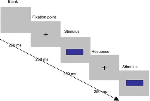
A rectangular shape (120 mm ×60 mm) on a gray background (40 cm ×30 cm) was presented on a monitor in a darkened room at a viewing distance of 60 cm. Stimuli were viewed one at a time, in a random order, remaining on display until a naming response was made. Responses were made using a computer keyboard. There were five repetitions of each stimulus, and the 30 trials were in a random order. The task was to label the stimuli as banafsagee “purple”, azrock “blue” or azrock–banafsagee “blue–purple” if the participant could not decide whether the stimulus was purple or blue. The term azrock–banafsagee “blue–purple” was described to the participants as a color which mixed half blue and half purple (50% purple and 50% blue). An example of the task is shown in .
Figure 4 Example of the color naming task.
Results and discussion
The agreement curve for blue–purple color naming for Arabic speakers is shown in . Participants used three terms to name the six stimuli. The graph represents the percentage of blue, purple, and blue–purple responses to each of the five stimuli in the continuum.
Figure 5 Percentage naming frequencies across observers for the six hues. Note: 1: “2.5PB”, 2: “5PB”, 3: “7.5PB”, 4: “10PB”, 5: “2.5P”, and 6: “5P”.
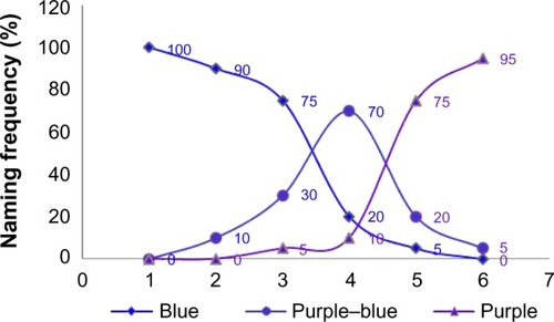
As can be seen, for the azrock “blue” term, the agreement curve peaks on a hue value of 2.5PB with 100% of the sample and gradually fell toward the purple region. Three stimuli out of six in the continuum were named azrock “blue” by over 75% of the sample (2.5PB, 5PB, and 7.5PB). In contrast, the agreement curve for the banafsagee “purple” term shifted toward a hue value of 5P with 95% of the sample and gradually fell toward the azrock “blue” region reaching the lowest point at 7.5PB with 5% of the sample. Two stimuli out of six in the continuum were named banafsagee “purple” by over 75% of the sample. It can be seen that the level of consensus for the azrock–banafsagee “blue–purple” term was highest only for the stimulus 10PB when it was offered by at least 70% of the sample.
Based on these results, it appears that the Arabic azrock–banafsagee “blue–purple” category boundary was approximately 10PB with the most frequent responses to the two stimuli to the left being azrock “blue” and for the two to the right of the boundary being banafsagee “purple”. It appears that the Arabic blue–purple category boundary is in the same location as for English.Citation61
Experiment 3: CP of color in the blue–purple category boundary
Introduction
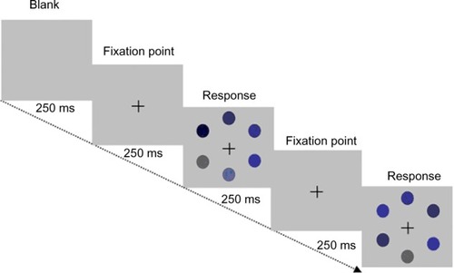
Previous studies investigated the color CP in Arabic blue–purple region,Citation11 and the results showed that discrimination of pairs of color from different lexical categories (blue and purple) was faster than pairs from the same lexical category (different shades of blue or purple), even though the separation of within- and between-category pairs was equal. In addition and for the same purposes, Al-rasheed et alCitation52 showed that CP of color was independent of habitual reading direction. Most tests of CP of color have used one or other of these tasks: X-AB tasks,Citation24,Citation38–Citation41 same–different tasks,Citation29,Citation42 similarity judgments,Citation39,Citation43 and target detection and visual search tasks.Citation44–Citation46 In the next experiment (Experiment 3), the grid search task was used to test the CP of color, and whether it will be shown in the blue–purple secondary category boundary.
Method
Participants
Twenty native Arabic-speaking undergraduates from the University of King Saud participated in this experiment. There were ten males, with a mean age of 21.0 years (SD =3.09), and ten females, with a mean age of 21.1 years (SD =2.60). Their ages ranged from 18 years to 25 years. Based on self-report, all were right-handed and had normal color vision as indicated by the City University Test.Citation60 Most of the participants participated for course credit, and a few volunteered.
Stimuli and apparatus
As shown in , three color stimuli were used in this experiment; two blues (2.5PB and 7.5PB) and one purple (2.5P); value and chroma were kept constant (5/10). The separation between adjacent stimuli was five Munsell hue steps (AE ~15). Their CIELUV coordinates (u*,v*) were as follows: −31.21, 63.17; −11.32, −63.63; and 9.49, −56.44; L*=51.58; a Cambridge Research Systems ColorCAL colorimeter was used to measure the CIE co-coordinates, and they were displayed on a 17-inch CRT model GDM-F520.
Figure 6 Illustration of the four stimuli used.
Procedure
Adjacent stimuli were paired, to form one within-category pair (blue1–blue2) and one between-category pair (blue1–purple1). For each pair, one stimulus was the target, and the other stimulus was used for the distractors, with both stimuli in a pair appearing equally often as distractors. The target for all trials was always blue, and the distractors were randomly switched between “within” (blue) and “across” (purple). There were equal numbers of trials for each combination of within category or between category, and the order of trials was randomized across these two categories. In addition, target location was randomized across trials with the constraint that the target appeared equally often to the left, right, top, and bottom of fixation. Stimuli were shown as 2.5 cm squares with 5 mm gaps between adjacent locations, appearing in locations specified by a 3×3 square grid on the display (). The target appeared among eight distractors on a gray background (19.47 cd/m2, 0.336 cd/m2, 0.344 cd/m2). The distractors plus the target stimulus locations within the grid were randomly selected.
Figure 7 Example of the grid task.
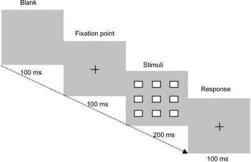
The experiment began with a fixation cross which remained for 100 ms to alert the participants that the trial was beginning. Then, the test display followed and remained on screen for 200 ms. The next trial began when the participants had responded. There were 180 trials, 90 for each category (within and cross) and 20 trials for each position. Participants were given 12 practice trials before starting the experiment, and they took approximately 10 minutes to complete the task.
The participants were tested individually in a dark room and sat with their head position constrained by a chin-rest, so that eye level was at the center of the monitor, with a viewing distance of 60 cm. Participants were informed that they would be presented with a target stimulus among a varied number of distractors and their task was to decide whether they detect the target which will be in a different hue than the distractors. Responses were made by clicking the mouse button as soon as they see the target.
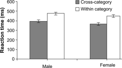
The percentage of incorrect trials was calculated for each subject, for each combination of sex (male/female) and category (cross/within). A two-way repeated measures analysis of variance on the error rates showed that the only significant effect was for category sex (F<1). Cross-category error rates (mean =2.38%, SD =3.21) were approximately 1% lower than within-category responses (mean =3.92, SD =4.84), F(1,9)=0.27, MSE =30.55, P<0.05.
Median RTs for each subject were calculated for each combination of sex and category for correct trials. Although female participants (mean =406 ms, SD =54) responded ~31 ms faster than male participants (mean =437, SD =65), this difference was not significant (F(1,9)=4.93, MSE =9954.0, P=0.58). For the category factor, there was a significant effect; cross-category responses (mean =380.8, SD =38.1) were approximately 82 ms faster than within-category responses (mean =462.8, SD =52.1; F(1,9)=46.9, MSE =67240.0, P<0.001). The sex-by-category interaction was also not significant, F(1,9)=0.005, MSE =5.62, P<0.94. From , the no interaction appears to be due to the larger category effect for cross vs within only but not for the sex male vs female. This impression was supported by paired samples t-tests (two-tailed) used to investigate the category for each sex. There was a significant category effect for the male (t(9)=4.59, P<0.001), and also for the female (t(9)=6.05, P=0.001).
Figure 8 Mean response times (±SE) with SE bars for correct trials for male and female participants for identification of the within/cross-category of chromatic target among distractors.
Discussion
For both male and female Arabic participants, discrimination of pairs of colors from different lexical categories (blue and purple) was faster than pairs from the same lexical categories (different shades of blue or purple). Yet again, the pattern of color categorization has been replicated, but this time, the category effect from right-to-left script readers in a secondary color category boundary has also been shown. All of the research on color CP before this study was conducted with Roman script or top-to-bottom scripts. But in this experiment, using participants of right-to-left scripts, such as Arabic, the author show essentially the same pattern as the color CP. Thus, these data provide further support for the color CP.
General discussion
The overall aim of the experiments presented in this paper was to establish the Arabic blue–purple category boundary and in particular to assess whether previous findings of CP of color can be shown in participants whose reading direction was from right to left as in Arabic in (blue–purple) secondary color category boundary.
The previous studies that found CP of colorCitation24,Citation29,Citation38–Citation46 have all tested participants who read left-to-right scripts (or top-to-bottom scripts), but participants who read from right to left in secondary color category had not been tested. Reading direction affects the pattern of lateralization on a range of perceptual tasks,Citation46,Citation53,Citation54,Citation56–Citation58 so it was plausible that reading direction could affect the CP of color. This hypothesis was tested by testing the CP of color of blue–purple in Arabic participants as (secondary color category). Experiments 1 and 2 identified the location of the Arabic blue–purple category boundary. The findings suggested that the blue–purple category boundary for an Arabic speaker is around 10PB – corresponding to the English blue–purple category boundary reported by Franklin and Davies.Citation61 Then, the CP of color was investigated in Experiment 3 for Arabic speakers – two groups of participants who differ in their sex took part in this experiment. Experiment 3 used a grid search task with an RT measure, while it was found that both groups had shown the CP of color. This confirms the robust nature of the color CP.
In summary, the present results of this study revealed color CP. The CP of color appears not to be affected by reading direction, and the effect is found for participants who read from right to left in primary color category as in a study by Al-rasheedCitation11 and in secondary color category as in the current finding and on a range of different visual search tasks.
Supplementary materials
The Munsell color-order system
The Munsell color-order system developed by an American artist Albert H Munsell in 1905 was designed to provide an orderly system for accurately identifying every perceptible color. The system specifies color in terms of three attributes: hue, value, and chroma (Figure S1).
The system has five principal hues on the horizontal plane – red (R), yellow (Y), purple (G), blue (B), and purple (P) – and five intermediate hues – yellow–red (YR), purple–yellow (GY), blue–purple (BG), blue–purple (PB), and red–purple (RP) – making ten hues in all. The vertical plane gives the value, which indicates the lightness of color, and distinguishes light colors from dark ones. The value scale ranges from 0 for pure black to 10 for pure white with different shades of gray between them. The horizontal plane represents the chroma, which indicates the saturation of colors. The Munsell color-order system is standardized so that each of the three Munsell dimensions is intended to be perceptually uniform.Citation5
The Commission Internationale de l’Eclairage
In 1931, the Commission Internationale de l’Eclairage (International Commission on Illumination) (CIE) produced the well-known color space that represents all possible colors in a chromaticity diagram. This model has been developed in several versions. One of them is the 1976 uniform chromaticity CIE (u′,v′) that was used in the experiments of the current study. This version is designed to be perceptually uniform. A given change in value corresponds nearly to the same perceptual difference over any part of the space. Table S1 shows the color-aid codes and CIE coordinates for the stimuli used for the color naming in Experiment 2.
Figure S1 Schematic representation of Munsell color space.
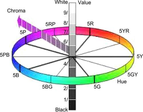
Table S1 Color-aid codes and CIE coordinates stimuli used for the color naming
Disclosure
The author reports no conflicts of interest in this work.
References
- MollonJDColor vision: opsins and optionsProc Natl Acad Sci U S A1999964743474510220361
- HeiderERUniversals in color naming and memoryJ Exp Psychol197293110205013326
- KayPBerlinBMerrifieldWBiocultural implications of systems of color namingJ Linguist Anthropol199111225
- MacLauryREColor-category evolution and Shuswap yellow-with-purpleAm Anthropol198789107124
- NewhallSNickersonDJuddDFinal report of the O.S.A. subcommittee on spacing of the Munsell colorsJ Opt Soc Am194333385418
- CIECommission internationale de l’Eclairage proceedingsCambridgeCambridge University Press1932
- Al-rasheedAAl-SharifHThabitMAl-MohimeedNDaviesIBasic colour terms of ArabicBiggamCarolePCaroleANew Directions in Colour StudiesAmsterdamJohn Benjamins Publishing Company20112
- Al-rasheedAAl-MohimeedNDaviesIBerlin and Kay’s theory of color universals and linguistic relativity. The case of ArabicJ Mod Educ Rev2013224562
- Al-rasheedAFurther evidence for Arabic basic colour categoriesPsychology2014517141729
- BerlinBKayPBasic Color Terms: Their Universality and EvolutionBerkeley, Los AngelesUniversity of California Press1969
- Al-rasheedACategorical effects in the perception of colour: behavioral evidence in hue search methodPsychol Res201448623634
- CohenJColor ontology and its significanceSymonsJCalvoPThe Routledge Companion to the Philosophy of Psychology Chap. 36Taylor and Francis Ltd2009
- NewtonIOpticks: Or a Treatise on the Reflections, Refractions and Colours of Light4th edNew YorkDover Publications1730/1952
- MaxwellJCExperiments on Colour as Perceived by the Eye, with Remarks on Colour BlindnessTransactions of the Royal Society of Edinburgh1855XXL Part2
- GladstoneWEStudies on Homer and the Homeric AgeLondonOxford University Press1858III457499
- GeigerLContributions to the History of the Development of the Human RaceLondonTubner and Company1880 Translated by D. Asher
- RiversCReports of the Cambridge Anthropological Expedition to the Torres Straits, 2CambridgeCambridge University Press1901
- WhorfBLLanguage Thought and RealityCambridge, MAMIT Press1956
- MagnusHDie geschichtliche Entwickelung des FarbensinneLeipzigVon Veit1877
- WoodworthRSThe puzzle of color vocabulariesPsychol Bull19107325334
- RayVFTechniques and problems in the study of human color perceptionSouthwest J Anthropol195283251259
- KayPMcDanielCThe linguistic significance of the meanings of basic color termsLanguage197854610646
- SaundersBACvan BrakelJAte there non-trivial constraints on color categorization?Behav Brain Sci19972016723210096997
- RobersonDDaviesIRLDavidoffJColor categories are not universal: replications and new evidence from a stone-age cultureJ Exp Psychol Gen200012936939811006906
- BrownRLennebergEHA study on language and cognitionJ Abnorm Soc Psychol195449454462
- HeiderEROlivierCCThe structure of the color space in naming and memory for two languagesCogn Psychol19723337354
- RoschENatural categoriesCognitive Psychology19734328350
- DaviesIRLCorbettGGA cross-cultural study of colour grouping: evidence for weak linguistic realtivityBr J Psychol1997884935179290238
- BornsteinMHKordaNDiscrimination and matching within and between hues measured by reaction times: some implications for categorical perception and levels of information processingPsychol Res1984462072226494375
- MollonJD“Cherries among the leaves”: the evolutionary origins of colour visionDavisSColour Perception: Philosophical, Psychological, Artistic, and Computational PerspectiveOxfordOxford University Press20001030
- GegenfurtnerKRKiperDCColor visionAnnu Rev Neurosci20032618120612574494
- ConwayBRColor vision, cones, and color-coding in the cortexNeuroscientist20091527429019436076
- KrauskopfJWilliamsDRHeeleyDWThe cardinal directions of color spaceVision Res1982229112311317147723
- De ValoisRLJacobsGHSpectral sensitivity in monkeyScience19681625335404974165
- HeringEROutlines of a Theory of the Light SenseCambridge, MAHarvard University Press1920/1964 Translated by L M Hurvich and D Jameson
- De ValoisRLDe ValoisKKA multi-stage color modelVision Res1993338105310658506645
- HarnadSCategorical Perception: The Groundwork of CognitionNew YorkCambridge University Press1987
- UchikawaKShonidaHInfluence of basic color categories on color memory discriminationColor Res Appl199621430439
- RobersonDDavidoffJBraisbyNSimilarity and categorisation: neuropsychological evidence for a dissociation in explicit tasksCognition19997114210394708
- RobersonDDavidoffJThe categorical perception of colors and facial expressions. The effect of verbal interferenceMem Cogn200028977986
- PillingMWiggettAÖzgenEDaviesIRLIs color “categorical perception” really perceptual?Mem Cogn200331538551
- BoyntonRMFargoLOlsonCXSmallmanHSCategory effect in color memoryColor Res Appl198914229234
- LawsGDaviesIAndrewsCLinguistic structure and non-linguistic cognition: English and Russian blues comparedLang Cogn Process1995105994
- FranklinAPillingMDaviesIRLThe nature color categorisation: evidence from eye-movements on a target detection taskJ Exp Child Psychol20059122724815878166
- DaoutisCAFranklinARiddetACliffordADaviesIRLCategorical effects in children’s colour search: a cross-linguistic comparisonBr J Dev Psychol2006242373400
- DaoutisCAPillingMDaviesIRLCategorical effects in visual search of colourVis cogn200614229234
- GilbertALRegierTKayPIvryRBWhorfian hypothesis supported in the right visual field but not the leftProc Natl Acad Sci U S A200610348949416387848
- DrivonikouGVKayTRegierRBIvryALFranklinADaviesIRLFurther evidence that Whorfian effects are stronger in the right visual field than the leftProc Natl Acad Sci U S A20071041097110217213312
- RobersonDParkHHanleyRJCategorical perception of colour in the left and right visual field is verbally mediated: evidence from KoreanCognition2008107275276217931614
- SiokWTKayPWangWSYLanguage regions of brain are operative in color perceptionProc Natl Acad Sci U S A2009106208140814519416812
- LiuQLiHCamposJLThe N2pc component in ERP and lateralization effect of language on color perceptionNeurosci Lett2009454586119429054
- Al-rasheedAFranklinADrivonikouGDaviesILeft hemisphere lateralization of categorical color perception among roman and Arabic script readersPsychology20145255270
- EviatarZReading direction and attention: effects on lateralized ignoringBrian Cogn199529137150
- EviatarZLanguage experience and right hemisphere task: the effects of scanning habits and multilingualismBrian Cogn199758157173
- FaridMGraingerJHow initial fixation position influences visual word recognition: a comparison of French and ArabicBrian Lang199653351368
- PrunetJFBelandRIdrissiAThe mental representation of semitic wordLinguist Inq200031609648
- BerentIIdentity avoidance in the Hebrew lexicon: implications for symbolic accounts of word formationBrian Lang200281326341
- SchwalmNDEviatarZGolanYBlumenfeldYThe effect of reading direction habit on numerical processingProceeding of the Human Factors and Ergonomics Society, 47th, Annual Meeting200316491653
- HanSNorthoffGCulture-sensitive neural substrates of human cognition: a transcultural neuroimaging approachNat Rev Neurosci2008964665418641669
- FletcherRThe City University Colour Vision TestWindsor, BerksKeeler Ltd1980
- FranklinADaviesIRNew evidence for infant colour categoriesBr J Dev Psychol200422349377