Figures & data
Figure 1 Map of French Guiana showing the location of 17 weather stations along the coast of French Guiana and the position of French Guiana within South America.
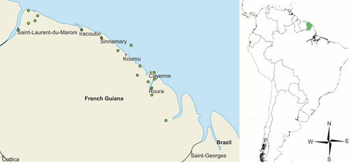
Figure 2 Monthly time series data showing the decomposition, reconstruction and forecasting of datapoints using SSA. (A) Original rainfall time series average for 17 weather stations along the coast of French Guiana, from 1969 to 2012. (B) Periodograms of the rainfall time series identifying significant repeating patterns once per year, twice per year and three times per year. SSA extracted component corresponding to periodogram spike of (C) three times per year, 4-month component, (D) twice per year, 6-month component and (E) once per year, 12-month component. (F) The extracted rainfall trend. (G) The reconstructed rainfall time series after the removal of stochastic noise. (H) A second periodogram of the reconstructed rainfall series showing less stochastic noise around the three main repeating patterns. (I) Forecasting of the rainfall trend to 2017 using sequential SSA.
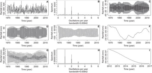
Figure 3 Three-year period of extracted components (dashed line) plotted against the same period of the reconstructed rainfall (solid line), showing which parts of the rainfall series the components represent. (A) Four-month component corresponds to both rainy seasons and the dry season. (B) Six-month component corresponds to the two rainy seasons. (C) Twelve-month component represents the rainfall for the whole year.
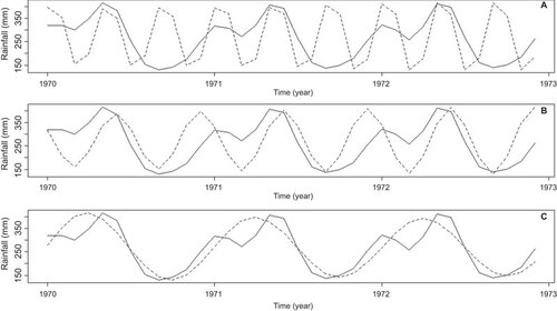
Figure 4 ω-correlation matrix, the F values represent oscillating components within a year (i.e. F6 is the 6-month bi-annual component). The level of correlation can be found by finding the component of interest along the X-axis and looking up the Y-axis to see where it corresponds with other rainfall components. Large values of ω-correlation between reconstructed components indicate that they should possibly be gathered into one group and correspond to the same component in SSA decomposition. The matrix uses a 20-grade gray scale from white to black corresponding to the absolute values of correlations from 0 to 1 (with 0 being no correlation and 1 being absolute correlation).
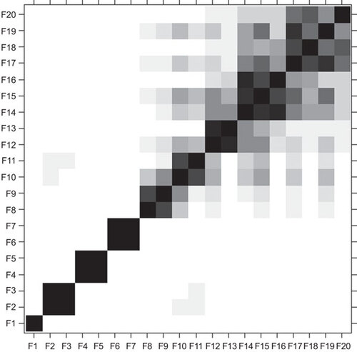
Figure 5 Monthly time series and EMD of Buruli ulcer cases per 100 000 people. (A) Monthly time series of Buruli ulcer cases per 100 000 people from 1969 to 2012. (B) First IMF. (C) Second IMF. (D) Third IMF. (E) Fourth IMF. (F) Fifth IMF. (G) Sixth IMF. (H) Seventh IMF. Periodograms for (I) first IMF showing a high level of variation across the spectra and therefore, should be considered white noise; (J) second IMF which has its highest power at two cycles per year; (K) third IMF with its highest power at one cycle per year; (L) fourth IMF with the highest power approximately at one cycle every 2 years; (M) fifth IMF with the highest power approximately at one cycle every 4 years; (N) sixth IMF with a low level of cycles representing very long-term trends; (O) seventh IMF also representing long-term trends.
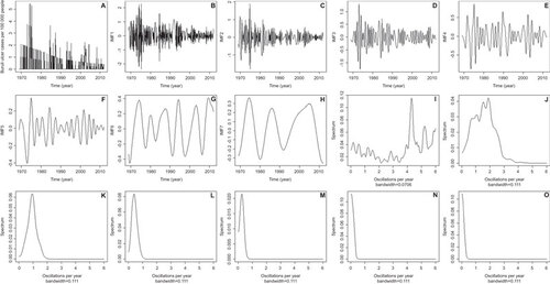
Figure 6 Wavelet coherence between (A) Buruli ulcer incidences per 100 000 people and the rainfall trend obtained from SSA. (B) Buruli ulcer incidences per 100 000 people and ENSO. The colors are coded from dark blue to dark red with dark blue representing low coherence through to high coherence with dark red. The solid black lines around areas of red show the α=5% significance levels computed based on 2000 Monte Carlo randomizations. The dotted white lines represent the cone of influence; outside this area, coherence is not considered as it may be influenced by edge effects. The black arrows represent the phase analysis and adhere to the following pattern: arrows pointing to the right mean that rainfall and cases are in phase, arrows pointing to the left mean that they are in antiphase, arrows pointing up mean that cases lead rainfall and arrows pointing down mean that rainfall leads cases.
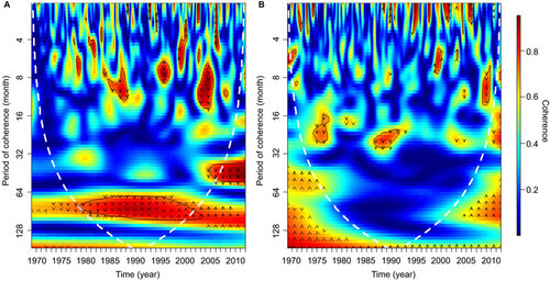
Figure 7 Cross-correlation analysis between (A) ENSO and reconstructed rainfall time series from SSA. (B) ENSO and original rainfall time series. ENSO and (C) first IMF from Buruli ulcer cases, (D) second IMF, (E) third IMF, (F) fourth IMF, (G) fifth IMF. Reconstructed rainfall series and (H) first IMF; (I) second IMF; (J) third IMF; (K) fourth IMF; (L) fifth IMF. Dashed horizontal blue lines in all panels represent the 95% confidence limit; black vertical lines which go beyond the dashed line can be considered non-random cohering oscillations between the two time series being assessed, with the lag period between an above average oscillation in the first time series and a subsequent above average oscillation in the second shown on the X-axis.
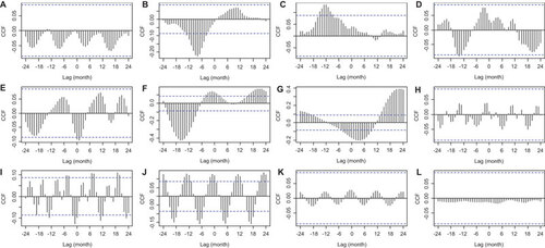
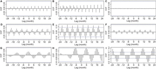
Figure 8 Cross-correlation analysis between rainfall seasonal components extracted by SSA and seasonal IMF series of Buruli ulcer. Four-month component and (A) first IMF, (B) second IMF, (C) third IMF. Six-month component and (D) first IMF, (E) Second IMF, (F) third IMF. Twelve-month component and (G) first IMF, (H) second IMF, (I) third IMF. Dashed horizontal blue lines in all panels represent the 95% confidence limit; black vertical lines which go beyond the dashed line can be considered non-random cohering oscillations between the two time series being assessed, with the lag period between an above average oscillation in the first time series and a subsequent above average oscillation in the second shown on the X-axis.