Figures & data
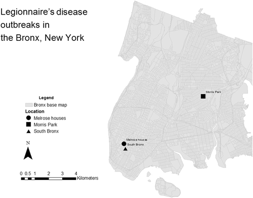
Outbreak locations are represented by circle (Melrouse houses), square (Morris Park) and triangle (South Bronx) shapes. Grey areas represent the streets within the Bronx district. Outbreak data in the Bronx, NYC was retrieved from the New York City Department of Health and Mental Hygiene and from the Centres for Disease Control and Prevention (CDC) website. Base map data was taken from NYC Department of city planningCitation17. Coordinates of outbreak locations retrieved by searching names of locations on Google maps. Maps were created using ArcMap 10.2
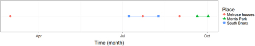
Red circles indicate the date of report of individual cases in Melrose houses. Lines indicate dates of outbreak durations at South Bronx (blue) and Morris Park (green). Outbreak data in the Bronx, NYC was retrieved from the New York City Department of Health and Mental Hygiene and from the Centres for Disease Control and Prevention (CDC) website. Plot was created using R (version 3.1.3)
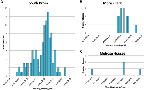
The first panel a shows the number of Legionnaire’s disease (LD) cases in the South Bronx, the top right panel b shows Morris Park and the bottom right c shows number of cases in Melrose Houses. Outbreak data in the Bronx, NYC was retrieved from the New York City Department of Health and Mental Hygiene and from the Centres for Disease Control and Prevention (CDC) website. Graph was created in Microsoft Excel
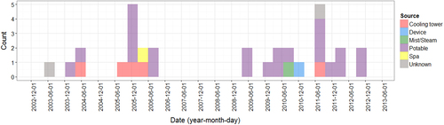
Bars are coloured according to water source: Cooling tower (red), device (blue), mist/steam (green), potable water (purple), spa (yellow) and unknown (grey). Plot was created using R (version 3.1.3)
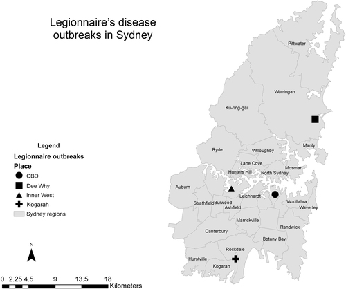
Outbreak locations are represented by circle (CBD district), square (Dee Why), triangle (Inner West) and cross (Kogarah) shapes. Grey areas represent the administrative districts within the Sydney region. Data source of outbreak data: NSW HealthCitation26. Base map data was taken from the Australian Standard Geographical Classification (ASGC) Digital Boundaries, AustraliaCitation14. Coordinates of outbreak locations retrieved by searching names of locations on Google maps. Maps were created using ArcMap 10.2
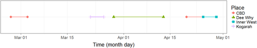
Solid lines indicate dates of outbreak durations in central business district (CBD) locations (red), Kogorah (purple), Dee Why (green) and Inner West (teal) locations. Data source of outbreak data: NSW Health 26. Plot was created using R (version 3.1.3)
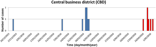
Blue bars represent cases in the first outbreak and red bars represent cases during the second outbreak. Data source of outbreak data: NSW HealthCitation26. Graph was created in Microsoft Excel
Data source: Australia’s notifiable diseases status: Annual report of the National Notifiable Diseases Surveillance SystemCitation33. Graph was created in Microsoft Excel