Figures & data
Fig. 1 Displays of the correlation matrix of the Heart attack data obtained in R by using the corrplot, FactoMineR, and factoextra packages. A: Colored tabular display or corrgram. B: Correlation circle or correlation biplot. See Section 2 for the abbreviations of the names of the variables.
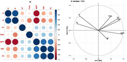
Fig. 2 Visualizations of correlation structure, using the Heart attack data. A: PCA biplot of the correlation matrix; B: Trosset’s correlogram; C: MDS map, with negative correlations indicated by dotted lines; D: Biplot obtained by PFA; E: Biplot obtained by WALS; F: Biplot obtained by WALS with scalar adjustment δ. The RMSE of the approximation is given between parentheses in the title of each panel.
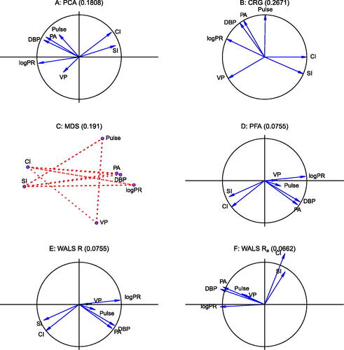
Fig. 3 Adjustment of the correlation matrix. All biplots have a calibrated correlation scale for SI. A: PCA biplot; B: PCA biplot using the δ adjustment; C: WALS biplot; D: WALS biplot using the δ adjustment. The interpretation of the biplot origin is shown by its projection (in red) onto the calibrated scale. Black dots on biplot vectors correspond to zero correlation for the corresponding variable. The interpretation of the black dot for SI is shown by its projection (in green) onto the calibrated scale. For positive δ, biplot vectors are extended beyond the biplot origin toward their zero point. For negative δ, tails of biplot vectors are colored in red for the negative part of the correlation scale.
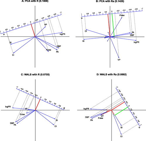
Table 1 Correlation matrix of the Heart attack data.
Table 2 Sample correlations () of SI with all other variables, and estimates of the sample correlations according to four biplots.
Table 3 RMSE of all variables for four methods.
Fig. 4 Comparison of the double biplots of PCA and WALS. A: PCA biplot, reporting goodness-of-fit of both data and correlation matrix on each axis using eigenvalues. B: WALS biplot (without δ adjustment).
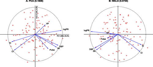
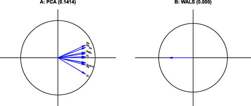
Fig. 5 Biplots of the correlation matrix of the Aircraft data. A: PCA biplot B: WALS biplot. The RMSE of the approximation is given in the title of each panel.
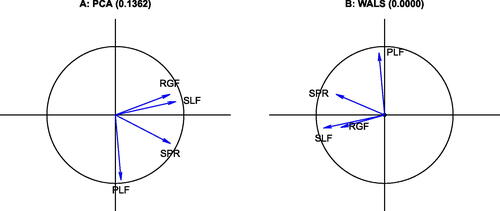
Fig. 6 Biplots of the Swiss banknote data. A: PCA biplot; B: WALS biplot. The RMSE of the approximation is given in the title of each panel.
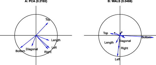
Table 4 RMSE of all variables for four methods.
Fig. 7 Biplots of a 10 × 10 equicorrelation matrix. A: PCA biplot; B: WALS biplot. Variable labels for the WALS biplot are not shown, as the 10 vectors coincide.