Figures & data
Table 1. Theoretical overview: the effect of higher inequality on.
Figure 1. Productivity and wages.
The graph shows the log  100 of seasonally adjusted productivity in terms of GDP per hour worked (working population) and the log 100 of seasonally adjusted real wage cost in terms of salaries and wages of dependent workers per hour worked. For both variables, the respective sample means have been subtracted. Source: destatis.
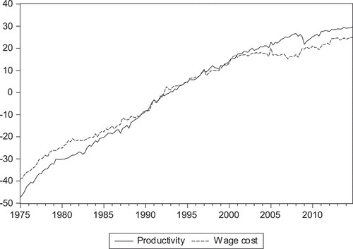
Figure 2. Hours.
The graph shows the log 100 of seasonally adjusted hours worked by all dependent workers. Source: IAB working time accounts.
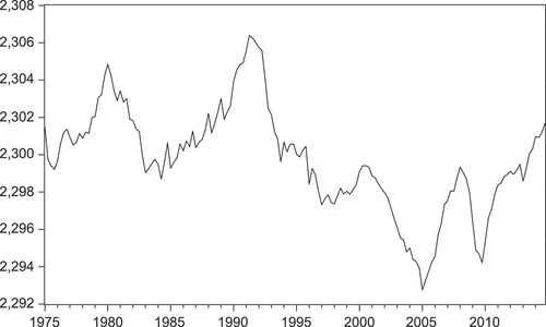
Figure 3. Inequality and skill-biased technical change.
The graph shows the seasonally adjusted Gini coefficient 100 (inequality; left scale) and relative skill productivity 100 (SBTC; right scale). Sources: IEB (inequality) and SIAB (SBTC).
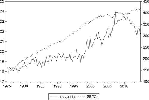
Table 2. Impulse responses: identifying assumptions in the matrix of long-run effects.
Figure 4. Responses of ,
and
to SNT, SBT and inequality shocks.
The solid lines show the responses of productivity (upper panels), wages (middle panels) and hours (lower panels) to 1% SNT shocks (left panels), 1% SBT shocks (middle panels) and 1 unit inequality shocks (right panels) up to 16 quarters. The dotted lines denote Hall (Citation1992)’s 2/3 bootstrapped confidence intervals.
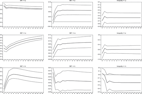
Figure 5. Historical decomposition: the contribution of inequality shocks.
The graph shows the contributions of structural inequality shocks to the shock-driven (i.e. beyond deterministics) part of productivity and hours. The contributions are measured as percent changes in productivity and hours, respectively.
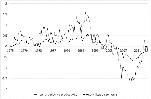
Figure 6. Inequality below and above the median wage.
The graph shows the seasonally adjusted Gini coefficient below (solid line) and above (dotted line) the median wage. Source: IEB.
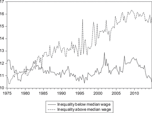
Figure 7. Responses of ,
and
to
and
shocks.
The solid lines show the responses of productivity (upper panels), wages (middle panels), and hours (bottom panels) to 1 unit shocks in wage inequality below (left panels) and above (right panels) the median wage up to 16 quarters. The dotted lines denote Hall (Citation1992)’s 2/3 bootstrapped confidence intervals.
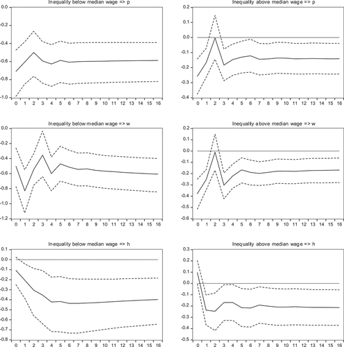
Figure A1: Robustness checks: Responses of ,
and
to inequality shocks.
The graphs show robustness checks with respect to the responses of , and to 1 unit inequality shocks up to 16 quarters. See text for more details.
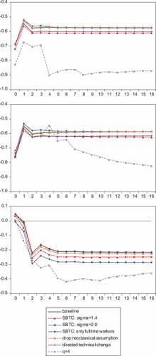
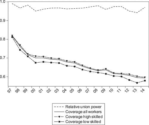
Figure A2: Union power: share of workers covered by collective labour agreements.
IAB establishment panel