
Figures & data
Figure 1. Turbines in European wind farms.
This figure presents the number of turbines in European wind farms. Panel A shows the distribution of turbines in the Republic of Ireland, for existing and under construction wind farms. Panel B shows the average of number of turbines in wind farms for different European countries commissioned in 2023.
Source: Wind Europe (Citation2023).
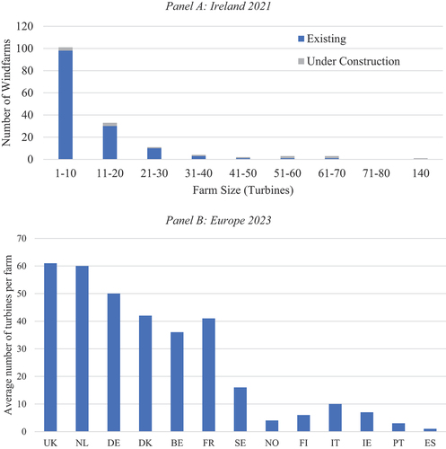
Table 1. Turbine component failures: 10 years since commissioning.
Figure 2. Electricity prices (EU27).
Commercial electricity prices in Europe from January 2007 to June 2023. The data is from the Sustainable Energy Authority of Ireland (SEAI).
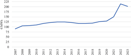
Figure 3. EU cost of capital for onshore wind projects.
This figure shows the cost of capital for Onshore Wind Projects across 19 European Union countries between September 2019 and April 2020 sourced from (Roth et al. Citation2021). The red bars mark the minimum and maximum values for countries.
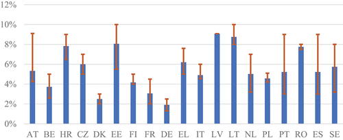
Figure 4. Weibull failure distributions.
This figure shows three Weibull functions over time. Age-related failures have a shape parameter k > 1 representing failures due to wear and tear, early failures have a shape parameter k < 1 indicating equipment damage or fault installation, and lastly random failures occur to any other reasons rather than age and early with a shape parameter k = 1.
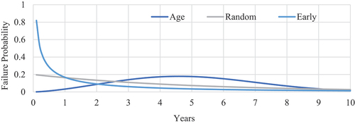
Table 2. The modelled failure parameters.
Figure 5. Industry vs simulated failure probabilities.
The figure shows the simulated failure probabilities over the lifetime of a turbine and the actual (Industry) data. The information is shown for three components: Generators, Gearboxes, and blades. The X-axes show age in years and the Y-axes show failure probability.
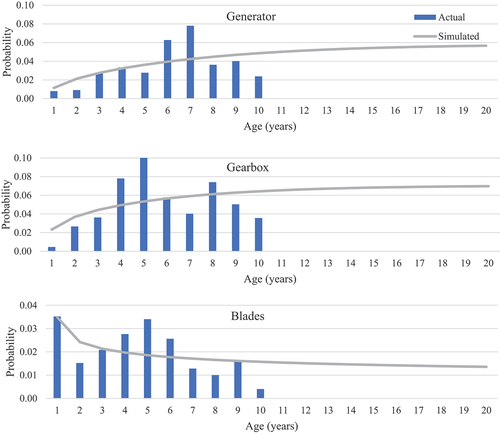
Figure 6. Turbine failure distributions.
This figure presents the number of failures in a turbine’s lifetime. Panel A shows the probability of failures for each component of a turbine, while Panel B is the distribution of total failures over the lifetime of a turbine.
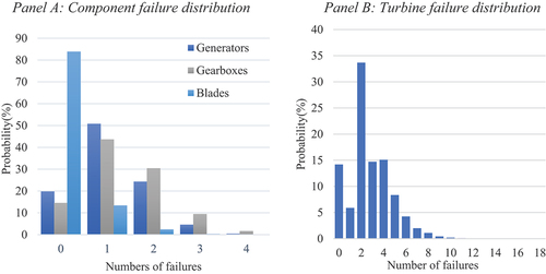
Table 3. Wind farm failure distribution.
Table 4. Turbine repair cost.
Table 5. Components discounted failure costs.
Figure 7. Turbine cost distribution.
This figure presents the distribution of discounted failure cost for a single turbine. The green line indicates the expected cost, and the red line highlights the 95th percentile, the lifetime Value at Risk (VaR). Cost is in units of € million.
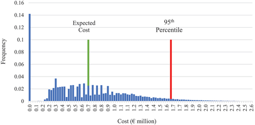
Table 6. Risk analysis for a single turbine.
Figure 8. Wind farms risk Metrics.
This figure gives the expected cost (EC), Value at Risk (VaR), the Condition VaR (CVaR) for wind farms ranging from 1 to 100 turbines. The full range is shown in Panel A, while Panel B highlights the values for seven specific farms. The expected cost (22%) is the limit of risk reduction through increasing the number of turbines on a wind farm. Values in Panel B are presented in € ‘000.
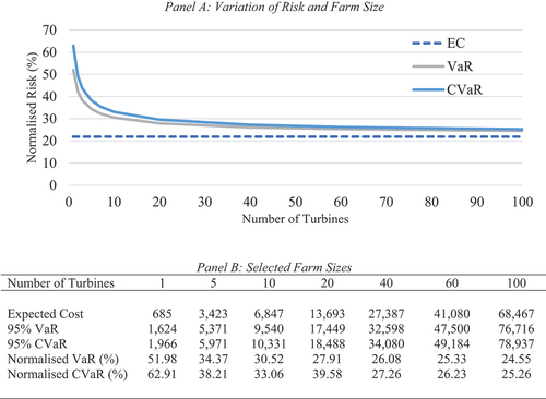
Table 7. Discount rate sensitivity analysis.
Supplemental material