Figures & data
Figure 1. Mean rate of copulations per week relative to the onset of incubation (week 0). The shaded area represents ± se.
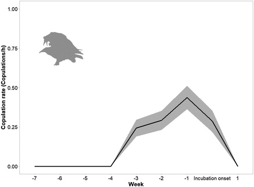
Figure 2. Mean rate of delivery of material to the nest per week relative to incubation onset (week 0) (A). Mean nest arrangement rate (B) per week in relation to hatching week (week 0). The shaded areas in both graphs represent ± se.
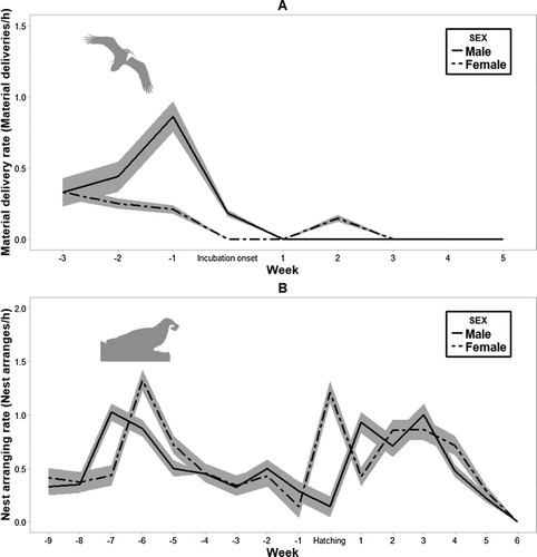
Table 1. Results of the GLMMs for each behaviour recorded in Egyptian Vulture pairs (n = 20) in northern Spain.
Figure 3. Incubation and brooding investment (A) and nest attendance investment (B) per week in relation to hatching date (week 0). Values are expressed as a percentage of time. Shaded areas represent ± se.
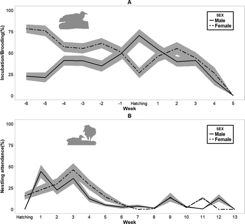
Table 2. Results of GLMMs for the most parsimonious model for each breeding behaviour of Egyptian Vultures.
Figure 4. The mean rate of egg turning (A) and mean changeover rate (B) per week in relation to hatching date (week 0). Temperature is expressed in degrees Celsius. Shaded areas in both graphs represent ± se.
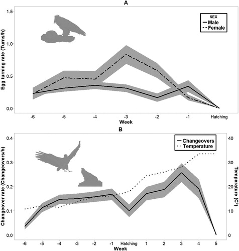
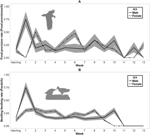
Figure 5. Mean food provisioning rate (A) and mean nestling feeding rate (B) per week in relation to hatching date (week 0). Shaded areas in both graphs represent ± se.