Figures & data
FIGURE 1 PM2.5 Air Quality Index for Jakarta, October 2018–September 2019
Source: World Air Quality Index (Citation2019).
Notes: The air quality index is based on the US Environmental Protection Agency standard, with 0–50 considered to be good, 51–100 moderate, 101–50 unhealthy for sensitive groups, 151–200 unhealthy, 201–300 very unhealthy, and 300 and over hazardous. The figure shows monthly averages of daily-average recordings, as measured at the US Embassy. PM = particulate matter.
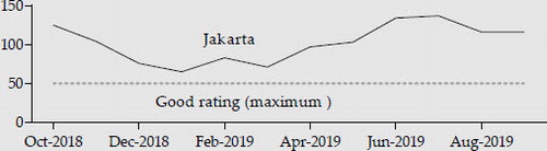
Table 1. Components of GDP Growth (2010 prices; % year on year)
FIGURE 2 Standard Deviation of Annual GDP Growth Rate, 2002–18 (percentage points)
Source: World Bank (Citation2019b).
Notes: The standard deviation is calculated for each country’s real annual GDP growth rate in percentage terms, using GDP data in constant 2010 dollars. The five countries with the lowest standard deviations are shown, along with the sample median. Data are available for 209 countries.
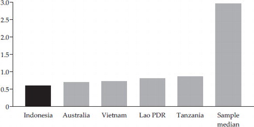
FIGURE 3 Inflation Rate (% per annum)
Source: Bank Indonesia through CEIC.
Notes: CPI = consumer price index. The inflation rate is calculated on a year-on-year basis, which involves comparing the CPI in each month with the CPI in the same month of the prior year.
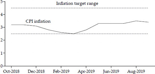
FIGURE 4 Jakarta Stock Exchange Composite Index (JCI) and Exchange Rate
Sources: Bank Indonesia and Indonesia Stock Exchange through CEIC.
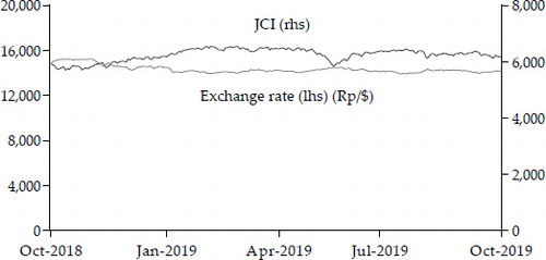
Table 2. Balance of Payments ($ billion per quarter)
Table 3. Budgets for 2018, 2019 and 2020 (Rp trillion)
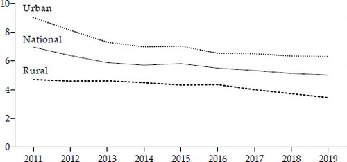
FIGURE 5 Household Access to Electricity (% of population)
Sources: IEA (2018). Population data from World Bank (Citation2019b) were used in the calculations.
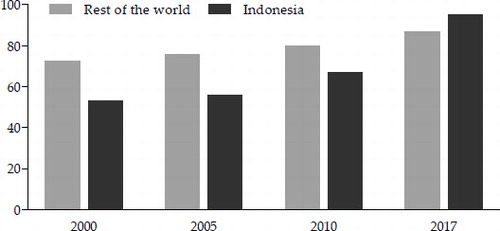
FIGURE 6 Disability Prevalence by Age Cohort, 2015 (% of total population aged two or older)
Source: Authors’ calculations using BPS (2016). The five columns sum to 100%.
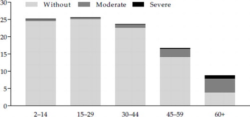
FIGURE 7 Share of Indonesia’s Population Aged 65 or Older (%)
Source: United Nations (Citation2019).
Note: The solid line represents the estimated historical share; the dashed line represents the projected share in the medium-fertility variant of the projections of the United Nations (Citation2019).
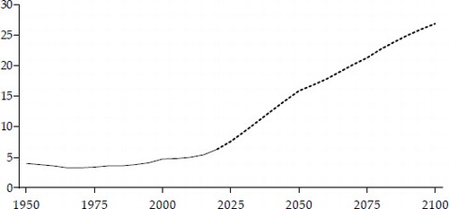
FIGURE 8 Unemployment Rate, 2011–19 (%)
Source: BPS (2019b). Measured in February each year to remove seasonal influences and because the August 2019 data were not available at the time of writing.