
Figures & data
Figure 1. Linear three-act spatial narratives. (A) Classic elements of a three-act narrative. While visual storytelling often departs from a linear narrative, it is helpful during design to consider the classic three-act narrative comprising the set-up, conflict, and resolution. Individual narrative elements (the setting, characters, problem context, etc.) can be visualized as unique symbols within a single graphic or separate frames within a larger, multi-scene story. The figure presents a mixture of narrative elements drawn from literary and film studies, which are presented in a typical rather than fixed order and relative rather than absolute location within the narrative arc. (B) Spatial narrative arcs. Phillips (2012) identified eight narrative arcs commonly used in geography and the geosciences, with the narrative arcs differing in how conflict is resolved. Four narrative arcs focus on a single protagonist – commonly a place or region – with conflict arising from either internal or external forces: destruction, genesis, emergence, and metamorphosis. Four narrative arcs emphasize the conflict between two or more characters, sometimes evolving from or resulting in a third state: cause-effect, convergence, divergence, and oscillation.
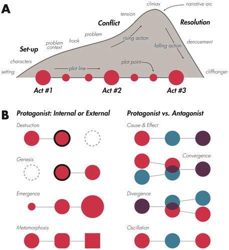
Table 1. Geographic problem contexts.
Table 2. Eight visual stories about climate change.
Table 3. Comparison of narrative elements in two scripts.
Figure 2. Visual storytelling genres. Visual storytelling genres differ by the visual or interactive technique used to enforce linearity in the narrative sequence. The black components of each genre diagram represent prototypical visual or interactive elements used by the genre to enforce linearity. (A) Static visual stories. Linearity is enforced through partitioning of the layout into frames and clarifying reading with annotation, the latter of which may include any of the visual accenting techniques illustrated in . (B) Longform Infographics. Linearity is enforced through vertical reading and browser scrolling. (C) Dynamic Slideshows. Linearity is enforced by advancement through a series of slides, which may include horizontal swiping or ‘next’ and ‘back’ buttons. (D) Narrated Animations. Linearity is enforced by the progression of digital display time, with the animation starting either on page load or through a play control. (E) Multimedia Visual Experiences. Linearity is enforced by anchor tags and hyperlinking, with content often activated dynamically while scrolling. (F) Personalized Story Maps. Linearity is enforced by the order that an individual contributes content to the map, with the story often presented from older to newer updates. (G) Compilations. Linearity is enforced unfolding events in near real-time or major updates to the design, with maps often organized in a stack from newer to older with links to the full story.
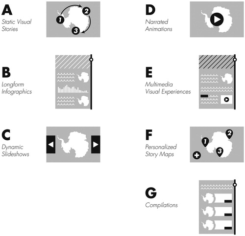
Table 4. Comparison of visual storytelling genres.
Figure 3. Mood as a visual storytelling trope. The visual style of maps and graphics set the mood for a story, influencing the audience’s affective and emotional reaction. The following deconstructs four basemap designs by the stylistic elements of form, colour, type, and texture. (A) OpenStreetMap. The default OpenStreetMap design is similar to a reference road map. The linework form is complex, using precise, thin strokes to outline roads, buildings, and other built infrastructure. The colour palette is similarly complex to symbolize the numerous layers, producing a visual hierarchy that emphasizes major roads over other features. The type is dense, using a simple sans serif font to communicate a sense that there are many features in the landscape. There are few textures, particularly for natural features. Overall, the visual style likely activates the audience affectively, giving an authoritative sense (perhaps too much so) of the accuracy and trustworthiness of the basemap. (B) Esri World Gray Canvas. Esri’s various grey styles are designed specifically to layer thematic information on top. The linework form is simpler, with most features removed and roads given subtle outlines; as a result, the water features and other aspects of the natural environment are more visible. Per the name, a greyscale colour palette is used, with most colours on the lower half of the value range. The type is sparse, using a thin sans serif in uppercase for major throughways. There are few textures (e.g., the railroad), further subduing the palette. Overall, the visual style likely deactivates the audience affectively, leading them to ignore the basemap. (C) CARTO Dark Matter. There are many similarities of CARTO’s Dark Matter to the Esri World Gray Canvas. The linework form is simple, the palette is in greyscale, the type is sparse (although using a thicker sans serif in lowercase), and there are few textures. However, the colours are dark, almost ominous, allowing for any added bright, saturated thematic layers to contrast markedly against the basemap. Because of the dark palette and high contrast, the visual style likely activates rather than deactivates the audience, and, depending on other aspects of design, could evoke an angry, anxious, or otherwise unpleasant reaction, a response that can be used purposefully to build suspense in the visual story. D: Stamen Watercolor. Stamen’s Watercolor is a creative departure from most slippy basemaps. The linework form again is simple, with many features outlined in a white stroke for contrast and their lines whimsically varying as if brushed by hand. The colour palette is bright, using many primary colours while balancing lights and darks. The textures mimic the movement of watercolour on the canvas – pooling at edges and spreading in a gradient over large expanses – and thus give the audience the impression of a physical material rather than a digital map. There is no type, allowing the symbols to take lead. Overall, the visual style likely activates the audience, creating a pleasant experience that invites the audience to get lost in the map and its many arrangements of form, colour, and texture.
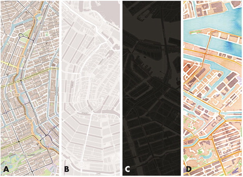
Figure 4. Storyboarding to plan information dosing. ‘The Melting of America’ published by National Geographic (Tierney and Treat, Citation2017) explains the increased susceptibility of Antarctic ice to climate change. Tierney (Citation2018) describes the process the National Geographic team completed to design the original static visual story for the printed magazine and then convert the visual story into a narrated animation for digital consumption. (A) Static Visual Story. The original static visual story was designed to fill a double-gatefold spread within the magazine. The print design effectively enforces linearity using a 12-column layout, balanced arrangement of negative space to separate major visual elements, and text annotation to clarify reading. (B) Storyboarding. The National Geographic team used storyboarding as a technique to dose the original static visual story into a series of five chapters for inclusion in the narrated animation. The storyboard roughly follows the sequence of narrative elements illustrated in . The storyboard first sets-up the visual story through an initial hook (the title sequence) and introduces problem context about the geophysical processes underpinning glacial melt, stressing the key problem that glaciers are breaking apart (Chapter 1). The storyboard then paces plot points about the conflict using rising dramatic action, building concern about glacial acceleration (Chapter 2) and glacial melting from above and below (Chapter 3). The storyboard reaches its climax – that there is no way to stop the melting (Chapter 4) – concluding with a cliffhanger about the future of Antarctica (Chapter 5). (C) Narrated Animation. The resulting 3:40 minute narrated animation uses display time to enforce linearity across the five chapters. The maps and graphics are individually less complex than the original static visual story to optimize viewing on smaller screen mobile devices. However, the maps and graphics are animated to aid interpretation of the dynamic geophysical processes. The text annotation largely is replaced by the audio narration, embedding the voice of expert scientists into the visual story.
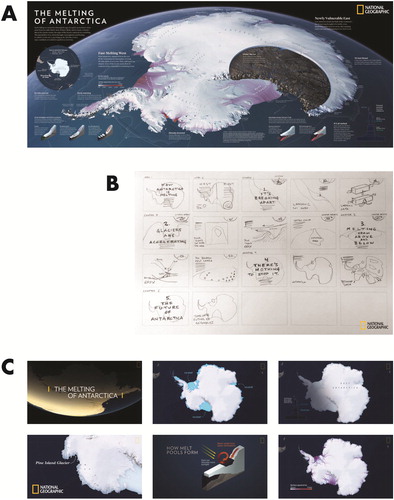
Figure 5. Visual accenting techniques for focusing attention. I use the term ‘visual accenting’ to describe a range of design techniques used to focus visual attention on specific features in the display. The figure provides nine visual accenting solutions for focusing attention on Zimbabwe in Southern Africa. (A) Highlighting on polygon stroke (colour hue). (B) Highlighting on polygon fill (colour hue). (C) Leader lines with label. (D) Flow arrow with label. (E) Geometric frame. (F) Opacity mask. (G) Numbering. (H) Scale change. (I) Call-out with label. Many dynamic techniques also exist for focus attention (not illustrated), such as blinking or flickering, dynamic panning and zooming, and focus + context visualization.
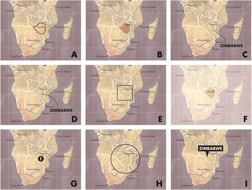
Figure 6. Redundancy and continuity as visual storytelling tropes. ‘How the Recession Changed Us’ published in The Atlantic (Lavin and Buck, Citation2011) uses a series of frames to compare the US before and after the ‘Great Recession’, which lasted December 2007 to June 2009. The designers establish a recurring motif across all panels, redundantly encoding pre-recession in light blue and post-recession in dark orange. In this way, the visual grammar of the story is learned once by the audience, with this redundancy contributing to the rising action as the panels move from livelihoods to (sometimes nefarious) activities to political viewpoints. Note also how the ‘Federal Budget Deficit’ graphic breaks the frame, with the bell curve extending into the maps above. This visual transition technique promotes continuity, suggesting a top-down rather than left-right reading of the visual story.
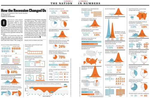
Figure 7. Metaphor as a visual storytelling trope. ‘Earth at Night, Mountains of Light’ published by Petrichor Geovis Studio (Wasilkowski, Citation2019) visualizes nighttime light emissions as a hyperrealistic, psuedo-3D surface, with brighter locations represented as taller mountain peaks in a metaphorical terrain. Such use of a metaphorical landscape is one way to make any visual story explicitly spatial, and arguably all thematic maps of abstract statistical information employ such a landscape metaphor to some degree. Other examples of a landscape metaphor include ‘The Two Americas of 2016’ published in The New York Times (Wallace, Citation2016) and ‘Human Terrain’ published by The Pudding (Daniels, Citation2018).
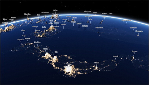
Figure 8. Voice as a visual storytelling trope. ‘They Would Not Take Me There; People, Places, and Stories from Champlain’s Travels in Canada, 1603–1016’ published by the University of Maine Canadian-American Center (Pearce and Hermann, Citation2010) follows the explorations of Samuel de Champlain through what would become New France. Drawing from his journals, the designers insert Champlain’s voice into the map using typography (blue Garamond). Alongside Champlain’s voice is an imagined Indigenous voice (green Garamond), ‘add[ing] context to a landscape that Champlain often refers to as empty or barren’ (Citation2010: 46). The designers’ voice also is inserted into the map for narration and context (black Univers Light), resulting in a juxtaposition of different perspectives, time periods, and power structures.
![Figure 8. Voice as a visual storytelling trope. ‘They Would Not Take Me There; People, Places, and Stories from Champlain’s Travels in Canada, 1603–1016’ published by the University of Maine Canadian-American Center (Pearce and Hermann, Citation2010) follows the explorations of Samuel de Champlain through what would become New France. Drawing from his journals, the designers insert Champlain’s voice into the map using typography (blue Garamond). Alongside Champlain’s voice is an imagined Indigenous voice (green Garamond), ‘add[ing] context to a landscape that Champlain often refers to as empty or barren’ (Citation2010: 46). The designers’ voice also is inserted into the map for narration and context (black Univers Light), resulting in a juxtaposition of different perspectives, time periods, and power structures.](/cms/asset/d9beaab7-caf2-4eeb-a2d2-0fac3e418aba/ycaj_a_1633103_f0008_oc.jpg)