
Figures & data
Figure 1. Long description. (a) A line graph displaying the biomass amount over time (when bleed-feed is not implemented). The x-axis represents the time and the y-axis denotes the biomass amount. The fermentation starts with a small amount of initial biomass. Next the biomass amount increases exponentially over time and then stays constant. Harvest time is indicated at the stationary phase. (b) A line graph displaying the biomass amount over time (when bleed–feed is implemented). The x-axis represents the time and the y-axis denotes the biomass amount. The biomass accumulates exponentially over time until bleed–feed is performed. The bleed–feed is performed instantaneously. Hence, the biomass amount immediately drops to a small value when bleed–feed is performed. The figure shows two examples to illustrate the biomass accumulation after bleed–feed, i.e. the starting biomass amount after bleed–feed is low in one example and high in the other. These two examples have the same cell growth rate. The example with a higher initial biomass reaches a certain biomass level sooner than the other one.
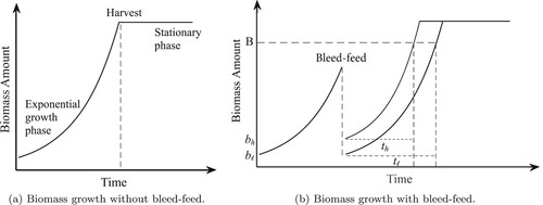
Table 1. Notation used in the renewal model.
Figure 2. Plots of ,
and
, for the industry base case (solid line), and a scenario with a higher risk of entering the stationary phase (dashed line).
![Figure 2. Plots of ν(m),G(t|b1), E[W(th,b2)]−b2 and R(tb,b2∗), for the industry base case (solid line), and a scenario with a higher risk of entering the stationary phase (dashed line).](/cms/asset/45dceb86-fbc6-4f01-833b-8b8dbf236285/tprs_a_2009140_f0002_oc.jpg)
Figure 3. The rate function used in the base case (a) and the corresponding probability density function (b). (a) The rate function and (b) the corresponding probability density function,
.
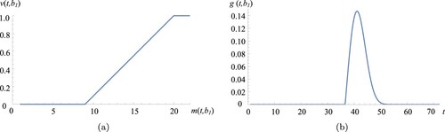
Table 2. Base case results and the room for improvement on current practice.
Figure 4. Base case throughput versus
in BO strategy.
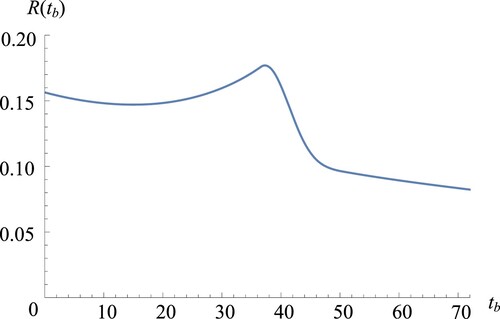
Figure 5. Surface plot depicting base case throughput versus
and
in JBO strategy, when
and
are optimised simultaneously.
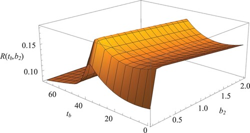
Figure 6. Reducing two-dimensional JBO into two sequential one-dimensional optimisation problems: (a) versus
and (b)
versus
for
.
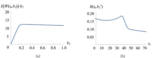
Table 3. Sensitivity on the biomass growth rate μ.
Figure 7. Throughput versus bleed–feed time
in BO strategy for slow growth (
).
Table 4. Sensitivity on the critical biomass level .
Table 5. Sensitivity on maximum biomass that can be obtained H.
Table 6. Sensitivity on setup duration s.