
Figures & data
Figure 1. An example vaccine distribution network for CVAP.
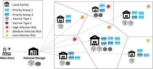
Table 1. KPIs for evaluating equity and effectiveness of CVAP solutions.
Figure 2. Attained and fair coverage levels for Plans 1, 2 and 3.
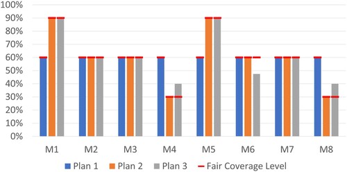
Table 2. Equity and effectiveness KPIs for the three allocation plans.
Table 3. KPIs of solution with sufficient and restricted capacity for municipality M5.
Figure 3. Coverage values with and without ECF model.
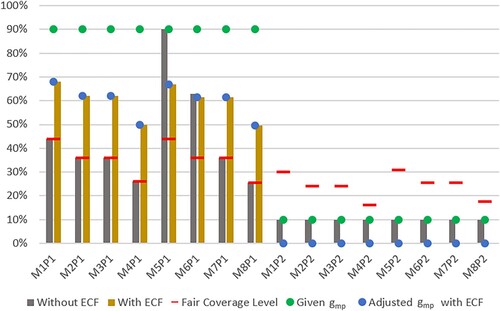
Table 4. KPIs of CVAP solutions with and without ECF model.
Figure 4. Coverage values with and without capacity restriction.
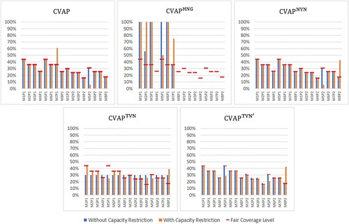
Figure 5. Coverage levels of municipalities under different plans for the case study instance.
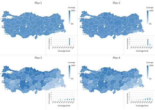
Figure 6. Coverage values for each municipality and priority group for different plans for the case study.
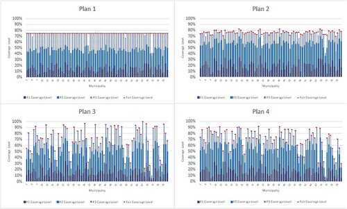
Table 5. KPIs for different plans for the case study.
Figure A1. Worldwide vaccination coverages by December 9, 2021 (Ritchie et al. Citation2020).
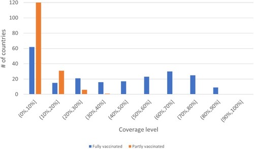
Table B1. Small instance parameters.
Table B2. Parameters for small instance with priority groups.
Figure A2. The framework for calculation of the composite prioritization weight .
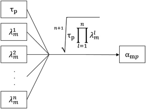
Table C1. Summary of relevant vaccine allocation studies.
Table D1. Example calculation.
Table
Supplemental Material
Download PDF (591.6 KB)Data availability statement
The authors confirm that the data supporting the findings of this study are available within the article [and/or] its supplementary materials.