Figures & data
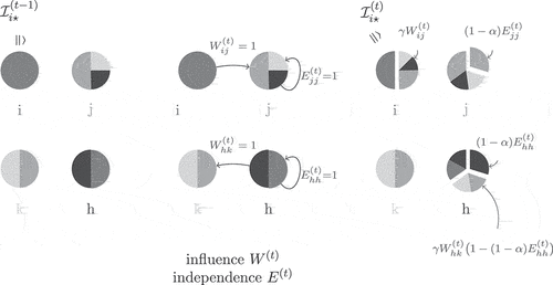
Figure 1. Visualization of exemplary influence relationship changes. The nodes’ distributions are depicted by pie charts, i.e., one pie equals one row in . Each node is associated with a unique color which is recognizable from the node’s label. A pie slice in a particular color then represents the share of influence from the node with this individual color on the node associated with that pie. The distribution changes are caused by node
influencing
,
becoming independent, and
being influenced by
while simultaneously becoming independent. In this example, the global susceptibility is set to
, and the independence rate to
.