
Figures & data
Table 1. The table summarises the types of movement and corresponding movement parameters assessed by the studies.
Figure 1. Panel A shows the setup for the somatic RHI. Panel B zooms into the hands (highlighting in red the fingers used for stroking and the stimulated fingers to induce the illusion) and panel C shows how the synchronous and asynchronous strokes differ.
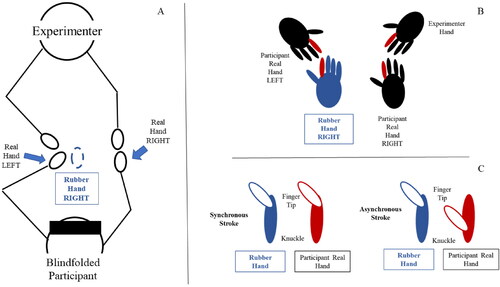
Table 2. Table shows the original statements by Lopez et al. (Citation2012) for the somatic RHI used in the current study.
Table 3. Table reports the areas of interest of the study and the corresponding channels over the brain regions. * = indicates right side of the brain, which is ipsilateral to the limb under illusion.
Figure 2. Panel a) shows the NIRS cap utilised to carry out the NIRS data recording. Coloured circles indicate cap holes (default). Panel b) shows the disposition of the transmitters (red circles) and receivers (blue circles) of the template adopted (image produced by Homer2 NIRS Processing package) and the channels provided.
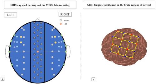
Figure 3. Figure shows the flowchart of the data processing of NIRS data from the recording of raw data till the calculation of the averaged HbO and HbR concentrations. HbO = oxygenated haemoglobin; HbR deoxygenated haemoglobin.
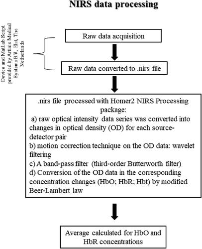
Figure 4. Figure shows the flowchart of the experiment. R&G = reach to grasp movement; ½ = half of participants; As = asynchronous stimulation; Sy = Synchronous stimulation.
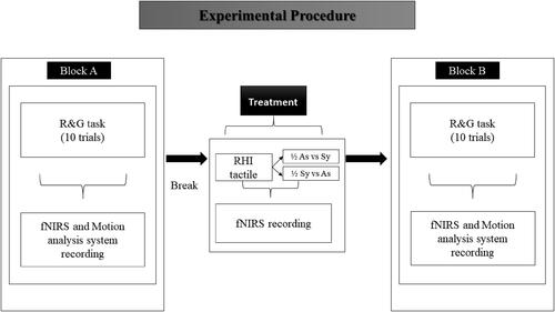
Figure 5. Figure shows the average of proprioceptive drift observed after synchronous and asynchronous stimulation. Bars represent the average of the group, while dots individual data points. Participants experienced greater drift (*) when the synchronous condition was experienced.
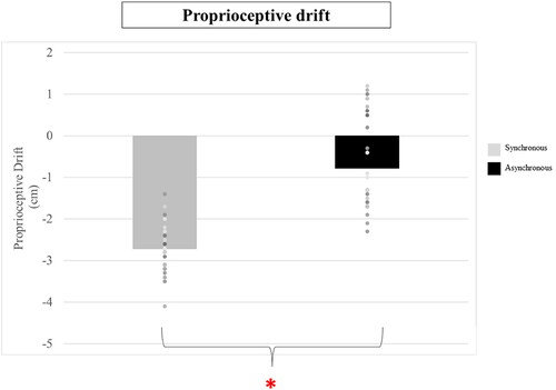
Figure 6. Panel a) shows the average rating for each of the 13 items (statements) in the ownership questionnaire after the synchronous and asynchronous stimulation. While panel b) shows the average for the five questionnaire clusters, and the differences (*) observed between synchronous and asynchronous stimulation. The bars indicate the Standard Error (SE). Panel c) shows individual data plotting for the ownership cluster of the questionnaire. This information is relevant given the known variability in RHI studies, and helps the Reader appreciating the spread of Group data, that would not otherwise be visible. Panel d) Compliance individual data plotting shows that the group average, which is significantly different between conditions, is not reflected so clearly as for other clusters when the individual data points are considered.
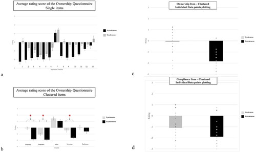
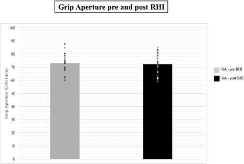
Figure 7. Figure shows the average of the maximum GA as observe before and after the exposure to the somatic RHI (treatment). Bars represent the average of the group, while dots and individual data points. The maximum GA remained stable between measurements (p>.05).
Supplemental Material
Download MS Excel (22.9 KB)Supplemental Material
Download MS Excel (39.1 KB)Supplemental Material
Download MS Excel (129.7 KB)DATA AVAILABILITY STATEMENT
The data that support the findings of this study are openly available in OSF at https://osf.io/963cq/ [DOI 10.17605/OSF.IO/963CQ].