
Figures & data
Figure 1. Low-frequency July temperature anomaly reconstruction for the southwestern United States as defined in inset (based on Gillreath-Brown et al. Citation2024:Figure 5). The extent of the SWUS inset is approximately: xmin = −112.82, xmax = −105.52, ymin = 32.66, ymax = 38.90. Blue line fitted by loess (local polynomial regression fitting) smoothing (α = 0.15). Negative values on the y-axis indicate temperatures cooler than the 1961–1990 average; the horizontal line at 0 marks the average July temperature from 1961–1990. Negative values on x-axis indicate years BC.
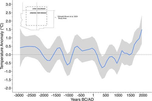
Figure 2. Low-frequency July temperature anomaly for the SWUS (Gillreath-Brown et al. Citation2024) and the Northern Hemisphere low-frequency component (Moberg et al. Citation2005) from AD 133 to 1900. Both series have been standardized to a mean of 0 and an s of 1 for the period in the graph.
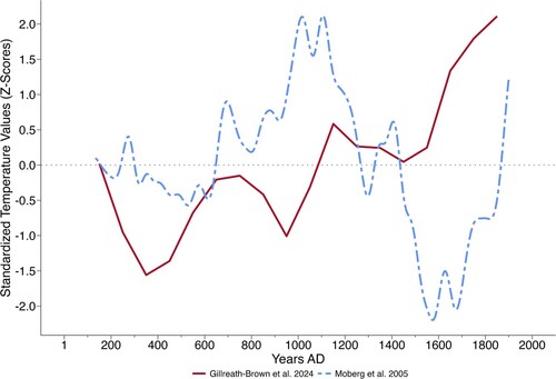
Figure 3. The ENSO index is calculated as the difference between the temperature reconstruction by Gillreath-Brown et al. (Citation2024) and the low-frequency component of the Moberg et al. (Citation2005) temperature reconstruction for the Northern Hemisphere from AD 133 to 1900. This index is negative when the Gillreath-Brown et al. reconstruction is cooler than that of Moberg et al. (Citation2005), suggesting El Nino-like conditions prevailed in the SWUS. This index is positive when the Gillreath-Brown et al. (Citation2024) reconstruction is warmer than that of Moberg et al. (Citation2005), suggesting La Niña-like conditions. The ENSO Index is computed from the z-scores for the Gillreath-Brown et al. (Citation2024) and the Moberg et al. (Citation2005) reconstructions as displayed in .
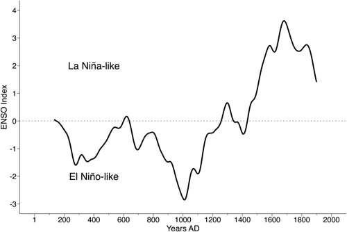
Figure 4. Annual accumulated growing degree days across the southwestern United States and Mexico, with locations of sites mentioned in the text or the following figures. Growing degree days were extracted and calculated from the 30 s (∼1 km2) average temperature (°C) from WorldClim version 2.1 (https://www.worldclim.org/data/worldclim21.html). We use 10°C as the base and 30°C as the maximum for the GDD calculation.
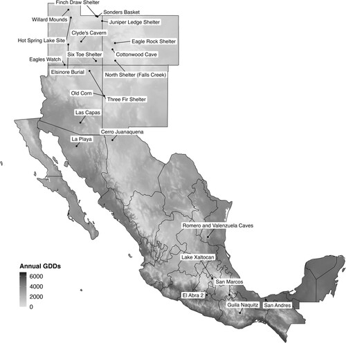
Figure 5. Earliest site with maize in each of the labeled political subdivisions, using data from the Ancient Maize Map (Blake et al. Citation2017) with additions listed in Supplemental Table S1. The linear model shows the regression of latitude on date for the labeled sites. The slope of the regression line implies an average spread rate of 0.001 degrees/year for this sample (r2 = 0.01; p > F = 0.72).
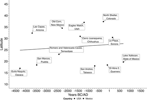
Figure 6. Location of maize’s northern frontier through time. Shown is the earliest site with maize in each century, with the constraint that only sites further north than earlier sites appear in the plot. Data from the Ancient Maize Map (Blake et al. Citation2017) with additions listed in Supplemental Table S1. The linear model shows the regression of latitude on date for the labeled sites. The slope of the regression line implies an average spread rate of 0.003 degrees/year for this sample (r2 = 0.76; p > F < 0.001). Between just Guilà Naquitz and Las Capas however the implied rate of spread is ∼8.7 times more rapid (0.026 degrees/year).
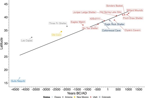
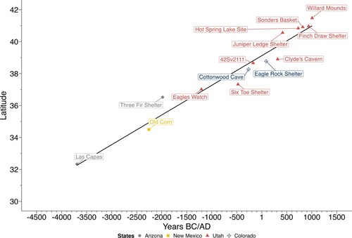
Figure 7. Location of maize’s northern frontier through time within or near the SWUS as defined here. The slope of the regression line implies an average spread rate of 0.002 degrees/year for this sample (r2 = 0.95; p > F < 0.001).
Supplemental Material
Download GIF Image (2.4 MB)
Supplemental Material
Download GIF Image (9.7 MB)
Supplemental Material
Download MS Excel (176.4 KB)Supplemental Material
Download PDF (157 KB)Data Availability Statement
The data that support the findings of this study are openly available in GitHub at https://github.com/Archaeo-Programmer/cropDiffusionR.