Figures & data
Figure 1. Graphical representation of an OMM with two states. If a person is in a given state i at time t, the parameters next to the arrows running from that state represent the average probabilities of being in each state j at time t + 1. The right part portrays fictional parameter values concerning alcohol use.
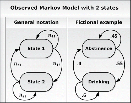
Table 1. Results for the level-2 parameters of the OMM. We use the posterior medians as point estimates, and the SD and 95% central credible intervals (CCIs) represent the uncertainty. Note that the parameters Σ(ε)11 and Σ(ε)22 are the variances of the random logit deviations ε12 and ε21, respectively, and Σ(ε)12 is the covariance between these two random effects.
Figure 2. Predicted transition probabilities for individuals with varying levels of trait neuroticism ( in the sample), based on the point estimates (posterior medians) of the model parameters given in . It can be seen that individuals with higher trait neuroticism are more likely to start experiencing negative affect (i.e., their π12 is larger) and, once this happens, they are also less likely to stop experiencing it (i.e., their π21 is smaller).
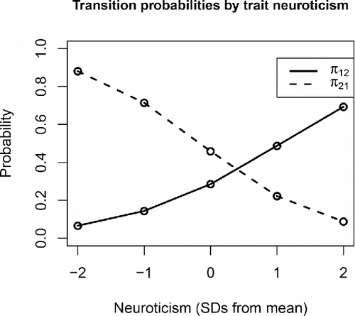
Figure 3. Scatterplot of the transition probabilities for the individual persons in the data, obtained by using Equations (Equation4(4) ) and (Equation6
(6) ) with the estimated model parameters. The plot shows that there is substantial interpersonal variance, and that those persons with a higher probability of transitioning into the negative state (π12) usually also had a lower probability of transitioning out of it (π21).
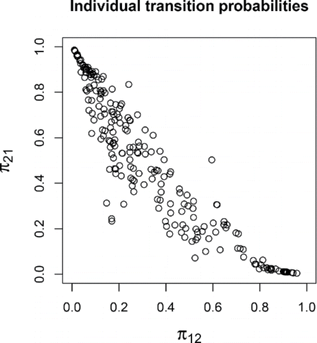
Figure 4. Results of posterior predictive check 1 for the OMM. The red lines represent the empirical mean and SD of the proportion of days that participants experienced NA. The histograms represent the model predictions, which take into account the uncertainty about the estimated model parameters.
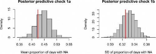
Figure 5. Distribution of the proportion of days spent in state 2 for the empirical (in red) or model-predicted (in gray) time series for the participants. The close overlap indicates adequate model fit. The model slightly underestimates the occurrence of (nearly) constant NA experience, as evidenced by the larger red bar at the extreme right of the graph.
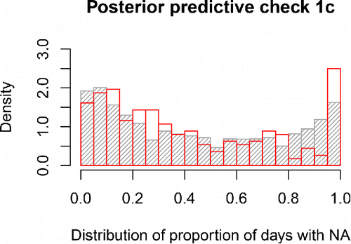
Figure 6. Results of posterior predictive check 2 for the OMM. The red lines represent the empirical mean and SD of the number of state switches in 56 days. The histograms represent the model predictions, which take into account the uncertainty about the estimated model parameters.
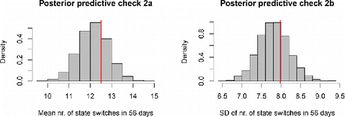
Figure 7. Distribution of the number of state switches in the empirical (in red) or model-predicted (in gray) time series for the participants. The close overlap shows that the model adequately captures the diversity among the study participants in how often they switched states.
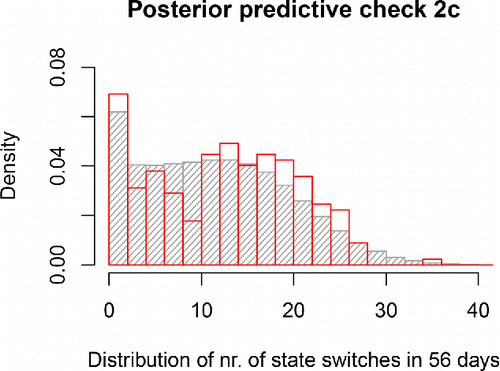
Figure 8. Observed (left) and predicted (right) states for three persons with widely differing switching rates. In generating the predicted data, the posterior medians were used as point estimates of the transition logits. Note that the specific day at which a person is predicted to switch states is not indicative of model fit, since no time-varying predictors were used; it is the overall pattern (switching frequency, time spent in specific states) that should match between the observed and predicted data.
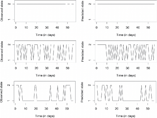
Table 2. Point estimates for the probabilities of different behavior types of each family member, conditional on the state the family is in. The probabilities for the average depressed and non-depressed adolescents are derived from the posterior medians of the average logits and the regression coefficients.
Table 3. Point estimates for the fixed effects in the transition model part. For the sake of interpretability, we present the implied probabilities, not the logits themselves. The value in row i, column j represents the probability, for an average family, of transitioning from state i to j.
Figure 9. Results of posterior predictive check 1 for the LMM. The red lines represent the empirical mean and SD of the proportion of negative affective behavior. The histograms represent the model predictions, taking into account sampling variation as well as uncertainty about estimates.
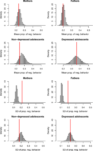
Figure 10. Distribution of the proportion of negative affective behavior over persons, in the empirical data (in red) and in the model-predicted data (in gray).
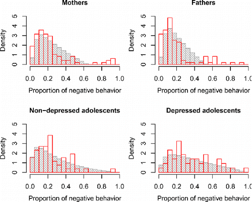
Figure 11. Results of posterior predictive check 2 for the LMM. The red lines represent the empirical mean and SD of the proportion of happy family interactions (moments when at least two family members behaved happily). The histograms represent the model predictions, taking into account sampling variation as well as uncertainty about estimates.
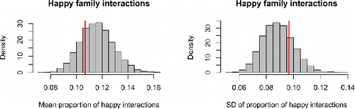
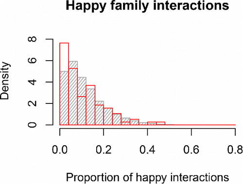
Figure 12. Distribution of the proportion of happy interactions for empirical (in red) or model-predicted (in gray) families. In the empirical data, there were more families at the left end of the distribution, i.e., families where it rarely (or never) occurred that two family members behaved happily at the same time.