Figures & data
Figure 1. The model in (1 A) represents the network model that is associated with the weight matrix The model in (1B) represents the common factor model that is equivalent to the network model in (1 A). The discrimination parameters of this common factor model are presented in the matrix
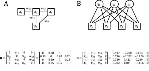
Figure 2. (a) Direct relations underlying the correlations between The causal structure on the left implies the conditional independence structure on the right. (b) Single common cause underlying the correlations between
and
Two different models that explain the correlational structure of three observed variables.
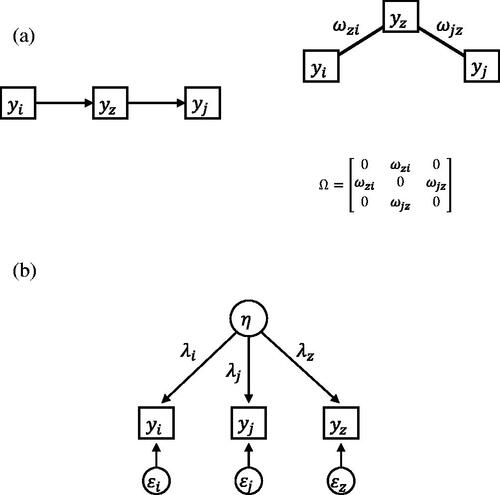
Figure 3. A visual representation of how the test works. The numbers 1:6 correspond with the steps explained in the text. The sample covariance matrix results in two estimated models that both correspond to a probability mass function. The model with the highest probability mass for the observed proportion wins the test. See text for detail.
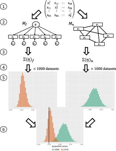
Figure 4. An example of possible output of the test. The black vertical line represents the observed proportion of partial correlations that switched sign or increased in absolute value. In this example the observed proportion in the data has a higher probability mass under the UFM than under the SNM.
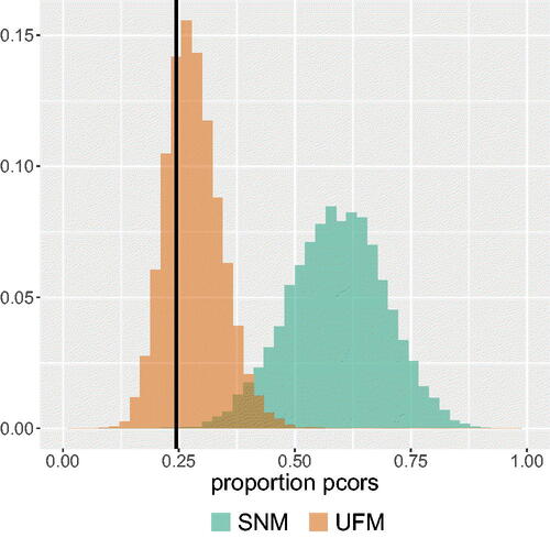
Figure 5. Performance of the test for 5, 10, and 15 variables with the number of observations on the horizontal axis. The green line with crosses represents the proportion of replications in which the test picked the correct model (for 5a, 5c and 5e this is an SNM and for 5 b, 5d and 5f this is a UFM). The blue line represents the mean proportion of partial correlations that have a different sign than the zero-order correlation or are greater in absolute value than the zero-order correlation in data sets that are generated from the true model. The dashed yellow line represents this mean proportion for the estimated SNM and the solid orange line represents this mean proportion for the estimated UFM.
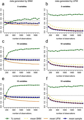
Table 1. Percentage of cases in which the PCL test made a correct (c) or incorrect (i) decision on whether a UFM or SNM underlies the data. The results in this table stem from simulations in which the test picked the model with the highest likelihood for the observed proportion significant partial correlations in the data. The percentages correct and incorrect decisions do not always add up to 100. The missing percentage is the percentage of cases in which the test did not decide because the SNM and UFM had the same likelihood.
Figure 6. Performance of the test for 10 variables when (a) an SNM with density 0.2 or (b) an SNM with density 0.8 underlies the data. The green line with crosses represents the proportion of simulated cases in which the test picks the right model (for both (a) and (b) this is an SNM). The blue line represents the mean proportion of partial correlations that have a different sign than the zero-order correlation or are greater in absolute value than the zero-order correlation in data sets that are generated from the true model. The dashed yellow line represents this mean proportion for the estimated SNM and the solid orange line represents this mean proportion for the estimated UFM.
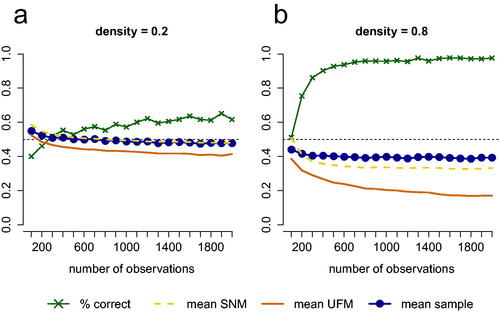
Figure 7. Performance of the test with cross-validation for conditions with 5, 10, and 15 variables with the number of observations on the horizontal axis. The green line with crosses represents the proportion of replications in which the test picked the correct model (for 5a, 5c and 5e this is an SNM and for 5 b, 5d and 5f this is a UFM). The blue line represents the mean proportion of partial correlations that have a different sign than the zero-order correlation or are greater in absolute value than the zero-order correlation in data sets that are generated from the true model. The dashed yellow line represents this mean proportion for the estimated SNM and the solid orange line represents this mean proportion for the estimated UFM.
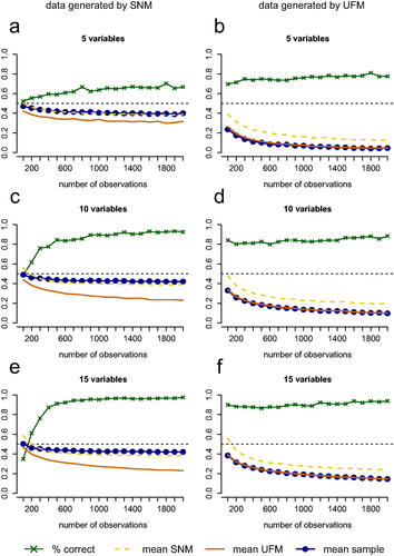
Table 2. Polychoric correlation matrix of the 9 procrastination items. This correlation matrix is obtained with cor_auto() of the R-package qgraph (Epskamp et al. Citation2012).
Figure 8. (a) The UFM that was estimated from the item responses in the procrastination dataset. The estimated factor loadings are standardized. (b) The network that is equivalent to the estimated UFM in . All weights are a function of the nine factor loadings, so that the weights conform to a rank one matrix. Note that the network is not an SNM; it is a complete graph.
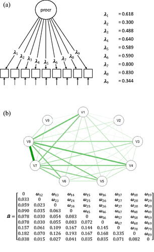
Figure 9. (a) The SNM that was estimated from the item responses in the procrastination dataset. (b) The eigenvalue decomposition of the correlation matrix implied by the SNM in . Q is a matrix of the eigenvectors and r is a vector of the eigenvalues. Estimated SNM and the equivalent common factor model.
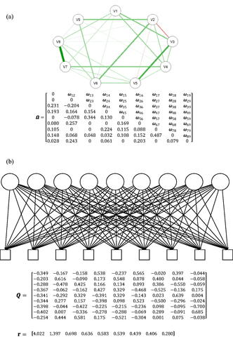
Figure 10. The probability mass functions of the best-fitting SNM and UFM for the proportion of partial correlations that either have the opposite sign as their corresponding zero-order correlations or are greater in absolute value than their corresponding zero-order correlations. The black vertical line represents the observed proportion in the data.
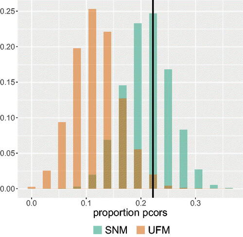
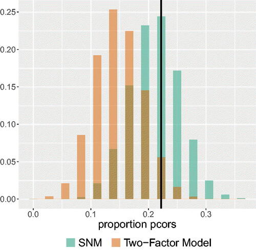
Figure 11. The probability mass functions of the best-fitting SNM and best-fitting correlated two-factor model for the proportion of partial correlations that either have the opposite sign as their corresponding zero-order correlations or are greater in absolute value than their corresponding zero-order correlations. The black vertical line represents the observed proportion in the data.