Figures & data
Figure 1. Three distinct approaches to a three variable network. The left figure illustrates a random graph model in which random variables are associated with the edges of the network. The middle figure illustrates a graphical model in which random variables are associated with the nodes of the network. These two approaches combine into the third approach, which is illustrated in the right panel where random variables are associated to both the nodes and the edges of the network.
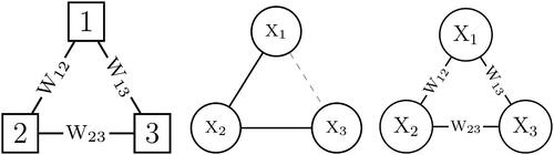
Figure 2. Two realizations of the Erdős-Rényi model for the three node network. Present edges are indicated with a black solid line and absent edges with a gray dashed line.
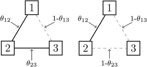
Figure 3. Two realizations of the Ising model for the three node network. Present relations are indicated with black solid line and absent relations with a gray dashed line.
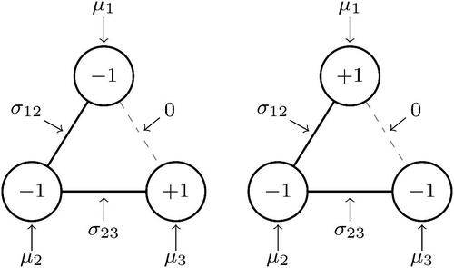
Figure 4. The (cumulative) distribution of clusters in ten-variable networks that were generated from random cluster models with constant edge probabilities but with distinct values for the clustering weight.
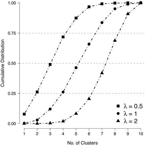
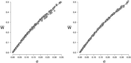
Figure 5. Scatterplots of observed correlations between node states —— for the divide and color model and the Fortuin and Kasteleyn model for a n = 10 variable network in the left panel, and a n = 20 variable network in the right panel. The correlations were based on data from N = 10, 000 cases. The edge probabilities θij were sampled uniformly between 0 and 0.5 and the thresholds μi were simulated from a standard normal distribution.
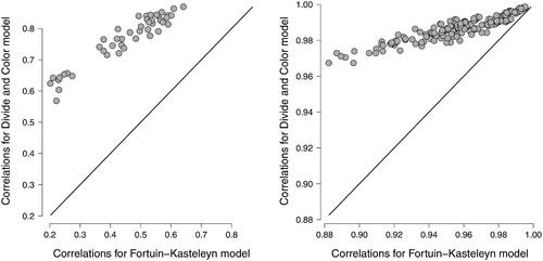
Figure 6. The formal relation between the association parameter σ of the Ising model and the edge probability θ in the random-cluster model.
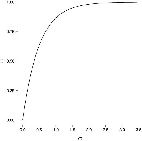
Figure 7. An n = 10 variable network was generated for a single person and 25 plausible values were generated based on r observations of the network. The left panel shows the proportion of correctly identified edges and the right panel the proportion of correctly identified clusters (averaged over plausible networks).
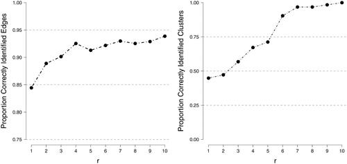
Figure 8. Scatter plots of the posterior mean estimates against the data generating values for the thresholds and
in the two synthetic scenarios. The horizontal gray lines reflect the 95% highest posterior density interval.
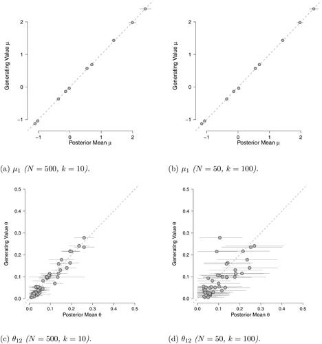
Figure 9. Scatter plots of the posterior mean estimates against the data generating values for the thresholds and
The horizontal gray lines reflect the 95% highest posterior density interval.
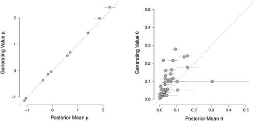
Table 1. Simulation results for the comparison of cluster distributions of the random-cluster and Erdős-Rényi models in various scenarios. See text for details.
Figure 10. The estimated population network structure for the nine symptoms of depression. Edges reflect the posterior means of the Erdős-Rényi model’s edge inclusion probabilities. Pie graphs around each node reflect the node’s activation probability in the absence of network relations. The network was visualized using the qgraph R-package (Epskamp et al., Citation2012).
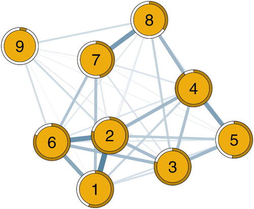
Table 2. Clustering of the idiographic networks of the encompassing network from all four waves split by cluster size. The top row provides the number of possible distinct clusters of a particular size, calculated as where h is the cluster size. The bottom three rows show the number of distinct clusters of a particular size observed in the three samples of plausible networks.
Figure 11. The idiographic networks of two participants across the four waves. Encompassing networks were estimated through consecutively adding data from each wave. After each wave, we ran a Gibbs sampler for 100,000 iterations. The network links depicted here reflect the proportion of links observed in the 100,000 iterations of the Gibbs for these individuals; the thicker the edge, the more often a link was observed. Node coloring represent the symptom states at the particular wave; green indicates a present symptom and red an absent symptom.
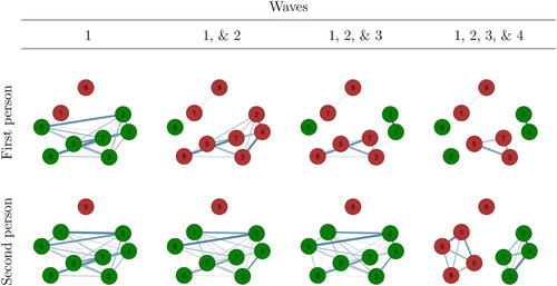
Figure 12. The three most plausible networks for the two persons. Numbers in brackets indicate the proportion of plausible networks with these topologies.
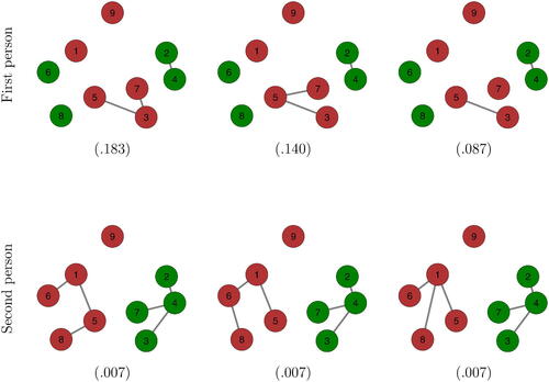
Figure 13. Scatterplots of the proportion of latent links against σij for Fortuin and Kasteleyn’s idiographic Ising model in the left panel, and the divide and color model in the right panel. The associations were defined as
where θij is the generating edge inclusion probability. Results were based on N = 10,000 simulated topologies for a n = 20 variable network. The edge inclusion probabilities θij were the same for both models and sampled uniformly between 0 and 0.5. The thresholds μi were simulated from a standard normal distribution.