Figures & data
Table 1 Classification of estuaries in New Zealand based on hydrodynamic processes from Hume et al. (Citation2007).
Figure 1 Location map of the study area in the southern basin of Tauranga Harbour. The box outlines the extent of the model grid. The harbour is subdivided into different regions based Hume et al. (Citation2009) to classify residence times. The river and stream inflow boundaries are marked and named.
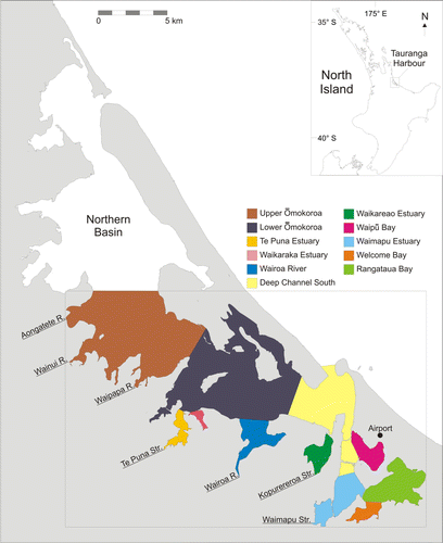
Figure 2 Site map of the location of the 3 November 1999–11 November 1999 S4 current meter deployments at ‘Ōmokoroa (O1, O2, O3)', ‘Motuhou (M1, M2, M3)’ and ‘Western (W1, W2, W3)’ which were used for model calibration. C1 and C2 mark the location of CTD deployments at Ōmokoroa and Western respectively in 2001. F1 and F2 mark the locations of the 10 May 2006–8 June 2006 FSI current meter deployments. P1 and P2 mark the Port of Tauranga and B1 and B2 mark the Bay of Plenty Regional Council water level recorders used for the 2006 validation runs. The location of the ADCP current meter is marked as A, which was used for additional validation. The ELCOM bathymetry grid is plotted as the background to the site map.
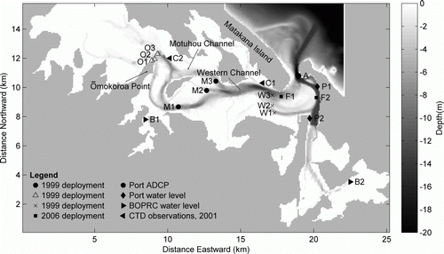
Table 2 Description of different model scenarios applied to southern basin of Tauranga Harbour.
Figure 3 Model calibration: modelled elevation (A), speed (B) and direction (C) plotted with S4 current meter observations for measurements at station 1 on the Western transect (W1 in ) in the southern basin of Tauranga Harbour.
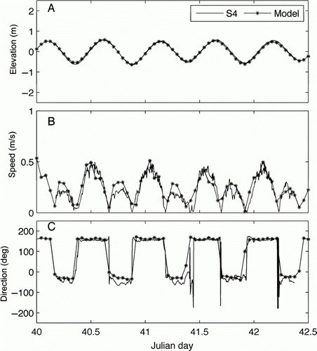
Figure 4 Model validation: comparison between 2008 measured (ADCP data) and modelled current speed at the mouth of the harbour (point A on ).
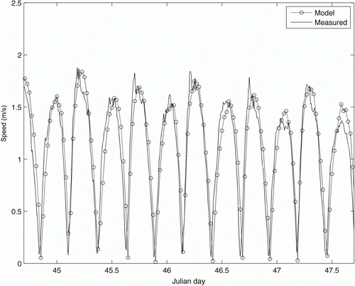
Figure 5 Panel A: M2 cotidal diagram of amplitude (m). Panel B: M2 cotidal diagram of phase (degrees) extracted from output of a 5-year model run. These simulations were forced on the outer boundary with output from the NIWA tidal model, and the M2 component extracted using tidal harmonic analysis software (see text).
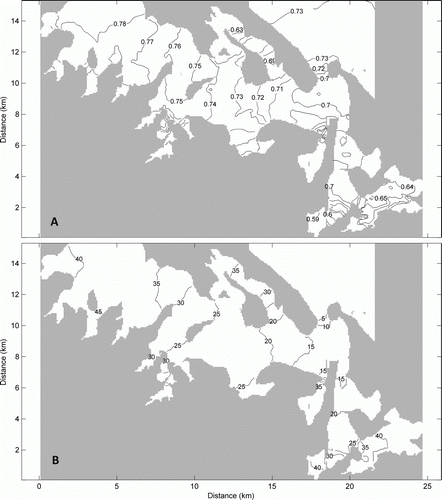
Figure 6 Grey arrows: modelled residual current speed and direction calculated over a 28-day period (the 2006 ‘validation simulation’ period). Solid grey areas indicate dry land and greyscale is water depth. Black arrows with circles: observed residual currents. Note that observed residuals are not measured at the same time or over the same time period as the 28-day model run.
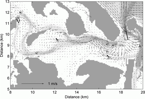
Figure 7 Depth-averaged modelled salinity (A), temperature (B) and residence times (C) of the harbour under dominant wind (top panels) (scenario 0, ) and without wind (bottom panels) conditions for summer (scenario 1, ). The results are averaged over spring to neap tidal conditions (14 days).
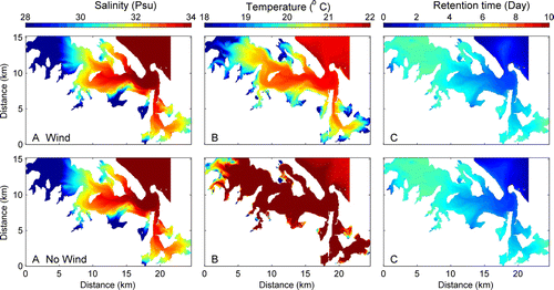
Table 3 Effect of wind velocity on average residence times of sub-estuaries in the southern basin of Tauranga Harbour.
Figure 8 Depth-averaged model results for storm winds over a 14-day spring–neap cycle. Left panels: arrows represent modelled residual current speed and direction. Background greyscale represents the bathymetry. Right panels: modelled retention time. Panel A: wind direction from 250 degrees in winter (scenario 4, ). Panel B: wind direction from 100 degrees in winter (scenario 2). Panel C: east–west current speed at transect marked on upper right panels (— base case (scenario 0); –*– east wind in winter (scenario 2); – + – east wind in summer (scenario 3); –□– west wind in winter (scenario 4); –○– west wind in summer (scenario 5).
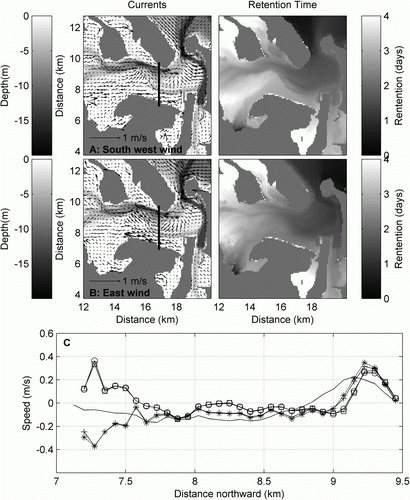
Figure 9 Comparison of measured (S4 and CTD [depth-averaged]) and modelled (ELCOM) salinity and temperature at Ōmokoroa (O2) (A and C) and Western (W2) (B and D) for February 1999. See for station locations.
![Figure 9 Comparison of measured (S4 and CTD [depth-averaged]) and modelled (ELCOM) salinity and temperature at Ōmokoroa (O2) (A and C) and Western (W2) (B and D) for February 1999. See Figure 2 for station locations.](/cms/asset/0748ba83-31ed-4ea8-9986-c122b37d4b15/tnzm_a_778300_o_f0009g.gif)
Figure 10 Comparison of the observed salinity variations during 24 different Wairoa discharge levels in 2001 and the modelled salinity variations following three Wairoa discharge events in 2007–2008. Both model and observed salinities have been depth-averaged. Panel A: the depth-averaged salinity observed at Western (C1) (top line with no circles) and Ōmokoroa (C2) stations (bottom line with circles) during 2001. Measurements were collected within approximately 1 hour of high tide (see for station locations). Panel B: discharge in the Wairoa River during 2001. The grey line shows the raw data, the black line has been smoothed with a 24-hour running mean when the discharge was below 20 m3/s (to smooth the effects of the control exerted by the hydrodams during low flow). Panel C: the relationship between the salinity difference between Western and Ōmokoroa CTD stations and the discharge in the Wairoa River. Filled circles indicate points in which the measurements were collected less than six tidal cycles after a > 20 m3/s discharge event in the Wairoa River. The best-fit line is also plotted (r 2 =0.76). Panel D: modelled salinity difference between Western and Ōmokoroa stations after the discharge events on 10 December 2007 (41.69 m3/s, triangles), 8 September 2008, (175.9 m3/s, circles), 16 August 2008 (63.69 m3/s, squares). The diamonds indicate the low-flow conditions modelled prior to each of these three events and the February 2008 scenario used in . The multiple symbols indicate each successive high tide following the event, with the filled squares indicating the tides immediately following the highest discharge.
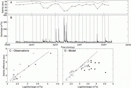
Figure 11 The dashed line represents the vertical profile extracted from model output that begins at Tauranga Harbour southern basin entrance and ends at Wairoa River mouth and runs along the main channel. The orthogonal black lines mark each 1000 m.
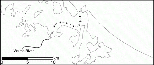
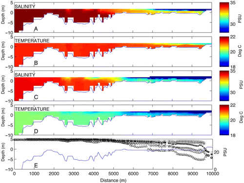
Figure 12 Tidal average of salinity and temperature in the harbour along a vertical profile extracted from the model extending landward from the harbour mouth (0 m at Mt Maunganui entrance) to Wairoa River (9825 m), (A and B) under normal flow conditions, 1 April 2008, (C and D) when the 539.9 m3/s Wairoa River discharge event occurred on 15 April 2008 (scenario 6, ). Panel E shows the depth-averaged maximum, minimum and average salinity during normal flow and the extreme discharge event. The markers o,*, x represent, respectively, the depth-averaged maximum, average and minimum salinity during normal flow. The markers □, ▵, ▿ represent, respectively, the depth-averaged maximum, average and minimum salinity during the extreme discharge event.