Figures & data
Fig. 1. Classification of the SLS storage ring from a clearance point of view. The blue and yellow areas require an individual approach to their clearance, and the area marked with purple is subject to the generalized dismantling and clearance approach.
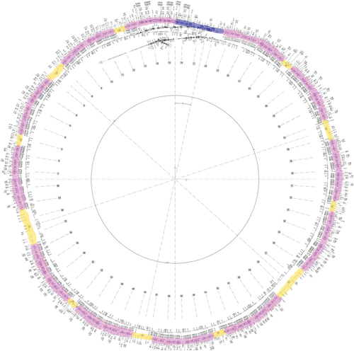
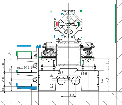
Fig. 2. Schematic representation of the clearance zoning for the girders area shown on the vertical section of the accelerator.
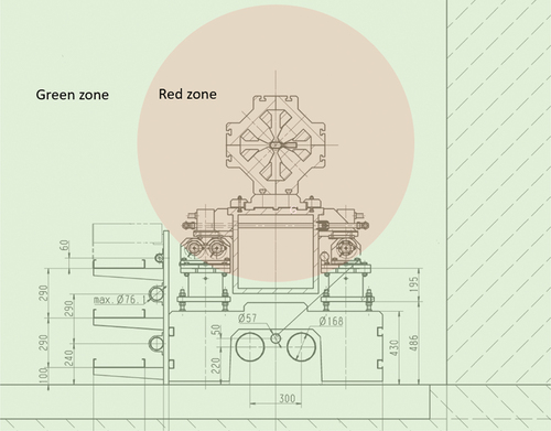
Fig. 3. Exemplary results of the dose rate measurements during 1 h (blue) together with readings of the beam current monitor (green). The dashed line is used to distinguish the different loss types.
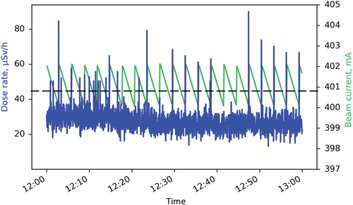
Fig. 4. Dose rate measured during 3 days, including beam drops. The 60-s rolling mean values are shown as the orange line for visualization.
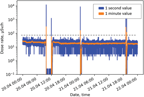
Fig. 5. Neutron dose rate meters installed for the symmetry studies.
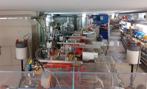
Fig. 6. Histogram of the ratios for the neutron dose rates measured on both sides of the accelerator. The Gaussian fit is shown as the red line.
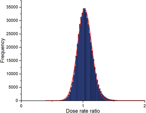
Fig. 7. Holders with reference samples installed at the main hot spot.
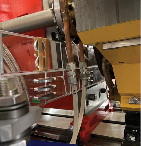
Fig. 8. Normalized relative specific activity of the activation samples measured at different distances to the vacuum chamber.
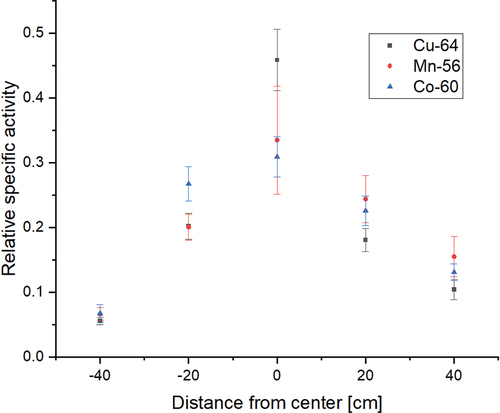
Fig. 9. Measurement positions for the passive dosemeters at the main hot spot.
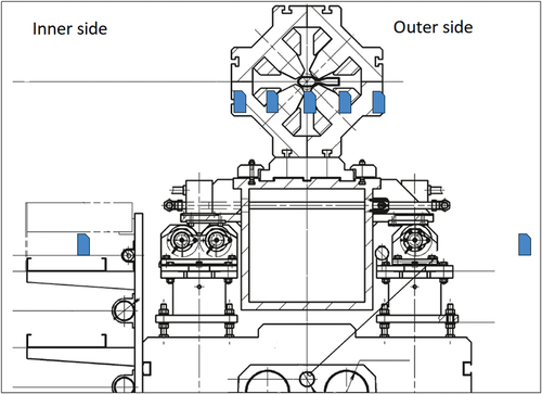
Fig. 10. Results of the measurements with passive dosemeters.
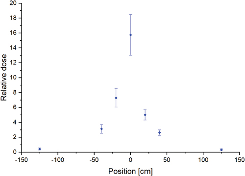
Fig. 11. Schematic representation of the measurement results for the samples taken from surroundings of the main hot spot. Red samples have a specific activity higher than the clearance limit, green samples lower than the clearance limit, and blue samples have a specific activity lower than the detection limit of the measurement system.