
Figures & data
Figure 1 Theoretical migration sequences by King and Skeldon (Citation2010)
Source: King and Skeldon (Citation2010).
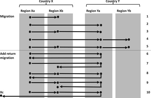
Table 1 Lifetime migration from birth to age 50 in 20 European countries, descriptive statistics (percentages)
Figure 2 Graphical representations of individual migration trajectories from birth to age 50, among those who have ever moved internationally, in 20 European countries.
Notes: Figures are best viewed in colour online. The sequence index plot (panel A) displays horizontal stacked bars that depict all sequences in the sample. In panel B, the relative frequency sequence plot (left-hand side) displays sequence medoids that depict 100 representative sequences, and the distance-to-medoid box plots (right-hand side) visualize the distance of all sequences in a frequency group to their respective medoid. The R2 and F-statistic are overall indicators of how well the selected medoids represent a given set of sequences. Sequences are residential states over successive years from age 0 to age 50. Statistics are based on the migrant sample (N = 1,600).
Source: Data from SHARE (Waves 3 [2008–09] and 7 [2017]; weighted).
![Figure 2 Graphical representations of individual migration trajectories from birth to age 50, among those who have ever moved internationally, in 20 European countries.Notes: Figures are best viewed in colour online. The sequence index plot (panel A) displays horizontal stacked bars that depict all sequences in the sample. In panel B, the relative frequency sequence plot (left-hand side) displays sequence medoids that depict 100 representative sequences, and the distance-to-medoid box plots (right-hand side) visualize the distance of all sequences in a frequency group to their respective medoid. The R2 and F-statistic are overall indicators of how well the selected medoids represent a given set of sequences. Sequences are residential states over successive years from age 0 to age 50. Statistics are based on the migrant sample (N = 1,600).Source: Data from SHARE (Waves 3 [2008–09] and 7 [2017]; weighted).](/cms/asset/fedccfe9-ccf1-4b00-9286-9f72b455733d/rpst_a_2231913_f0002_oc.jpg)
Figure 3 Migration trajectories, among those who have ever moved internationally, in 20 European countries
Notes: Figures are best viewed in colour online. Relative frequency sequence plots display sequence medoids (left-hand panel) that depict representative sequences for each 3–4 sequences, and distance-to-medoid box plots (right-hand panel) visualize the distance of all sequences in a frequency group to their respective medoid. The R2 and F-statistic are overall indicators of how well the selected medoids represent a given set of sequences. Sequences are residential states over successive years from age 0 to age 50. Statistics are based on the migrant sample (N = 1,600).
Source: As for .
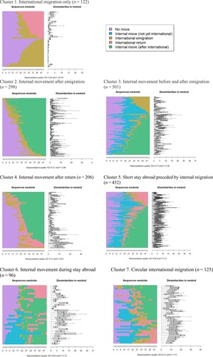
Table 2 Characteristics of each migration trajectory type from birth to age 50 in 20 European countries
Table 3 Predictors of migration trajectory patterns from birth to age 50 in 20 European countries
Table 4 Percentage distribution of migration pathways by European region
Table A1 NUTS 2 regions in SHARE countries: numbers, population density, land size, and migration within and between NUTS 2 regions
Figure A1 Cut-off criteria for cluster solutions (normalized scores)
Notes: Figures are best viewed in colour online. ASW = Average silhouette width; HGSD = Hubert’s Gamma Somers’ D; PBC = Point-biserial correlation. For ease of comparisons across indicators, their scores have been normalized.
Source: Data from SHARE (Waves 3 [2008–09] and 7 [2017]; weighted).
![Figure A1 Cut-off criteria for cluster solutions (normalized scores)Notes: Figures are best viewed in colour online. ASW = Average silhouette width; HGSD = Hubert’s Gamma Somers’ D; PBC = Point-biserial correlation. For ease of comparisons across indicators, their scores have been normalized.Source: Data from SHARE (Waves 3 [2008–09] and 7 [2017]; weighted).](/cms/asset/6b5ba0dd-af05-408e-be56-d7e920e93ade/rpst_a_2231913_f0004_oc.jpg)