
Figures & data
Table 1 Categorizing of forum posts by organization
Figure 1 Map showing results of the hot spot analysis in which the red areas are clusters of postcodes that contain statistically significant amounts of authors, when compared to all other postcodes where posts were made. The names of the cities or regions are used here for broad visual identification purposes.
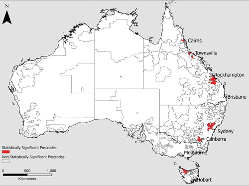
Figure 2 Map showing the cluster and outlier analysis results as applied to the sites identified through hot spot analysis (). Red (high–high clusters) postcodes have statistically high numbers of authors and are spatially close to postcodes that also have significantly high numbers of authors. Blue (low–high outliers) postcodes have a statistically low number of authors and are spatially close to postcodes with a statistically high number of authors. Identifying these clusters and outliers further assists in selecting the most data-rich, spatially proximate postcodes for further qualitative analysis.
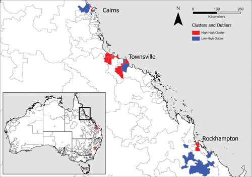
Figure 3 Map showing an index of data validity, for this study’s data, applied to Queensland postcodes. The metric is a sum of two z scores, with the lowest possible value of 0 and the highest possible value of 10. The highest metric score for the current data set is 7.9. Postcodes with scores above 4.8 have been highlighted (shaded red), as these represent the highest 10 percent of metric scores. Note that the shaded areas are broadly similar to those highlighted through hot spot analysis and cluster and outlier analysis.
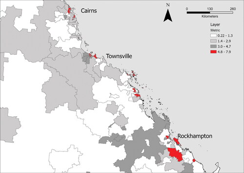
Table 2 Theory of access and definition
Table 3 Results of the qualitative coding by case study site in Queensland, Australia