Figures & data
Figure 1. New monthly cases per 1 million population.
Source: Our World in Data (Ritchie et al., Citation2020).
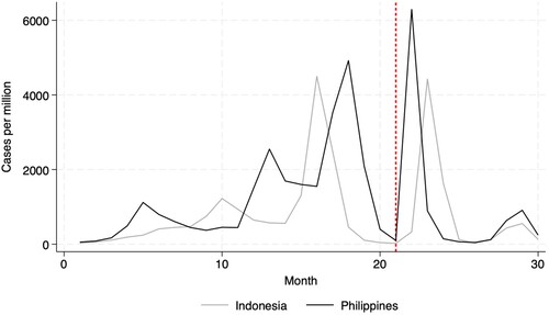
Figure 2. New monthly deaths per 1 million population.
Source: Our World in Data (Ritchie et al., Citation2020).
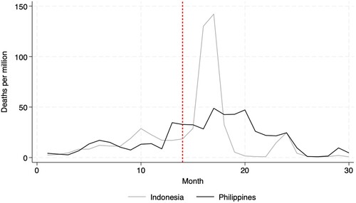
Figure 3. Estimate cumulative excess mortality.
Source: World Health Organization.
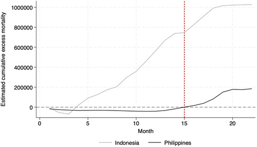
Figure 4. Indonesian puskesmas and COVID fatality rates by province.
Sources: Indonesian Central Statistics Body; Indonesian Ministry of Health.
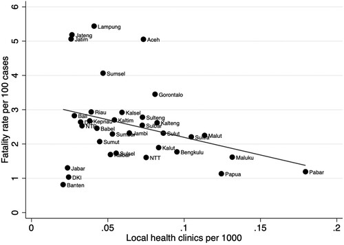
Figure 5. Philippines health clinics and COVID fatality rates by province/HUC/ICC.
Sources: Philippines National Health Facility Registry; Philippines Department of Health.
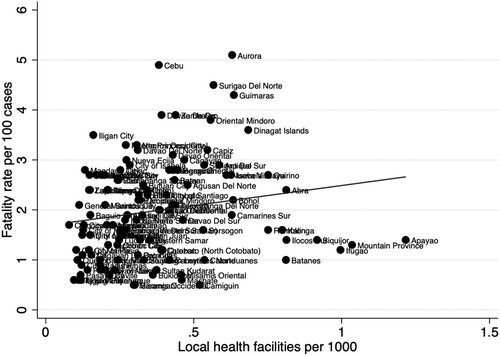
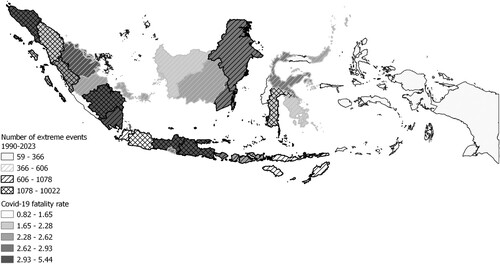
Figure 6. Provincial COVID fatality rate and extreme events from 1990–2023.
Sources: Indonesian National Disaster Management Agency; Indonesian Ministry of Health.