Figures & data
Table 1. Mean (SD) or percentage of baseline characteristics in patients who underwent pancreas and kidney transplantation (SPK) or pancreas transplantation alone (PTA).
Table 2. Clinical status in 159 patients 52 weeks after simultaneous pancreas and kidney transplantation (SPK) or pancreas transplantation alone (PTA).
Table 3. Mean (SD) of glucometabolic parameters and immunosuppressive therapy eight and 52 weeks after transplantation in patients in the SPK and PTA groups.
Figure 1. Time courses for (A) C-peptide, (B) eGFR and (C) fasting glucose after organ transplantation. Time courses within each group (‘PTA’ and ‘SPK’), the average group difference (‘Group’) and the time by group effect (‘Int’) are annotated on the panels as effect size (Beta = B) with 95% confidence intervals and a corresponding p-value. The right indents represent areas under the curve (AUC) for each group. SPK = Simultaneous pancreas and kidney transplantation, PTA: pancreas transplantation alone. *p < .05, **p < .01 and p < .001. The box-and-whiskers depict median, inter quartile range (IQR) and min and max values (no further than 1.5 × IQR). The thick lines connect the medians. The thin lines represent data from each individual.
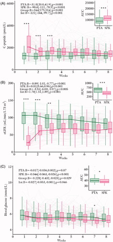
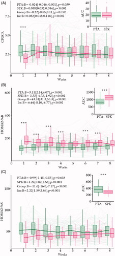
Figure 2. Time courses for (A) CPGCR, (B) HOMA2-%B and (C) HOMA2-%S after organ transplantation. Time courses within each group (‘PTA’ and ‘SPK’), the average group difference (‘Group’) and the time by group effect (‘Int’) are annotated on the panels as effect size (Beta = B) with 95% confidence intervals and a corresponding p-value. The right indents represents areas under the curve (AUC) for each group. SPK = Simultaneous pancreas and kidney transplantation, PTA: pancreas transplantation alone. *p < .05, **p < .01 and p < .001. The box-and-whiskers depict median, inter quartile range (IQR) and min and max values (no further than 1.5 × IQR). The thick lines connect the medians. The thin lines represent data from each individual.