
Figures & data
Figure 1. Histogram for the distribution of pedigree size (a), sibship size (b) and parent-offspring relatedness (c,d).
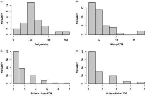
Figure 2. Histogram for median age at PDAC diagnosis (a) and median age at death (b). Kaplan–Meier plot for age at death (c) and survival time from diagnosis to death (d), for male (blue) and female (red) PDAC patients.
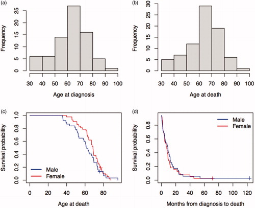
Table 1. Comparison of FDRs between PDAC and unaffected groups.
Table 2. Age at diagnosis and age at death of PDAC patients.
Supplemental material