
Figures & data
Table 1. Characteristics of patient and lesions in the total, training and validation set.
Table 2. Risk factors for difficult colorectal ESD procedures.
Figure 1. The nomogram for predicting difficult colorectal ESD. LST: Laterally spreading tumor.
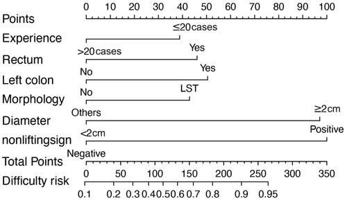
Figure 2. Discrimination and validation of nomogram for predicting difficult colorectal ESD. The receiver operating characteristic (ROC) curves based on the nomogram for the probability of difficult colorectal ESD in the training (A) and validation (B) sets. Calibration curves of the nomogram in the training (C) and validation (D) sets (bootstrap 1000 repetitions). Nomogram-predicted probability of difficult colorectal ESD is plotted on the x-axis and actual probability is plotted on the y-axis. The dashed 45° line represents a perfect prediction by an ideal model, and the solid line represents the performance of our nomogram, which lays closer to the dashed line, meaning a good performance of prediction. 95%CI: 95% confidence interval; AUC: Area under the curve.
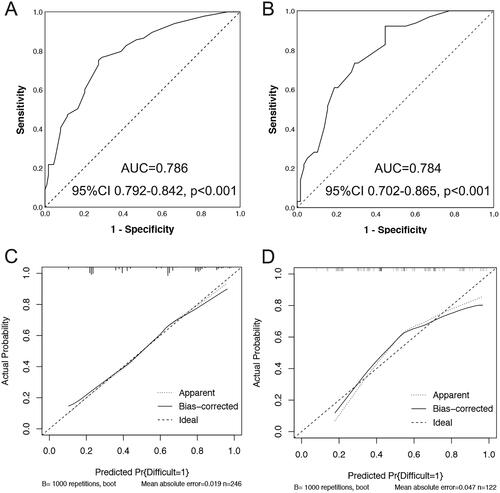
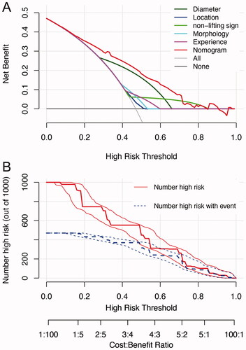
Figure 3. Decision curve analysis (DCA) and clinical impact curve for the nomogram. In the DCA (A), the y-axis represents the net benefit, and the x-axis represents the threshold probability. The gray solid line represents the hypothesis that all patients had difficulty in colorectal ESD. The black solid line represents the assumption that no patients had difficulty in colorectal ESD. The red dashed line represents the nomogram, and other colored lines represent different predictors. The decision curves showed that if the threshold probability is set between 10 and 70%, using the nomogram to predict difficulty of colorectal ESD adds more net benefit than any other predictors alone. In clinical impact curve (B) the vertical axis displays number of high risk. The two horizontal axes show the correspondence between risk threshold and cost: benefit ratio. Of 1000 patients, the heavy red solid line shows the total number who would be deemed high risk for each risk threshold. The blue dashed line shows how many of those would be true positives (cases).
Data availability statement
The data that support the findings of this study are available from the corresponding author, P L upon reasonable request.