Figures & data
Table 1. Summary of two long-term experimental sites
Table 2. Crop rotations of two long-term experimental sites
Table 3. The amount of carbon input to soils from crop residue and applied rice straw in each plot of Site A
Table 4. The amount of carbon input to soils from crop residue and applied compost in each plot of Site B
Table 5. Monthly factors used in the Rothamsted Carbon (RothC) simulations to correct the decomposition rate of carbon based on whether paddy rice or upland crops were used
Figure 1. Comparison of simulation results for Site A. (A) Original model, (B) paddy–soil version, and (C) alternate use of the two versions. Solid and dashed lines show predicted changes in soil organic carbon (SOC) in plot with and without straw application, respectively. Closed and open triangles show observed SOC in plot with and without straw, respectively. P, continuous paddy; SU, short-term upland conversion; MU, medium-term upland conversion.
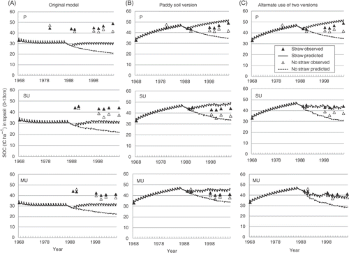
Figure 2. Comparison of simulation results for Site B. (A) Original model, (B) paddy–soil version, and (C) alternate use of the two versions. Thick solid and dotted lines show predicted soil organic carbon (SOC) in –compost plots with and without nitrogen (N) fertilizer application, respectively. Thin solid and dotted lines show predicted changes in SOC in +compost plot with and without N fertilizer application, respectively. Closed and open circles show observed SOC in –compost plot with and without N fertilizer application, respectively. Closed and open triangles show observed SOC in +compost plot with and without N fertilizer application, respectively. P, continuous paddy; LU, long-term upland conversion.
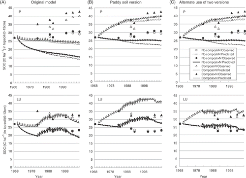
Figure 3. Comparison of root mean square error (RMSE) and mean difference (M) among the three model simulations. Open, closed and gray bars show original model, paddy–soil version and alternate use of two versions, respectively. P, continuous paddy; SU, short-term upland conversion; MU, medium-term upland conversion; LU, long-term upland conversion.
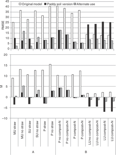
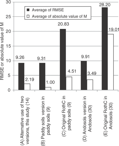
Figure 4. Comparisons of model performances of our study (A), previous studies (B) and (C) from Shirato and Yokozawa (Citation2005), and (D) and (E) from Shirato et al. (Citation2004). Closed and open bars show averages of root mean square error (RMSE) and absolute value of mean difference (M), respectively. Numbers above bars are values of the average. Numbers in parentheses in the labels on the x-axis indicate the number of plots.