Figures & data
Table 1. Productivity attributes for convention and organic Hayward kiwifruit grown in the Te Puke area and submitted to the Zespri export inventory between the 2001/2002 and 2015/2016 seasonsa.
Figure 1. The 4 × 4 seasonal temperature matrix, showing high (red) and low (green) Hayward kiwifruit production risk thresholds, based on quartiles of 3-month mean temperature at Te Puke. MJJ = May–July, etc.
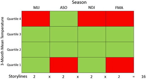
Table 2. Seasonal temperature distribution for Te Puke, based on HadGEM2-ES/RCM simulated data for the period 1971–2000.
Figure 2. Hayward kiwifruit production viability scenarios, based on the temperature threshold storylines. MJJ = May–July, etc.
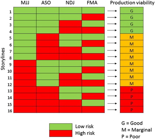
Figure 3. Map of the mean annual growing degree days (base 10°C) for New Zealand, based on the period 1981–2010, showing areas above (green) and below (fawn) 850 GDD. Also shown are 14°C contours of the mean November–January (NDJ) and February–April (FMA) temperature, based on the same 30-year period.
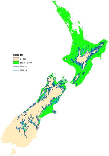
Figure 4. Simulated year-by-year Hayward kiwifruit production viability for 1971–2100 map application, available at https://well-shny-vp.shinyapps.io/CCII/.
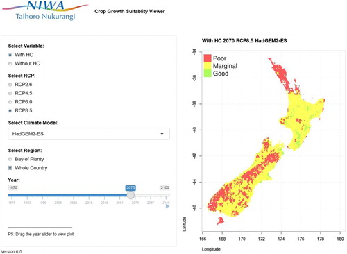
Figure 5. The number of years per decade with mean MJJ temperatures in each of the four 1971–2000 quartile bands, based on HadGEM2-ES/RCM RCP8.5 simulated data for Te Puke. The year on the X-axis is the last year of the decade (i.e. 1980 = 1971–1980).
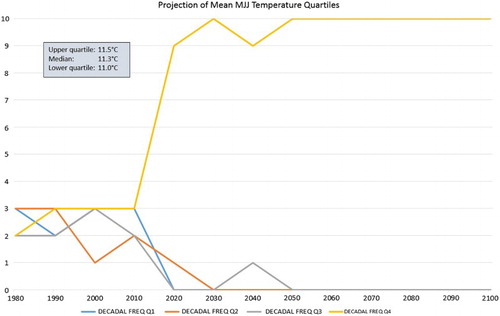
Figure 6. The number of years per decade with ‘good’, ‘moderate’ and ‘marginal’ production viability for Hayward kiwifruit, based on HadGEM2-ES/RCM RCP8.5 simulated data for Te Puke. The year on the X-axis is the last year of the decade (i.e. 1980 = 1971–1980).
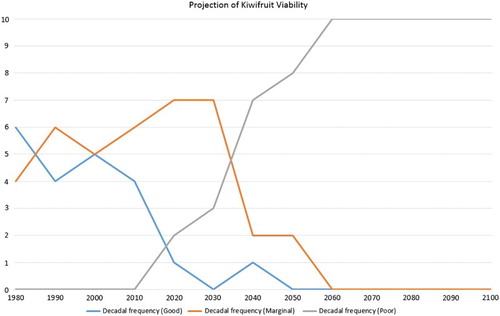
Figure 7. As for , but including the effect of applying hydrogen cyanamide.
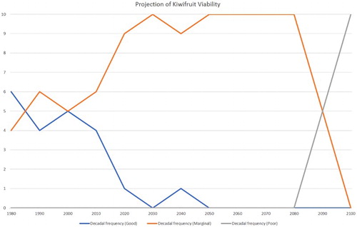
Figure 8. The number of years per decade with ‘poor’ production viability for Hayward kiwifruit for all six GCMs, based on RCM RCP8.5 simulated data for Te Puke and no application of hydrogen cyanamide. The year on the X-axis is the last year of the decade (i.e. 1980 = 1971–1980).
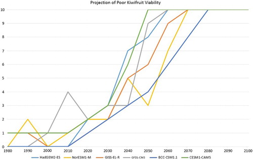
Figure 9. As for , but showing all four RCPs for the HadGEM2-ES model.
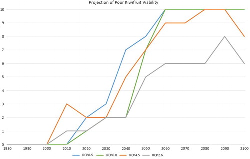
Figure 10. The number of ‘good or marginal’ Hayward kiwifruit production viability years for the period 2046–2065, based on the average of all six GCMs and RCP8.5 (without HC).
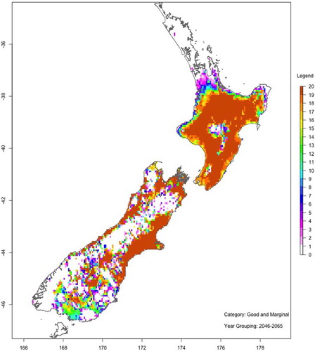
Figure 11. As for , but with HC.
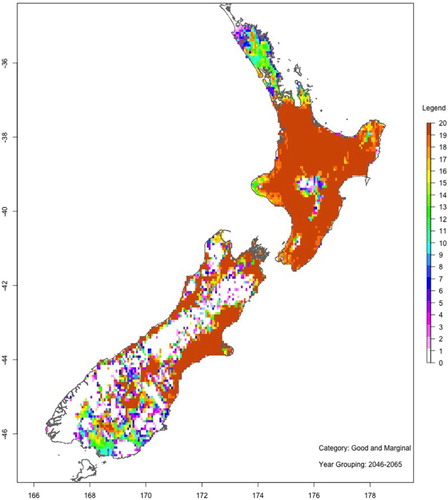
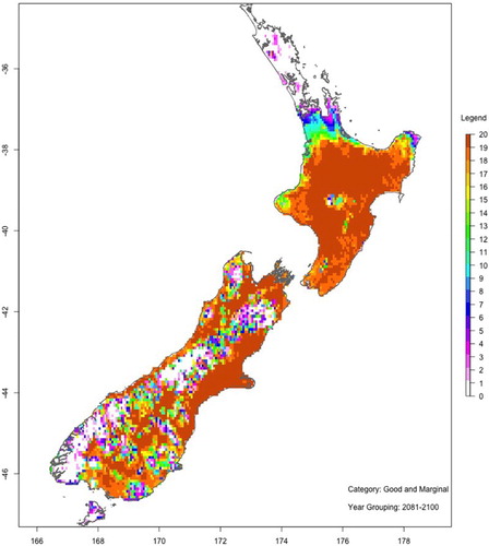
Figure 12. As for , but for the period 2081–2100.
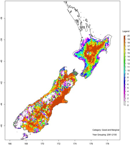
Figure 13. As for , but with HC.