Figures & data
Table 1. Major parameters of TANSO-FTS.
Figure 1. Nominal footprints of TANSO-FTS in the vicinity of Japan.
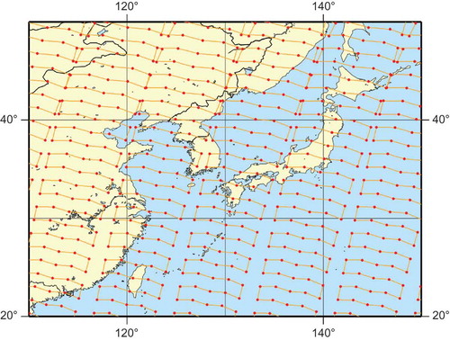
Figure 2. Definitions of technical terms used in the method. The circles are semi-variograms and the solid curve is a semi-variogram model obtained by fitting a curve to the circles.
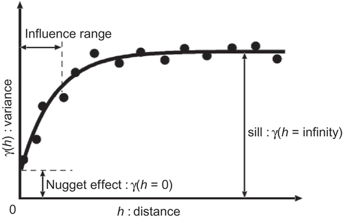
Figure 3. Flowchart of the steps involved in creating FTS Level 3 products. The numbers in the boxes denote the section numbers in the manuscript.
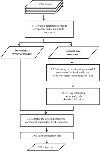
Figure 4. An example of empirical semi-variograms. Open circles and triangles denote semi-variograms obtained from data over ocean and land, respectively. Solid curves show empirical semi-variogram curves obtained by least-squares fitting of each semi-variogram plot.
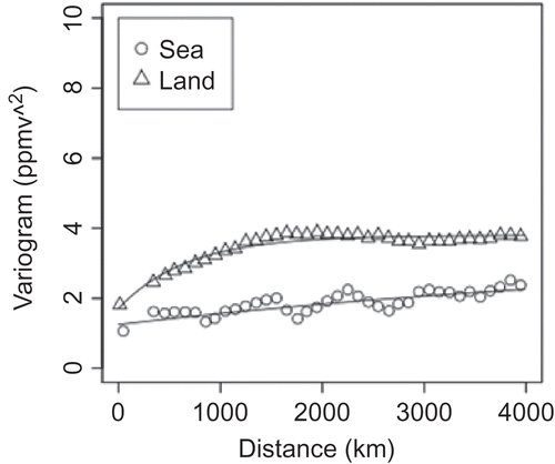
Figure 5. Global XCO2 distributions simulated with the NIES.05 atmospheric tracer transport model. The average column density for one month is plotted in each panel. Each panel shows the monthly distribution in one of four representative months (seasons) in a year.
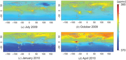
Figure 6. Virtual XCO2 distributions simulated with the NIES.05 atmospheric tracer transport model.
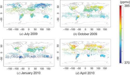
Figure 7. Semi-variograms and semi-variogram curves estimated from the virtual L2 data shown in . Each open circle and triangle was obtained from data over ocean and land, respectively. Solid curves show semi-variogram models obtained by least-squares fitting of each semi-variogram. The values calculated by the models are used to construct semi-variogram matrices. Each panel corresponds to the analogous panel in .
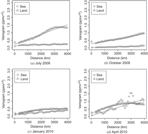
Figure 8. L3 maps calculated from the virtual L2 maps shown in . Each panel corresponds to the analogous panel in .
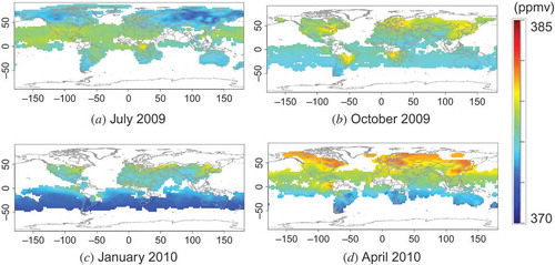
Figure 9. Standard deviation maps for the L3 maps shown in . Each panel corresponds to the analogous panel in .
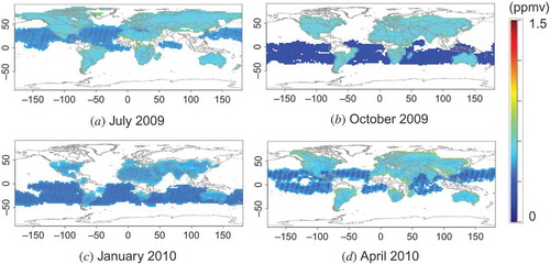
Figure 10. Difference between the ‘ideal’ XCO2 distribution shown in and the reconstructed XCO2 distribution obtained by kriging (). The white zones are areas where values cannot be determined by the method used there. Each panel corresponds to the analogous panel in .
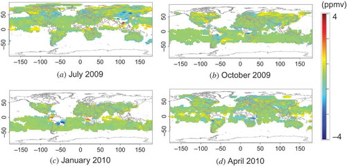
Figure 11. Histograms of the data plotted in . Each graph corresponds to the analogous panel in .
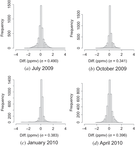
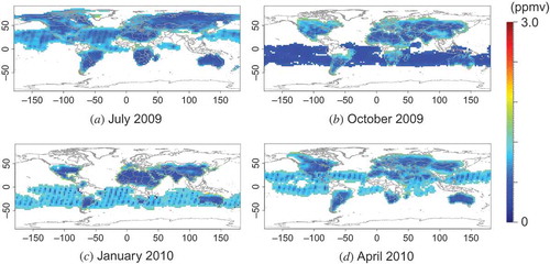
Figure 12. Real L2 maps retrieved from GOSAT Level 1 B products.
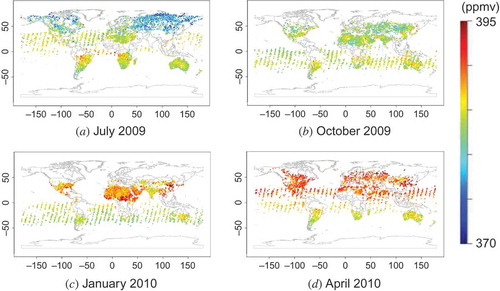
Figure 13. Semi-variograms and semi-variogram curves estimated from the real L2 maps shown in .
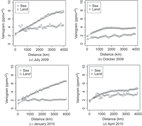
Figure 14. Real L3 maps estimated from the real L2 maps shown in .
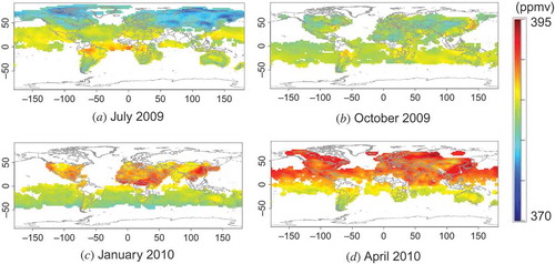
Figure 15. Standard deviation maps for the L3 maps shown in .
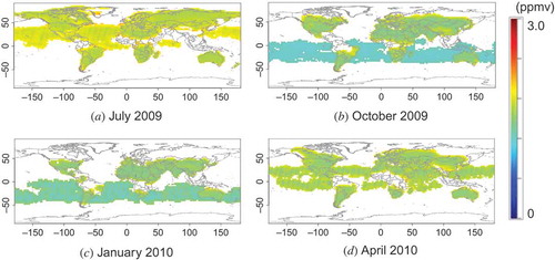
Figure 16. Estimation error, , for the real data.