
Figures & data
Figure 1. A choropleth map displaying data from an analysis of state-level public support for a federal ban on abortion in the U.S (Fischer and Ali Citation2021). The colour legend employs a diverging blue-red colour palette, with white in the centre, showing the full range of possible values. The 30% point is marked with a dotted line and labelled to indicate that no state exceeds this level of support. Reproduced with permission.
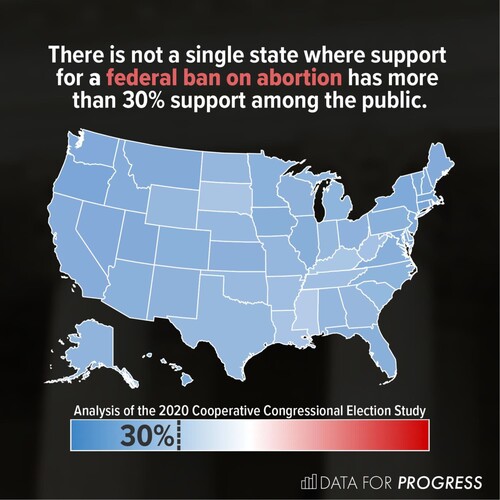
Figure 2. Example stimuli: six choropleth maps showing fictitious pollution data. Four colour legends are displayed below each map, but only one colour legend accompanied the map in each trial. Colour legends with extended ranges have a maximum value equal to double the maximum plotted value (top row: 400; bottom row: 1800). Colour legends with truncated ranges have a maximum value equal to the maximum plotted value in the map (top row: 200; bottom row: 900). During the experiment, all six colour scales were used in conjunction with all maximum values.
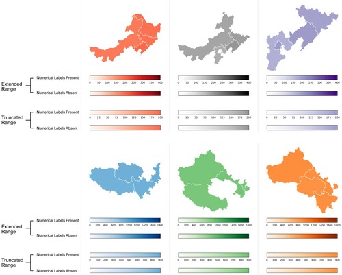
Table 1. Demographic Information.
Figure 3. An example of a single experiment trial, showing a choropleth map with a truncated colour legend, plus a response marker on the visual analogue scale.
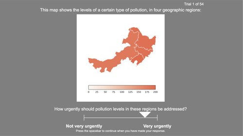
Table 2. CIELab values for colour legends’ start and end colours.
Figure 4. Visual analogue scale responses to the question ‘How urgently should pollution levels in these regions be addressed?’. Distributions for the two conditions are shown using histograms, boxplots, and raw data points representing individual observations. In the ‘Extended Range’ condition, the colour legend’s upper bound was equal to double the maximum plotted value. In the ‘Truncated Range’ condition, the colour legend’s upper bound was equal to the maximum plotted value.
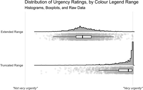
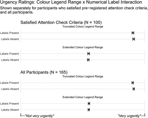
Figure 5. Mean urgency ratings showing the interaction between colour legend range and numerical label presence, displayed separately for the different samples of participants. Error bars show 95% confidence intervals around the means.
Data availability statement
The pre-registration, plus materials, experiment script, data, analysis code, and Dockerfile are available at https://osf.io/qe9hf/. This repository contains the requisite resources to generate a fully-reproducible version of this paper.