
Figures & data
Figure 1. Map of Red Goshawk occurrence records between 1978 – 2020 and respective Australian States, Territories, and Ecoregions used in this analysis.
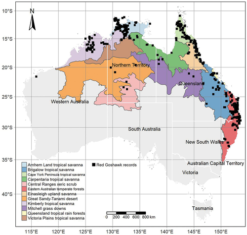
Figure 2. Red Goshawk reporting trends between 1978 – 2020. a) National scale with bars in-filled proportionately by State records. b) New South Wales. c) Queensland. d) Northern Territory. e) Western Australia.
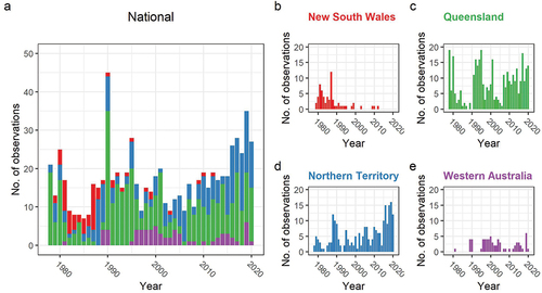
Figure 3. Red Goshawk records plotted spatially and coloured by respective State and Territory. a) Timeseries maps spanning four decades from the 1980’s to 2010’s. b) Latitude of records between 1978 – 2020 fitted with a Generalised Additive Model trendline and 95% Confidence Interval.
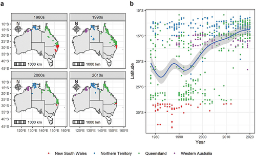
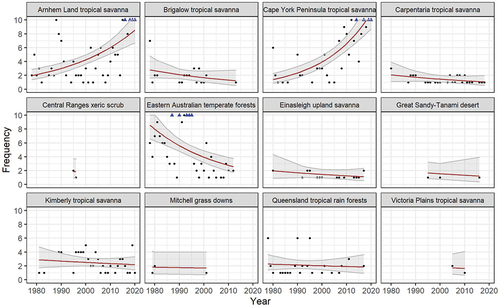
Figure 4. A Poisson log-linear mixed effects model using the frequency of Red Goshawk reports each year between 1978 – 2020, with the mean (red line) illustrating the population trend, and the shaded area illustrating the 95% confidence interval. Y scales are fixed on a 0 – 10 range with frequencies >10 indicated by blue triangles.