Figures & data
Figure 1. Examples of the rich variety of smooth model components that can be represented as reduced rank basis smoothers, with quadratic penalties and therefore can routinely be incorporated as components of a GAM. This article develops methods to allow their routine use in a much wider class of models. (a) One dimensional smooths such as cubic, P- and adaptive splines. (b) isotropic smooths of several variables, such as thin plate splines and Duchon splines. (c) Nonisotropic tensor product splines used to model smooth interactions. (d) Gaussian Markov random fields for data on discrete geographies. (e) Finite area smoothers, such as soap film smoothers. (f) Splines on the sphere. Another important class are simple Gaussian random effects.
Figure 2. A smooth Gaussian location scale model fit to the motorcycle data from Silverman (Citation1985), using the methods developed in Section 3.2. The left plot shows the raw data as open circles and an adaptive p-spline smoother for the mean overlaid. The right plot shows the simultaneous estimate of the standard deviation in the acceleration measurements, with the absolute values of the residuals as circles. Dotted curves are approximate 95% confidence intervals. The effective degrees of freedom of the smooths are 12.5 and 7.3 respectively.
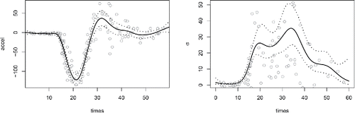
Figure 3. Simulation based illustration of the problems with previous AIC type model selection criteria and the relatively good performance of the Section 5 version. In all panels: (i) the solid curves are for conventional conditional AIC, (ii) the dotted curves are for the Section 5 version, (iii) the middle length dashed curves are for AIC based on the heuristic upper bound degrees of freedom, (iv) the dashed dot curves are for the marginal likelihood based AIC and (v) the long dashed curves are for the Greven and Kneib (Citation2010) corrected AIC (top row only). (a) Observed probability of selecting the larger model as the effect strength of the differing term is increased from zero, for a 40 level random effect and Gaussian likelihood. (b) whole model effective degrees of freedom used in the alternative conditional AIC scores for the left hand panel as effect size increases. (c) Same as (a), but where the term differing between the two models was a smooth curve. (d) As (a) but for a Bernoulli likelihood. (e) As (a) for a beta likelihood. (f) As (a) for a Cox proportional hazards partial likelihood.
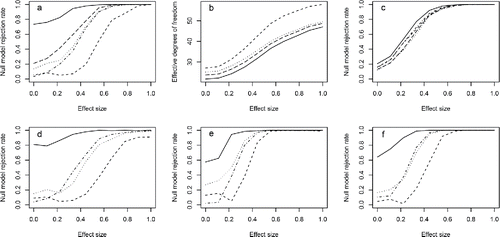
Figure 4. Results of simulation comparison with gamlss (beta, nb, scat, zip) and BayesX (ocat) packages for one dimensional P-spline models. The two plots at lower right show comparisons of log 10 computing times for the case with the smallest time advantage for the new method — Beta regression. The remaining panels show boxplots of replicate by replicate difference in MSE/Brier’s score each standardized by the average MSE or Brier’s score for the particular simulation comparison. Each panel shows three box plots, one for each noise to signal level. Positive values indicate that the new method is doing better than the alternative. Boxplots are shaded grey when the difference is significant at the 5% level (all three for nb correlated should be gray). In all cases where the difference is significant at 5% the new method is better than the alternative, except for the zero inflated Poisson with uncorrelated data, where the alternative method is better at all noise levels.
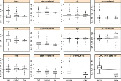
Figure 5. Three representative protein mass spectra (centered and normalized) from serum taken from patients with apparently healthy prostate, enlarged prostate, and prostate cancer. It would be useful to be able to predict disease status from the spectra. The red and blue spectra have been shifted upward by 5 and 10 units, respectively.
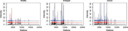
Figure 6. Results from the ordered categorical prostate model fit. (a) The estimated coefficient function f(D) with 95% confidence interval. (b) Boxplots of the model probability of cancer, for the 3 observed states (1, healthy, 2, enlarged and 3, cancer). (c) QQ-plot of ordered deviance residuals against simulated theoretical quantiles, indicating some mismatch in the lower tail.
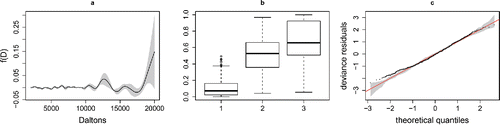
Figure 7. Part of a dataset from the USA on fuel efficiency of cars.
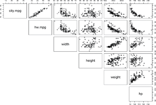
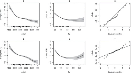
Figure 8. Fitted smooth and random effects for final car fuel efficiency model. Panels (a)–(c) relate to the city fuel consumption, while (d)–(f) are for the highway. (c) and (f) are normal QQ-plots of the predicted random effects for manufacturer, which in the case of highway MPG are effectively zero.