Figures & data
Figure 1. (a) The U.K. Black Smoke Network monitoring network at its largest in 1967. Symbol sizes are proportional to annual average log black smoke. (b) Annual average log black smoke against year. Black dots are averages over space, with dot size proportional to network size. Gray dots are station averages. (c) Daily averages for 1967, across all stations shown in (a). (d) All daily measurements for the longest running site, shown as a gray “+” in (a).
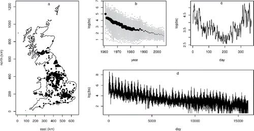
Figure 2. Semivariograms for the 40th (top row) and 200th (bottom row) days of years 1966, 76, 86, and 96, checking for residual spatial autocorrelation. Each plot shows the empirical semivariogram for the log black smoke measurements as black dots, with the corresponding reference bands under zero autocorrelation as black lines. The white dots and dotted lines show the equivalent for the residuals of model (Equation1(1)
(1) ). The reduction of the network in later years leads to wide reference bands, but in all plots the model appears to offer a reasonable representation of the spatial pattern.
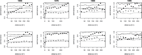
Figure 3. Aggregate ACF for model (Equation1(1)
(1) ) residuals assuming independent residuals in gray, with the equivalent for the standardized residuals assuming AR1 residuals, overlaid in black. While not perfect, the AR1 model greatly reduces the unmodeled temporal autocorrelation.
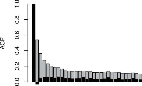
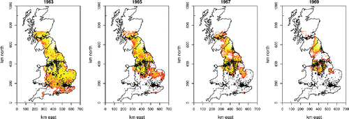
Figure 4. Image plots of log predicted number of days exceeding the EU daily exposure threshold for town center locations for several years in the 1960s. By 1975 there were essentially no exceedance days predicted.
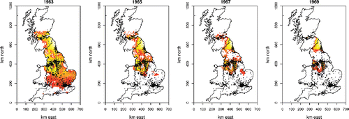
Figure 5. Image plots of log average probability of exceeding the EU daily exposure threshold for town center locations for several years in the 1960s. Red is -6 corresponding to less than one exceedance day expected per year, while the top of the scale is 0.