Figures & data
Fig. 1 Scatterplot of Galton’s peas data. Thickness of a dot represents the number of data points at that location. (Figure courtesy of Susan Holmes.)
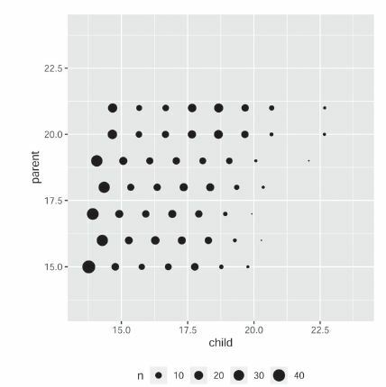
Table 1 Contingency table for Galton’s peas data.
Fig. 2 Values of for various kinds of scatterplots, with n = 100. Noise increases from left to right. The 95th percentile of
under the hypothesis of independence is approximately 0.066.
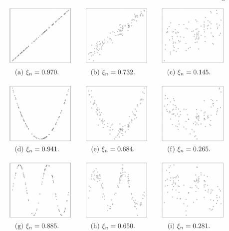
Fig. 3 Histogram of 10,000 simulations of , superimposed with the asymptotic density function.
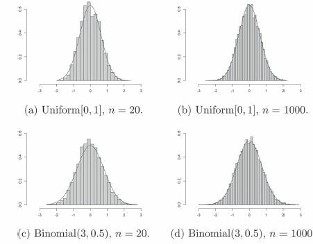
Fig. 4 Histogram of 10,000 simulations of when X and Y are dependent Bernoulli random variables (see Section 4.2), superimposed with the normal density function of suitable mean and variance. Here,
and n = 1000.
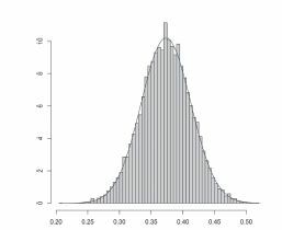
Fig. 5 Comparison of powers of several tests of independence. The titles describe the shapes of the scatterplots. The level of the noise increases from left to right. In each case, the sample size is 100, and 500 simulations were used to estimate the power.
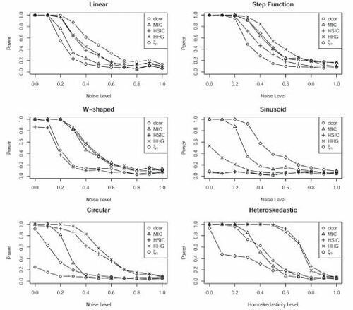
Table 2 Run times (in sec) for permutation tests of independence, with 200 permutations.
Fig. 6 Transcript levels of the top 6 among the 215 genes selected by ξn but by no other test. The dashed lines are fitted by k-nearest neighbor regression with k = 3. The name of the gene is displayed below each plot.
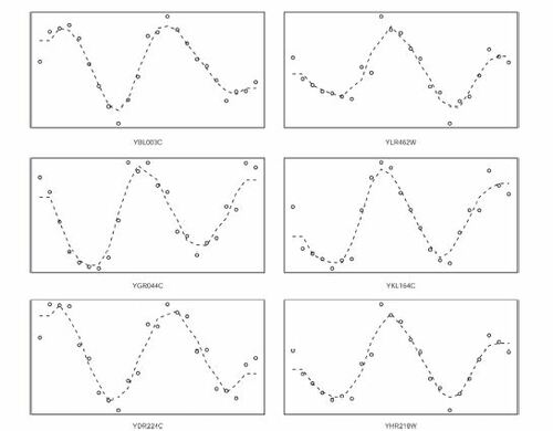
Fig. 7 Transcript levels of a random sample of 6 genes from the 215 genes that were selected by ξn but by no other test.
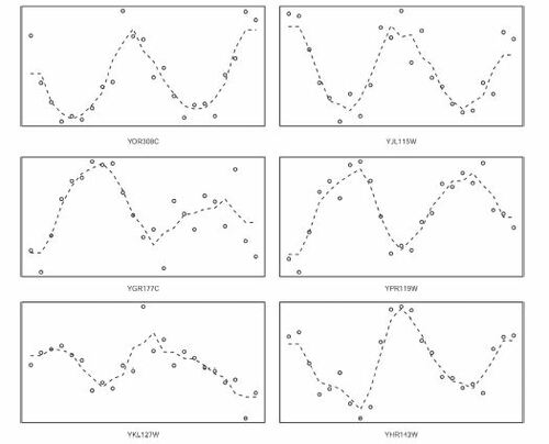
Fig. 8 Transcript levels of 6 randomly sampled genes from the set of genes that were not selected by ξn but were selected by at least one other test.
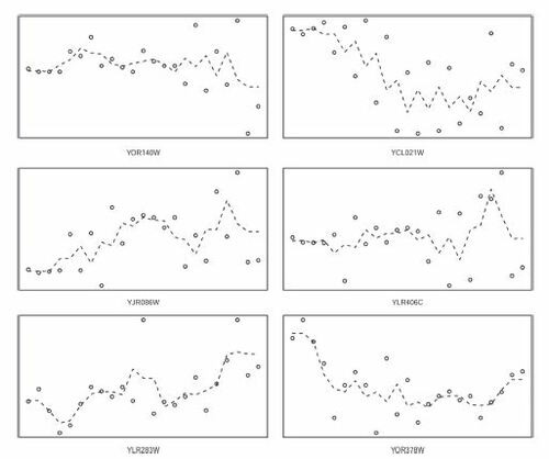
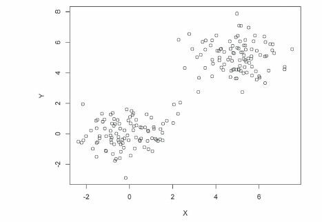
Fig. 9 Scatterplot of a mixture of bivariate normals, with n = 200. For this plot, maximal correlation , MIC
, and
.