Figures & data
Fig. 1 Location map of the Korba aquifer and geological settings (squares are 10 × 10 km). Hydraulic heads observed in August 2004 are also shown.
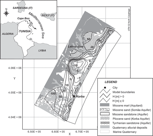
Fig. 2 (a) Average pumping rates map after Kerrou et al. (Citation2010) with the location of the exhaustive pumping rate survey (dashed line polygon). (b) Scatter plot of estimated Qc versus measured Qm pumping rates; (c) histogram of the residual e; and (d) experimental (o) and model (––––) variograms of the error.
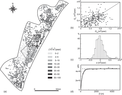
Fig. 3 The Korba aquifer 3-D numerical model, modified after Kerrou et al. (Citation2010). Note that wells were attributed at around 10 m from model surface and the lateral fluxes were integrated over the Pliocene formation thickness. Element sizes range from 150 to 200 m in the main aquifer and between 50 and 100 m near the shoreline. Vertically, the mesh is divided into 19 layers with 5 m thickness on average.
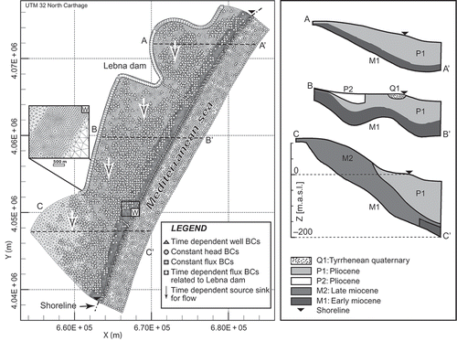
Fig. 4 Scatter plot showing the fits between the observed and calculated concentrations: (a) heads (m) and (b) salt concentrations (g/L). In both cases, observed values ±RMSE (root mean squared error) are also shown.
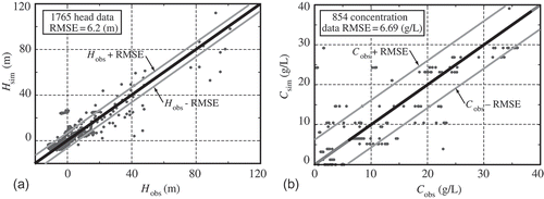
Fig. 5 (a) and (b) Example maps of the pumping rates (Qc 1996). (c) and (d) Histograms of pumping rates for wells 240 and 361. (e) Time-dependent evolution functions for both wells (Q 240: ––– and Q 361: - - - -) with 1996 volumes as reference.
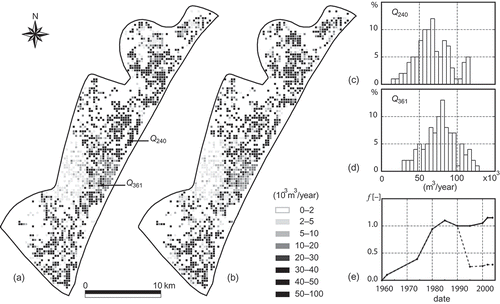
Fig. 6 Ensemble average maps for the 100 realizations: (a) head H (m); and (b) relative concentration C (‐).
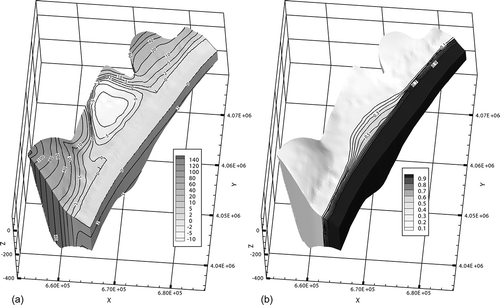
Fig. 7 Histograms of: (a) and (b) head H (m), and (c) and (d) relative concentration C (‐) in wells Q 361 and Q 240, respectively. Ensemble average (––––) and ensemble average ±2 ensemble standard deviations (grey lines) are also shown.
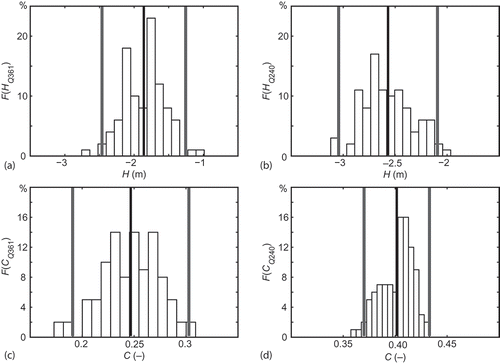
Fig. 8 Probability map for a point (a) to be under the mean sea level and (b) to exceed the 0.1 relative salt concentrations. Both maps show 0.95, 0.75, 0.5, 0.25 and 0.05 isoprobability contours.
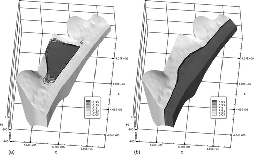
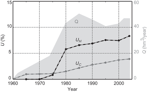
Fig. 9 Time evolution of the uncertainty: Q (grey polygon) represents the total estimated exploitation volume (hm3), UH is the ratio (%) between the uncertain area with respect to the probability of falling below sea level and the onshore aquifer area; and UC is the ratio (%) between the uncertain area with respect to the probability of exceeding 0.1 relative concentration and the onshore aquifer area.