Figures & data
Table 1 Summary flow statistics for the Upper Ahuriri River at South Diadem gauge (period of record 1963–2009)
Fig. 1 Location map of (a) the Upper Waitaki River Basin major hydrological features and (b) HEC-GeoHMS catchment map showing the extent of the Ahuriri River, major tributaries, and 31 sub-basins used in the HEC-HMS model.
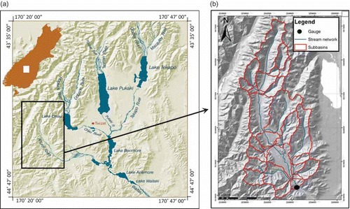
Fig. 2 Schematic flow chart for runoff curve number mapping for input to HEC-HMS.
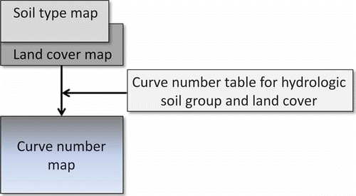
Fig. 3 Calibration storm (14–18 May 2009) used for the Ahuriri River catchment HEC-HMS model.
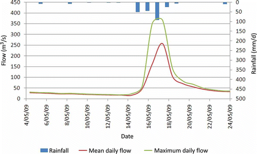
Fig. 4 Mean monthly flows for the Ahuriri River at the South Diadem gauge (1963–2009).
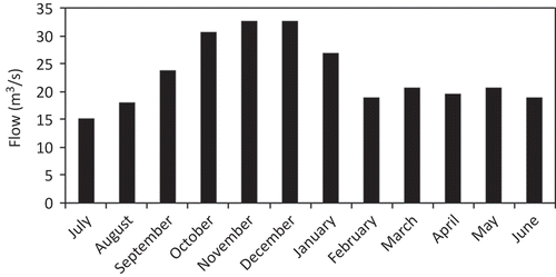
Table 2 Parameters for the two best-fitting distributions, flood peak estimates (m3/s), and the average values of the two distributions
Fig. 5 Plot of comparison of estimated flood magnitudes and return periods for the five best fitting probability distributions for the Ahuriri River flood data.
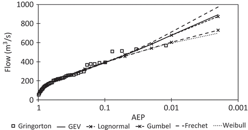
Fig. 6 HEC-HMS model calibration results showing the Ahuriri River observed and modelled flow for the calibration event.
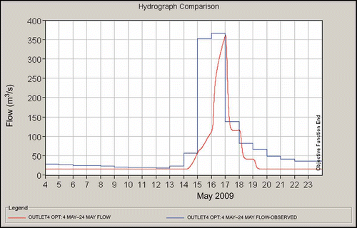
Table 3 Summary of comparison of HEC-HMS model results to statistical and other estimates for all flood peaks evaluated in this study (m3/s). PEPF (Per cent Error in Peak Flow) compares HEC-HMS peak to statistical mean peak. ARI is annual recurrence interval (years) and AEP is annual exceedence probability
Fig. 7 HEC-HMS model validation results showing the Ahuriri River observed and modelled flow.
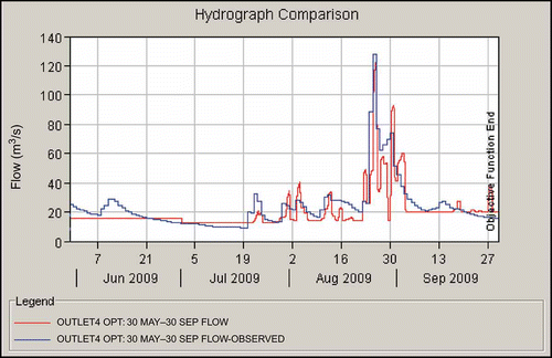
Fig. 8 Comparison of the Gringorton plotting position of observed Ahuriri River flood data, GEV and lognormal statistical probability distributions mean, calibrated HEC-HMS model results based on the best curve numbers (CN), model results with both +5% CN and –5% CN, and results from Pearson (Citation1995) based on regional L-moments and quantiles.
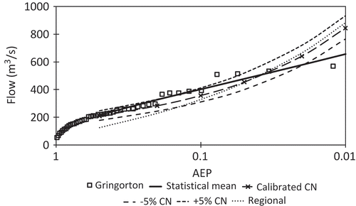
Table 4 Sensitivity analysis results of per cent change in curve numbers with resulting proportion change in modelled flood peaks. ARI is annual recurrence interval and AEP is annual exceedence probability
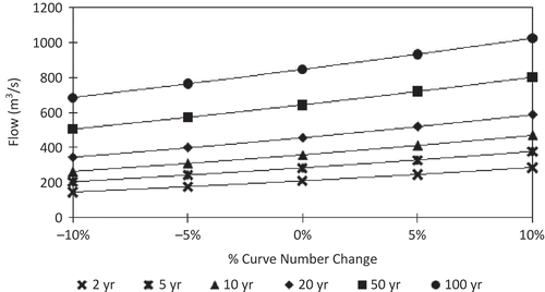
Fig. 9 Results of the curve number sensitivity analysis showing the significant increase in flows observed as the curve number increased.