Figures & data
Figure 1. Hydrological Outlook data, models and workflow. Blue shading represents streamflow and groundwater data, green shading represents climate data, bi-colour shading represents use of both groundwater and climate data. Solid line boxes indicate methods using observations alone, dashed boxes indicate use of dynamical seasonal forecasts. Grey boxes represent the model used. The final Hydrological Outlook UK is shown as a dotted box.
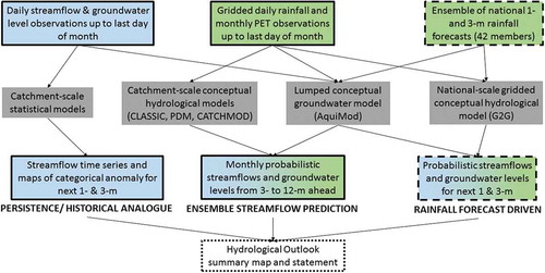
Table 1. Categories and associated probabilities used to classify the Hydrological Outlook UK.
Figure 2. Regional streamflow forecasts for January 2017 to March 2017 for three quartiles and two members of the MO ensemble of rainfall forecasts. The observed flows could be more extreme than the flows generated by either the lowest or highest members of the rainfall ensemble. See for key details.
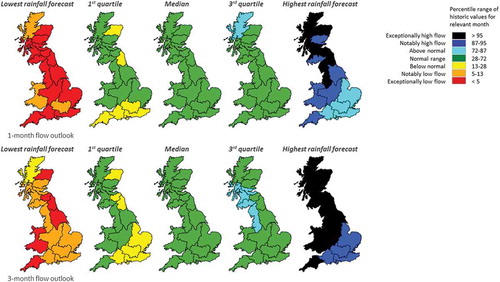
Figure 3. Regional histograms illustrating the full range of ensemble streamflow forecasts: January 2017 to March 2017.
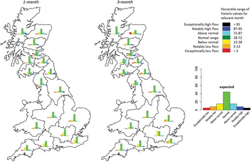
Figure 4. Groundwater level forecasts for end January and end March 2017 for the following five ensemble members: lowest, 1st quartile, median, 3rd quartile and highest. The observed levels could be more extreme than those generated by either the lowest or highest members of the rainfall ensemble.
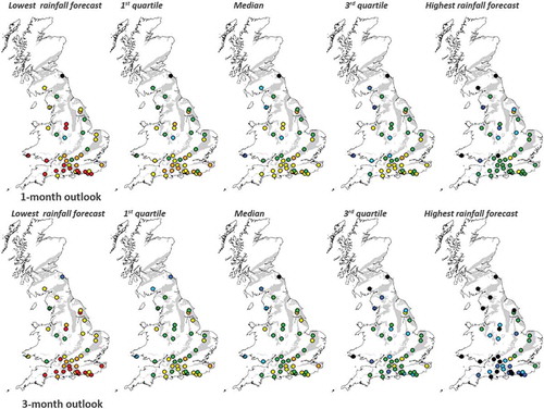
Figure 5. Seasonal mean streamflow outlook based on historical climate starting in January 2017. Stack diagrams of the empirical cumulative distribution for the River Avon at Bathford for forecast horizons from 1 to 12 months (x-axis). The height of each colour band for a given x-axis represents the proportion of the sample within a given flow category.
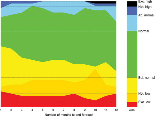
Figure 6. Bar plots of forecasted distribution at the river basin centroids. Note the bar plots only show five categories as described in .
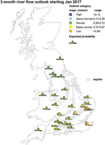
Figure 7. Time series plot for January 2017 streamflow forecast for the River Thames at Kingston showing the persistence forecast (here final forecast, red dashed line) and the five most similar historical analogues (solid thin black lines). The normal range covers the middle 44% of the empirical distribution of streamflow (see ).
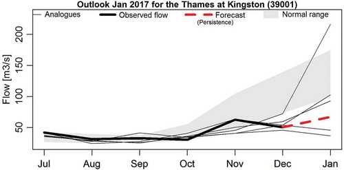
Figure 8. Categorical streamflow volume forecasts for January 2017, based on persistence and historical analogy, and associated confidence levels. Note that only three categories are used, with the notably and exceptionally wet (dry) and above (below) normal being merged into a single blue/high (orange/low) category, respectively. See key for details.
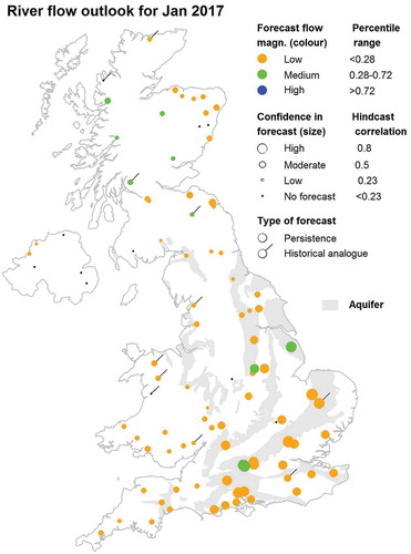
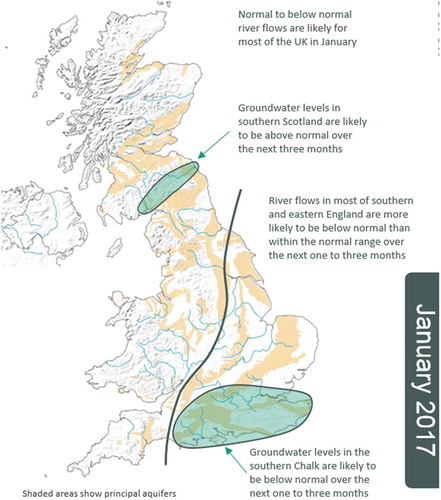
Figure 9. Example of a Hydrological Outlook UK summary map.