Figures & data
Figure 1. Location of the selected stations used in the study in the nine climate regions over the contiguous United States. Adopted from https://www.ncdc.noaa.gov/monitoring-references/maps/us-climate-regions.php. Note that WN Central stands for Western North Central (or Northern Rockies and Plains).
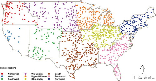
Figure 2. Quantile perturbation analysis on extreme precipitation, using 5-year moving block window size in different climate regions of the USA. The black-dashed lines represent the 95% confidence intervals to define statistically significant perturbations.
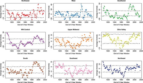
Table 1. Occurrence of the significant positive/negative anomalies in each decade, reported as a percentage of the total number of 5-year sub-periods; the blue and red labels represent the maximum negative and positive percentage for each climate region, respectively.
Figure 3. (a) Spatial distribution of sign and value of the highest anomaly. (b) The frequency of significant anomalies in different regions. Note that the scale of the y-axis varies for different climate regions.
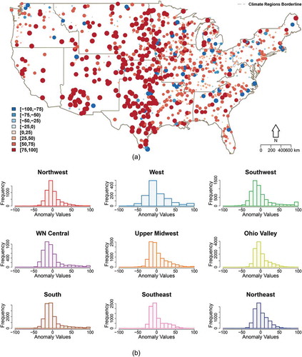
Figure 4. The percentage of stations that perform better with different combinations of climate drivers within each climate region.
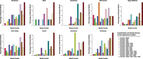
Figure 5. Coefficient regression values for different climate predictors within each climate region. (a) Boxplots indicating the range of coefficient regressions (variable scale of y-axes). (b). Maps showing the spatial distribution of coefficient of regression values for different climate variables. (c) Barcharts of the significance ratio (ratio of stations with significant response at 5% to the total number of stations) of the climatic variables within each climate region.
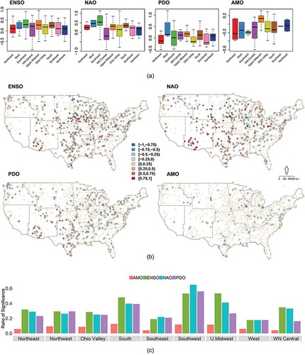
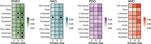
Figure 6. Coefficient regression values for different climate predictors and different block sizes. The color scheme represents the median of significant coefficient of regression values within each region. Black dots indicate the regions where values are significant in more than 75% of stations. White cells denote that the median coefficient regression is close to zero.