Figures & data
Figure 1. Treatment planning process. First, the patient is treated (a) using four 70 MHz wave guide antennas placed in a ring around the patient. At the end of the treatment session, a CT scan is made (b). This scan is automatically segmented into air, bone, fat, and muscle, and the bladder is delineated by a physician (c). Using this segmentation, the electromagnetic field is computed (d). Finally, the temperature distribution in the patient is computed (e). All images show the coronal view (top right), sagittal view (top left), and axial view (bottom) through the centre of gravity of the scanned patient volume.
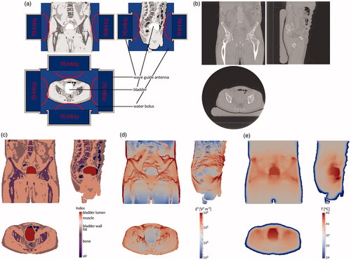
Figure 2. (a) Temperature measurements of patient #12. Each point represents an individual measurement, the lines are moving five-point averages as a guide to the eye. Sensors 1–2 (pressed against the bladder wall) are shown in orange, sensors 3–8 (in the bladder lumen) in blue, sensors 9–10 (fixation balloon) in purple, sensors 11–12 (urethra, near the bladder) in red, and sensors 13–14 (urethra, further from the bladder) in green. While the tip of the probe is inside the bladder, the last few sensors are in the urethra, leading to a different temperature profile. For the first 15 min, the temperature increases roughly linearly; after about 40 min, steady state temperatures are reached. (b) Temperature measurement for sensor #7 (patient #12) at 3 cm from the probe tip (green), and the temperature simulations by the muscle-like model (brown stars), the static model (red empty squares), and the dynamic model (blue filled squares). The time axis for the measurements has been shifted so that T = 37 °C at t = 0 s.
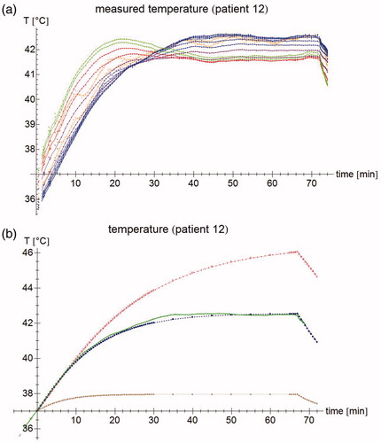
Table 1. parameter values for the three different simulations performed for each patient. Parameters are obtained from: Balidemaj et al. [Citation51], Gabriel and Gabriel [Citation53–54], Rossmann and Haemmerich [Citation55], Klein and Swift [Citation56] and Sharqawy et al. [Citation57].
Figure 3. (a) Temperature rise per sensor for patient #12 after 30 s. Green filled circles: measurements, brown stars: muscle-like model, red empty squares: static model, blue filled squares: dynamic model, purple empty circles: expected temperature rise based only on computed specific absorption rate (SAR). (b) Normalized SAR per sensor after 30 s. Brown stars: muscle-like model, red empty squares: static model, blue filled squares: dynamic model. (c) Aggregated normalized SAR, showing median, inter-quartile range, minimum and maximum, and outliers.
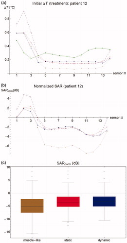
Figure 4. (a) Correlation between initial temperature rise at t = 30 s and steady state temperature. Lines show best linear fit. (b) Correlation between normalized SAR and normalized steady state temperature. A strong correlation means that errors in predicted steady state temperature are largely explained by errors in SAR computation. (c) Residual plots of the correlation, showing a clear bias on a per patient basis, but a good distribution for the group. Dashed lines separate points belonging to different patients. (d) Correlation for patient #12, showing that correlation parameters within one patient are radically different form the group ones.
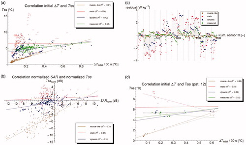
Figure 5. Modeled temperature profiles through the patient in the x-, y-, and z-directions. The vertical lines indicate the outer edge of the bladder lumen (yellow) and the bladder wall (purple), respectively.
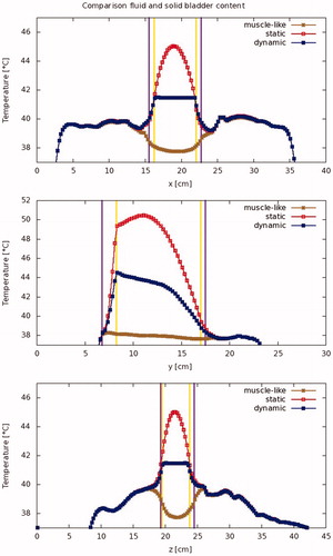
Figure 6. Modeled temperature standard deviation (a: absolute, and b: relative) per patient for the bladder contents and the bladder wall.
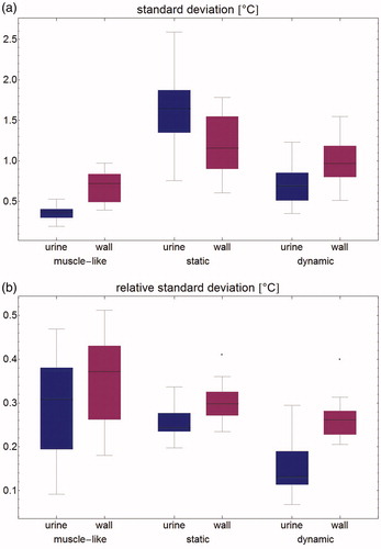
Figure 7. Temperature volume histogram, showing the modeled steady state temperature distribution for the bladder contents (dotted), the bladder wall (solid), and the interface between those two regions, representing the urothelium (dashed); each as computed by the muscle-like model (brown), the static model (red) and the dynamic model (blue).
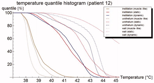
Table 2. Mean temperature in °C for all patients (mean, standard deviation, and minimum and maximum temperature are given) for the three different simulations of the bladder lumen: 'muscle-like' models the bladder lumen as solid, perfused muscle; ’static urine' uses physical parameters for urine, but no flow dynamics; and 'dynamic urine' also applies flow dynamics.
Figure 8. (a) Steady state temperature per sensor as measured (filled circles), and as predicted by the muscle-like model (stars), the static model (empty squares) and the dynamic model (filled squares). The measured temperatures and those predicted by the dynamic model are relatively homogeneous and close to each other, whereas the muscle-like model grossly underestimates the steady state temperature, and the static model overestimates the same. (b) Aggregated normalised steady state temperature Tss for all patients. The muscle-like model (brown, left) predicts temperatures that are generally far too low, the static model (red, middle) tends to overestimate the temperature and has a wide spread in temperature errors, and the dynamic model (blue, right) tends to underestimate the temperature, and has a much smaller spread in temperature errors. (c) Error in T50 for the muscle-like (brown, right), static (red, middle), and dynamic (blue, right) models. Although the dynamic model tends to underestimate temperatures, it has by far the smallest errors of the three models.
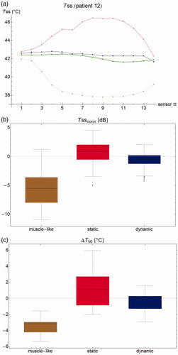
Table 3. Performance of the muscle-like, static and dynamic models on a per patient basis, determined by the difference between measured and modeled temperatures and the sensor locations.
Figure 9. Correlation of the (measurable) urine temperature and (clinically relevant) wall temperature for the T90 (a), T50 (b) and T10 (c), respectively, according to the muscle-like model (brown star), the static model (red empty squares), and the dynamic model (blue filled squares). The lines show the best linear fit, based on least squares.
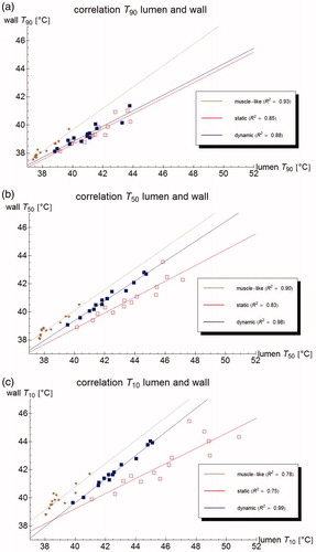
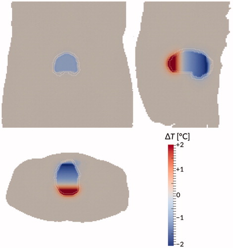
Figure 10. Temperature difference between the dynamic model and the ‘perfect mixing’ model (‘perfect mixing’ minus dynamic) after 90 min treatment time for patient #12. Bladder wall shown in white. Shown are a coronal view (top right), sagittal view (top left), and axial view (bottom) through the centre of gravity of the bladder. Gravity points into the paper, to the left, and to the bottom, respectively.