Figures & data
Table 1. Patient characteristic, including the number of the CT slices used for manual and semi-automatic segmentation of structures.
Figure 1. 3D volume rendering of three exemplary STS patients with implemented catheters in the tumor.
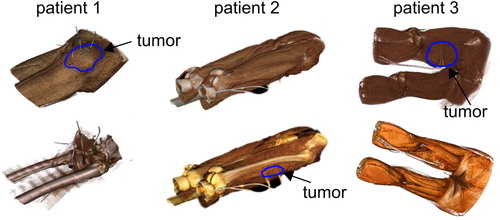
Table 2. Applicator setting for both patient treatments and thermal simulations.
Figure 2. Thermal simulation setup in the software SigmaHyperPlanTM.
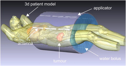
Figure 3. Flowchart illustrating the evaluation procedure of both treatment and simulated temperature data.
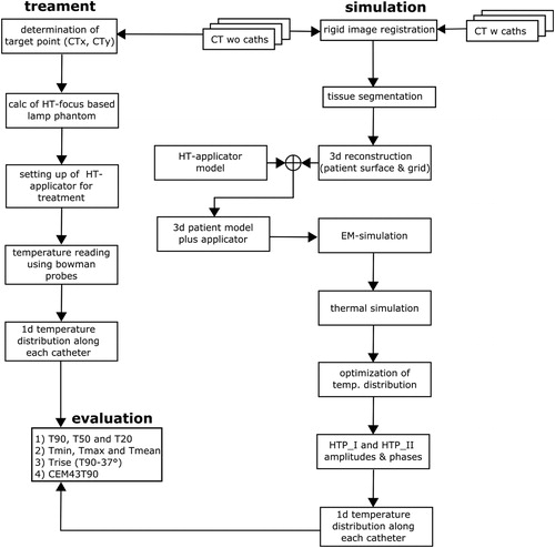
Figure 4. Measured temperatures along the tumor catheters for all treated patients. Note that the height of each boxplot represents the measured values over the entire treatment time for each catheter position. The red points are the calculated mean values and the black bold line in the boxplot gives the median value. The position 0 cm means that the sensor was located at the catheter tip. The temperature mapping was in 1 cm steps.
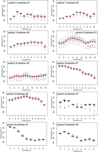
Figure 5. Calculated temperatures using the data from . Note that the width of the boxplot reflects the time-averaged temperature values for all mapping positions. The red point is the computed mean value.
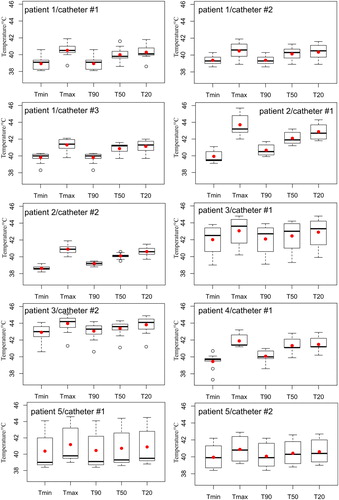
Table 3. Thermal dose (CEM43T90) values for both patient treatments and thermal simulations.
Table 4. Temperature change () of T90 above the patient body temperature of 37 °C.
Figure 6. Coronal cross-sections thermal maps, overlaid on CT images, of the five STS patients generated from the HTP_I. The maps show relative inhomogeneous temperature distributions within the HT-GTV. Note that some hot spots are developed either within the muscle tissue or close to the bone.
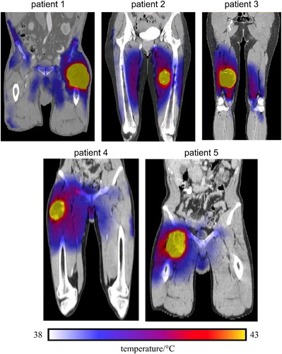
Table 5. Temperatures obtained from the HTP_I. Note that the core body temperature is 37 °C.
Table 6. Temperatures calculated from the thermal simulation HTP_II.
Table 7. Temperature differences between patient treatment and thermal simulation HTP_I.
Table 8. Temperature differences between patient treatment and thermal simulation HTP_II.
Table 9. Differences of for both thermal simulations, where the patient treatment served as a reference.
Figure 7. 2D Photograph images of the lamp phantom positioned inside the SIGMA-Eye applicator, where the applicator settings of patient treatment, HTP_I and HTP_II were applied. The hot spot in the phantom presents the 2D electrical field distributions using 400 watts for all phantom measurements. Note that the field distributions of HPT_I and HTP_II feature a significant deviation with respect to the shape of the distribution and the hot spot position, when they compared to the treatment settings.
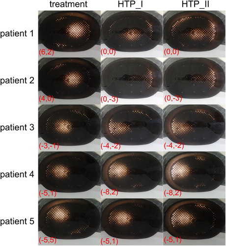
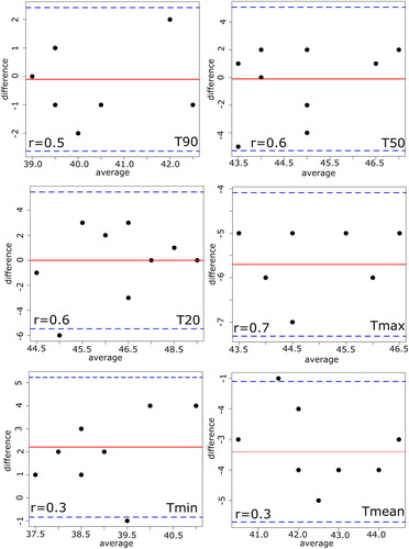
Figure 8. Bland–Altman plot with the corresponding correlation coefficient (r) between the real patient treatment and thermal simulation HTP_I. The solid line shows the mean of differences between both methods and the thin dashed lines show
of confidence interval of 95%, where
the standard deviation of the differences. Note that values with the same differences will be plotted on the top of each other.
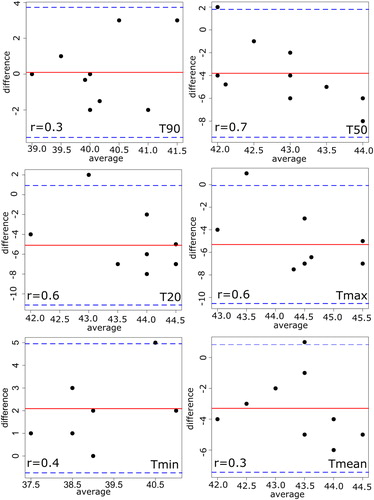
Figure 9. Bland–Altman plot with the corresponding correlation coefficient (r) between the real patient treatment and thermal simulation HTP_II.