
Figures & data
Figure 1. Overview of numerical approach. (a) A bolus of acid chloride and oily solvent is delivered through the blood vessels. The bolus enters the liver parenchyma, Ω, through the tissue-vessel interface, (b) The injection pressure drives Darcy flow through the porous liver tissue. Mass balance is used to track the bolus transport. Heat transfer is a combination of both convection of the chemically reacting acid chloride and heat diffusion. Atmospheric pressure and zero flux are assumed on the far boundary,
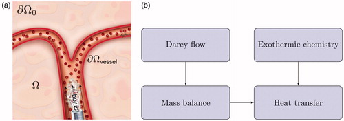
Table 1. Parameter summary [Citation46–52].
Figure 2. Observed heating. (a) The maximum time point and heating observed in the MR thermometry imaging (MRTI) is shown. Temperature (°C) is shown in relative change from the baseline ambient temperature. (b) The temperature rise is shown as a function of time (seconds) at the spatial positions labeled in (a). For every voxel on the line indicated by the white arrow in (a) there is a time–temperature curve in (b).
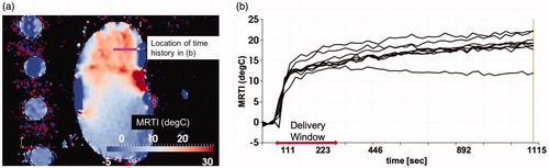
Figure 3. The temporal dynamics of the DCACl solution. Bolus saturation is shown in (a) and (b). The pressure field is shown in (c). The time instance of (a) represents the initial conditions. The final time point of the simulated 20-min experimental time window is shown in (b) and (c). The corresponding predicted temperature field is shown in . The color bars in (a) and (b) are provided in color online and represent the volume fraction Pressure is shown in atmospheric units, atm.
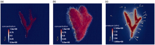
Figure 4. Comparison of simulation to measurement. The final time point of the simulated 20-min experimental time window is shown. (a) Measured and (b) predicted temperatures are shown. The color bars represent relative °C change from the baseline temperature. (a) The measured temperature is shown within a 5 mm thick 2D imaging plane of the MR thermometry. The maximum temperatures seen occur within the imaging-visible vasculature. Isotherms of the maximum temperatures outline the tissue-vessel boundary, (b) The corresponding temperature predictions corresponding to (a) is shown. Convection and diffusion processes at the vessel-tissue interface provide the forcing function for the temperature transport. Similarly, the (c) measured and (d) predicted temperature is shown 1 cm out-of-plane from (a). The length of the line profiles shown in (a)–(d) is 5 cm.
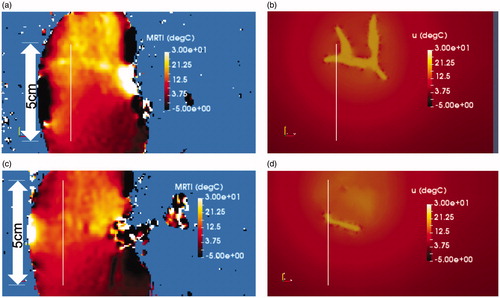
Figure 5. Comparison of simulation to measurement. (a) The predicted and measured temperature is shown as a function of distance [mm] along the 5 cm line profiles illustrated in . (b) The predicted and measured temperature is shown as a function of distance [mm] along the 5 cm line profiles illustrated in .
![Figure 5. Comparison of simulation to measurement. (a) The predicted and measured temperature is shown as a function of distance [mm] along the 5 cm line profiles illustrated in Figure 4(a) and (b). (b) The predicted and measured temperature is shown as a function of distance [mm] along the 5 cm line profiles illustrated in Figure 4(c) and (d).](/cms/asset/23d5dfc6-858d-49e6-941e-1d1540af5ea2/ihyt_a_1749317_f0005_c.jpg)