
Figures & data
Table 1. Characteristics of the study cohort before PSM.
Figure 1. Kaplan–Meier curve comparing CSS and OS between AKI and non-AKI patients. CSS: cancer specific survival; OS: overall survival.
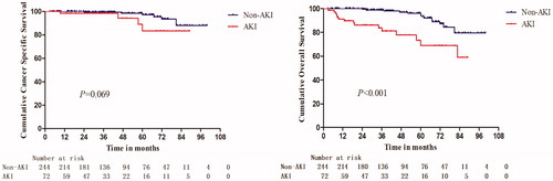
Figure 2. Nomogram for the prediction of AKI after NSS or MWA, based on multivariable logistic regression analysis. Instructions: locate the patient's baseline eGFR on the corresponding axis. Draw a line straight downward to the score axis to determine how many points toward the probability of AKI the patient receives for his/her baseline eGFR. Repeat the process for each additional variable. Add the points for each of the predictors. Locate the final sum on the total score axis. Draw a line straight up to find the patient's probability of AKI. AKI = acute kidney injury; eGFR = estimated glomerular filtration rate; CCI = Charlson comorbidity index.
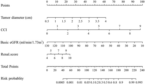
Table 2. Independent predictors of AKI.
Figure 3. AUC, calibration curve and decision curve analysis of AKI nomogram. A, AKI nomogram ROC curve. The x-axis indicates 1-specificity and y-axis the sensitivity. Area under the curve of ROC (AUC = 0.864) represents the great AKI discriminative ability of the nomogram. B, AKI nomogram calibration curve. The x-axis represents the nomogram-predicted probability and y-axis AKI actual probability. A perfect prediction would correspond to the 45° blue dashed line. The red dotted line represents primary cohort (n = 316) and the black solid line is bias corrected by bootstrapping (B = 1000 repetitions), indicating observed nomogram performance. C, Decision curve analysis (DCA) of AKI nomogram. DCA demonstrating the net benefit associated with the use of the nomogram-derived probability, based on multivariable logistic regression analysis, for the prediction of AKI. AKI = acute kidney injury.
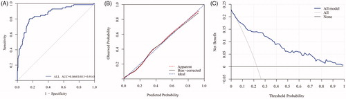
Table 3. Accuracy assessment of predictive OSP by Law of Total Probability.