Figures & data
Figure 1. Diagrammatic illustration of a microwave ablation cross-section (left). Actual photograph of a microwave ablation performed in an in-vivo pig liver model (right).
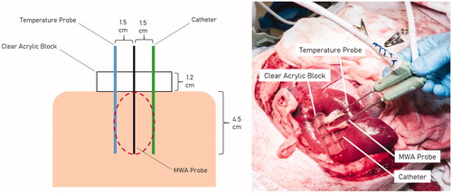
Table 1. The 6 protocols.
Figure 2. Diagrammatic illustration of how each microwave ablation zone was measured. L: Length; D: Diameter.
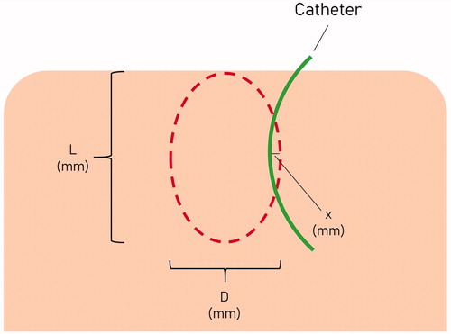
Figure 3. Representative images of the ablation zones after TTC staining illustrate differences between the various protocols. The photographs are to scale. (A) 65 W continuous for 10 min (65W 10MIN), (B) 25 W–65W ramped protocol (RAMPED), (C) high-power pulses with 31–32 s cooling pauses (95W PULSED), (D) low-power 40 W continuous for 16 min 15 s (LOW POWER), (E) 95 W pulse for 1 min, followed by continuous 65 W for 8 min, then a second 1 min 95 W pulse with no interleaved cooling pauses (BOOKEND 95W), (F) 65 W continuous for 15 min (65W 15MIN).
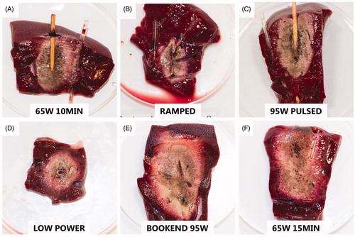
Figure 4. Comparison of 6 protocols.
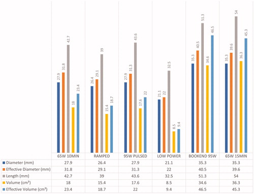
Table 2. Summary of all 6 protocols.
Figure 5. Comparison of elliptical index of 6 protocols.
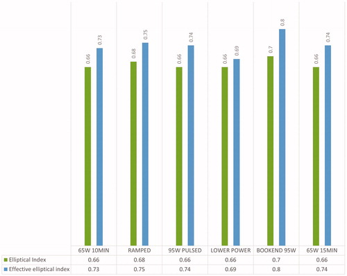
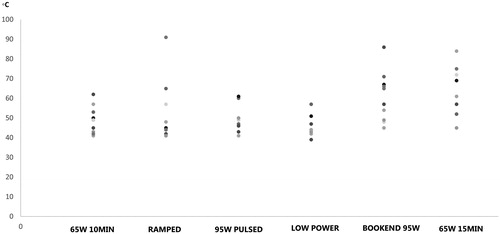
Figure 6. Scatter plot diagram of the maximum temperatures recorded for each of the protocols.