Figures & data
Figure 1. Flow diagram shows study patient accrual process.
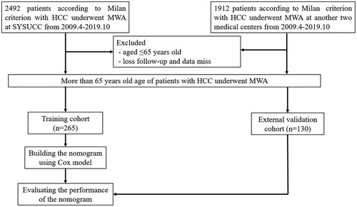
Figure 2. Kaplan–Meier LTP curves of comparation between the training data set and the validation data set.
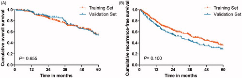
Table 1. Baseline patient characteristics.
Table 2. Local tumor recurrence between different ablative margin.
Table 3. Factors associated with OS after MWA for HCC according to univariate and multivariate analysis.
Table 4. Factors associated with RFS after MWA for HCC according to univariate and multivariate analysis.
Figure 3. The nomogram was developed in the training dataset. (A) Nomogram shows assessment of 1-, 3- and 5-year OS of elderly patients with EHCC after MWA; (B) Nomogram shows assessment of 1-, 3- and 5-year RFS of elderly patients with EHCC after MWA.
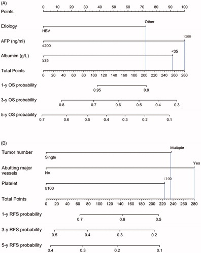
Figure 4. Graphs show results of Kaplan-Meier analyses according to the nomogram risk score in the training dataset. (A) 1-, 3- and 5-year OS in low-risk group was higher than that in high-risk group;(B) 1-, 3- and 5-year RFS in low-risk group was higher than that in high-risk group in the training dataset.
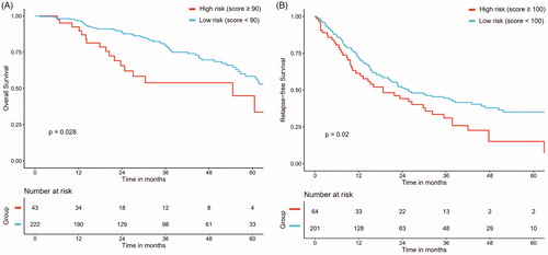
Table 5. OS and RFS rate in high-risk and low-risk groups.
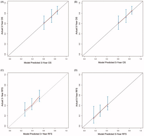
Figure 5. Calibration curve for predicting LTP after MWA at (A) 3-, and 5- years OS in the training data set; (B) 3-, and 5- years RFS in the training data set; (C) 3-, and 5- years OS in the validation data set; (D) 3-, and 5- years RFS in the validation data set. Nomogram-predicted probability of OS or RFS is plotted on the x-axis; actual OS or RFS is plotted on the y-axis.