Figures & data
Figure 1. Schematic of the patient models and the applicator. The water bolus is shown in blue. The patient model is shown in gray. (a) and (b) show the 14-channel two-row cylindrical applicator for Alex. (c) and (d) show the 16-channel two-row cylindrical applicator for Murphy. (e) and (f) show the 10-channel spherical applicator for Venus.
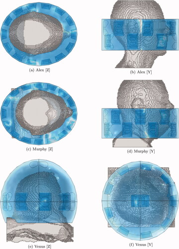
Figure 2. Schematic of the patient models and the applicator. The water bolus is shown in blue. The patient model is shown in gray. (a) and (b) show the 8-channel spherical applicator for Luna. (c) and (d) show the 14-channel two-row cylindrical applicator for Will. (e) and (f) show the 14-channel two-row cylindrical applicator for Clarice.
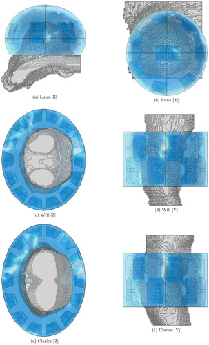
Figure 3. Antenna models utilized to assemble the applicators at the three selected operating bands. The illustrations are not to scale, in order to highlight the relative differences. (a) and (b) show the geometry optimized for a pelvis phantom, length 15.2 cm. (c) and (d) show the geometry optimized for a muscle phantom, length 6 cm. (e) and (f) show the geometry optimized for a breast phantom, length 5 cm.
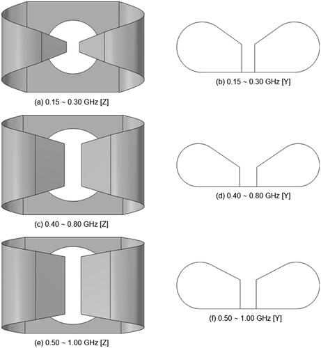
Figure 4. Reflection coefficients of the antenna models calculated at their (real) radiation impedance. The impedance is shown in the legend.
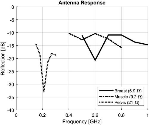
Figure 5. Illustrating the hot-spot (H, magenta) and cold-spot (C, cyan) sub-volumes. Schematic of neck section with target volume T and a ring applicator (black dots). Both H and C are equal to a fraction p of the target volume. The first centimeter of skin (yellow) is excluded from the spot evaluation. Note that the hot- and cold-spot sub-volumes are not necessarily contiguous sub-sets of the target T and the remaining tissue R, respectively.
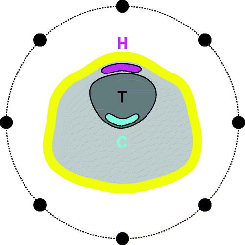
Table 1. Average computation times for HTQ and HCQ30 in single- and multi-frequency settings.
Figure 6. Treatment plan values of target coverage (SAR) for each patient, frequency combination, and optimization cost function. The cost function is color-coded in the legend. (a), (b), (g), and (h) report values of TC50 for the neck and pelvis models. (d) and (e) report values of TC75 for the breast models, as TC50 saturates at 100% for these patients.
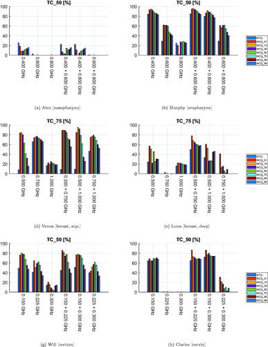
Figure 7. Treatment plan values of 50-percentile tumor temperature (T50) for each patient, frequency combination, and optimization cost function. The cost function is color-coded in the legend. The maximum temperature anywhere in the healthy tissues is 43 °C.
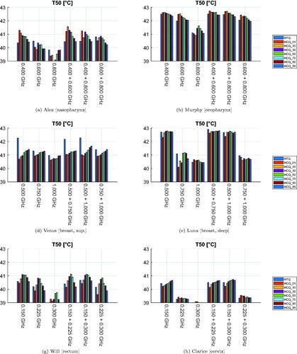
Figure 8. Treatment plan values of 90-percentile tumor temperature (T90) for each patient, frequency combination, and optimization cost function. The cost function is color-coded in the legend. The maximum temperature anywhere in the healthy tissues is 43 °C.
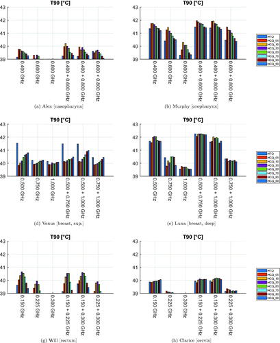
Figure 9. Treatment plans at 400 + 600 MHz for Alex. The SAR is normalized to the highest value in the patient. Transverse sections at target center. The target is delineated in white. The magenta/cyan voxels represent locations of highest/lowest SAR (hot-spot/cold-spot), excluding the first centimeter of tissue from the skin surface.
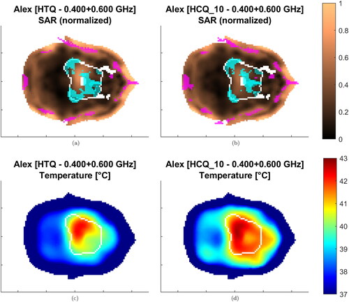
Figure 10. Treatment plans at 500 MHz for Venus. The SAR is normalized to the highest value in the patient. Sagittal sections at target center. The target is delineated in white. The magenta/cyan voxels represent locations of highest/lowest SAR (hot-spot/cold-spot), excluding the first centimeter of tissue from the skin surface.
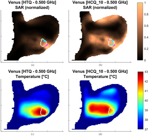
Figure 11. Dispersion plots and linear regression models for the relationship between HTQ and the clinical indicators. Model fit on all treatment plan values excluding samples relative to Venus.
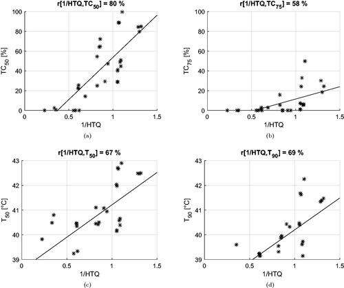
Figure 12. Dispersion plots and linear regression models for the relationship between HCQ30 and the clinical indicators. Model fit on all treatment plan values excluding samples relative to Venus.
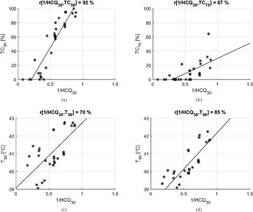
Table 2. Correlation coefficients between the inverse of the cost functions (HTQ, HCQ) and the clinical indicators (T, TC).
Figure 13. Average value of each clinical indicator as a function of the HCQ target percentile parameter p (solid line). The average values relative to HTQ are also reported for comparison (dotted line). The average is taken across all treatment plans excluding samples relative to Venus.
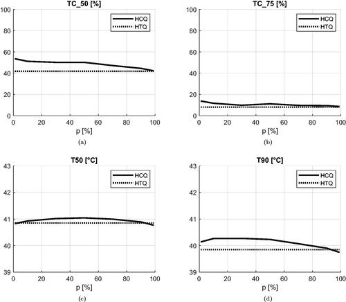
Figure A1. Dispersion plots and linear regression models for the relationship between HTQ′ and the clinical indicators. Model fit on all treatment plan values excluding samples relative to Venus.
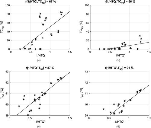
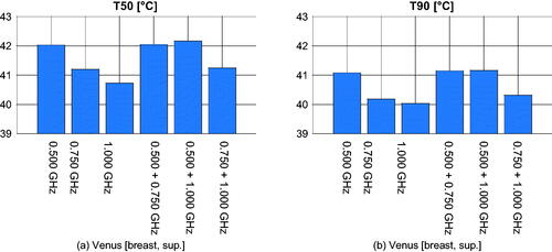
Figure A2. Treatment plan values of T50 and T90 obtained using HTQ′ for Venus at each frequency combination.